Map Viewer charts have some exciting feature enhancements with the October release. Read on to learn more about what’s new and improved.
Temporal binning for bar charts
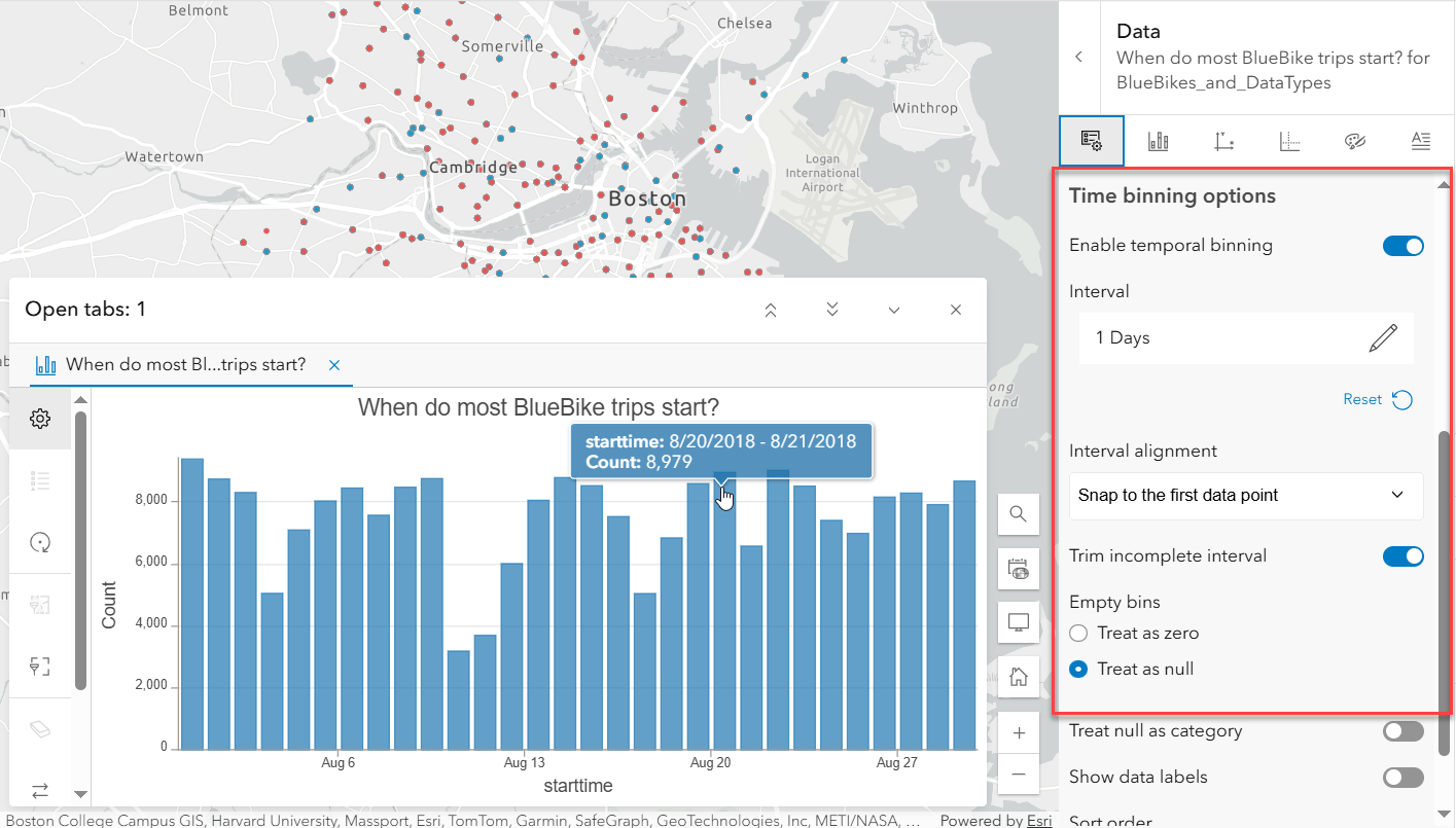
When a date field is used for Category or Date, time binning options can be set up by turning on the Enable temporal binning toggle in the data pane. This allows data to be aggregated and displayed at regular time intervals (like daily, weekly, or monthly).

Display null as a category
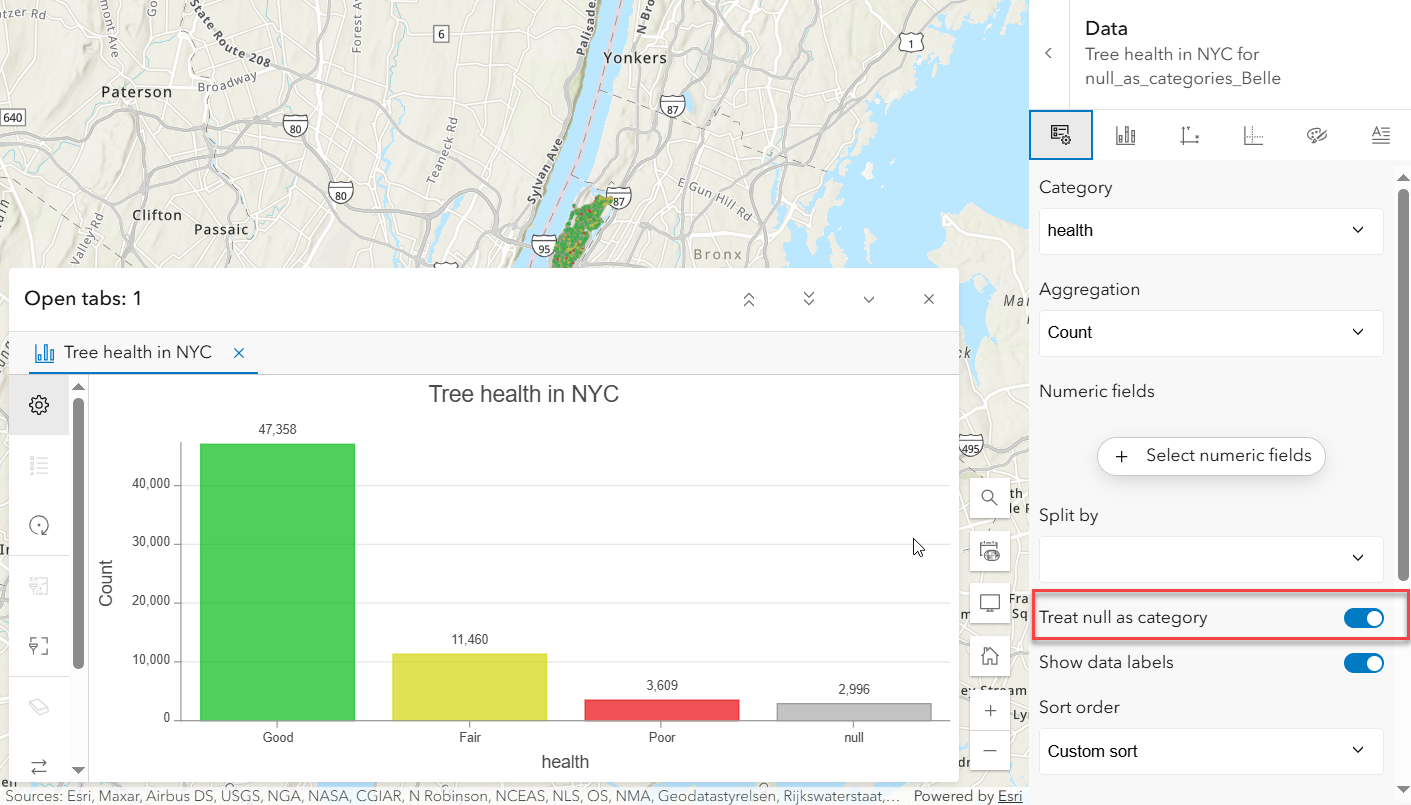
Bar charts now have the option to treat null values as a category by enabling the Treat null as category toggle in the data pane. This adds a separate bar to the chart summarizing the null values in the category field. The null bar color and label can be customized in the series tab.

Tooltip display field
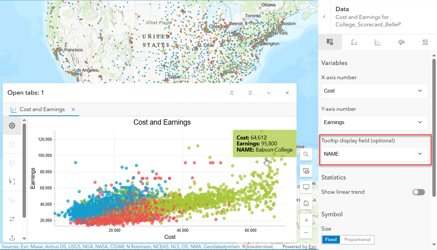
Scatter plots now have an optional Tooltip display field allowing an extra field to be displayed in the tooltip. For example, this scatter plot displays the relationship between cost and earnings by school. The extra tooltip display field allows for the school’s name to be included in the tooltip so each point in the scatter plot can easily be identified.

In addition to the new enhancements above, here’s a quick look back at some important updates from the previous release.
- Reorder charts: You can now drag and reorder charts within the chart list to organize them the way you want.
- Export charts: Charts can now be exported as PNG images, and the underlying data can be downloaded as a CSV file. These export options are available under the charts toolbar.
Thanks for staying up to date, we hope you enjoy these new features and would love to hear how you are utilizing these enhancements in your work!


Article Discussion: