Line charts are now available in Map Viewer!
With the addition of line charts, Map Viewer Charts is now out of beta as it covers the four main visualization categories:
- Distributions (histogram)
- Categories (bar chart)
- Relationships (scatter plot)
- Change (line chart)
Line charts visualize change along a continuous x-axis, usually representing time or distance. Visualizing change can help us explore trends and find patterns in our data. This is particularly important when working with temporal data, as we often need more than a map to understand change over time.
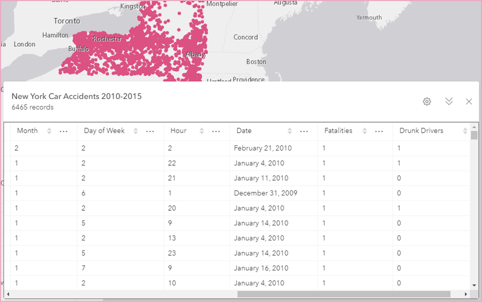
Let’s use this data set of car accident incidents in the state of New York from 2010 through 2015 to explore some ways that line charts can help us uncover patterns and trends in our data.

In addition to the location of each accident, the data set has other attributes including the date each accident took place, and the number of fatalities, pedestrians, and drunk drivers involved in each accident.
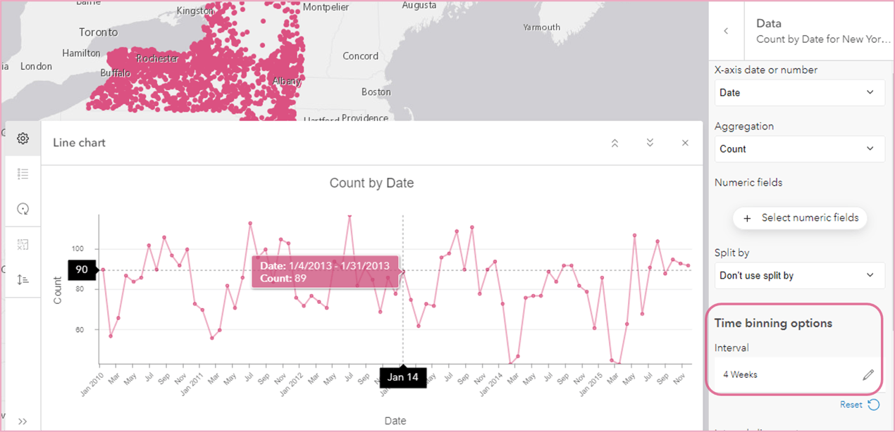
Since we have a date field, we can use a line chart to visualize the distribution of accidents over time. When a date field is used on the x-axis, the data is binned into time intervals. A default time interval is chosen based on the temporal extent of the data, but this can be changed using the Interval control under Time binning options. The car accident data was binned into four-week intervals. With the Aggregation type set to Count, the chart shows us how many car accidents took place during each four-week period. At first glance the line appears to show a seasonal trend, where the number of car accidents increases in the warmer months and decreases in the colder months.

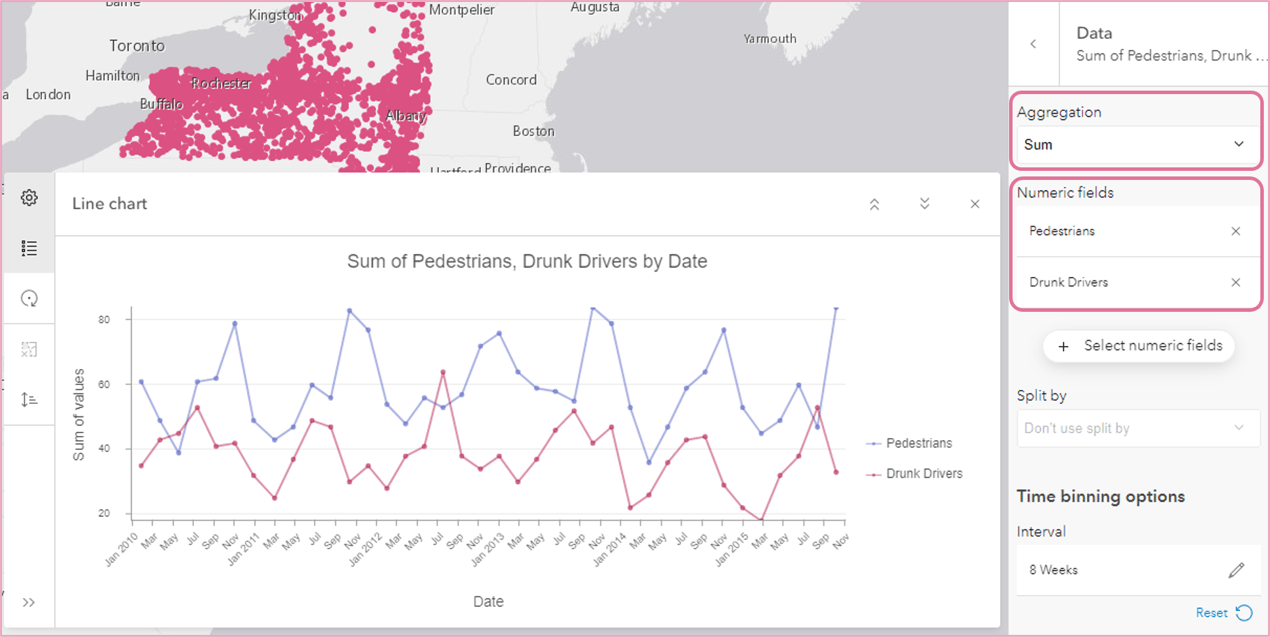
In addition to visualizing counts, we can also summarize one or more Numeric fields. For example, by adding the Numeric fields ‘Pedestrians’ and ‘Drunk Drivers’, and changing the Aggregation to Sum, we now see a sum of the total number of pedestrians in one line series and the sum of drunk drivers in another. I changed the time interval size to eight weeks to smooth out the lines, and we can see that there are usually more pedestrians involved in accidents than drunk drivers, but there have been three periods where the number of drunk drivers surpassed the number of pedestrians involved in car accidents.

So far, we’ve explored temporal line charts, but line charts can be created with a numeric x-axis as well. A numeric axis is commonly used to visualize change over distance, and it can also be used to visualize time in other creative ways.
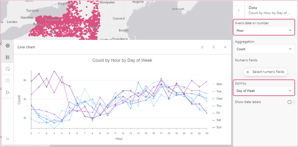
For example, in this chart we’re looking at change in car accident counts by hour of day and day of week. By adding ‘Hour’ as the numeric x-axis, and setting Split by to ‘Day of Week’, the chart shows one line series for each day of the week, and we can see how patterns in accident occurrences change throughout the day for each day of the week. We can see that rush-hour has consistently high accident counts despite day of week, but the most accidents happen over the weekend during the early morning hours.

Those are just a couple examples of how line charts in Map Viewer can be used to visualize change. I hope you’re inspired to uncover trends and patterns in our own data!
PS, check out this great blog post on how to share your charts using the new Chart Viewer Instant App!

Article Discussion: