Calendar heat charts are now available in Map Viewer as part of the February release! Alongside line charts and bar charts, they provide a new way to explore temporal data.
Line charts and bar charts are best at visualizing change over time along a linear axis. Calendar heat charts provide a different perspective by revealing patterns in when incidents typically occur within a week or within a year. They summarize many time periods into a single calendar view to help identify recurring times of day, days of the week, or days of the month with higher activity.
How calendar heat charts work
Calendar heat charts aggregate records with a Date field into a calendar grid. Each cell represents a specific calendar unit, and color indicates the aggregated value for that unit.
Two calendar types are supported in Map Viewer. Year by month and day of month, which aggregates data into a year view, and Week by day of week and hour of day, which aggregates data into a week view.
When data spans multiple years or weeks, incidents are summarized into the same calendar positions. For example, all October 22 incidents are aggregated together in the year view, and all Wednesday incidents at 12 PM are aggregated together in the week view. The result is a single calendar that summarizes typical temporal behavior.
By default, calendar heat charts display counts, but numeric fields can also be summarized using aggregation methods such as sum, mean, median, minimum, or maximum.
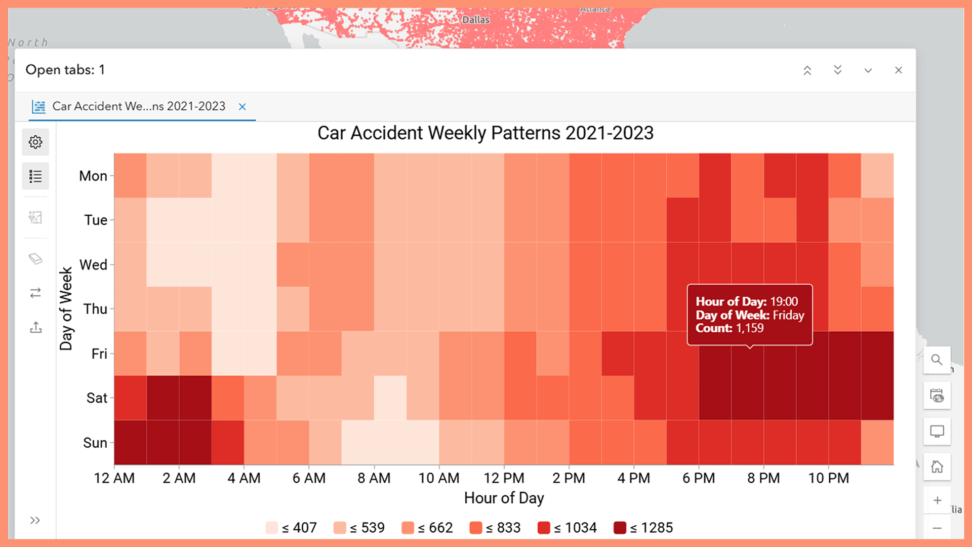
Example: Car accident patterns
In a week view, calendar heat charts reveal differences between weekday and weekend patterns. Rush-hour peaks are visible during weekday mornings and afternoons, while most accidents take place late at night on weekends.

In a year view, problematic days can be identified. Dates such as January 1, July 4, or October 31 often stand out when accident data is summarized across multiple years.

When to use calendar heat charts
Calendar heat charts are useful when understanding patterns influenced by human schedules and routines, such as public safety incidents, service requests, or transit usage. They are less appropriate for data that is not tied to calendar structure.
For understanding recurring temporal patterns within a calendar, calendar heat charts offer a clear and intuitive way to explore temporal data in Map Viewer.
I hope you give it a try and let us know what you think!

Article Discussion: