Population pyramids are a type of chart that is great for visualizing the age structure and sex ratio of a given population. They are typically shown as two back-to-back bar charts, with the left side representing males and the right side representing females, with age groups increasing on the vertical axis. Population pyramids are used by urban planners, healthcare policy makers, economic analysts, and many more.
How We Did It
ArcGIS Online offers multiple styles of built-in chart elements for pop-ups, but to create the population pyramid chart we needed a more custom approach. These examples below show how you can use HTML + Arcade to build a custom chart.
Data Structure is Important
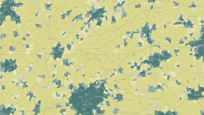
A major element of the population pyramid is data that divides age and sex into separate fields. The USA 2020 Census Population Characteristics dataset in the Living Atlas provides that structure. This layer is symbolized such that dark green counties are predominantly urban, and dark yellow counties are predominantly rural.


With all the data in separate fields we can start to construct the Arcade expression. Population pyramids group by age, so the first step is to create an array that specifies those groupings. Then we need to set up two more arrays that will hold the fields for the two sides of the pyramid (male and female).
![Snippet of the Arcade code showing an array being defined called ageGroups = ['85+','80-84','75-79','70-74','65-69', ... ] Then two more arrays called maleFields and femaleFields contain the specific fields in the layer.](https://www.esri.com/arcgis-blog/app/uploads/2025/09/part1_arcade-scaled.png "Snippet of the Arcade code showing an array being defined called ageGroups = ['85+','80-84','75-79','70-74','65-69', ... ] Then two more arrays called maleFields and femaleFields contain the specific fields in the layer.")
To build the HTML chart, we need to essentially create a table where each row shows one of those age groups. Then inside each row, add a bar for male and female populations. Explore the full Arcade expression in this map’s pop-up configurations to see how the chart dynamically scales based on the data.

What Population Pyramids Reveal
While some population pyramids are truly pyramid-shaped, the phrase “population pyramids” means these types of charts, regardless of the shape. In fact, different shapes can reveal different types of communities. Here are some examples.
Youthful Populations
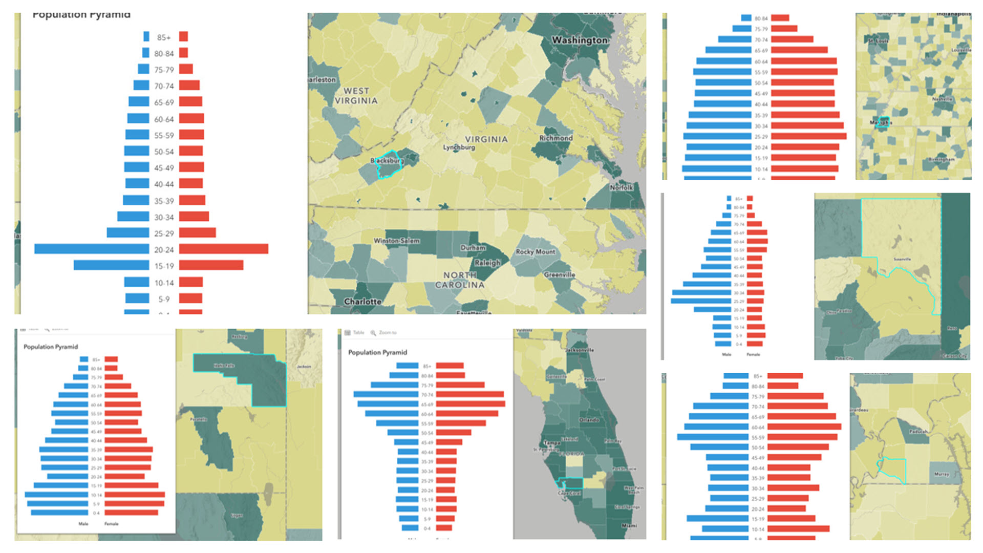
Youthful populations are depicted in population pyramids that are bottom-heavy, with lots of population in the childhood years. For example, the population pyramid for Bonneville County, ID shows a roughly triangular shape.
 are largest, and they generally get progressively smaller and smaller towards the top as the age groups increase.")
Stable Populations
Beehive-shaped pyramids reflect steady growth. Often the female side is larger than the male side starting at around the 75+ age groups, reflecting the fact that women’s life expectancy is slightly higher than men’s. This is true in Shelby County, TN, as well as in many other counties.
. The bar for age 85+ for females is about double the size of the 85+ bar for males.")
Aging Populations
The inverted triangle shape, especially in the youngest age groups, shows an aging population. For example, in Cumberland County, ME, there are fewer 0-4 year-olds than 5-9 year-olds, and fewer 5-9 year-olds than 10-14 year-olds, and so on. This continues up until ages 30-34, suggesting a shrinking population. Manatí Municipio, PR is experiencing a similar situation.


Male-Skewed Populations
When the left side is noticeably bigger than the right side of the pyramid, particularly among the adult populations, this can signal the presence of a military facility (such as in Onslow County, NC, home to Camp Lejeune) or a correctional facility (such as in Lassen County, CA, home to a state prison).


College Towns
Populations with a visible bump in the 18-24 age groups are most often college towns in small counties. In small counties, the university can make a large difference in the overall population. For example, Montgomery County, VA is home to Virginia Tech.

Early-Career Urban Centers
Major cities have long been destinations for young adults starting out their careers. These dark green counties in the map are predominantly urban, such as New York County, NY and San Francisco County, CA have a bulge in the 20 – 34 age groups.


Recreation and Retirement Communities
Much like college towns and urban centers, recreation and retirement communities attract people in a specific stage of life. In-migration in older ages can be seen in the large bars for 55-74 age groups. Two examples of this are Horry County, SC, and Charlotte County, FL.


Missing-Workforce Populations
An hourglass shape reveals lots of children and lots of older adults relative to working-age adults. This can be seen in both Hickman County, KY and Butte County, SD. In places such as these, children in the care of grandparents may be common.


Population Pyramids Are Not Just for Population
Population pyramids can be used to visualize any continuous measure (in this case, age) with two binary groups (in this case, sex). For example, we created a pop-up for this map that shows housing cost burden by owner/renter status.

For best results, make sure the bins along the y-axis are as close to “equal-interval” as you can get. For age groups, all were 5-year intervals, with the exception of the top-coded 85+ group. For the housing cost burden, they were all 10% intervals, with the exception of the top group.
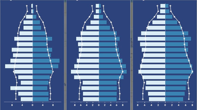
Try experimenting with other types of charts too! Below are examples of a stacked bar chart and a grouped bar chart that display the same owner/renter data.
.")
Check out the full Arcade expression and experiment with your own data using the template expressions in this Population Pyramids with Arcade map. The Arcade expressions are stored within the pop-up configurations.
Have you made population pyramids in your work? Share it in Esri Community.


Article Discussion: