Arcade is an expression language that allows you to define custom content in ArcGIS applications for desktop, mobile, and the web. Arcade expressions give you the flexibility to create dynamic popup elements, calculate new values, and format data. In this post, I’ll demonstrate how you can use Arcade to map diversity.
First, I’ll provide details describing my methodology, then we’ll explore the results with a ton of maps.
Diversity index
When the 2020 United States Census numbers were released, the summary of responses showed the U.S. is more diverse than ever. In the context of demographics, diversity usually refers to the level of variation that exists in a population with respect to race and ethnicity.
In fact, Esri provides a diversity index that returns a value between 0-100 for each census tract in the U.S. A diversity index indicates the probability that two people selected at random within an area belong to a different race or ethnicity. Therefore, higher numbers indicate more diversity.
.")
Languages spoken at home
Occasionally I like to explore data in the ArcGIS Living Atlas of the World. The Living Atlas has a treasure trove of data, including up-to-date data from the American Community Survey (ACS). I load the data in the ArcGIS Online Map Viewer to see if I can learn something new by experimenting with various Smart Mapping styles.
Recently, I came across this layer containing data for languages spoken in the home. It reports the number of people speaking languages in the following categories:
- English
- Spanish
- Asian and Pacific Islander languages – Includes Chinese (incl. Mandarin, Cantonese), Japanese, Korean, Hmong, Vietnamese, Khmer, Thai, Lao, Burmese, Tibetan, Turkish, Tagalog (incl. Filipino), Ilocano, Samoan, Hawaiian, Cebuano (Bisayan), Iloko (Ilocano), Samoan, Indonesian.
- Other Indo-European languages – Includes French (incl. Cajun), Haitian creole, Italian, Portuguese, German, Yiddish, Pennsylvania Dutch, Greek, Russian, Polish, Serbo-Croatian, Ukrainian, Armenian, Persian (incl. Farsi, Dari), Gujarati, Hindi, Urdu, Punjabi, Bengali, Nepali, Marathi, Telugu, Tamil, Malayalam, Kannada, Albanian, Lithuanian, Pashto, Romanian, Swedis.h
- Other languages – Includes Navajo, Apache languages, Cherokee, Dakota languages, Tohono O’odham, Arabic, Hebrew, Amharic, Somali, Yoruba, Twi, Igbo, Swahili, Bantu languages, Lingala, Hungarian, Jamaican Creole English
I loaded the layer in the ArcGIS Online Map Viewer and created a predominance map. A predominance map shows which language group is most common among the people living in an area. Southern California immediately revealed interesting patterns.
Click here to open the web map
 in Glendale coincide with high Armenian populations in the area.")
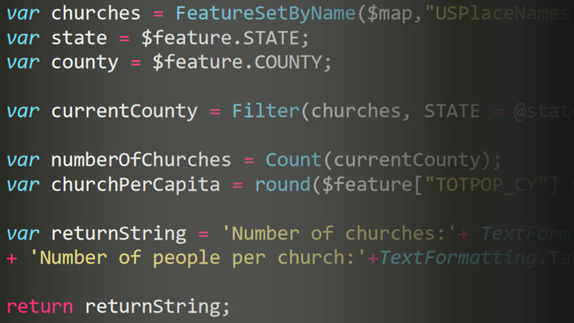
While exploring this map, I immediately thought about diversity — not in the context of race and ethnicity — but of languages. Since language diversity isn’t a field contained in this layer, I decided to write an Arcade expression to create a language diversity index. Arcade provides an avenue to calculate any value within the context of the map even though I don’t own this data.
As opposed to predominance, which focuses on the most common category, a diversity map will communicate the variety within the area. Low diversity areas will coincide with areas that show strong predominance for one category.
Simpson’s Diversity Index
I chose Simpson’s Diversity Index to calculate diversity using Arcade. While Simpson’s Diversity Index is typically used to calculate biodiversity, it can also be used to calculate diversity for demographics in human populations.

This formula returns a number between 0 – 1, indicating the probability that two individuals selected at random belong to different groups or categories. The higher the score, the higher the diversity in the area for the given variables.
I wrote the following function in Arcade to calculate Simpson’s Diversity Index for any set of categories within a population. For readability within the map, I decided to multiply the final index by 100 (e.g. representing probability as 50% is easier to read than 0.5).
// Returns a value between 0-100.
// Indicates the % chance two people
// who speak different langages are
// randomly selected from the area.
function simpsonsDiversityIndex(vals){
  var k = Array(Count(vals));
  var t = sum(vals);
  for(var i in vals){
    var n = vals[i];
    k[i] = n * (n-1);
  }
  var s = Sum(k);
  var di = 1 - ( s  / ( t * (t-1) ) );
  return Round(di*100);
}
Let’s input a few test values to see how this index works. If there are five groups, where one has 100 individuals and the others each have zero, the function will return 0. This indicates there is no diversity since all individuals come from a single group.

Conversely, maximum diversity is indicated by all groups having the same population. To test this, I provided the function with five groups, each with 100 individuals. It returns an index of 80. In other words, there is an 80 percent chance that two individuals selected at random will come from different groups.

Note that there can never be a result of 1 (or 100%). The highest possible score returned from Simpson’s Diversity Index will always be (n - 1) / n, where n is the number of categories considered.
Therefore, a higher number of categories combined with similar populations in each category will result in a higher diversity index.
Mapping language diversity
Once the function was written, I referenced the total number of people in each language category as inputs to the function.
var asian = $feature["B16007_calc_numAPIE"];
var english = $feature["B16007_calc_numEngOnlyE"];
var european = $feature["B16007_calc_numIEE"];
var other = $feature["B16007_calc_numOtherE"];
var spanish = $feature["B16007_calc_numSpanE"];

var languages = [asian, english, european, other, spanish];

function simpsonsDiversityIndex(vals){
  var k = Array(Count(vals));
  var t = sum(vals);
  for(var i in vals){
    var n = vals[i];
    k[i] = n * (n-1);
  }
  var s = Sum(k);
  var di = 1 - ( s  / ( t * (t-1) ) );
  return Round(di*100);
}

simpsonsDiversityIndex(languages);
Clicking OK in the Arcade editor executes the expression for each feature in the layer. Once the expression finishes, a style is created based on statistics summarizing the output for all features. Selecting an above-and-below theme reveals the following map.

Brown areas indicate areas of high language diversity, or areas where people are more likely to live close to others who speak a different language than themselves. The green areas indicate areas of low language diversity, or areas where people are more likely to speak the same language as their neighbors.
As a whole, most tracts in the United States have low language diversity because most people speak English in the home. Areas with the highest language diversity tend to be in large cities, with the exception of cities in the Midwest.

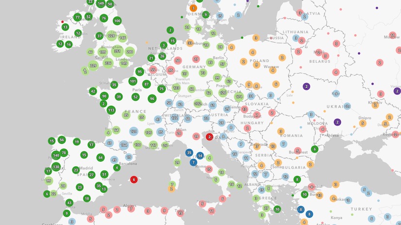
The following maps explore language diversity compared with maps showing the predominant language group spoken in the home in a few select cities. The size of the circles in each map corresponds to the total population ages 5 and older in the area.
Click each image to enlarge it for readability.
Click here to view the live web map and explore the data on your own.


Open this app to explore this data in other parts of the United States using a Swipe widget.
Language diversity in areas with high Spanish and English speaking populations
If I add the total Spanish speaking population as a second variable to the layer’s style, the Map Viewer will replace the fill symbols with marker symbols. The larger the size of the symbol, the higher the number of Spanish speakers in the tract.
Therefore, the maps below show the number of Spanish and English speakers in each area within the context of overall language diversity.


Diversity of specific Asian groups
The Living Atlas recently added layers containing the populations of specific Asian groups at the state, county, and tract levels. Many people in these groups speak different languages, but are represented within a single category in the languages layer. Because of this, I was eager to explore the diversity that exists within Asian populations.
I used the same Simpson’s Diversity Index Arcade function in the layer’s style. However, this time I referenced numbers from 23 specific Asian groups and created the following map.
Click to expand and view the expression
var indian = $feature["B02018_002E"];
var bangladeshi = $feature["B02018_003E"];
var bhutanese = $feature["B02018_004E"];
var burmese = $feature["B02018_005E"];
var cambodian = $feature["B02018_006E"];
var chinese = $feature["B02018_007E"];
var filipino = $feature["B02018_008E"];
var hmong = $feature["B02018_009E"];
var indonesian = $feature["B02018_010E"];
var japanese = $feature["B02018_011E"];
var korean = $feature["B02018_012E"];
var laotian = $feature["B02018_013E"];
var malaysian = $feature["B02018_014E"];
var mongolian = $feature["B02018_015E"];
var nepalese = $feature["B02018_016E"];
var okinawan = $feature["B02018_017E"];
var pakistani = $feature["B02018_018E"];
var srilankan = $feature["B02018_019E"];
var taiwanese = $feature["B02018_020E"];
var thai = $feature["B02018_021E"];
var vietnamese = $feature["B02018_022E"];
var other = $feature["B02018_023E"] + $feature["B02018_024E"];


var groups = [ indian, bangladeshi, bhutanese, burmese, cambodian,
  chinese, filipino, hmong, indonesian, japanese, korean, laotian,
  malaysian, mongolian, nepalese, okinawan, pakistani, srilankan,
  taiwanese, thai, vietnamese, other];

// Returns a value 0-100.
// Indicates the % chance two people
// from different Asian regions are
// randomly selected from the area.
function simpsonsDiversityIndex(vals){
  var k = Array(Count(vals));
  var t = sum(vals);
  for(var i in vals){
    var n = vals[i];
    k[i] = n * (n-1);
  }
  var s = Sum(k);
  var di = 1 - ( s  / ( t * (t-1) ) );
  return Round(di*100);
}

simpsonsDiversityIndex(groups);

The results show very high diversity in many parts of the U.S. However, several areas in large metropolitan areas, like Los Angeles, Chicago, and New York, reveal neighborhoods with high Asian American populations and low diversity. For example, these include the following communities in Los Angeles: China Town, Little Tokyo, Little Saigon, Korea Town, Little Manila, and Cambodia Town.
Check out the diversity of specific Asian groups in the following maps.
Click each image to enlarge it for readability.


These maps clearly show the high diversity that exists within Asian populations on their own.
Predominant Asian groups
The predominance style reveals the predominant group of each low diversity area. Because I can only map up to 10 categories with predominance, I chose to consider only the most populous categories as reported by the Pew Research Center.
Click each image to enlarge it for readability.


The default popup on these layers displays a chart visualizing the populations of each group relative to one another. A single tall bar indicates low diversity populations. Several bars indicate more diversity in the population.

To learn more about the demographics of Asian Americans in the United States, check out the following article from the Pew Research Center.
https://www.pewresearch.org/fact-tank/2021/04/29/key-facts-about-asian-americans/
Diversity of Hispanic and Latino groups
The Living Atlas also recently added a layer containing data describing the number of people belonging to specific Hispanic and Latino groups. This includes 25 unique categories from regions of South America, Central America, Mexico, the Caribbean islands, and Spain.
The results almost look like the inverse of the map of diversity among specific Asian groups. Most census tracts in the United States show low diversity among Hispanic and Latino groups. High population areas in Florida and the east coast are exceptions.
Click each image to enlarge it for readability.

The predominance map for the same extent shows that most people of Hispanic origin in the United States are Mexican.

However, Florida and New York have high populations from other Hispanic/Latino groups, making them perhaps the most diverse areas among Hispanic and Latino populations.


The following maps show predominant Hispanic/Latino populations considering the most common groups as reported by the Pew Research Center, and groups within Central and South American subgroups.
Predominant Hispanic/Latino groups
Click each image to enlarge it for readability.


To learn more about the demographics of people of Hispanic/Latino origin in the United States, check out the following article from the Pew Research Center.
https://www.pewresearch.org/fact-tank/2021/09/09/key-facts-about-u-s-latinos-for-national-hispanic-heritage-month/
Explore these maps on your own
The following apps allow you to explore diversity and compare it with predominance for each of the variables described in this post. I encourage you to explore the data in each to learn more about the diversity that exists within each each category.
- Diversity of Asian specific groups and languages spoken in the home
- Diversity of Hispanic/Latino groups and languages spoken in the home

Conclusion
The term diversity intentionally focuses on the differences that exist in a population. This may include differences in race, ethnicity, language, culture, religion, age, gender and many other categories. As I reflect on my associations and friendships with neighbors, coworkers, and other associates from all sorts of backgrounds, I am reminded of two things:
- We are alike in many ways; we are all human, and experience the same emotions (though through different life experiences, which leads to the second point).
- We are all truly unique whether or not we have similar backgrounds or belong to the same demographic categories; our uniqueness shows we our more diverse than data often indicate.
While the maps I shared above focus on the diversity of specific categories, don’t forget that more diversity exists in each area than the data actually reports.
Creating a diversity index is just one of many examples where you can use Arcade to calculate new values to display custom content in web maps. I encourage you to read other posts focusing on how you can use Arcade to customize your maps.

Article Discussion: