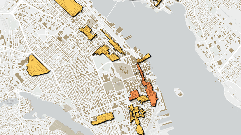
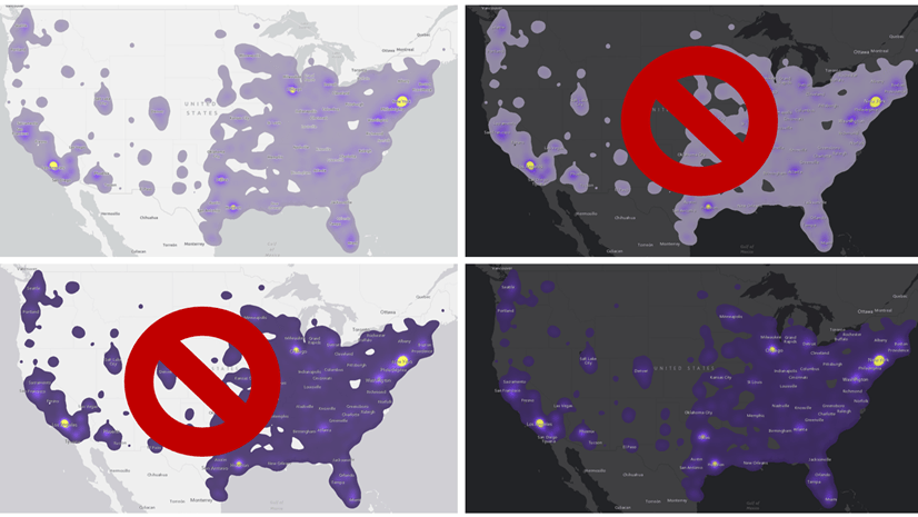
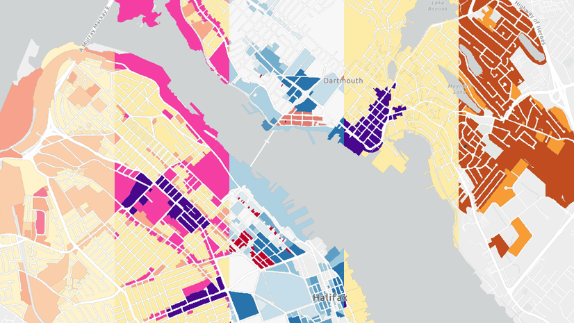
In map design, the choice of color scheme is dependent on the basemap. If you have a light basemap, most people will interpret dark colors to mean “more” and light colors to mean “less”. If you have a dark basemap, the opposite is true. The video below shows examples of designing with light and dark color schemes in ArcGIS Online and ArcGIS Pro.
Takeaways:
- If you’re using a light basemap, dark colors will stand out more and so appear to mean “more”.
- If you’re using a dark basemap, light colors will stand out more and so appear to mean “more”.
- You can flip color schemes to control which end equates to more and which equates to less.
- The subject of your map can sometimes override these rules.
- In ArcGIS Online, you can search for color schemes designed specifically for light or dark basemaps.
- If you’re struggling to find the right color scheme, try changing the basemap.
- Colors all look different against different backgrounds.
There are a lot of other considerations that go into designing choropleth maps. You can learn about some of them in this related video: Configure a choropleth map.
You can follow along with the map in ArcGIS Online: https://www.arcgis.com/apps/mapviewer/index.html?webmap=1bd8144a76e44fb1bc4b7064c2f66b3d
Or with the map in ArcGIS Pro: https://www.arcgis.com/home/item.html?id=1d49fdf0931045698b7d172d1d9e0394
You can find the data at Halifax Open Data: https://catalogue-hrm.opendata.arcgis.com/
You can find more videos like this one on the Quick Cartography playlist: https://www.youtube.com/playlist?list=PLGZUzt4E4O2I2vD7vtbemJ_QifsN3nmHX

Article Discussion: