Esri provides hundreds of color ramps that improve the mapping experience. Ramp designers implemented color theory and how perceptual differences work to create ramps in Adobe Illustrator. Decades of experience among numerous cartographers influenced the specification of these ramps.

Map Viewer contains over 300 color ramps. The team tagged and categorized each ramp to make exploration easy. Certain ramps are shown depending on the mapping style and theme selected. Map Viewer recognizes if the map contains a dark or light basemap and provides a default ramp suggestion that works best for your map. These defaults get you close to a final map, but there are some tips and tricks you can follow to choose the best ramp for your data.
Bright and Subdued Ramps
Your map’s subject is the first thing to think about when choosing a color ramp. Bright colors draw attention to the most important values, such as values which should raise alarm to the reader. You can also add playfulness to a map’s subject by using bright ramps. Subdued colors are useful for serious topics and conservative audiences.

Meaningful Values
Once you choose a color ramp, set meaningful values to define how the map applies the colors. The best maps use meaningful values based on what a subject matter expert shares about the topic or what you research about it. For example, center the ramp on a national average or goal to view areas above or below the meaningful value.
The map below shows the percentage of children in kindergarten with all required immunizations. The map author chose 95% as the center point in the color ramp because 95% is the rate at which “community immunity” from contagion is reasonably achieved for the entire population. Red school districts are not meeting this goal while blue districts have an immunization rate of over 95%.

Match your basemap
Your color ramps will appear on a layer drawn on top of a basemap serving as the map’s background. Basemaps can be colorful or monochrome, dark or light.
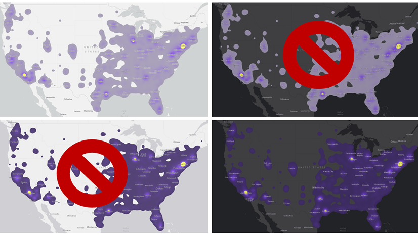
Ramps that are best for dark backgrounds have a dark end for low values and a bright, saturated end for high values. The bright areas stand out while the dark areas fade into the basemap. You can also flip the ramp to draw attention to the low values. Dark backgrounds with eye-catching, bright ramps add drama to your story and create a modern look-and-feel.
Ramps that are best for light backgrounds have a light end for low values and a darker end for high values. The darker areas stand out while the light areas fade into the basemap. You can also flip the ramp to draw attention to the low values. Light backgrounds provide a clean, classic tone to your story.

Sequential Ramps
Sequential ramps are available with the High to Low theme. These ramps use two colors: a strong color for high values and a light color for low values. Maps that use the sequential ramps are valuable because they focus attention primarily on just one part of the data (the high values). You can flip the ramp to draw attention to the low values.

Diverging Ramps
Diverging ramps are expressed in the Above and Below theme. These ramps use three colors: a strong color for high values, a strong color for low values, and a dark or light center depending on the basemap. Maps that use the diverging ramps are valuable because they can draw attention to what’s considered “high” values as well as “low” values. These ramps are centered around an average or a meaningful value.
For example, if authorities caution that children should not drink well water with more than 10 mg/liter of nitrates, your map reader needs to clearly see that threshold represented in the map. Obviously, 0 mg/liter would be the lower bound for the color ramp, and 10 mg/liter could be where a strong red color gets applied. A value of 30 mg/liter is also regarded as significant since it is three times the threshold value. If the purpose of the map is to show all the data, it makes sense to use a diverging color ramp using colors that indicate where the water is OK to drink, and where it is not (see first ramp below). In the second example, only those values at nearly 3x the threshold earn the dark purple color. The threshold value itself (10 mg/liter) has no special color indicated.

These versions below use 3 discrete classes to simplify the map. All values 10 – 30 get the same color, so even though a value of 28 is twice the value of 14, they receive the same color. Note this approach obscures the variation in the data.

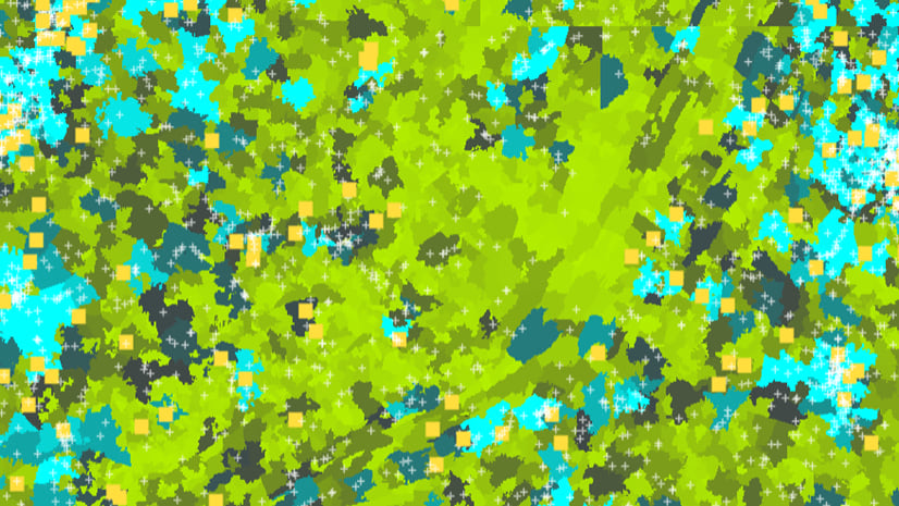
Dot Density Ramps
The popular dot density style is now available in Map Viewer. This mapping style makes your data and story more personal by representing a count of something or someone with an individual dot. When mapping two or more categories, there may be places where there’s a mix of both categories. In this case, Map Viewer blends the two colors. The dot density color ramps were created with blending in mind.

Colorblind Friendly
More than two hundred of the color ramps available are colorblind friendly. The team individually tested each ramp with a color blindness simulator (ColorOracle) to verify that the ramp shows detectable color variation with the most common type of color blindness.

Explore new color ramps in Map Viewer
There is a color ramp for every type of map. With helpful categories and well-designed ramps, Map Viewer makes it easy for you to find the one that works best for your story.
Join the Map Viewer Esri Community for discussions, updates, and blogs.

Article Discussion: