A point is a specific location; a geographic element defined by a pair of x,y coordinates, often using latitude and longitude. A point is represented by a single dot or symbol on your map. While points are perfect for showing the exact location of features, they aren’t always visually intuitive, especially when there are many of them. Using smart mapping and other Map Viewer capabilities, you can present your point data in more meaningful ways.
I didn’t know dot…
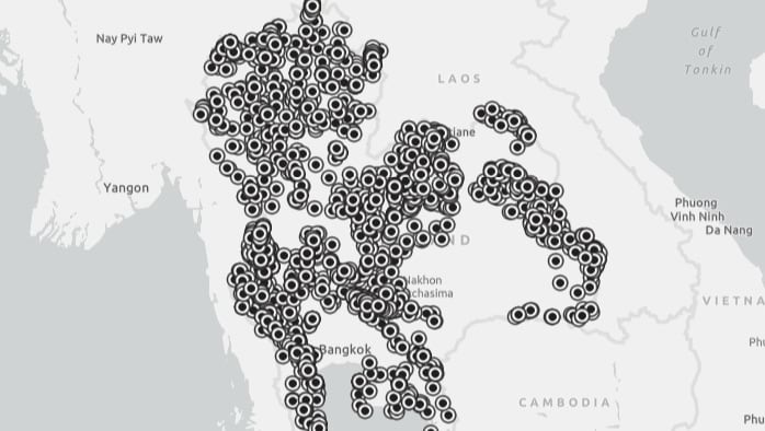
This map shows a large number of point features, approximately 4,000 of them, in this case showing cave locations in Thailand.
Did you know that using smart mapping and other techniques to visually and spatially aggregate the data you can create a more intuitive map?
Heat map
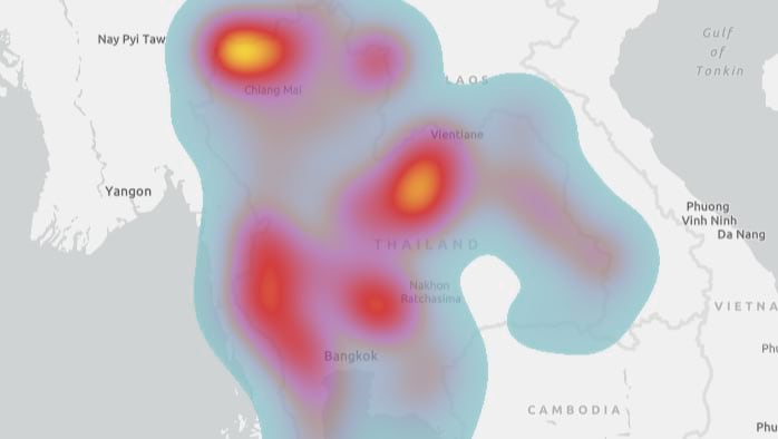
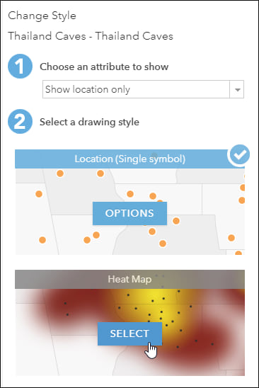
Using Map Viewer, you can explore your data in different ways by applying a variety of smart mapping styles. Smart mapping uses a data-driven approach that lets you choose from a variety of visualization methods (styles) that you can customize. One of the available smart mapping styles for point features is Heat map.
Heat maps are especially effective when many points are to be displayed. The relative density of points on the map is calculated, and can be rendered in a variety of color schemes to suit your tastes and needs. Typically the color schemes range from cool colors indicating low density to hot colors indicating high density.
Create a heat map
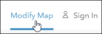
Step 1 – Open the Thailand Caves map and click Modify Map. You can optionally Sign In if you want to save your work.
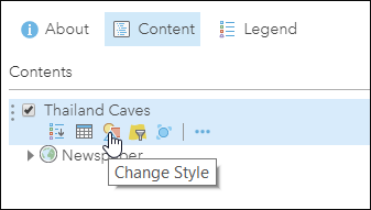
Step 2 – Click Content, then click Change Style under the Thailand Caves layer.
Step 3 – Select Heat Map from the available style options.
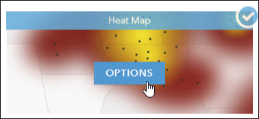
The Heat Map style will be applied. Save the map if you like the results. You can optionally refine the heat map by clicking Heat Map Options.
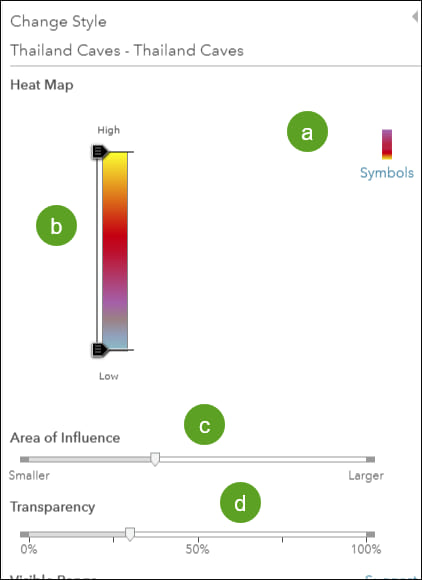
Then you can:
(a) Choose a different symbol color ramp by clicking Symbols.
(b) Adjust the sliders on the color ramp to highlight either low or high density.
(c) Adjust the circle of influence to to make the density clusters larger and smoother, or smaller and more distinct.
(d) Adjust the transparency.
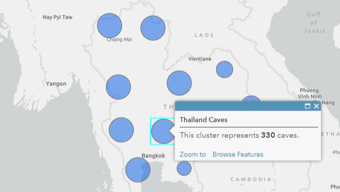
Clustering
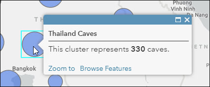
Clustering will group point features that are within a certain distance of one another into one symbol. The symbol size indicates the number of features in that cluster. The clustering is dynamic, meaning that as you zoom in or out the cluster size changes; zoom out and there are fewer and larger clusters, zoom in and there are more and smaller clusters. The cluster pop-up can also be configured to display the number of features in each cluster. When you have zoomed in so only one feature is represented, the feature pop-up (rather than the cluster pop-up) will display.
Use clustering
Step 1 – Open the Thailand Caves map and click Modify Map. You can optionally Sign In if you want to save your work.
Step 2 – Choose a symbol that you want to use to represent the clusters.
(a) Click Content, then click Change Style under the Thailand Caves layer.
(b) Click Options in Location (Single symbol).
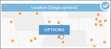
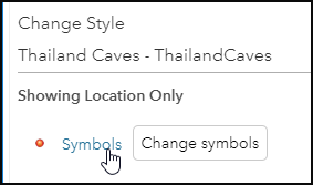
(c) Click Symbols to change the current symbol.
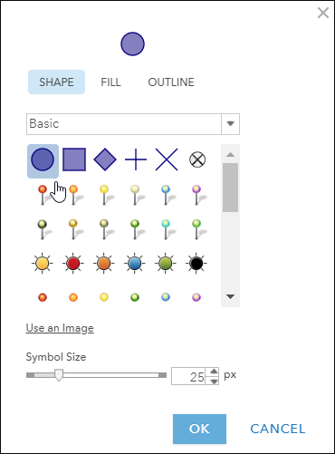
(d) Choose a symbol you like.
Choose the circle from the Basic symbol gallery. Optionally choose the Fill and Outline color, then adjust the symbol size. When finished, click OK.
Click OK, then Done, to return to the Map Viewer Content pane.
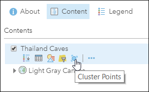
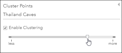
Step 3 – Click Cluster Points under the layer name.
Step 4 – Check the box to Enable Clustering, then adjust the slider to create the desired effect.
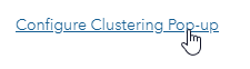
Step 5 – Configure the cluster pop-up.
Click Configure Cluster Pop-up to configure the desired pop-up information.
Summarize Data using Aggregate Points
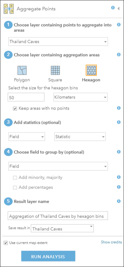
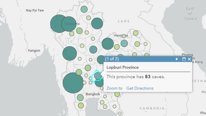
Using the Aggregate Points analysis tool, you can determine which points fall within a polygon. The Aggregate Points tool uses area features to summarize a set of point features. The boundaries from the area feature are used to collect the points within each area and use them to calculate statistics. The resulting layer displays the count of points within each area.
The areas can be any polygon feature layer you have added, or you can use Living Atlas content or the built-in square or hexagon bins.
Step 1 – Open the Thailand Caves map and click Modify Map. You can optionally Sign In if you want to save your work.
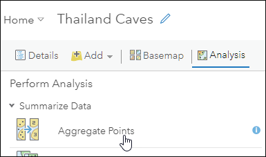
Step 2 – Click Analysis.
Step 3 – Open the Summarize Data tool category.
Step 4 – Choose Aggregate Points.
Step 5 – Complete the tool parameters as described below;
(1) Select the Thailand Caves layer.
(2) Choose the area layer to use for aggregation. Any points that fall within the boundaries of areas in this layer will be counted and optionally summarized using your choices of statistics. You use any polygon feature layer you have added to your map, or can choose the built-in square or hex bins. Each option is discussed in more detail in separate sections below.
(3) Enter the result layer name.
Then click Run Analysis.
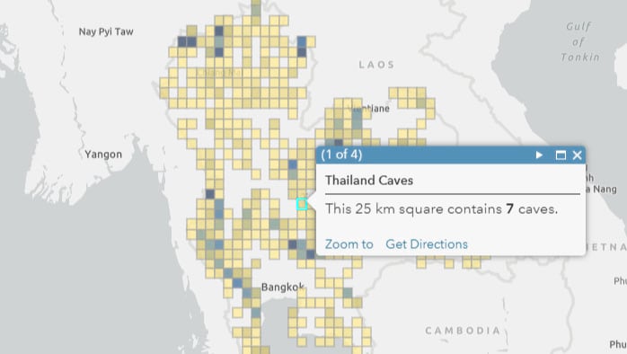
Square Bins
Square Bins are generated automatically when the tool runs. Specify the size of the square bins in tool parameter 2.
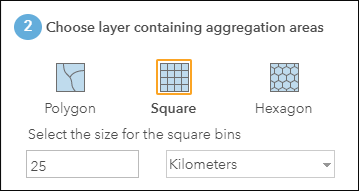
After running the tool, the results will be displayed using graduated color symbols. Configure the layer symbols and pop-up to suit your needs.
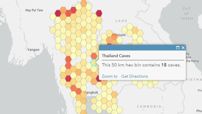
Hex Bins
Hex bins are generated automatically when the tool runs. Specify the size of the hexagon bins in the second tool parameter.
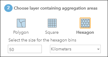
After running the tool, the results will be displayed using graduated color symbols. Configure the layer symbols and pop-up to suit your needs.
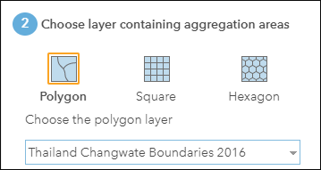
Polygon
Use the drop down to choose any polygon feature layer you already have in your web map, or you can choose from any Living Atlas polygon layer. In this case we have used the Thailand Changwate Boundaries 2016 obtained from the Living Atlas. These essentially represent the country provinces.
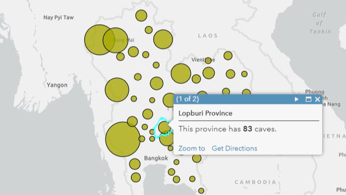
The default smart mapping style is Counts and Amounts (Size). Click Options to adjust the color and size of symbols as desired, then configure the pop-up.
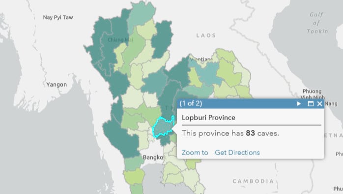
Optionally you can choose Counts and Amounts (Color).
You can also use Counts and Amounts (Size and Color) to show the density using both size and color.
And you can use two layers, in this case Size and Amounts (Color) and Size and Amounts (Size), to create an interesting effect.

Summary
Sometimes the point locations are all that you need, but especially when you have a large number of points, using both visual and spatial aggregation tools can deliver more meaning to your viewers.
For more information
- Change Style (Help)
- Heat map (Help)
- Configure clustering (Help)
- Aggregate points (Help)
- Clustering in ArcGIS Online Enables Data Exploration (ArcGIS Blog)
- Heat Mapping in Two Simple Steps (ArcGIS Blog)
- Aggregation examples (Story Map)

Commenting is not enabled for this article.