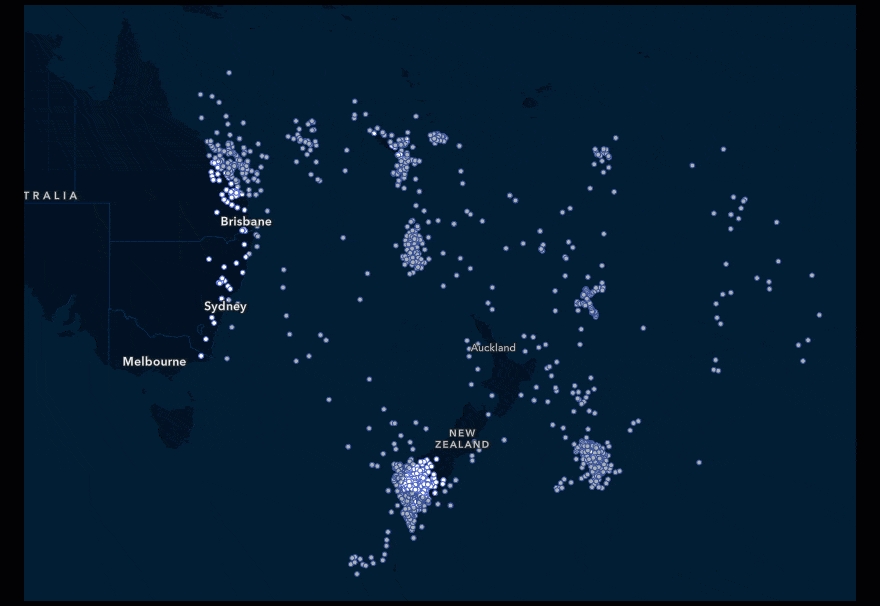
Point datasets with a large number of dense features inevitably overlap, hiding any potential meaning within the data. A heat map uses the features in the layer to calculate and display the relative density of points on the map as smoothly varying sets of colors ranging from cool (low density of points) to hot (many points) – hence the name heat map.
Heat maps are particularly helpful when many of the points on the map are close together or overlapping, making it difficult to distinguish between features. This is especially common when points are viewed at multiple scales. Small scales make large, dense point features nearly indecipherable, forcing the viewer to zoom in and lose any potential pattern hidden within the data.
Additionally, heat mapping is also great for event-based data, such as traffic violations, where it is likely that points are coincident in the same location.
Two quick steps
Smart mapping helps you create beautiful and informative maps, quickly by suggesting appropriate mapping styles for your data. If you have point data, heat map will be a suggested style option.
- Select the Heat Map style
- Explore the Style options to adjust color and density
Apply your knowledge
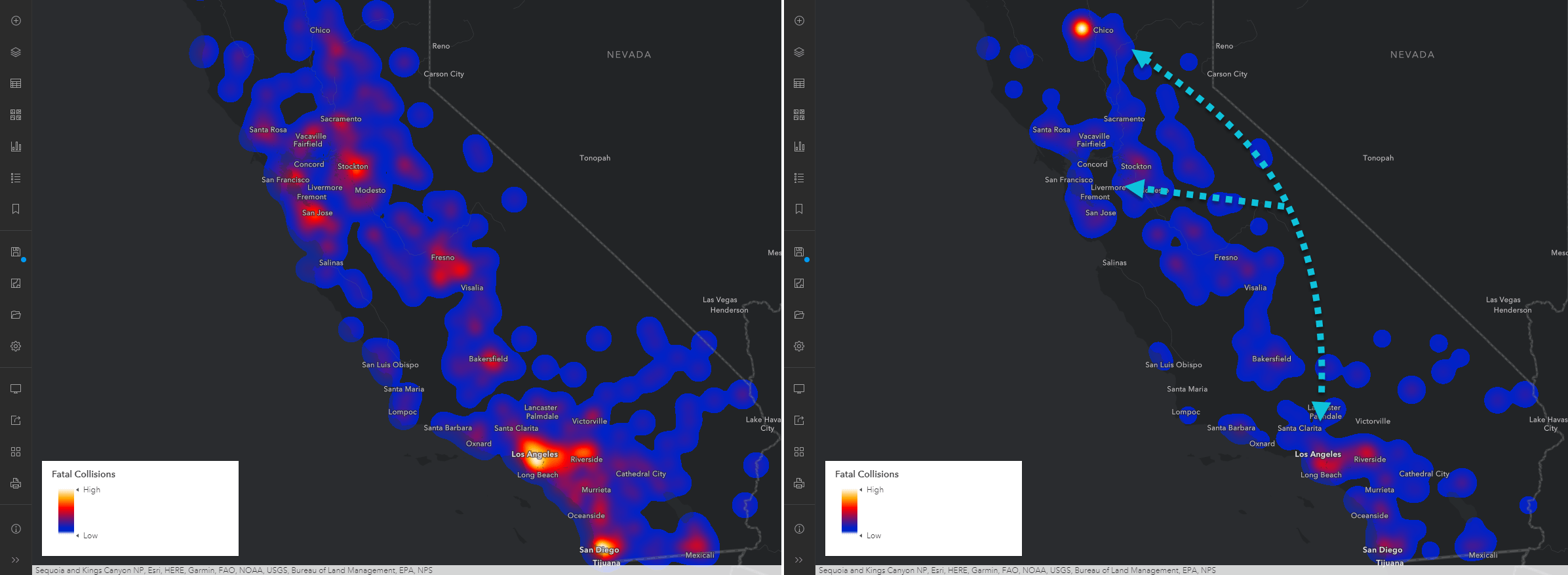
If your data contains numeric attributes, the heat map can weight this data to calculate the optimal display. In this heat map of traffic collisions, the number of injuries is applied as a weight. The weighted heat map on the right has more cool spots in the San Francisco, Central Valley, and Southern California areas compared to the unweighted version on the left. Whereas the clusters in Chico, Northern California, are much hotter. This tells us that there are fewer accidents in Chico compared to the other major urban areas, but the accidents result in more injuries.
Tips and tricks
- Avoid heat maps if you have only a few point features; instead, map the actual points.
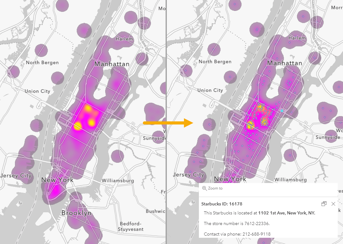
- Add the point layer again on top of your existing heat map for pop-up information and reference. Increase transparency so the heat map is still clearly visible or adjust the layer visibility so the points only appear when zoomed in.
Try it out today
Heat mapping is a powerful style that quickly transforms dense point features into a readable map. With smart mapping providing a strong foundation for the data, it is easy to customize the style further to create the map for your needs. For an interactive tutorial on the heat mapping style, see this story map. See the official help documentation for more information. For more smart mapping tutorials, check out this StoryMap collection.
Try it out today, and when ready share your maps with the hashtag #smartmapping and #ArcGISOnline.
This article was originally published April 2017 and has been updated July 2021.

Article Discussion: