Don’t make your symbology for your data layers compete with your basemap! This blog post will give you some tips and tricks to create clear, effective, and nice-looking maps by creating high contrast between your map’s basemap and your map’s subject matter.
First, Choose Your Desired Basemap
If you’re mapping topics related to demographics or people, you generally don’t want to use the default Topographic basemap, as the colors and the shaded relief texture in that basemap can compete with the colors displaying your map’s subject matter. The Light Gray Canvas or Dark Gray Canvas, or even the Human Geography basemaps (both light and dark available), are more suitable in most cases.
High to Low Color Ramps
“High to low” is a style best for mapping a percentage or a rate. This is an easily-understandable style in which the bright colors depict higher percentages. Notice I said “bright” colors depict higher percentages, not “dark” colors. When using a dark basemap, we want that high contrast to show high values.
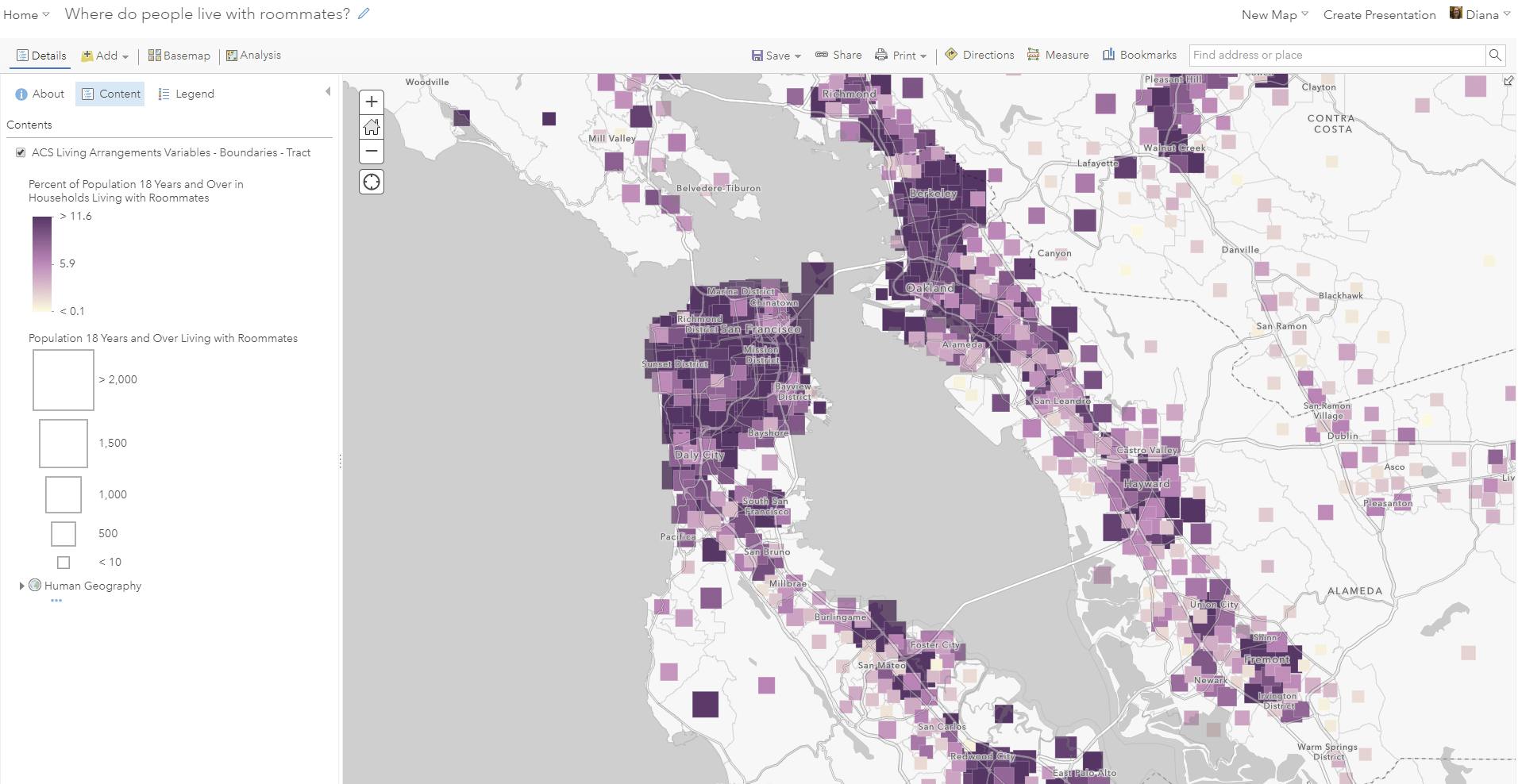
For example, here’s a purple high-to-low color ramp used in this map titled Where do People Live with Roommates?, which uses a light basemap. The color ramp is as expected: darker purple means a higher percentage of adults living with a roommate.
Another map, Where are households using a Smartphone as their only computing device?, uses the same purple color ramp as in the roommates map above, but it’s reversed due to the dark nature of the Nova basemap:
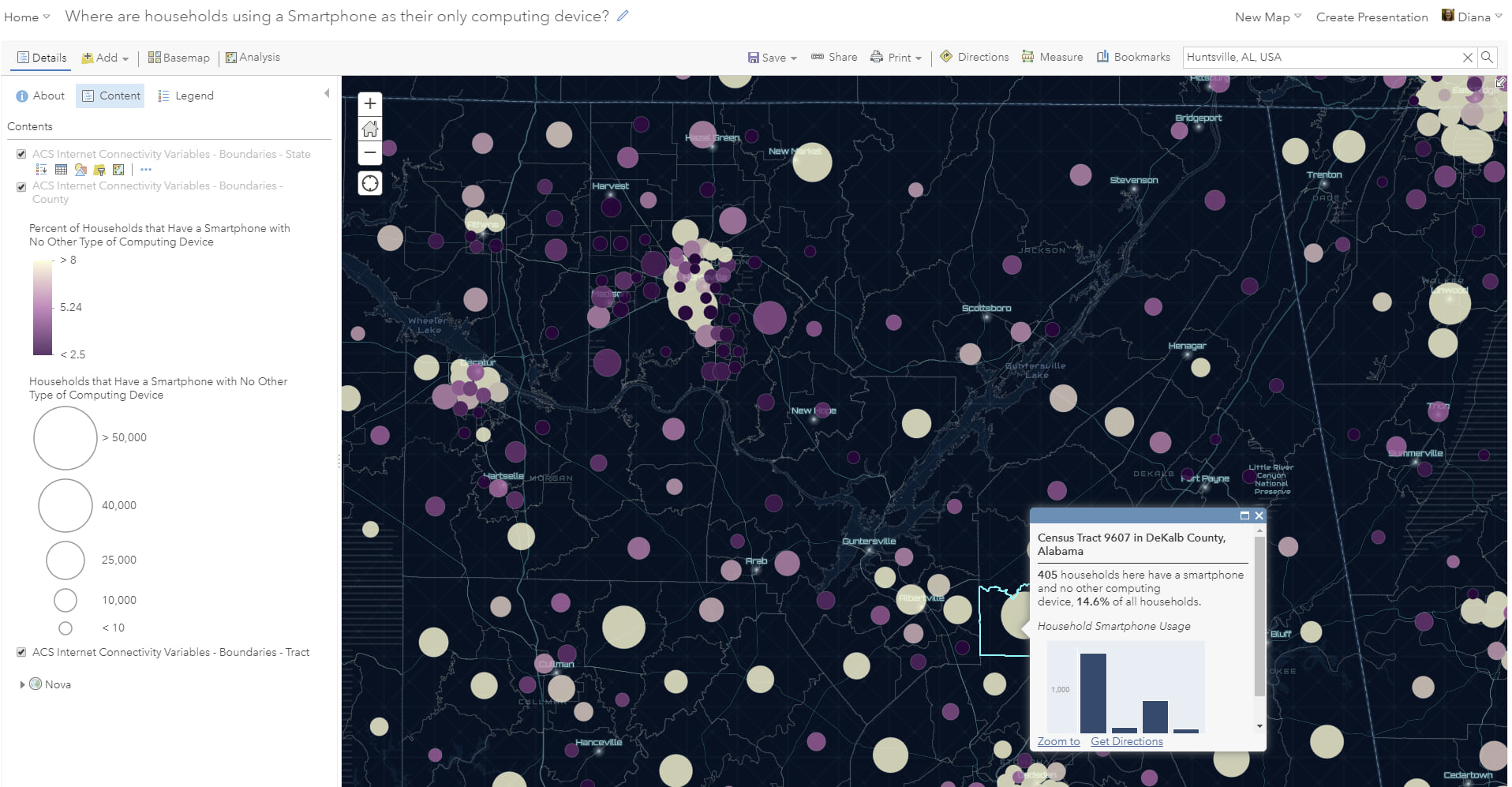
Now the lighter color depicts a higher percentage due to the increased contrast to the basemap.
Above and Below Color Ramps
The “above and below” style is great when you want to provide an anchoring point. This anchoring point could be a goal, a national average, or some other meaningful value. By using two colors (one above this anchoring point, and another below), anyone viewing your map can immediately see which geographies are above the anchoring point and which ones are below, and minimizes the impact of extreme outliers on the overall visualization. Geographies with values close to the anchoring point should be deemphasized. A great way to do this is to give the anchoring value a color similar to the color of the basemap. If you’re using a light basemap, the center of your above-and-below color ramp should be light. A great example is this map titled Is a 40-Hour Work Week Normal?

It’s anchored on a meaningful value for this topic, and it quickly conveys that the population in the Midwest works longer hours on average than the population in other places. Counties that have an average of 40 are given less prominence as they fade into the basemap compared to the brighter-colored counties.
If you’re using a dark basemap for an above-and-below style of map, the center of your color ramp should be dark. We’ve tried to help you out by building some contextual intelligence into ArcGIS Online. For example, SmartMapping will pick up on the fact that you’re using Dark Gray Canvas, and will offer you some above and below color ramps that have a dark center:
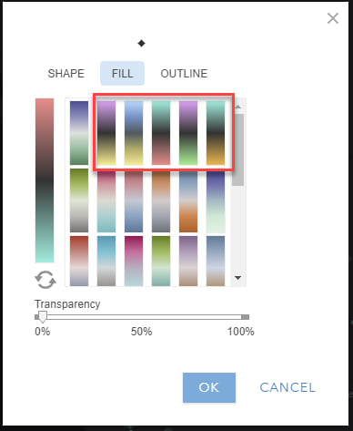
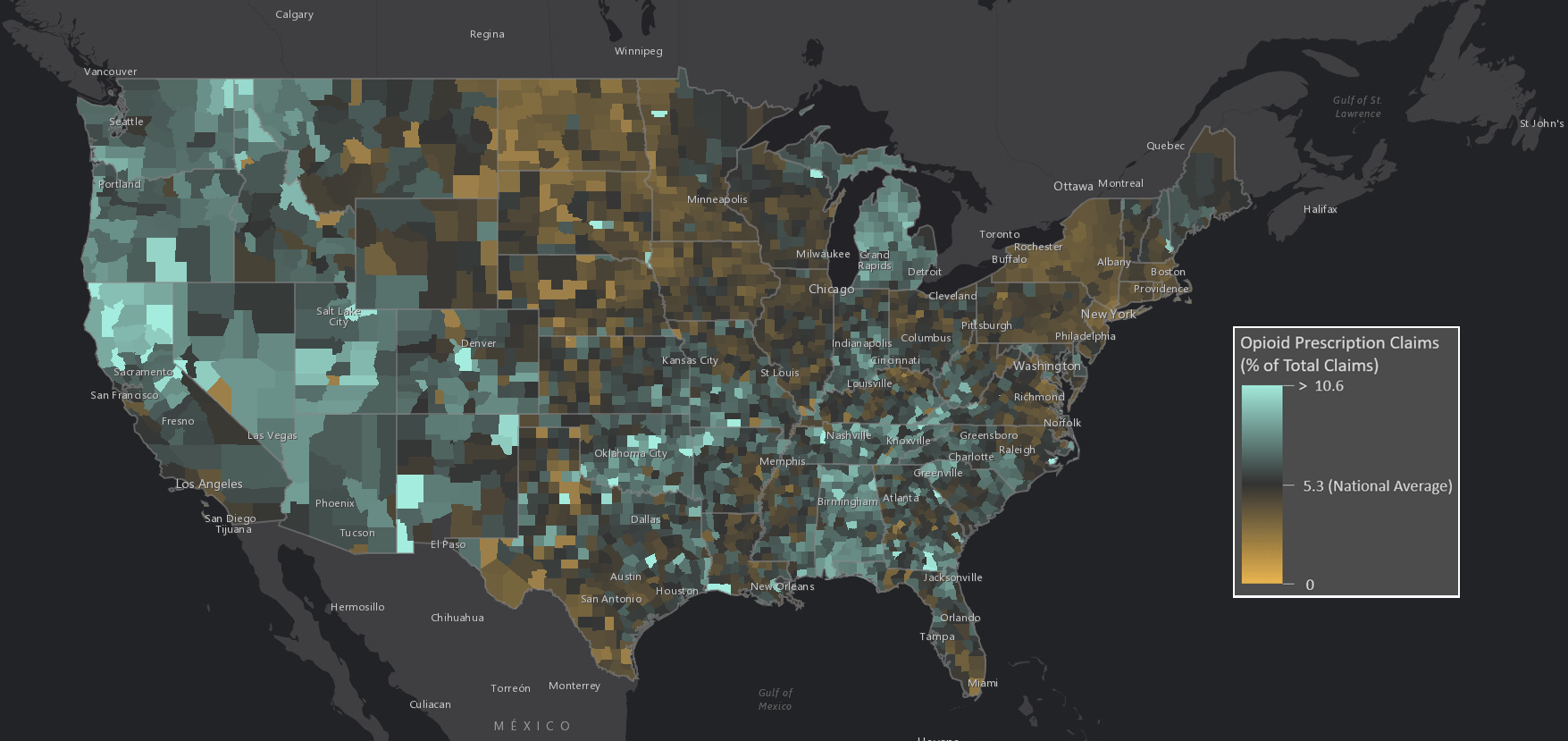
The effect is that the features that deviate from the center point are the ones most highlighted in the map. For example, this map of Opioid Prescription Claims does this beautifully. The map is centered on a meaningful value (in this case, the national average), and the counties that are close to the national average are deemphasized with a color that fades into the basemap.
Heat Map Color Ramps
If you’re working with point data that has lots of coincident points, one option would be to do a heat map. Just as with the above-and-below and high-to-low styles, you want larger quantities to be shown by high contrast between the basemap and the hot spots in your heat map too. If you’re using a light basemap, pick a color ramp that starts with a light color, and vice-versa if using a dark basemap. Let’s look at using two similar heat map color ramps. Both ramps are purple to yellow, but one is designed for a light basemap and the other is designed for a dark basemap.
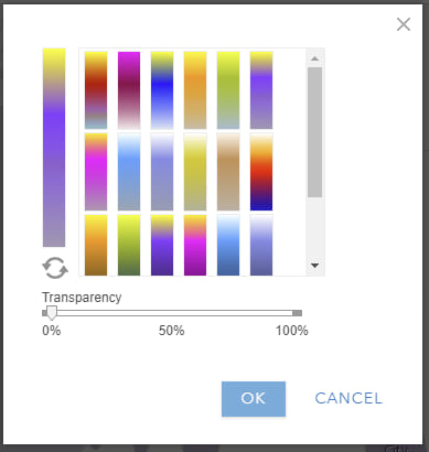
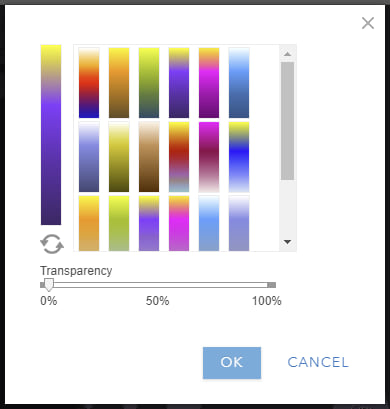
By experimenting with both of these color ramps with the Light Gray Canvas and Dark Gray Canvas basemaps, we can see that the first one is designed to be used with a light basemap, and the second with a dark basemap. Let’s take a look:
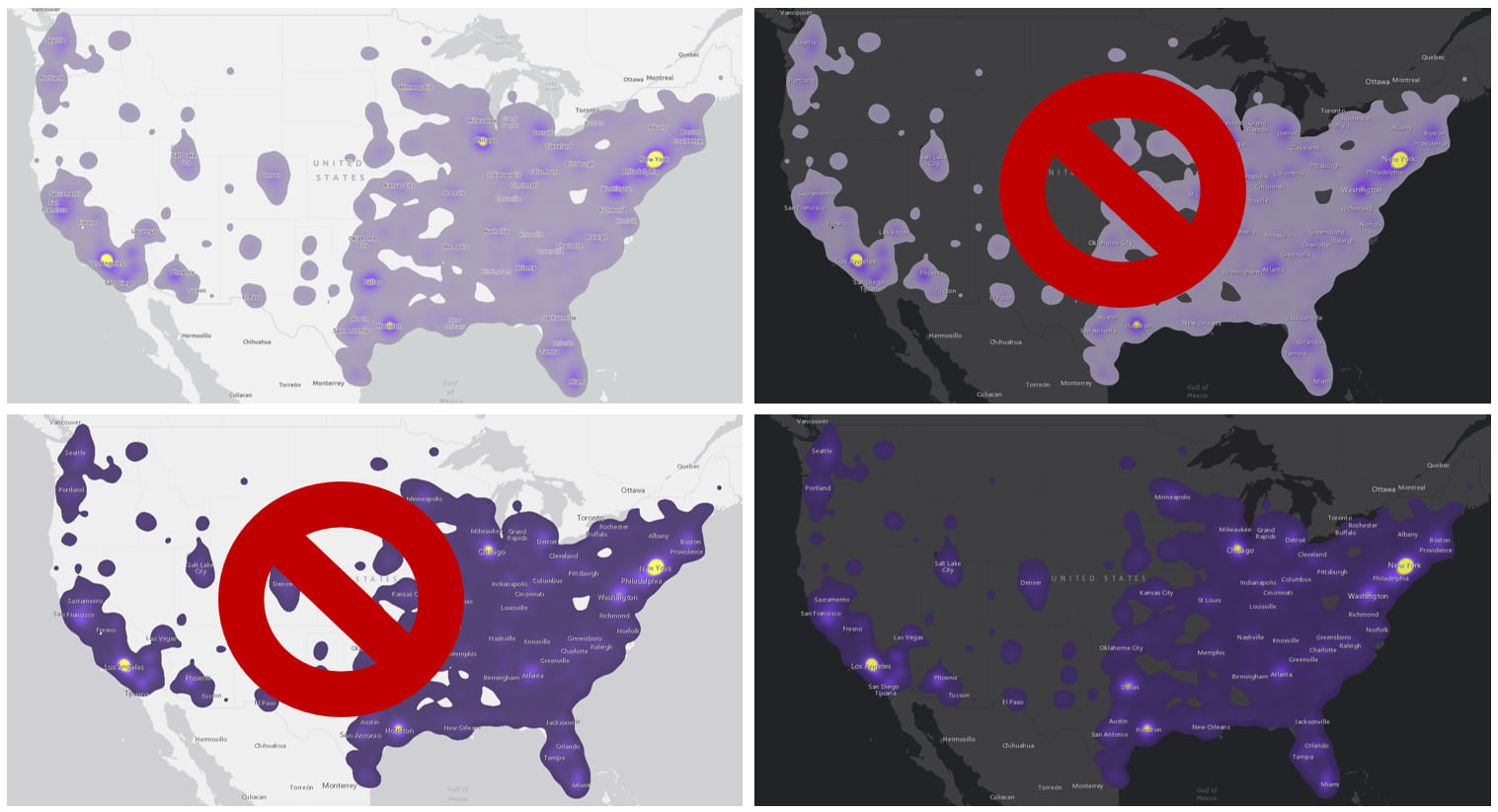
Places with high population stand out better when we use the appropriate color ramp.
Predominance Map Color Ramps
Predominance mapping is nice when you have a group of different categories with numeric values in your attribute table, and a large number of features in your map. These categories might have natural colors associated with them (red vs. blue election maps, for example), or not.
Sometimes when doing predominance mapping, one category dominates most of the map. In these cases, make the most predominant color a subtle color, and let the interesting parts of the map have a more interesting color.
For example, in this map of how households do their taxes, the most predominat method (at the tract level) is via a CPA or Other Tax Professional, whereas far fewer tracts’ most predominant method is Turbo Tax, Did Manually, or H&R Block. For this reason, the colors depicting Turbo Tax, Did Manually, and H&R Block catgories are brighter so that they stand out more.
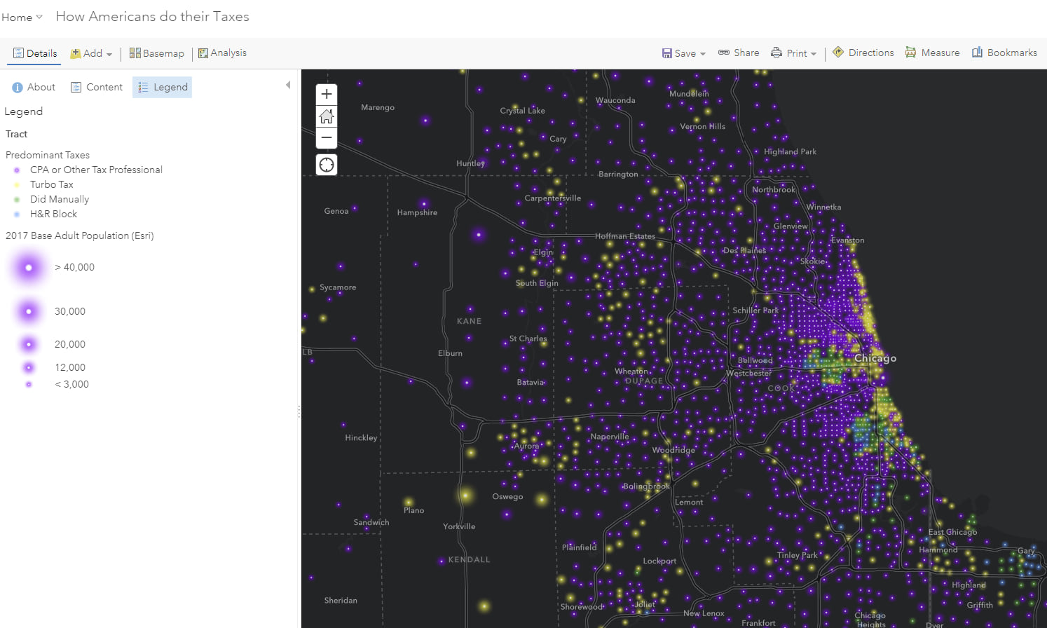
This way the interesting places in your map pop, while the geographies that have the most predominant value are closer in color to the basemap.
Sequential Color Ramps for Ordinal Data
Sometimes, even categorical data has natural order to it. Levels of education and age ranges are two common examples of this type of data. ArcGIS Online has sequential color ramps within the Predominance mapping style for this very purpose. Just like you can with the high-to-low or above-and-below color ramps, you can reverse these sequential-predominance color ramps to make them work well with your basemap.
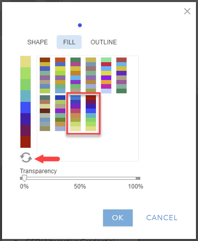
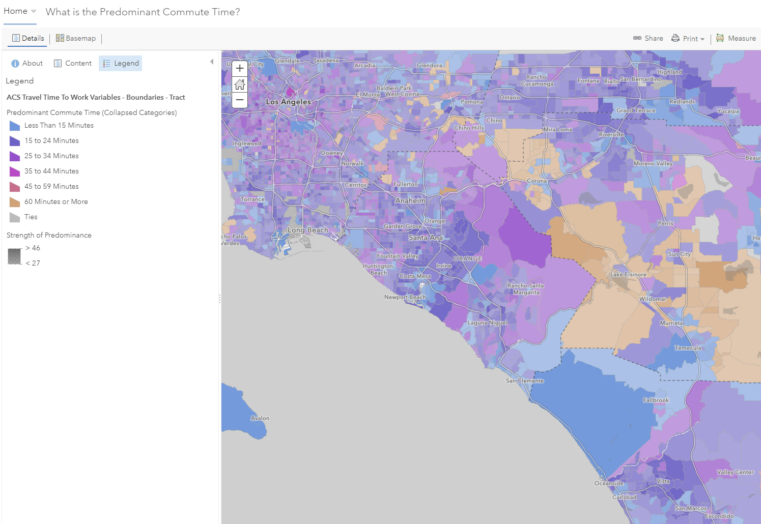
For example, a map showing What is the Predominant Commute Time? by tract in Los Angeles uses the first of the two sequential color ramps. Tracts where the most common commute length is 60 minutes or more (the top-coded category) is in the interesting peach color.
Put Thought into Your Basemap Choice
Choosing a good color ramp for the subject you are mapping starts with choosing a good basemap. Feel free to browse through the hundreds of basemaps available within ArcGIS Living Atlas to choose the one that best fits your needs, or even style your own!
Be careful with filled-polygon maps that use high-to-low ramps on dark basemaps!
Darker colors meaning higher values is deeply entrenched in our minds. This technique of reversing the color ramp against a dark basemap works well for graduated symbols and proportional symbols, because the basemap is so visible. If you’re doing a filled-polygon map, be careful. A reversed color ramp against a dark basemap can work if the basemap is still visible. If, however, you’re zoomed in to a city or town, and not much of the basemap is showing, then use your best judgement. Step back and ask yourself, does the dark basemap work? Should I switch to a lighter basemap and avoid confusing my audience? Try both and see which version portrays your data more effectively.

Make Better Maps
Once you’ve decided on a basemap, the next step is to select a color ramp that will create a high contrast between your basemap and the high values of the subject you are mapping. By keeping this in mind next time you’re working in ArcGIS Online, you can #MakeBetterMaps.
Last updated 4/26/19.

Commenting is not enabled for this article.