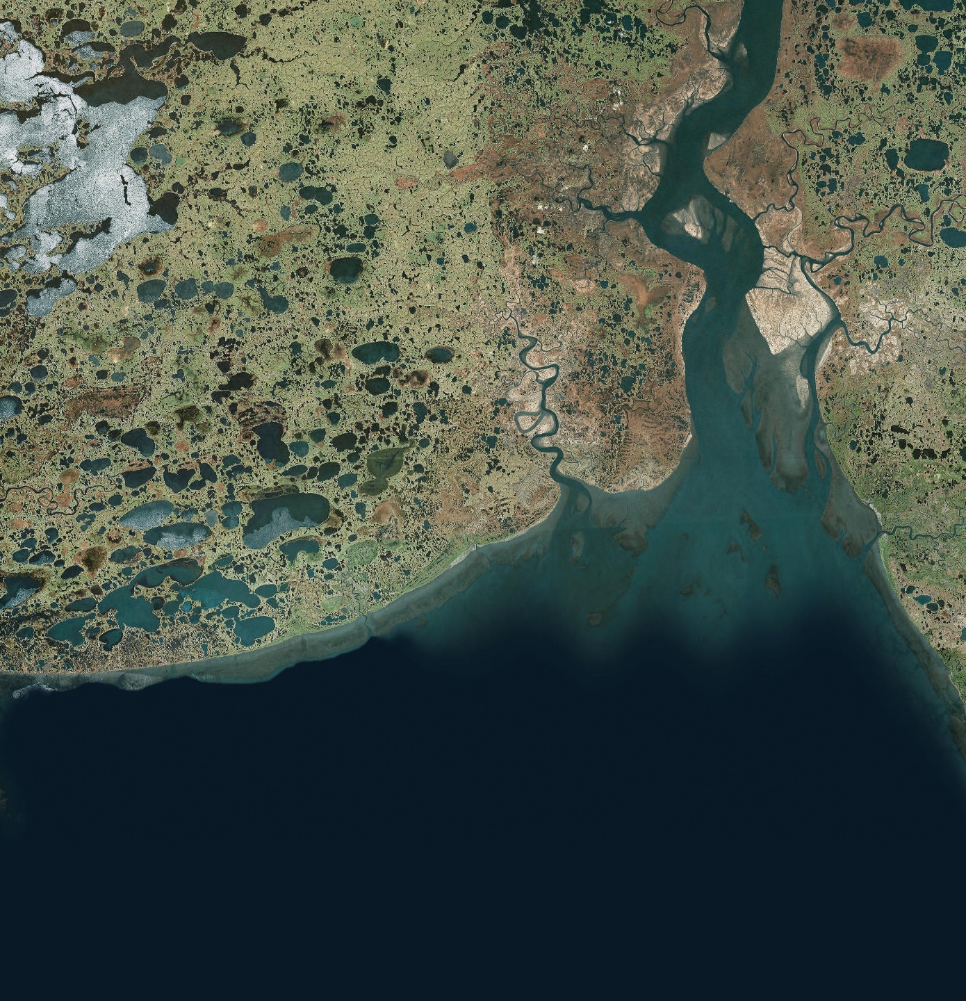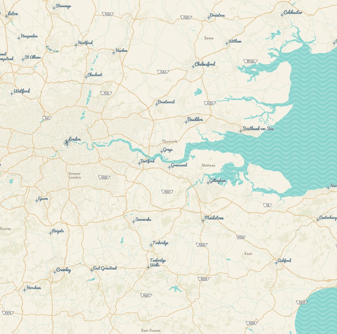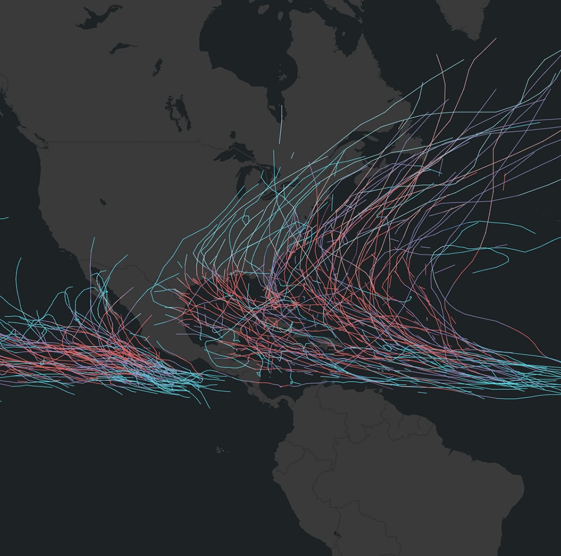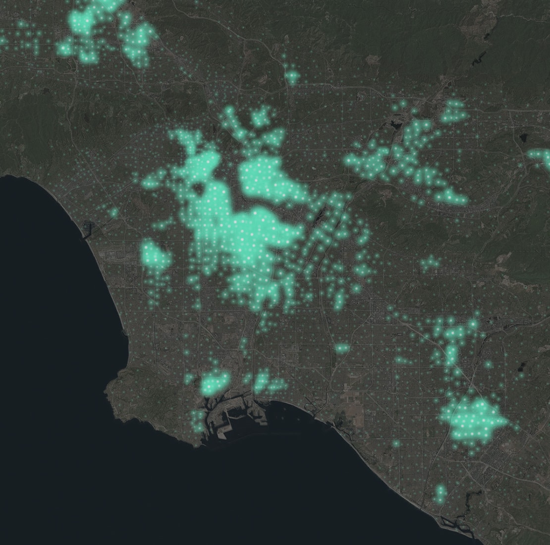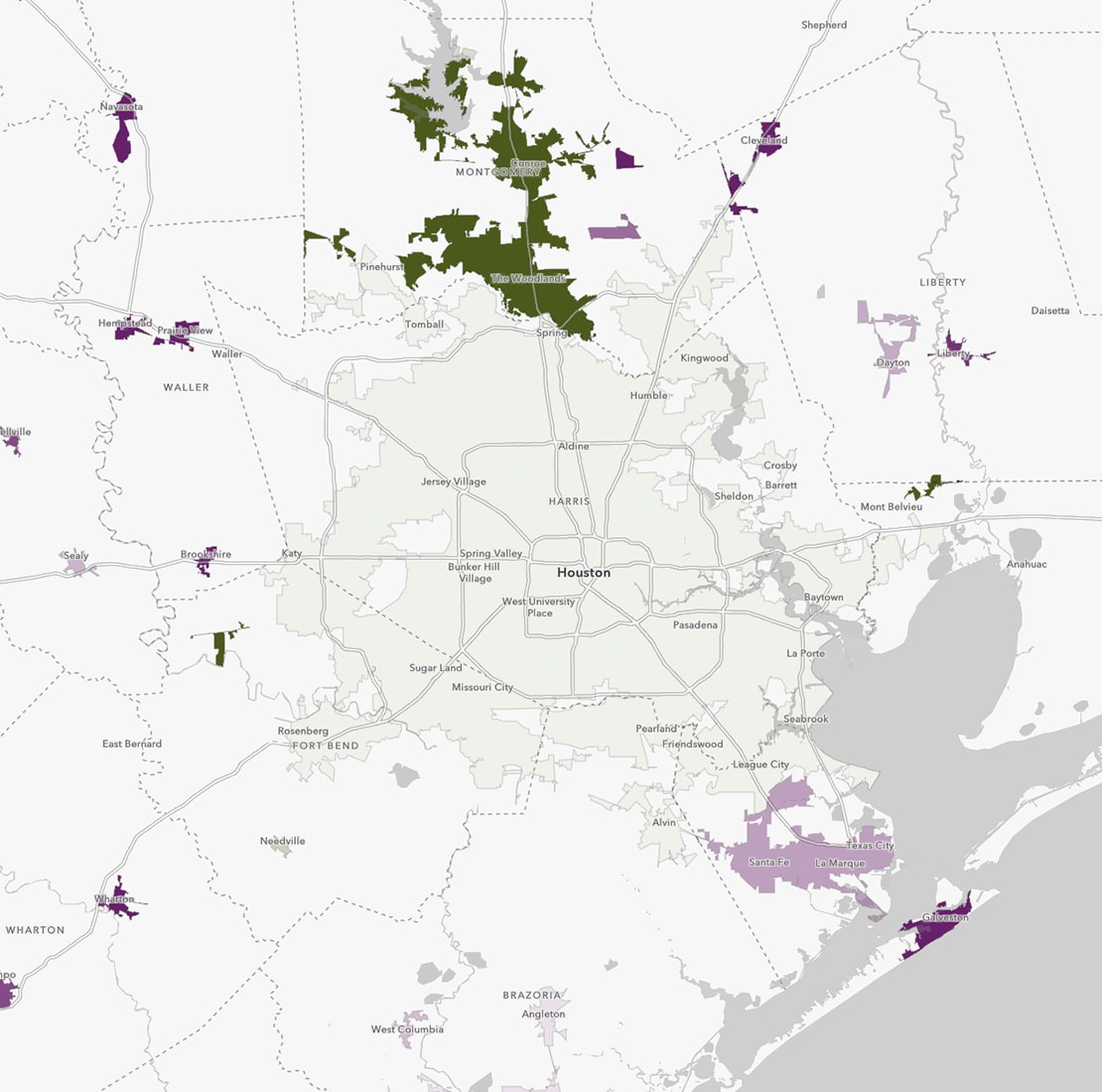
Let your data speak through interactive maps
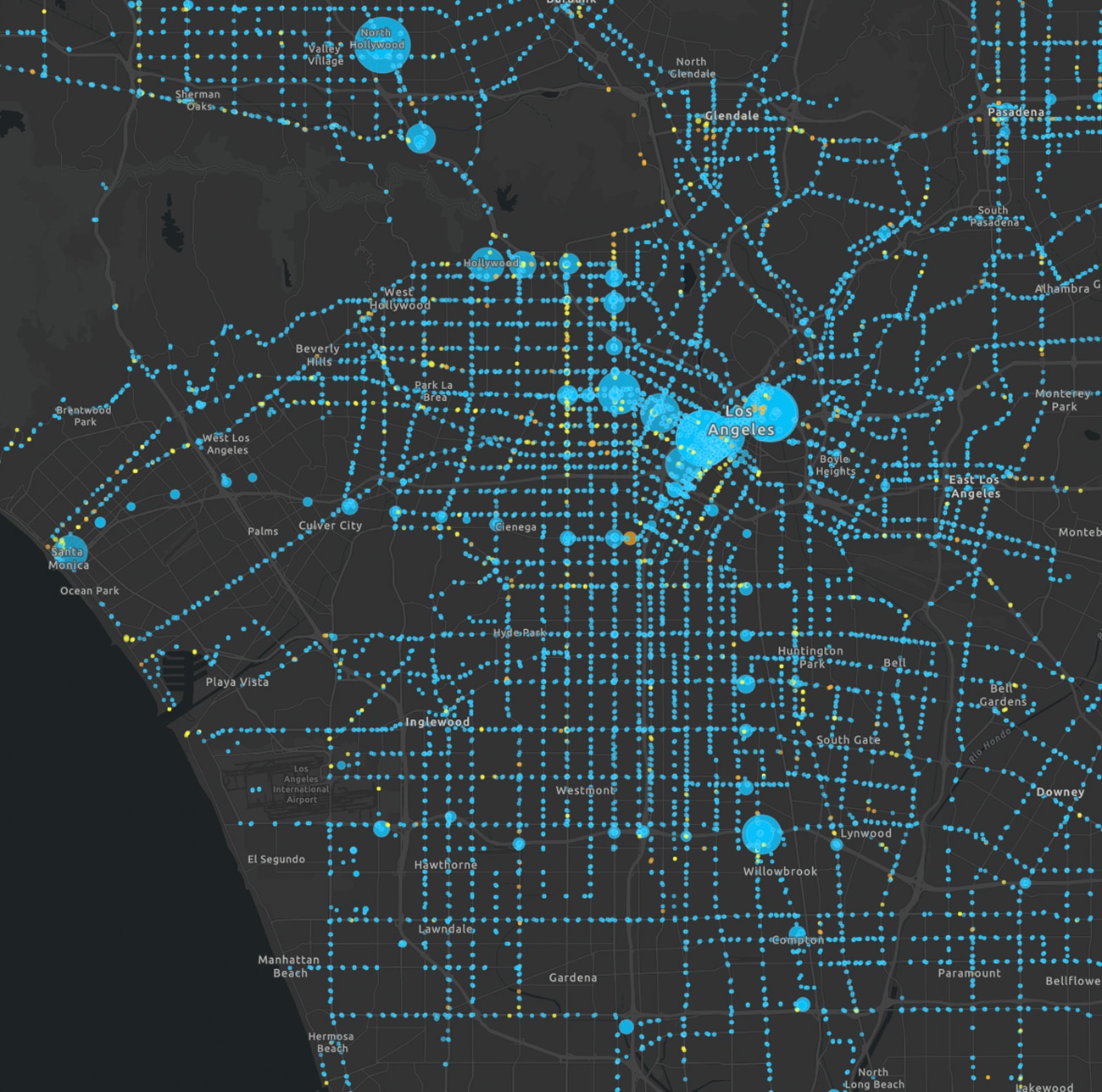
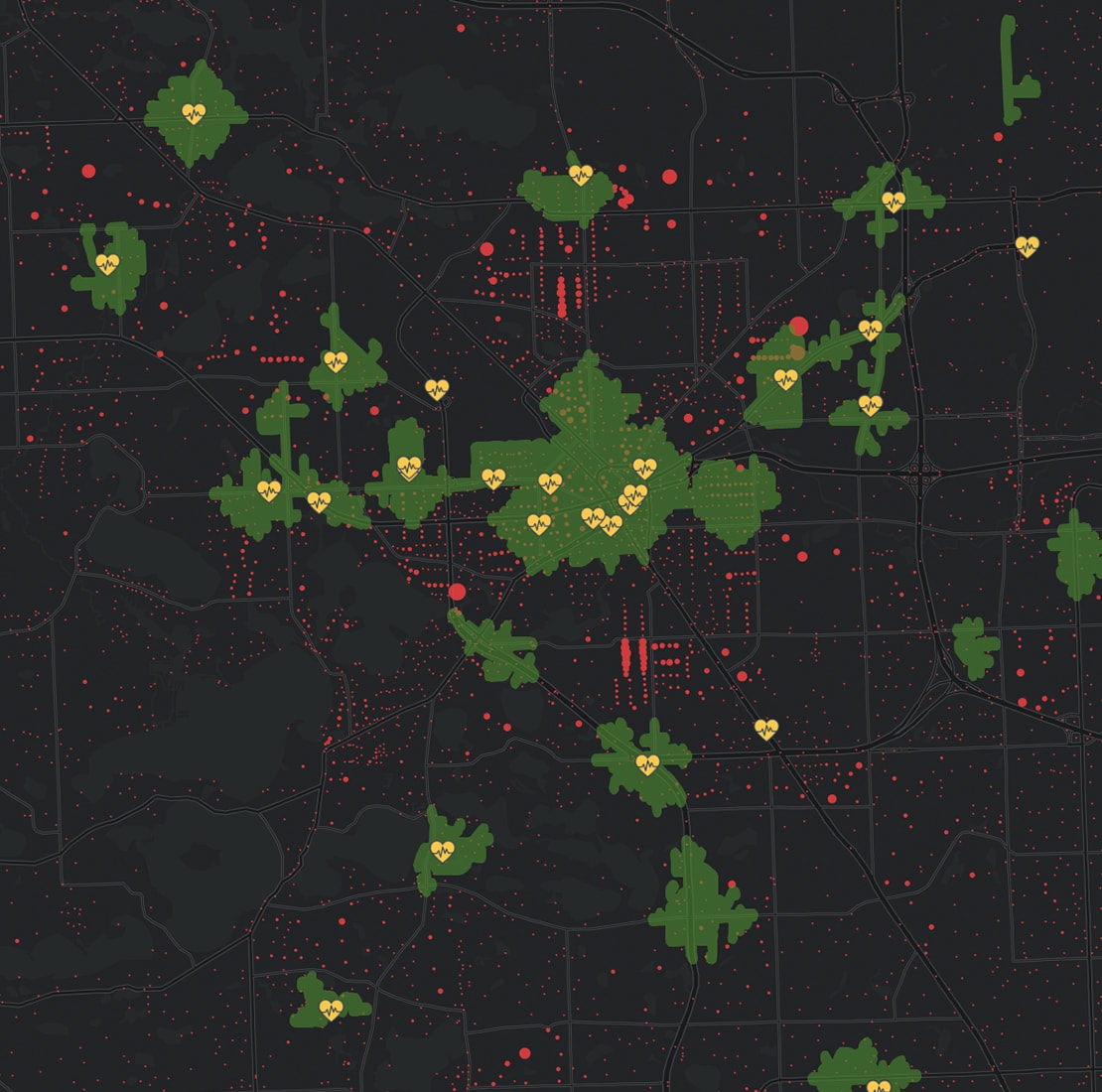
Interactive maps create immersive experiences that take maps from a static view to an opportunity for users to explore. Enhanced details and new perspectives spring from the map as you zoom in, search, and interact with the data.
There are many ways to explore interactive maps. Here are several options:
- Gain additional details as you zoom in
- Click on the map to see region-specific information in text, tables, and images
- Search the world's locations and your custom locations
- Get additional perspectives by filtering data and changing colors