When visualizing data, you can often gain important insights by comparing groups within your dataset. In ArcGIS Pro you can create charts that display multiple groups (called “multi-series charts”) and visually distinguish between these groups within a single chart. Such multi-series charts are helpful for better understanding similarities and differences between groups and can assist in answering questions such as:
- How does electricity usage over time compare between US regions?
- Does the relationship between cost of living and income vary between countries?
- Do the types of crimes committed in a city change based on neighborhood?
Grid Layouts
In the 2.9 release, the Charts team has added functionality to display multi-series bar charts, line charts, and scatter plots in a grid. Grid layouts, which are often called “small multiples” in the data visualization community, allow you to display multiple series as a grid of individual mini-charts. Each of these smaller charts only shows data that is exclusive to a series or group. To demonstrate this new functionality, I’ll first create a multi-series line chart displaying the total size of wildfires in Southern California by date and group the data by county:

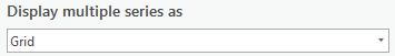
Interpreting the chart above can be a struggle. By plotting all series in a single chart area, I’ve created a mess of jumbled and overlapping lines that lacks clarity and coherence. Now I’ll attempt to disentangle these series by displaying the same chart as a grid. This is as simple as selecting the “Grid” option in the Display multiple series as dropdown under the Series tab:
And here’s the chart above in a grid layout:

Much better, right? By displaying each series in a smaller individual chart, the grid layout appears much cleaner and more readily allows for interpretation of patterns.
Grid Configuration
Individual mini-charts can be difficult to read when many series are displayed or there are differences in scale that obscure the details of certain mini-charts. To better facilitate viewing a specific group, we provide the ability to turn on a preview chart, which gives a larger view of the selected mini-chart. The preview chart also allows you to make selections which are reflected in the mini-charts and in the map. In the chart above, it is difficult to interpret the trend for the Imperial County mini-chart, so here I’m turning on the preview chart to see more detail:

The number of rows and columns in your grid is set automatically, but you can also explore different configurations by changing the Mini charts per row control. For instance, you can decrease this number to show all mini-charts in a single column:

Other Supported Charts
Above I demonstrated grid layouts with line charts, but this feature is also available for bar charts and scatter plots. For instance, here’s a multi-series bar chart showing the total number of hours people spend on specific activity types, split by age group:

And here’s a scatter plot showing the relationship between per capita income and voter turnout grouped by census region (note that r-squared values are calculated and displayed for each individual mini-chart!):

Conclusion
Grid layouts can be an effective way to visualize and compare groups within your dataset. The Pro Charts team is excited about this new feature, and we encourage you to try grid layouts in your next project!

Hi there,
Can you please enhance the X Axis labelling, there are labels that are being cut off where the charts meet. Or is there an option to hide this label?
Regards,
Marc
Hi Marc, thanks for the feedback!
We hope to improve axis labeling for grid charts in a future release, but for now you can hide axis labels with the following steps:
1) Go to the Format tab in the Chart Properties pane
2) In the Format tab, select the Text elements sub-tab
3) In the list of text elements, select the Axis Labels item
4) Change the color to “No color”
Take care,
Chris
Hello,
Nice workaround! However, I noticed that when a grid layout bar chart is embedded in a print layout, changes made to the Legend Text item (text element) are not reflected in the chart as it appears in the layout. I wanted to make the legend text transparent, for example, because it doesn’t align properly. However, the change does appear in the chart preview when it is open below the print layout. All other text formatting changes appear to update as expected within the chart in the layout, except this one. Any ideas?
Thank you!
Hi Trevor,
Thanks for the question! As you’ve noted, unfortunately there is a known bug where chart text that is set to transparent is still being displayed inside of layouts. However, the good news is that we are adding the ability to toggle visibility for every text element in the upcoming Pro 3.1 release, which should help you accomplish your goal. This toggle will be included with the other text element formatting options in the Format tab of the Chart Properties pane.
Until then, you might try hiding the Legend Text items by setting the color of the text to match the background color of the chart.
Take care!
Chris