Introduction
In this second blog article, we’ll discuss the input data and the steps used to bring it all together and calculate our five gentrification indicator variables.
Data sources
The input data came from three main sources:
1) National Historical Geographic Information System (NHGIS) – provided freely downloadable US census tract boundary GIS files and CSVs representing hundreds of data variables related to socio-economic and demographic characteristics, education level, median family income, and median gross rent. For the purpose of this study, I downloaded data for these variables for four time steps: 1990, 2000, 2010, and 2020.
2) ArcGIS Living Atlas of the World – because certain variables were not available from NHGIS for 2020, we approximated these with the most recent data from the ArcGIS Living Atlas. Detailed steps for accessing this data are described in the following sections.
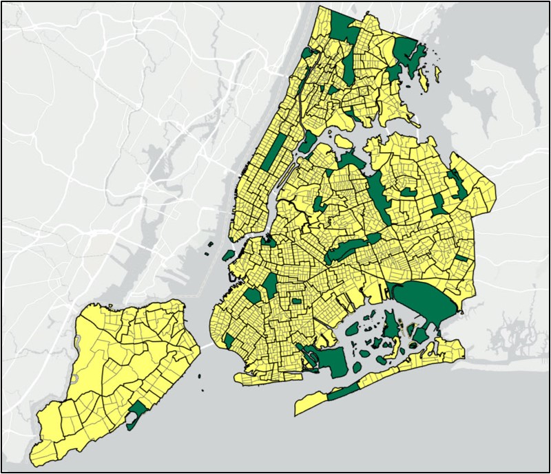
3) NYC OpenData – was used to help us identify and remove areas where gentrification cannot take place (e.g. parks, airports, cemeteries, etc.). In particular, we used the 2010 Neighborhood Tabulation Areas.
Data preparation steps
Prepare the US census tract GIS data in ArcGIS Pro
The base GIS dataset representing US census tract boundaries for the year 2010* contains several important fields. For example, the GISJOIN field contains a unique identifier on which all subsequent joins will take place. The STATEFP10 and COUNTYFP10 fields contain unique state and county FIPS identifiers for each census tract, respectively. To make it easier to query census tracts for specific areas such as New York City (which contains census tracts across five counties) we used the Calculate Field tool to concatenate the STATEFP10 and COUNTYFP10 fields into a new text field.
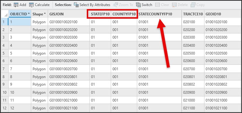
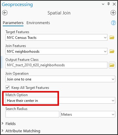
From here, we can select census tracts by their true county FIPS code. In the case of New York City, a simple attribute query of five county FIPS codes (36005-Bronx, 36047-Kings, 36061-New York, 36081-Queens, 36085-Richmond) gave us the 2,164 census tracts that make up New York City. After exporting these selected census tracts as a new feature class with the appropriate spatial reference (in this case, NAD 1983 State Plane New York Long Island), the final step was to use the Spatial Join tool to append the neighborhood name to any census tract whose center falls within it. This will allow us to identify census tracts in parks, airports, cemeteries, etc. that will be removed from the analysis in subsequent steps.
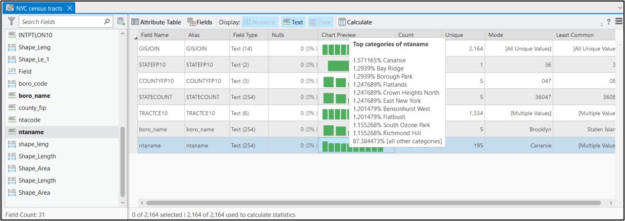
Using ArcGIS Pro’s Data Engineering view, we can easily see and explore the summary statistics and distributions of each variable in the feature class. We also now have the “ntaname” attribute, which represents the neighborhood name.
Read and wrangle tabular CSV files of historic census data (year 2000)
Now that I have a clean, prepared GIS dataset, I’ll move into an ArcGIS Pro Notebook to continue cleaning, wrangling, integrating, and otherwise preparing my datasets for analysis.
Like most data science notebooks, I’ll start off with a cell where I import the necessary Python libraries.
- pandas – working with and manipulating tabular data
- numpy – scientific and mathematical computing, working with arrays and matrices
- arcgis – the ArcGIS API for Python, used to convert ArcGIS data to Pandas DataFrames
- arcpy – the ArcGIS geoprocessing framework. Provides Pythonic access to the ~2,000+ geoprocessing tools, as well as functions for data management, conversion, and map automation
- os – working with operating system files and file directories
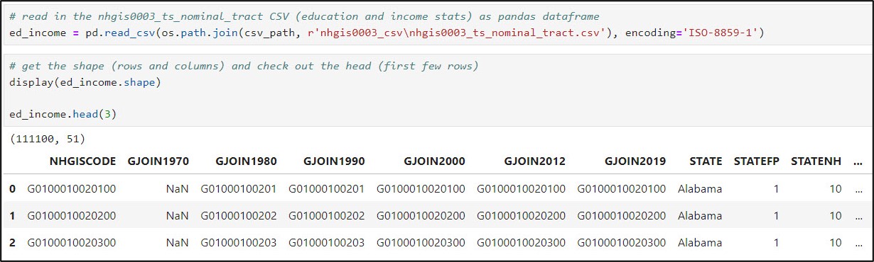
Next, I’ll use Pandas to work with the NHGIS CSV files. All told, six CSV files were needed to cover the variables that will eventually be used to calculate the five gentrification indicators. In some cases, one CSV contained all required variables for multiple time stamps (e.g. 2000 and 2020), while in other cases there was a different CSV file for each time stamp. The following steps were then performed within the notebook for each of the six CSV files.
- Read in the CSV file as a Pandas DataFrame using .read_csv
- Get the number of rows and columns using .shape
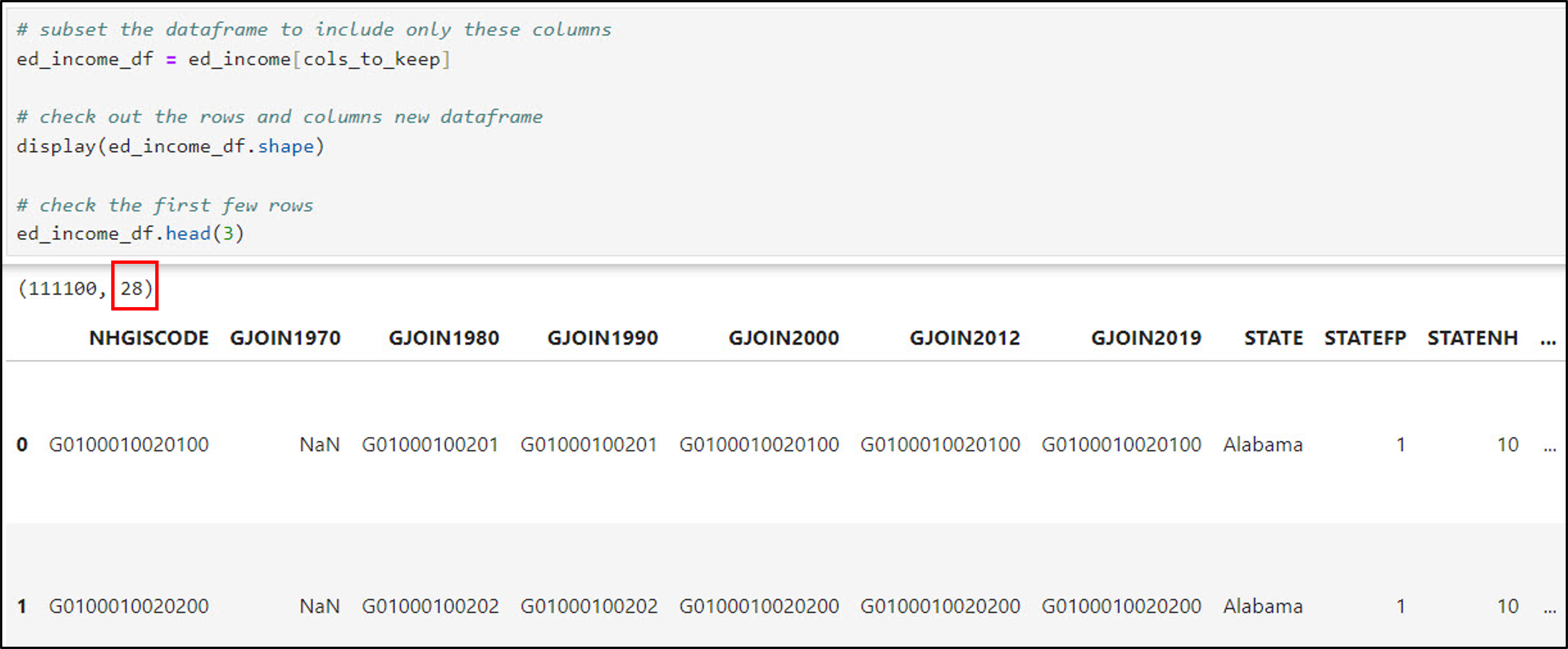
- We can see that this CSV file has ~111,000 rows representing census tracts, with 51 columns. Notice the first few columns, which contain unique identifiers (e.g. “key fields”) that we will use to join tables together later in the workflow.
- View the first few rows using .head
- Generate a list of the column names using .columns
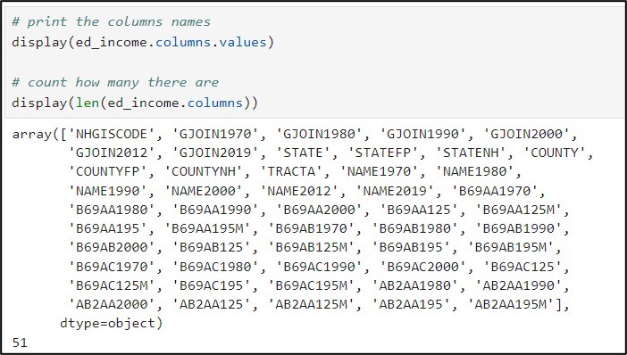
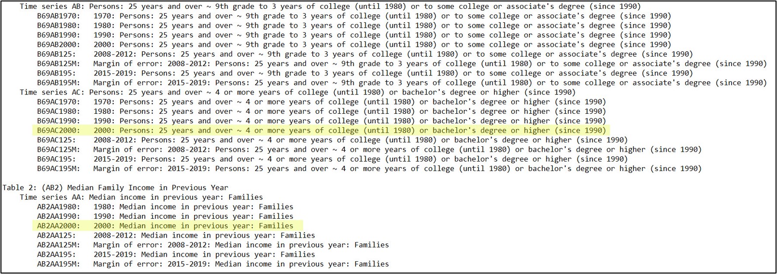
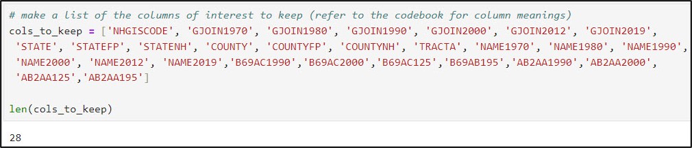
- Use the metadata for each CSV to determine which subset of columns to keep based on the variables you need for the analysis
- Make a new Python list of “columns to keep” containing this subset of column names
- Create a new DataFrame containing only this subset of variables
- Notice we’ve gone from 51 columns to 28.
Next, I performed a series of steps to join all six Pandas DataFrames into one master DataFrame containing over 70 columns of data, some of which will be used to calculate the gentrification indicators.
This was achieved using the Pandas .merge function, which is conceptually similar to an attribute join in ArcGIS Pro. You simply pick the common (key) fields in the DataFrames you are joining together, and specify them in the “left_on” and “right_on” arguments.
Geoenrich census tracts with current census data (year 2020)
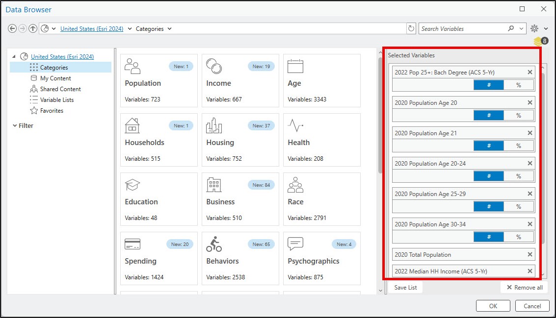
As mentioned above, the NHGIS was missing the most recent data for 2020 for a few variables, so this was a good opportunity to leverage Esri’s GeoEnrichment capability and the ArcGIS Living Atlas of the World.
1. Socio-demographic composition
- 2000: non-Hispanic white population (NHGIS)
- 2020: non-Hispanic white population (NHGIS)
2. Education level
- 2000: Population > 24 years of age with at least a 4-year college degree (NHGIS)
- 2020: No data
3. Age
- 2000: Population between 20 and 34 years old (NHGIS)
- 2020: No data
4. Income
- 2000: Median family income (NHGIS)
- 2020: No data
5. Rent costs
- 2000: Median gross rent (NHGIS)
- 2020: No data
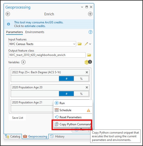
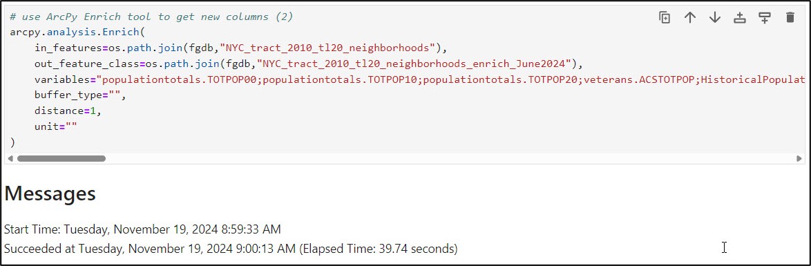
Using the ArcGIS Pro Enrich tool, I was able to easily search for the variables I needed, populate the tool parameters, then copy the Python command so I could paste the syntax into my notebook to run the tool programmatically within my notebook.
Next, I use the ArcGIS API for Python to convert the enriched feature class to a Spatially Enabled DataFrame (SeDF) using the .from_featureclass method. The SeDF is Esri’s spatial version of a Pandas DataFrame, which allows for seamless data I/O between ArcGIS and the Python data science ecosystem.
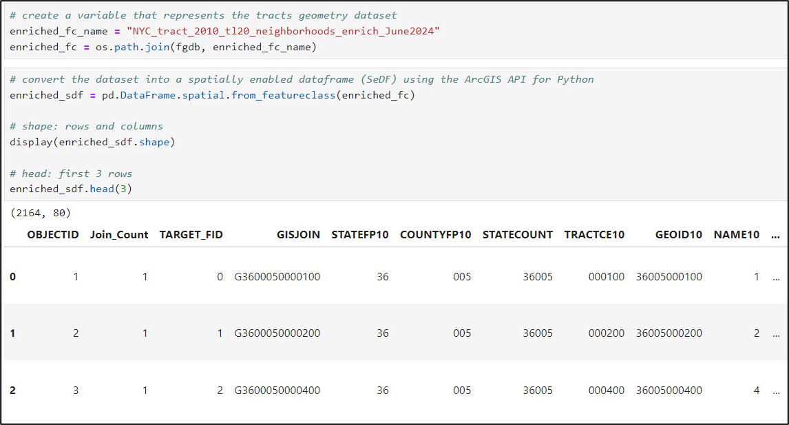
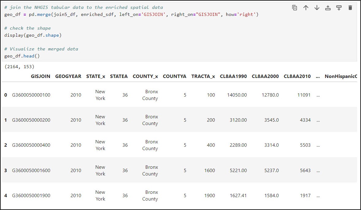
Last, I joined the cleaned NHGIS data to the enriched SeDF, producing a final DataFrame of 2,164 census tracts with ~150 rows of data.
In the next blog, we’ll dive much deeper into this data to ensure that it has everything we need to complete our analysis. Onward!


Article Discussion: