Introduction
In the previous blog, we created a gentrification index for New York City and several other US cities using Principal Components Analysis (PCA). Our methodology and workflow was based on and closely reproduced the one presented in the 2022 research paper “A small area index of gentrification, applied to New York City”.
While the authors of this paper chose PCA as their method for creating the gentrification index, the reality is that there are dozens of other ways to create indices. In fact, some recent research has suggested that there are drawbacks to using PCA for index creation.
As such, we thought it would be interesting to explore alternative approaches for creating the gentrification index using ArcGIS Pro’s Calculate Composite Index tool. Not only will this help us potentially find a more appropriate index creation method, but it’s also simply a good practice to try out and compare different approaches and methodologies in any analysis or data science project. When different approaches produce similar results, it suggests they are capturing the true patterns and relationships in the data, which gives us more confidence in our understanding of the underlying process and takes some of the focus off of the methods themselves.
Last, we want to reiterate that index creation in general is a subjective process. There are many decisions that go in along the way, and you as the analyst/researcher are responsible for understanding these decisions and their consequences. Input datasets are different, index creation methods are different, domain expertise is different, and therefore there is typically no right or wrong answer when creating an index. It really boils down to the overall purpose of the index and your understanding of the decisions that went into its creation.
All that said, there is a general framework you can follow when working with indices. The framework consists of three main phases:
- Design: ensures that the index is appropriate for its intended purpose and the necessary input data is acquired.
- Create: the steps to calculate the index, including data preprocessing, combination, and postprocessing.
- Analyze: examine the results, iterate, and communicate them to your audience or stakeholders.
Design
In the Design phase, we’ll address several of the following questions:
- What is the purpose or goal of the index?
- What are the dimensions (theoretical factors) of the index, and which data variables represent them?
- Does each variable have a clear purpose in the index?
- Are all variables weighted equally or differently?
- Do the variables contribute to the index in the same direction?
- What is the appropriate geographical unit for the analysis?
First, let’s review the overall goal of the index, which was to understand the geography of gentrification in New York City. After a thorough review of the gentrification literature, the researchers that we based this example on determined that their gentrification index needs to capture shifts in five different socio-economic “dimensions” (e.g. factors) over time. These dimensions are represented by the following indicator variables:
- Dimension #1: Socio-demographic composition
- Variable #1: Change in non-Hispanic white population between 2000 and 2020
- Dimension #2: Education level
- Variable #2: Change in college-educated population between 2000 and 2020
- Dimension #3: Age
- Variable #3: Change in population aged 20-34 between 2000 and 2020
- Dimension #4: Income
- Variable #4: Change in median family income between 2000 and 2020
- Dimension #5: Rent costs
- Variable #5: Change in median gross rent 2000 and 2020
Recall from our previous blog that we settled on the following five highlighted variables as the gentrification change indicators.
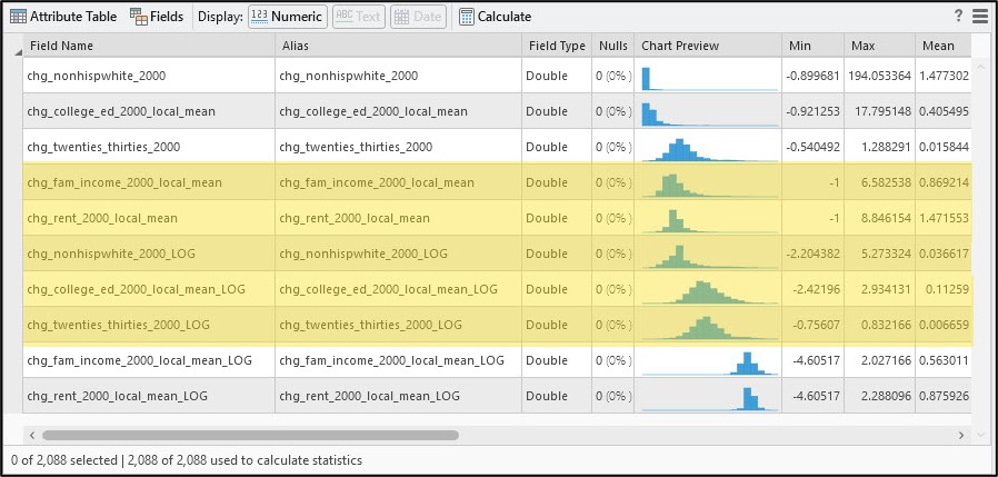
There are a few other considerations during this Design phase. First, we want to make sure that we understand the direction of the relationship between these indicator variables and the gentrification index itself. In our case, all five indicator variables theoretically have a positive relationship with gentrification, meaning that relative increases in any of them between 2000 and 2020 are associated with an increase in gentrification during that time span. Second, we want to consider if all five gentrification indicator variables contribute equally to the final index. The selection of weights is an important, yet very subjective step in the index design process, and one that could have a substantial impact on the final index results.
Third, we want to ensure that the correlation between/among the gentrification indicator variables is not high, as this can potentially lead to unintentional weighting. As shown in blog #3 of this series, the correlation coefficients between any two of our indicator variables are around 0.5 or lower, which indicates low redundancy among these variables and assures us that they are each capturing a different aspect of the gentrification process.
Last, we’ll choose our spatial unit of analysis. As a rule of thumb, it is a best practice to choose the smallest geographical unit possible for which the input data is available. This encourages minimal within-unit variation and lessens the impact of the Modifiable Areal Unit Problem (MAUP). In New York City (and other major US cities), the appropriate spatial unit was the census tract, as it is a sufficiently small geographic unit that contains a measure of our gentrification indicators, and also allows us to capture the spatial variation of the process of gentrification at the city scale.
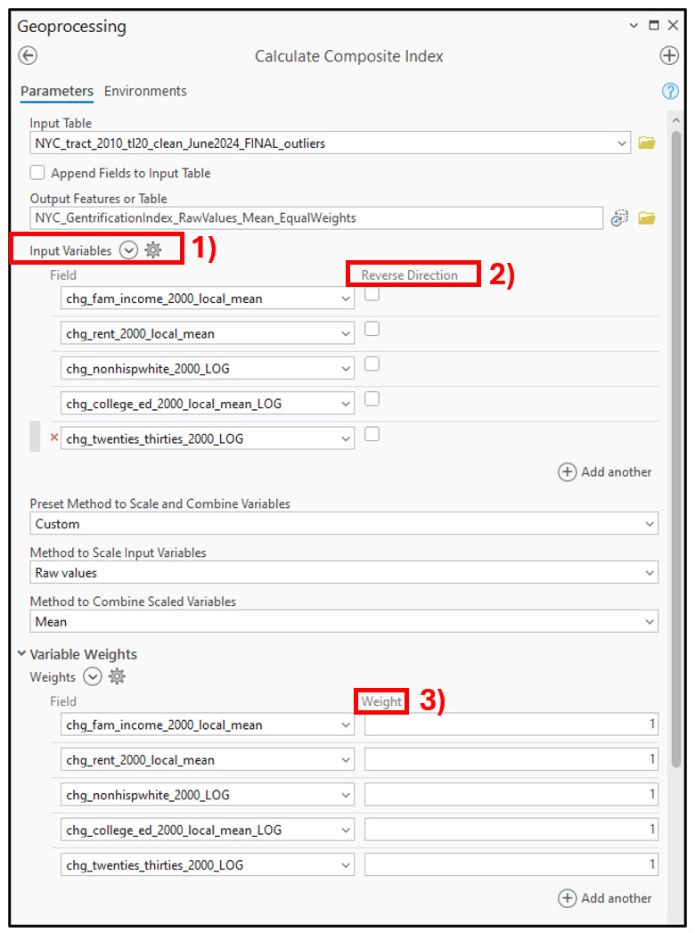
In the Calculate Composite Index tool, we’ll 1) pass in our five indicator variables, 2) leave the “Reverse Direction” boxes unchecked because each variable has a positive relationship with gentrification, and 3) set all weights equal to 1.
Create
Next, we have the Create phase, which is where all the “calculations” happen. This phase addresses several of the following questions:
- How should the chosen input variables be preprocessed?
- Are their units comparable? (e.g. dollars vs. raw counts vs. percentages). If not, how do we get them all on the same scale?
- Which mathematical operations should be used to combine variables and calculate the index?
- Should the index allow high values in one variable to compensate for low values in another?
- How should the resulting index be postprocessed and formatted to make it understandable and interpretable by the audience?
Let’s have a closer look at these variables to see if they are compatible with one another in two ways: direction and scale.
We discussed in the previous section that our five gentrification indicators all have the same directional relationship with gentrification; as each one increases, so too should the gentrification index score. If this was not the case, for example, low values of some variables being associated with a high value of gentrification, a best practice is to reverse these variables prior to building an index with them.
Next, we have to decide how we’d like to standardize our variables such that they are on a common scale. There may be situations where your input variables have different units such as temperature, counts, currency, percentages, etc. so it is important that they are all scaled to the same unit and range.
Like many of the steps in the index creation process, how you choose to rescale your input variables is a subjective decision that depends on your overall goal and the characteristics of your data. This Esri technical paper details a variety of scaling methods and their different advantages and considerations, but here are a few high-level things to think about when making this decision:
When scaling your variables…
- Is it more important to preserve the difference in the magnitude of values within a variable, or preserve the position of values (rank) within a variable?
- Do the variables contain outliers/extreme values, and, if so, how will these impact the resulting index?
- Is there a reference value or threshold value that you want to compare each variable against (e.g. the average of the variable)?
- Do you need to compare index values over time?
- Have you already performed some kind of transformation on the variables (e.g. logarithmic transformation)?
Your selection of appropriate scaling method will likely be based on your answers to several of these questions. For more information on each of these questions and specific examples/scenarios for each, please consult Step 5 of the Esri technical paper and the Calculate Composite Index tool documentation.
In my case, I’ve already transformed several of my variables (see blog #3 in this series for more details), so my initial preprocessing choice will be to do no preprocessing and simply use the “raw values” of each indicator. Choosing raw values preserves differences in magnitude in each variable, preserves the original units of each variable, and allows for negative values, which my data inherently has because relative change calculations can be positive (increase) or negative (decrease), and because logarithmic transformations can produce negative values. Furthermore, my previous data cleaning and transformation steps reduced the impact of outliers and skewness in my data variables, so I am not overly concerned with a rescaling method that is robust to outliers and skew.
Next, we’ll combine these preprocessed variables into one single variable called the index. Like all the previous steps, there are several different options, and your choice will depend on your data and end goal.
In the Calculate Composite Index tool, you can choose between two categories of mathematical operations to combine your variables: additive and multiplicative.
Additive methods are easy to interpret and involve adding together (sum) or taking the average (mean) of the input variables. Multiplicative methods include finding the product (multiply) or geometric mean of the input variables. These methods are a bit more challenging to interpret than the additive methods and may have a larger impact on the resulting index score. Your decision on whether to choose additive or multiplicative methods primarily boils down to one question/consideration:
How much do we allow high values in one variable to compensate for low values in another?
This is a concept referred to as compensability. Generally speaking, additive methods are compensatory, meaning that they allow high values in one variable to compensate for or “cancel out” low values in another variable. Multiplicative methods are mostly non-compensatory in nature and require several input variables to be high in value to produce a high index score.
One additional consideration is whether your input variables contain negative values. If this is the case, the general recommendation is to use an additive method to combine the variables. For more information on combining input variables and some additional considerations and best practices, please see Step 6 of the Esri technical paper and the Calculate Composite Index tool documentation.
Because my input variables represent relative change (increases or decreases) in different gentrification indicators over time, I have both positive and negative values, so I will go with an additive method.
Last, we need to think about how we postprocess our combined values into a resulting index that contains values that are meaningful and interpretable. In general, this may involve reversing the index if necessary, or rescaling the index to a scale that is understandable and easy to work with, such as 0-100. You may also consider classifying the index into standard deviations, or a set of custom classes that are specific to your particular analysis problem. You can read more about composite index postprocessing in Step 7 of the Esri technical paper and the Calculate Composite Index tool documentation.
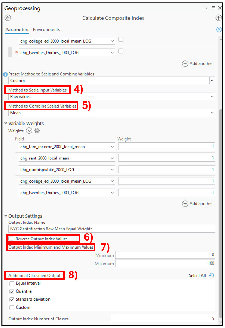
Back in the Calculate Composite Index tool, I’ll specify the following parameters:
- Method to Scale Input Variables – “Raw values”, as I have already preprocessed the gentrification indicators using a logarithmic transformation, and because I have negative values.
- Method to Combine Scaled Variables – “Mean” is chosen because my data requires an additive combination method.
- Reverse Output Index Variables – unchecked because high index values represent high values of gentrification.
- Output Index Minimum and Maximum Values – output index will be on a 0-100 scale for easy interpretability.
- Additional Classified Outputs – two additional output maps will be created, one classifying the gentrification index into standard deviations, and the other into quantiles.
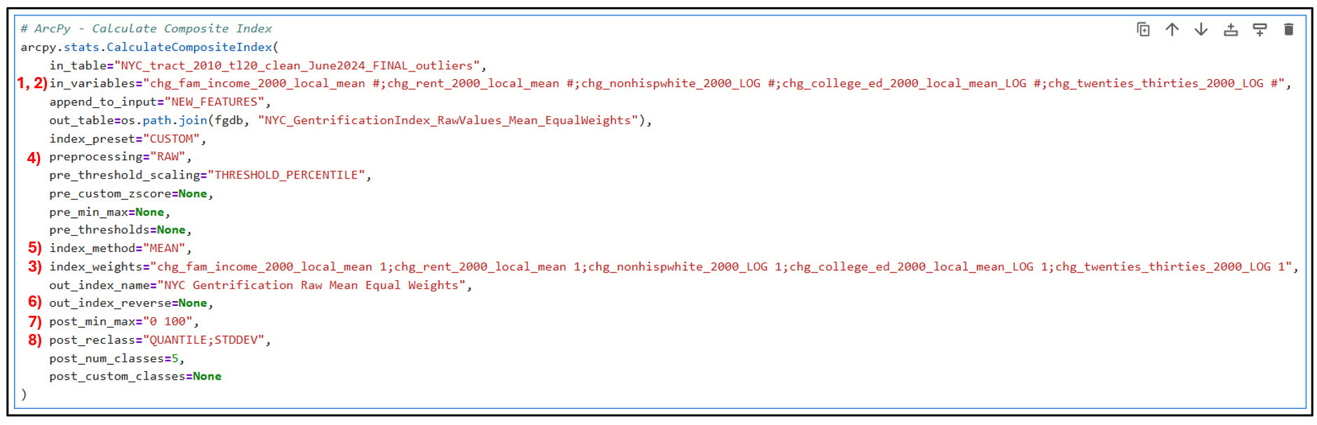
As with all previous steps in this blog series, we can copy the Python syntax from the parameterized Calculate Composite Index tool directly into our Notebook.
Analyze
After all that work, we finally get to the last phase of index creation: Analyze. In this phase, we address questions such as:
- Did all the input variables serve a purpose in the index?
- How did each input variable contribute to the index?
- How certain are the results?
- Do the results make sense to stakeholders?
- Can we iterate on our index to improve it?
- Are there additional downstream analysis tasks?
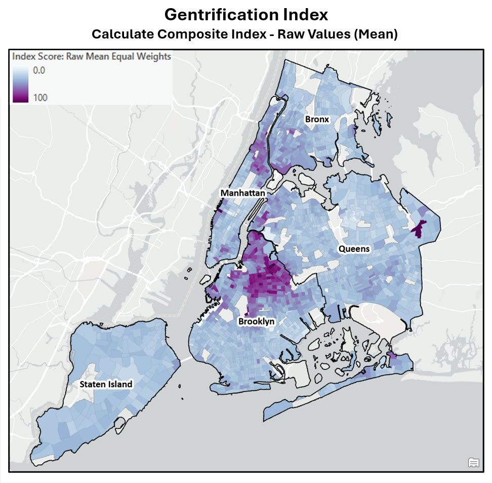
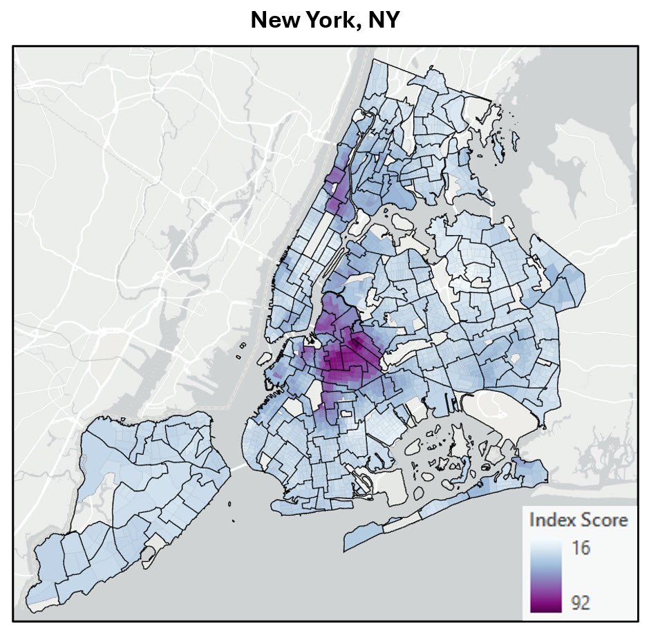
Let’s dive into some of the results, starting with the index map. Generally speaking, our results visually confirm what we saw in blog #4 where we used PCA to create the gentrification index—the most gentrifying neighborhoods between 2000 and 2020 occurred in northern Brooklyn, northern Manhattan, and southern Bronx.
The Calculate Composite Index tool also produces a series of charts, including a histogram of the index values. This histogram is useful for interactively exploring the range of index values on the map, especially the highest and lowest values.
Here selected in yellow in both the index map and corresponding histogram are census tracts with some of the highest gentrification index values in New York City.
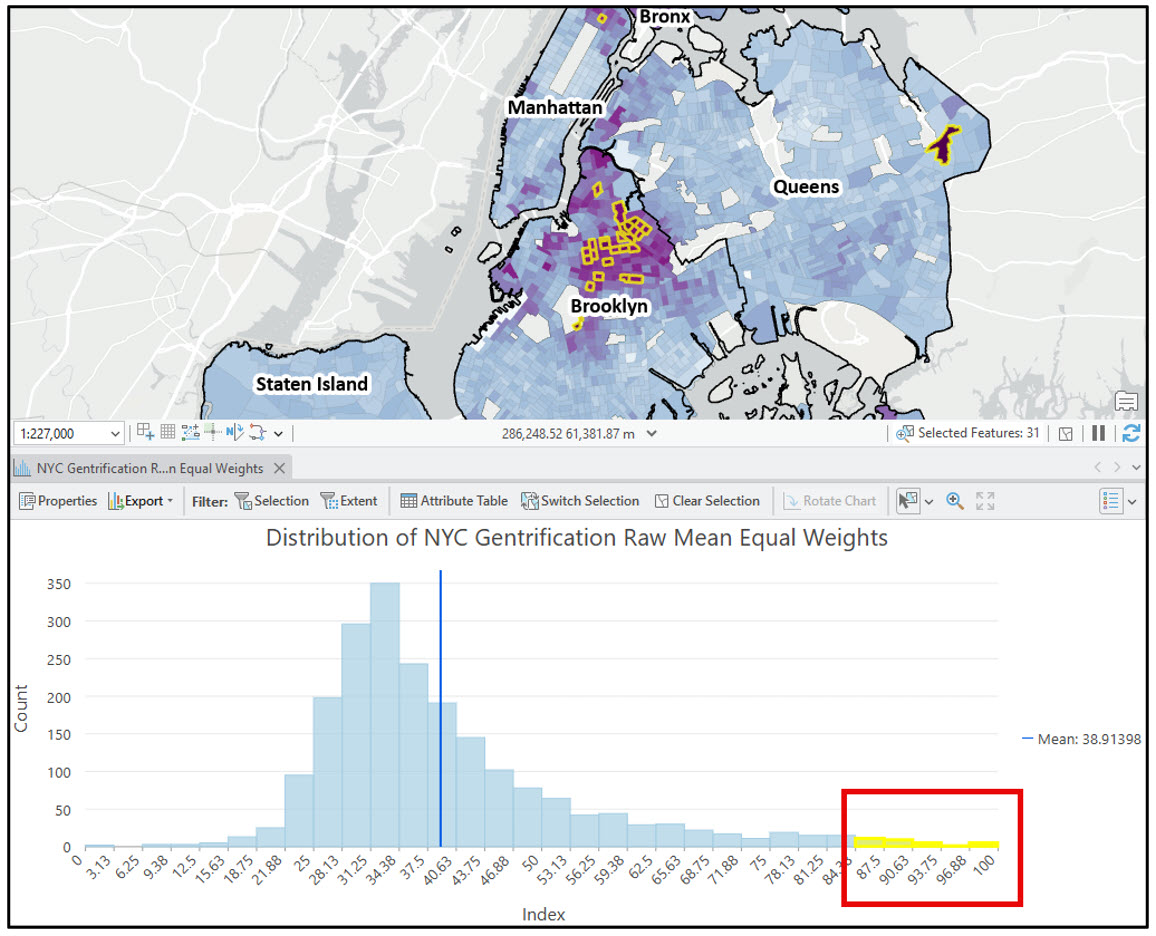
As expected, most of these occur in Brooklyn, however there is one interesting census tract in the northeast corner of Queens that I’d like to explore further. To do so, I can take advantage of the pop-ups that come pre-configured with the output index layer.
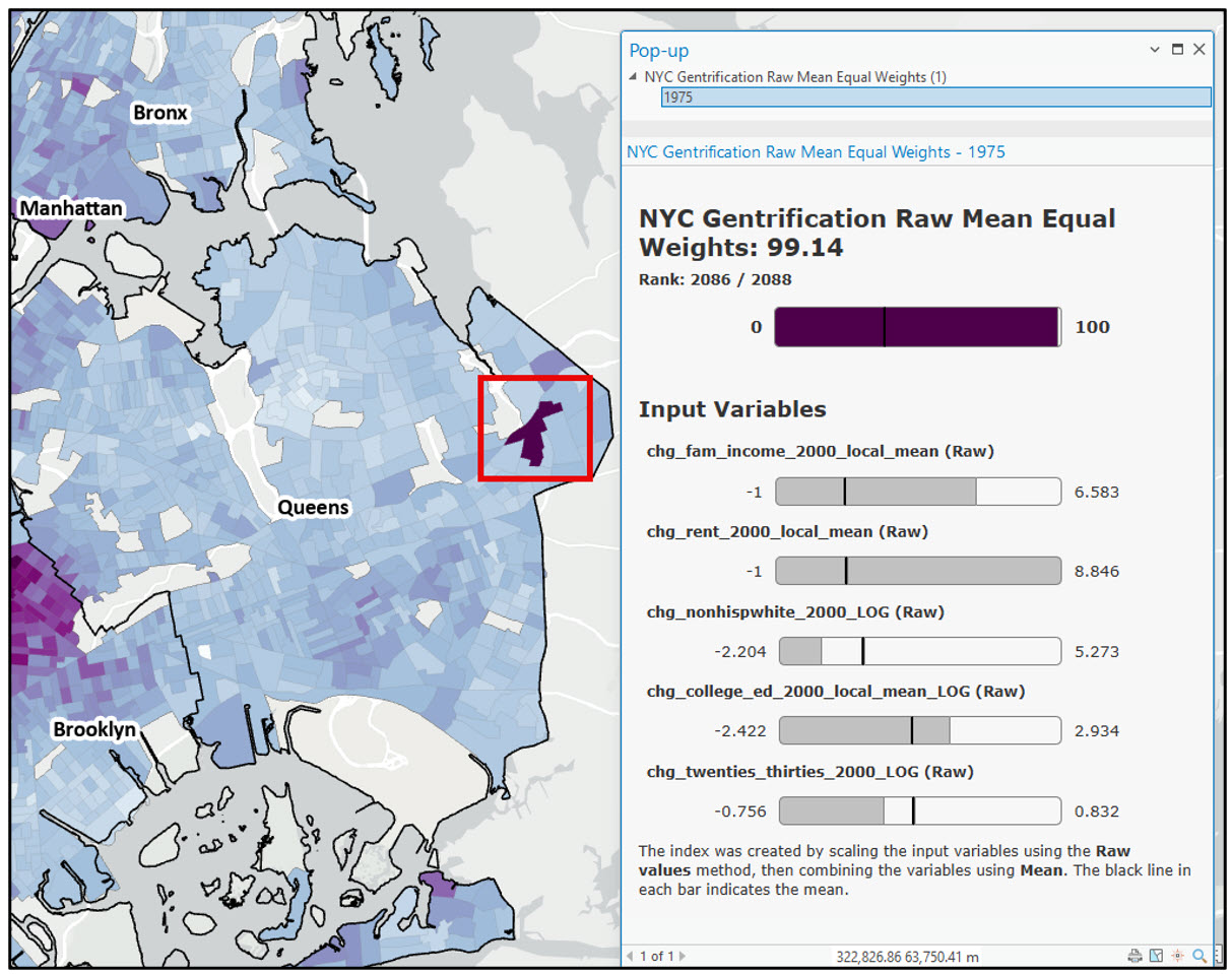
This pop-up helps me understand the variable composition at each location. The top horizontal bar shows the index score for the location and its rank relative to all other locations. In this example, this census tract has the third highest gentrification index score in all of New York City. The other horizontal bars show the contribution of each input indicator to the overall index. For this location, the most important variables driving the high gentrification index values are increases in rent costs, family income, and the number of college-educated residents between 2000 and 2020.
There are several other charts that may also be helpful for interpreting your results. These include two box plots that show the input variable distributions before and after preprocessing, and a scatter plot matrix that shows how the input variables relate to the final index, and to each other.
In my case, the two box plots are exactly the same because I transformed my input variables in a previous step and I did not need to reverse their direction, so there was technically no preprocessing done to them in the tool. However, the scatter plot matrix is worth exploring further.
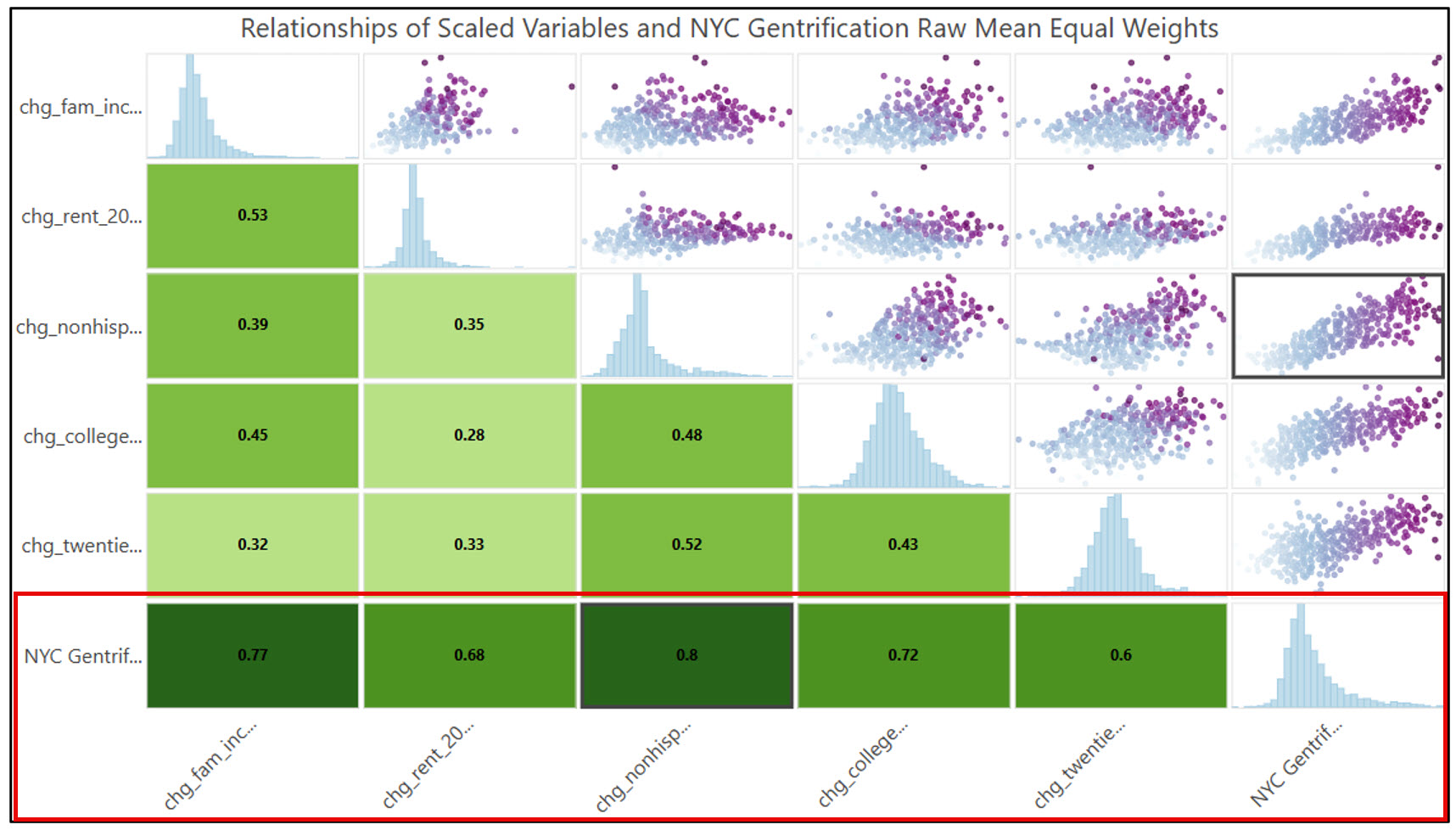
Recall in blog #3 of this series that we created a scatter plot matrix for the five gentrification indicator variables, and were satisfied that the correlations were roughly 0.5 or lower between any two of our indicator variables. This gave us confidence that our variables were not redundant and each was capturing a different aspect of the gentrification process. These same correlations are shown in the first four rows of the output scatter plot matrix above.
What we are most interested in, however, is the bottom row, which shows the Pearson’s r correlation coefficients between each gentrification indicator variable and the final gentrification index score. You can use this row to help you verify if your input variables have the expected directional relationship with the final index, to understand which ones contributed the most or least to the index results, and to see if these contributions are generally balanced.
In this study, each correlation coefficient is positive, which is what we would expect—increases in any of the gentrification change indicators over time lead to increased gentrification. Additionally, the correlation is generally similar and strong for all of them, which suggests that they are all contributing relatively equally to the final index*. Broadly speaking across New York City, increases in non-Hispanic white population, family income, and number of college-educated residents were the main drivers of gentrification between 2000 and 2020, with correlation coefficients of 0.80, 0.77, and 0.72, respectively.
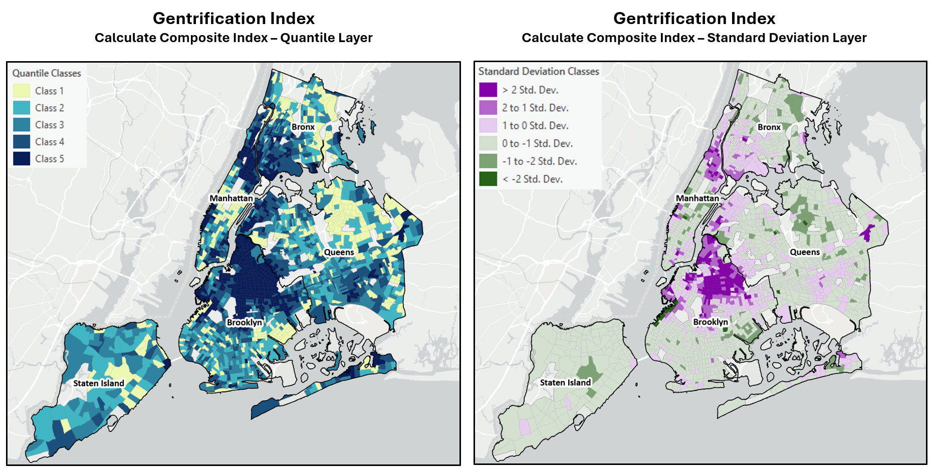
Finally, let’s take a quick look at two more maps output by the Calculate Composite Index tool. The map on the left shows the output index quantile layer, which groups the index values into a specified number of classes that each have an equal number of observations. In our case, choosing five classes means that each class contains 20% of the data. Class 1 in yellow shows the lowest 20% of gentrification index scores, while Class 5 in dark blue contains the highest 20%.
In my case, this map is not particularly useful, so I’ll instead focus on the map on the right, showing the standard deviations of the index values above and below the mean. Areas in light purple and light green are close to the average gentrification index value, while areas in dark purple and dark green show where the extreme high and low values of gentrification are. This map again confirms what we have already learned throughout this blog series—that several neighborhoods in Brooklyn (e.g. Stuyvesant Heights, Bedford, Bushwick) and northern Manhattan (Harlem, Hamilton Heights) have experienced the most gentrification in New York City between 2000 and 2020.
Now that we’ve got our final index maps, what’s next?
First, it’s always important to share your results with the stakeholders who may be impacted by your index. In the case of this gentrification study, the stakeholders could include local government officials and policy makers, real estate developers, investors, urban planners, and local residents and business owners. It is critical to engage with these stakeholders to a) verify that your results make sense, and b) so you can incorporate their feedback and local knowledge to potentially improve your index.
Second, remember that index creation is a multi-step process with many subjective decisions along the way—which weights to choose, how to transform the input variables, how to scale the resulting index, etc. You may consider trying different variations of preprocessing, combination, and postprocessing methods to get an understanding of how these different decisions impact the final composite index, which is good practice in case you need to justify your choice of methods.
On a related note, it is also important to consider how uncertainty in your input data can impact your final results. This is especially true when your input data variables come from a source such as the American Community Survey (ACS). Unlike the decennial US Census (which provides a true count of each variable), the ACS is a modeled estimate of the true variable value at a location based on a measured sample. To address this, the ACS provides margin of error (MOE) estimates to help you measure the reliability of each variable. For more on working with MOE in ArcGIS, check out the Mapping with margins of error tutorial series.
If you are creating composite indices from input data that includes some measure of uncertainty, you can use the Assess Sensitivity to Attribute Uncertainty tool to help you understand the impact of this uncertainty on your final result. In the case of Calculate Composite Index, this tool would create many different versions of the final index map based on the uncertainty included with the input variables, then compare these simulated results to the original index map. This would give you an indication as to how stable your results are in the face of attribute uncertainty.
Last, you might want to perform additional spatial analysis on your final index map. For example, clustering techniques such as Hot Spot Analysis can help you identify statistically significant clusters of high and low index values in your data, while Cluster and Outlier Analysis takes this a step further to find low and high spatial outliers among these hot spots and cold spots. These techniques can help lend confidence to your findings, and may reveal interesting patterns and trends that lead you to new questions and avenues for research.
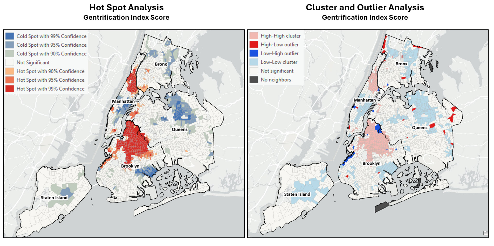
For additional suggestions on how to explore your final results, please see Step 10 of the Esri technical paper on Creating Composite Indices in ArcGIS.
Application of the workflow in other US cities
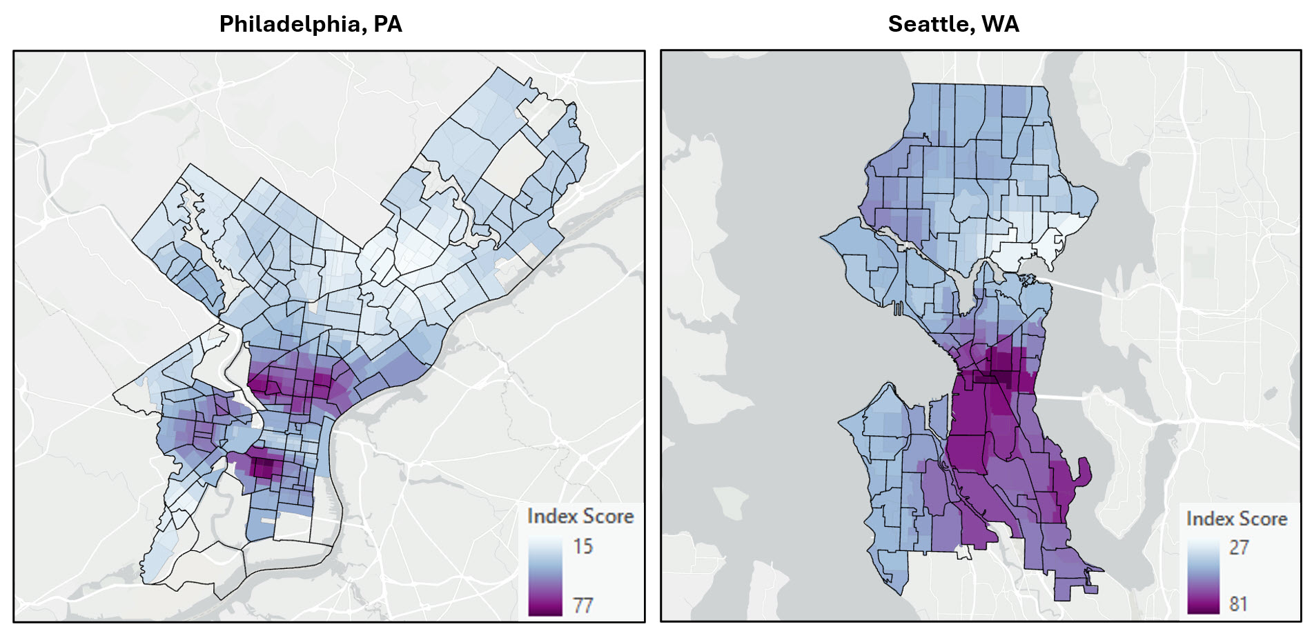
As we did in blog #4 of this series, we applied the same workflow to several other US cities—this time using Calculate Composite Index instead of Dimension Reduction (PCA). Overall, the spatial pattern of gentrification appears to be quite similar regardless of the index creation method. This suggests that both methods are capturing the true patterns and relationships in the data, which in turn gives us confidence in our understanding of the underlying process of gentrification in these cities.
Based on the results of this particular workflow and our decisions along the way, here are the top 5 most gentrified neighborhoods in each of the following US cities between 2000 and 2020.
- New York City – Stuyvesant Heights, Bushwick South, Bedford, Bushwick North, Crown Heights North
- Philadelphia – Point Breeze, Brewerytown, Sharswood, Old Kensington, West Poplar
- Seattle – Atlantic, International District, Pioneer Square, Leschi, Minor
- Washington, DC – Buzzard Point, Truxton Circle, Ivy City, Carver, Eckington
- San Diego – Sherman Heights, Horton Plaza, Marina, Grant Hill, East Village
…and here are the final maps!

Conclusion
This blog series detailed how you can use ArcGIS Notebooks and ArcGIS Pro for a complete spatial data science workflow, including data wrangling and engineering, data exploration, machine learning, and spatial analysis. We hope that you not only learned a few things about Python, spatial data science, and how powerful it is to do your data science work in ArcGIS Notebooks, but also a bit about the important process of gentrification in US cities.
Additional Resources
- Esri Webinar: Creating a Composite Index
- How Calculate Composite worksArcGIS Blog: Explore the New Calculate Composite Index Tool in ArcGIS Pro 3.1
- ArcGIS Blog: Five tips to create a better index
- How Assess Sensitivity to Attribute Uncertainty works
- Introducing the Assess Sensitivity to Attribute Uncertainty tool


Article Discussion: