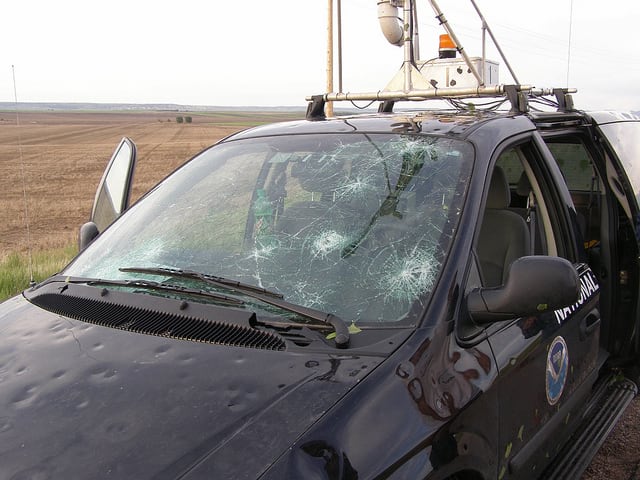
Hail is frozen precipitation which falls in the form of balls or irregular lumps of ice. It causes over a billion dollars of damage to crops, livestock, and property annually in the US. A single Midwest severe storm in June 2017 resulted in more than 1.4 million dollars in damage. Understanding where and when hail events occur can help local emergency managers, insurance assessors, and agricultural agents better estimate the costs and mitigate the risks of hail damage.
This blog explores the analysis of spatial and temporal patterns of hail events for the contiguous US for 21 years from 1996 through 2016 thus generating a climatology of hail. A climatology is a summary of weather over a period of time. Data were gathered from the National Oceanic and Atmospheric Administration/National Climatic Data Center’s (NOAA/NCDC) Storm Events Database. It is important to note that the Storm Events Database records “the occurrence of storms and other significant weather phenomena having sufficient intensity to cause loss of life, injuries, significant property damage, and/or disruption to commerce.” Thus, this blog describes a study of severe storm climatology rather than a comprehensive meteorological climatology.
What causes hail?
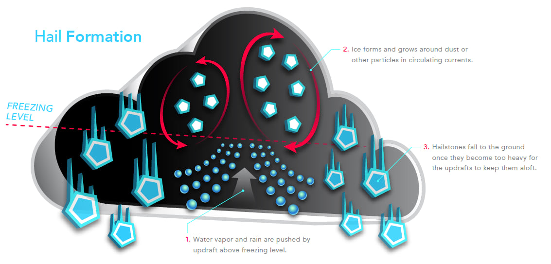
Hail is associated with thunderstorms in which air is rapidly forced upward (updrafts). These updrafts push water vapor and rain high into the thunderstorm where the temperature drops below freezing allowing ice to form around dust or other particles in the air. These particles serve as the seeds for hailstones which fall to the ground once they become too heavy for the updrafts to keep them aloft (Fig. 1).
A spatial perspective
There were over 272,000 hail events in the contiguous US from 1996 through 2016. Mapping every event produces a seemingly solid mass of points over the entire country and is not informative. However, calculating a kernel density (Fig. 2) produces a continuous surface which shows the number of hail events per five kilometer cell at any location.
Figure 2 — Results of kernel density analysis of hail events (1996 through 2016).
Figure 2 shows high numbers of hail events in the Midwest particularly in the Great Plains. On this map we are looking at the hail events cumulatively, summing all the events across time within each 5-kilometer cell. We are ignoring time altogether. This map helps us answer the question, “What is the overall (cumulative) frequency of hail events in the US?” This map allows us to see broad spatial patterns and serves as the basis for more detailed analyses.
A temporal perspective
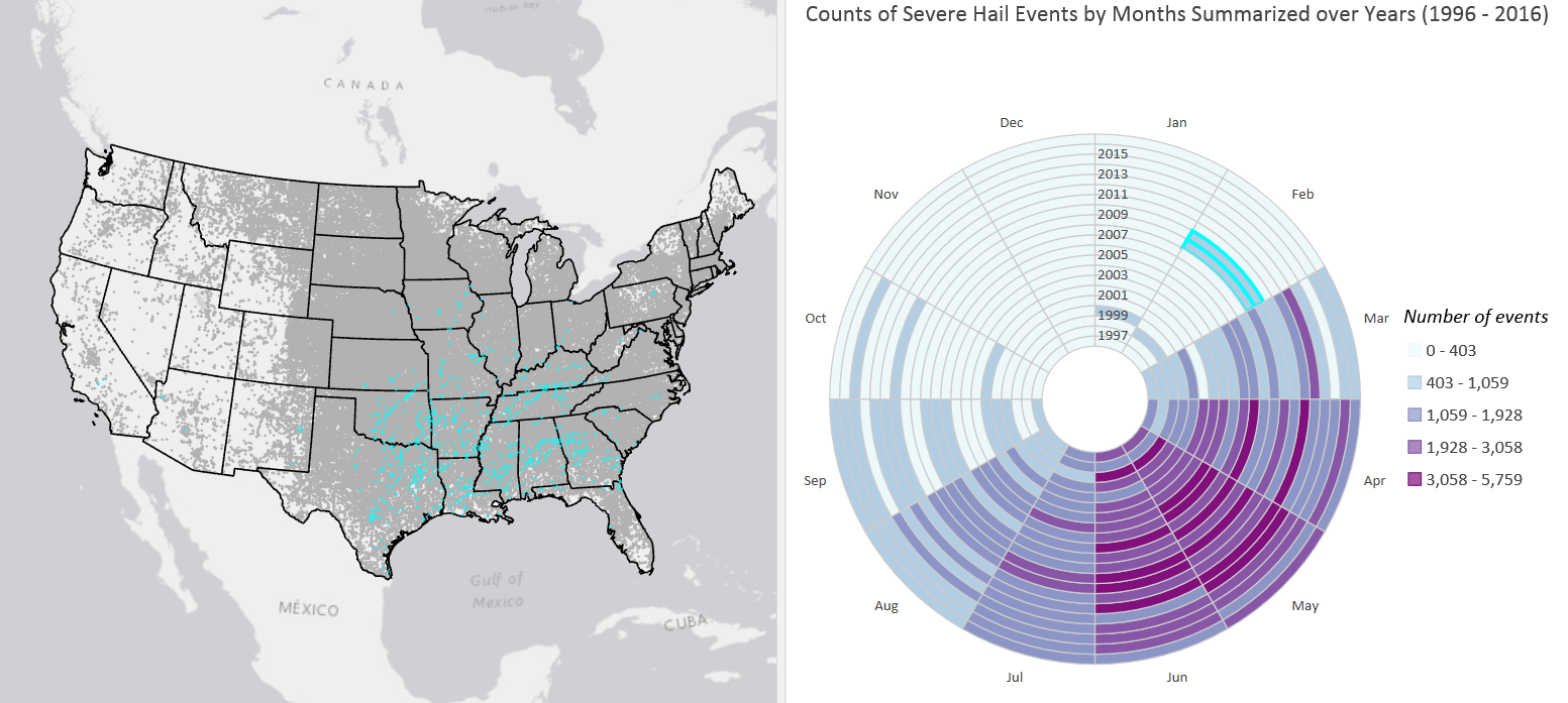
Mark Twain said, “If you don’t like the weather in New England, just wait a few minutes.” Weather is highly dynamic, and a climatology summarizes weather variability over long periods of time. So, we really need to look at hail events from a temporal perspective as well. One way to accomplish this is through visual analytics. To do this we can use a data clock. A data clock summarizes temporal data in two dimensions to reveal seasonal or cyclical patterns and trends over time. The data clock in Figure 3 confirms patterns of severe hail events with very little hail occurring in January and February, increasing occurrence in March and April, to the highest occurrence in the May and June, moderate occurrence in July and August, and finally to a period of very little activity in the fall and winter months.
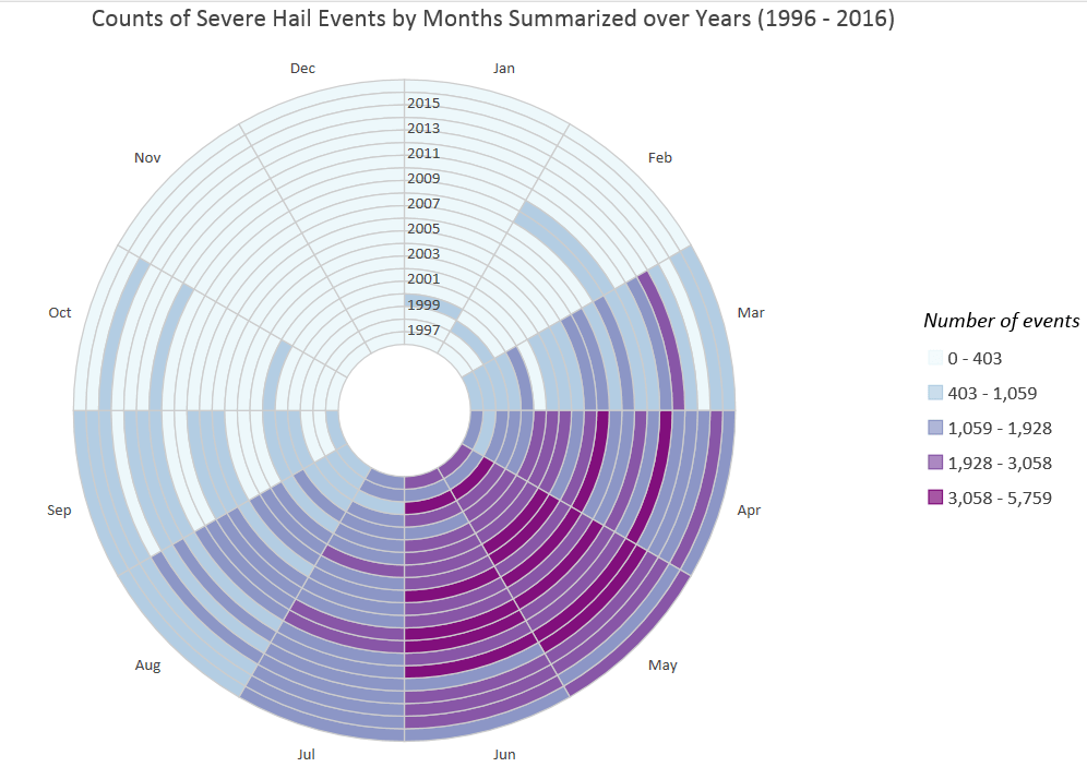
You may have noticed two anomalous years in the February wedge of the data clock that have moderately high counts. One of the most powerful features of the data clock, and other chart types in Pro, is that they are dynamically linked to their related map. When you select areas on the chart, they are also selected on the associated map. Selecting the two anomalous years in the February wedge reveals that these events were concentrated in the southeastern states (Fig. 4) where anomalous spring-like temperatures can support the development of thunderstorms.
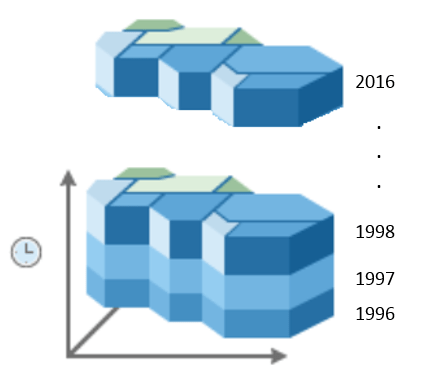
Now that we understand the broad temporal patterns of hail events, we can explore the temporal trends at various locations in our map. More than 272,000 hail events were aggregated into a space time cube using the Create Space Time Cube By Aggregating Points tool in ArcGIS Pro. This tool takes temporal data (hail events) and aggregates it into defined geographies (counties in our case). The output of this tool is a space time cube where each county now has an associated time series (Fig. 5).
When the cube is created, the temporal trend for each location (county) is captured using the Mann-Kendall statistic. This statistic tells us if there is a significant trend (either up or down) in the number of hail events for each county from 1996 through 2016. Figure 6 shows statistically significant upward trends in the upper Great Plains states of North and South Dakota and eastern Wyoming and significant downward trends in northeastern Oklahoma and other southern states.
Figure 6 — Statistically significant upward and downward trends in time series of the the number of hail events from 1996 through 2016 for each county.
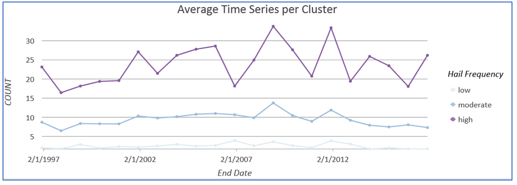
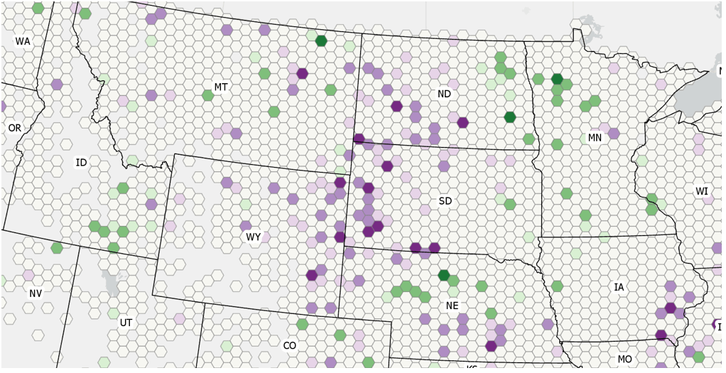
While the Mann-Kendall trend map shows the broad temporal patterns across all 21 years of this analysis, we might question if there will be significant variation year by year. To capture temporal patterns within the 21-year period of our climatology, we can use the Time Series Clustering tool. This tool partitions the collection of time series in a space-time cube, based on the similarity of time series characteristics. Time series can be clustered so they have similar values in time or similar behaviors or profiles across time (increases or decreases at the same points in time). Since we are interested in the frequency of hail events, Fig. 7 shows the time series clusters based on the count (the number of hail events). From this map and the associated time series graph, we can see that there appear to be three distinct patterns of hail events across time in the contiguous US. The optimal number of clusters, three, was automatically determined by the Time Series Clustering tool using a spectral gap heuristic. Clear patterns exist showing that most of the continent has low hail activity in contrast to the Great Plains. This pattern warrants additional investigation. What is it about the Great Plains that makes more events happen here?
A spatiotemporal perspective
The temporal analysis in the previous section showed trends in the number of hail events in each county from 1996 through 2016. Each location (county) was analyzed separately across time. However, a good climatology should summarize patterns across space and time. In this section, we explore whether there are clusters of counties with high or low counts of hail events and if there are temporal trends in the intensity of that clustering, thus generating a comparative climatology. Looking across 21 years of data, are there regions (counties and their neighbors) that have a significantly higher or lower number of hail events compared to the overall (contiguous US) number of hail events. We can do this using the Emerging Hot Spot Analysis tool. This tool takes the space time cube created for the previous analysis and identifies clusters as hot and cold spots. It also determines if there is any trend (using the Mann-Kendall statistic) in the intensity of the clustering. Exploring the clustering behavior of hail events in space and how that clustering changes over time generates a spatiotemporal regionalization. Rather than trying to glean patterns from hundreds of thousands of individual hail events, local emergency managers, insurance accessors, or agricultural agents can see meaningful summaries of hail event patterns across space and time concurrently.
Figure 9 – Results of the Emerging hot spot analysis.
The Emerging Hot Spot Analysis tool categorizes each county based on the type of clustering and trend at that location. For example, several counties in Kansas and nearby areas (Fig. 9) are categorized as persistent hot spots (n). In the context of the hail event climatology in this study, this means that these counties have been part of clusters of significantly higher number of hail events at least 90% of the time (19 of the 21 years) with no discernible trend indicating an increase or decrease in the intensity of the clustering over time. In contrast, the counties in western Washington state, northwestern Nevada and central California are classified as persistent cold spots. These counties have been part of clusters of significantly lower number of hail events at least 90% of the time (19 of 21 years) again with no discernible trend indicating an increase or decrease in the intensity of the clustering over time. A description of all emerging hot spot categories can be found here.
Regarding the striking pattern of severe hail events across the Great Plains, why is there such a high intensity of hail events in this area? According to meteorologist Jeff Haby, several meteorological factors contribute to this pattern. In part, the high elevation of the Great/High Plains and a relatively low freezing level (the pressure level where the temperature is freezing) means that hail has less time to melt before it reaches the ground. These two factors plus the tendency for storms to build vertically in this area thus creating sufficient updraft to carry water vapor above the freezing point, contribute to the high hail event frequency.
Integrating climatology and GIS
One of the benefit of a GIS-derived climatology is that geography is an integrative science. It provides opportunities for data integration, spatial analysis, collaboration, and powerful communication of analysis results that can drive decision making. In the case of our hail events climatology, we can integrate additional information such as the amount of land in each county that is devoted to crops to calculate a risk map for hail damage to agriculture. Figure 10 is a relationship map which shows the relationship between the percentage of time a county was a significant hot spot (high hail event area) and the number of acres in agricultural production within a county. The darkest color indicates areas that have both high hail occurrences and large amounts of land devoted to agricultural production. Note that this mimics the extent of the “breadbasket” of the Great Plains. This analysis could be repeated using other variables, such as the median age of homes or the percentage of houses without garages, to create a variety of risk surfaces such as risk to roofs or risk to automobiles, respectively.
Figure 10 — Risk to agriculture from hail events.
Where to go from here
Here are three ideas for how you might further explore the science of where (and when) by integrating GIS and climatology with ArcGIS.
- Determine if counties are the appropriate spatial scale for a hail events climatology. Changing the areal unit of analysis can significantly impact the results of an analysis (see the inset below). The Create Space Time Cube tool used in this analysis allows you to aggregate to fishnet or hexagonal grids. Explore other units of analysis and other sizes to see if the overall spatial patterns change.
- Repeat this study for other severe weather events. The Storm Events Database contains 48 different types of severe weather events (for example, excessive heat or tornadoes). Repeat the analyses outlined in this blog on other severe weather events.
- Examine patterns related to hail magnitude (size of the hail). This study only explored the frequency of hail events. For more recent years, the Storm Events Database also records the size of the hailstones that caused damage. Determine if there are clusters and trends when the size of hail is considered?
The blog post is provided by Kevin Butler. Kevin is a product engineer on the Spatial Statistics team.

Commenting is not enabled for this article.