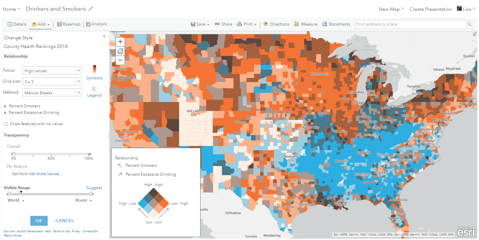
Relationship maps are a new way to visualize and compare your data within ArcGIS Online. They allow you to map two patterns within a single map and help you see if two things are related. This is done using a technique known as bivariate choropleth mapping, where two color ramps combine into a grid-like legend showing all pattern combinations.
For example, here is a relationship map of transit stops in Los Angeles, California. The stops are mapped based on two things: the amount of time people wait during evening rush hour at transit stops, and where there are minority populations living within a 5-minute walk. The areas in purple show where both patterns are high, which help us understand the transit accessibility and availability for minority populations.
This blog introduces what a relationship map is, and how they can help us learn new things. This new mapping style is easy to try and can provide valuable insight about your data that you may not have found otherwise.
So how is it done?
It’s as easy as selecting the two attributes you want to compare. To follow a similar tutorial in the form of a Story Map, click here.
To get started in ArcGIS Online, add your point, line, or polygon feature service into the map. Within the Change Style layer option, select two numeric attributes from your data that you are interested in comparing on the map. Numeric attributes are fields with non-text, number values. Smart mapping will automatically recognize that you have selected two numbers, and within your list of mapping styles, you will see the “Relationship” mapping style.
Once you select the Relationship mapping style, go into the Options to customize your map.
By default, you’ll see a grid of colors, showing if the two attributes have data values that are both high, both low, or individually high/low.
There are many easy ways to make adjustments to your relationship map:
Color
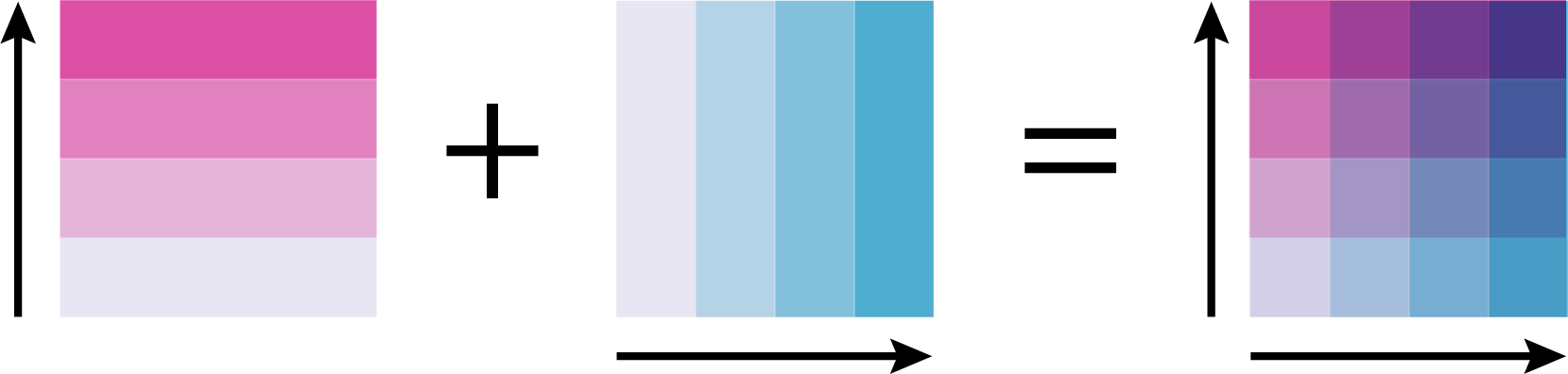
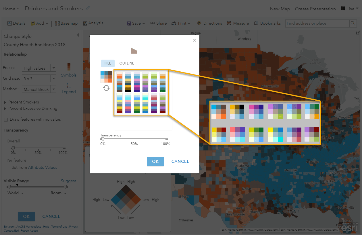
There are many different color options to choose from within the “Symbols” option. Choose a ramp with colors that make sense with what you are mapping. These ramps are designed to use two distinct colors for each corner of the grid. This shows where the patterns are strongest or weakest. They use the sequential-sequential color pattern. Think of it as two color ramps that converge to show if the patterns overlap:
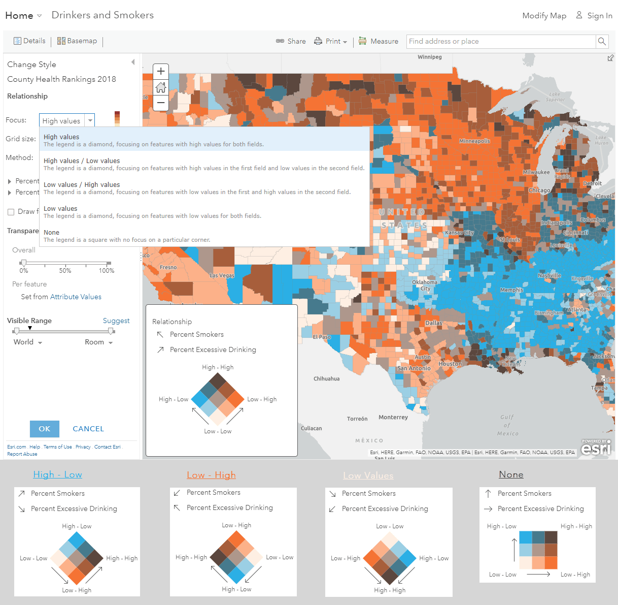
Focus
The focus option allows you to rotate the legend in order to draw attention to a certain corner of the legend. For example, if we want to focus on areas with lots of smokers but not many drinkers, we might want to use the low-high spectrum. By defining what we want the top of the diamond to be, we choose what the user pays attention to in the map. By default, the high-high values appear at the top.
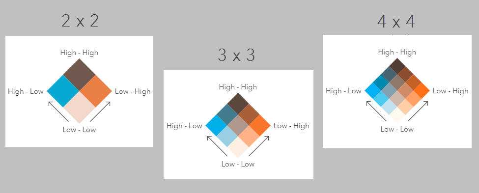
Grid Size
By default, the grid size is 3×3. This tends to be the easiest to understand because the corners show where the patterns are strongest/weakest. 3×3 also allows the distribution to be spread over a few colors, but not so many that the map becomes difficult to understand. You can also choose to use a 2×2 or 4×4 grid.
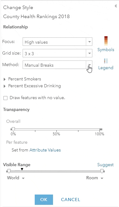
Method
By default, the map is set to use a quantile classification, because this helps spread the values over most of the grid colors. However, you have the option to choose a classification method more suitable for your data. You can also add a normalization attribute, or customize the values being used as breakpoints. We recommend choosing numbers that are important to what you are showing in the map. For example, the national average, or a number related to a policy decision.
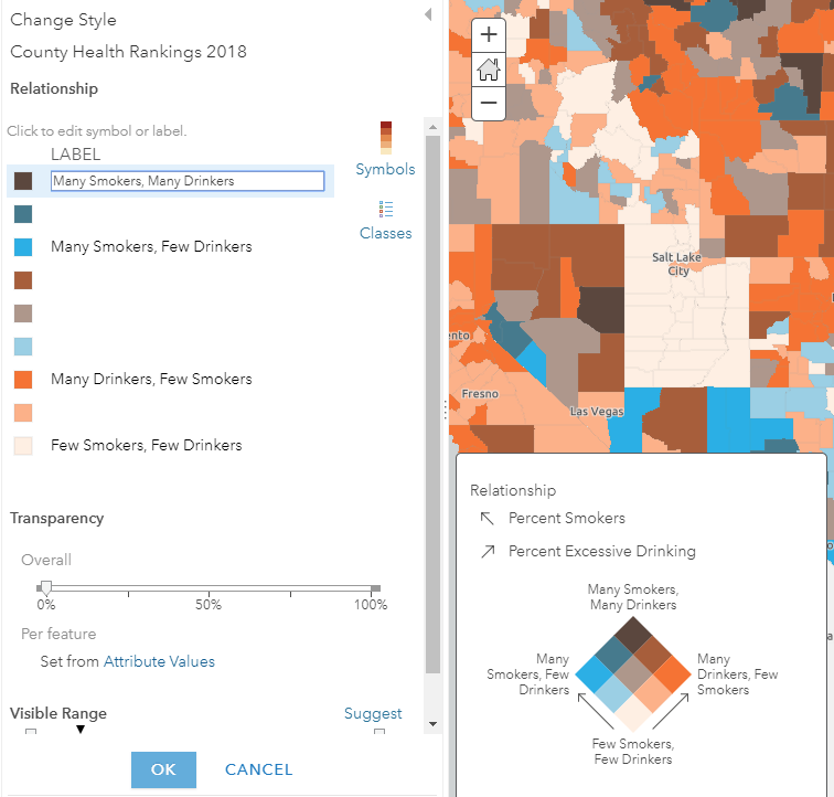
Legend Labels
Make your map easier to understand by creating easy-to-read custom labels for the legend. Go into “Legend” to edit the text that appears at the corners.
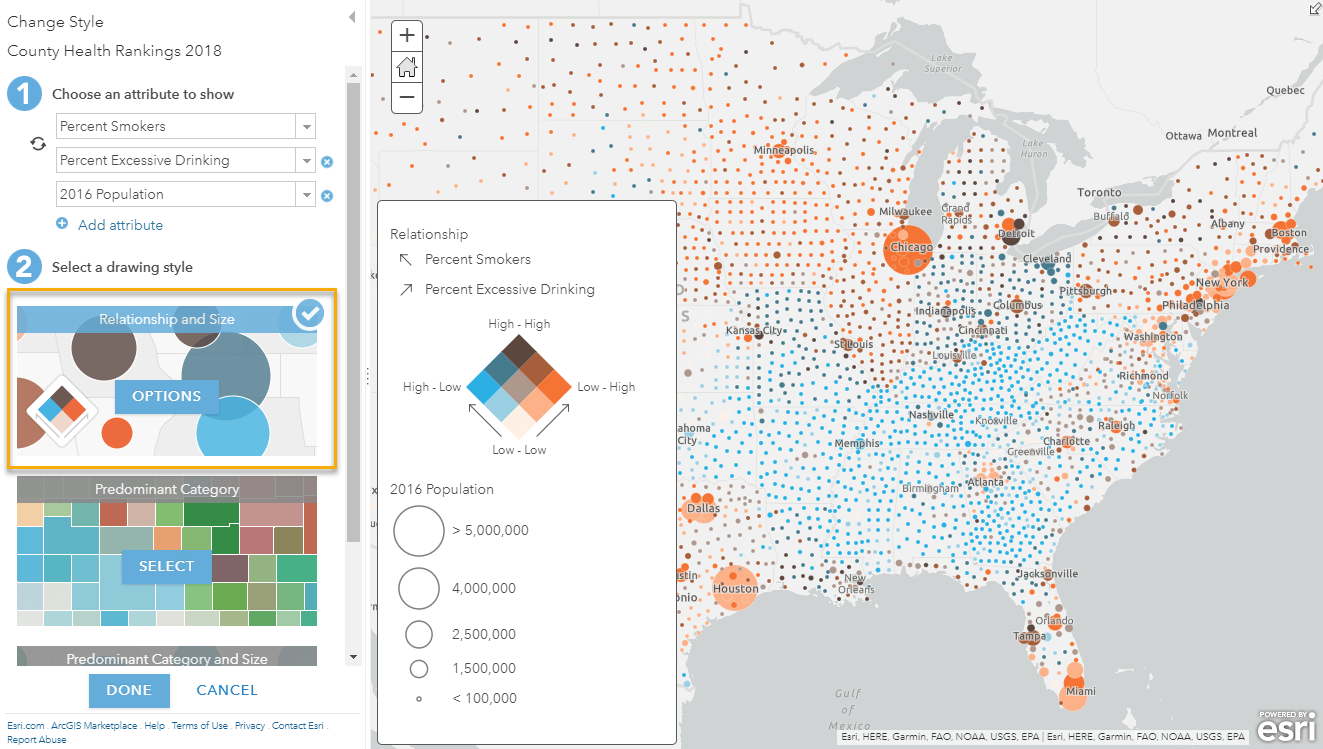
Relationship and Size
You can also go one step further, and add a size component to your relationship map style. When choosing attributes, select a third attribute to be shown by size. The first two attributes you choose will be shown by relationship, and the third will be shown by size. This is an easy way to bring in another component from your data, which adds additional context to your map.
There are many different ways to easily create customized maps using the “Relationship” and “Relationship and Size” mapping styles. You can also use these styles as a way to easily explore your data. Simply select your attributes and the mapping style, and see if you find out something new about your data.
The following links offer additional resources for these mapping styles:
-
ArcGIS Online Change Style Help Pages:


How can we download relationship maps from ArcGIS Online to ArcMap? I’ve tried a few times, but it erases the attributes when I pull it into Desktop.