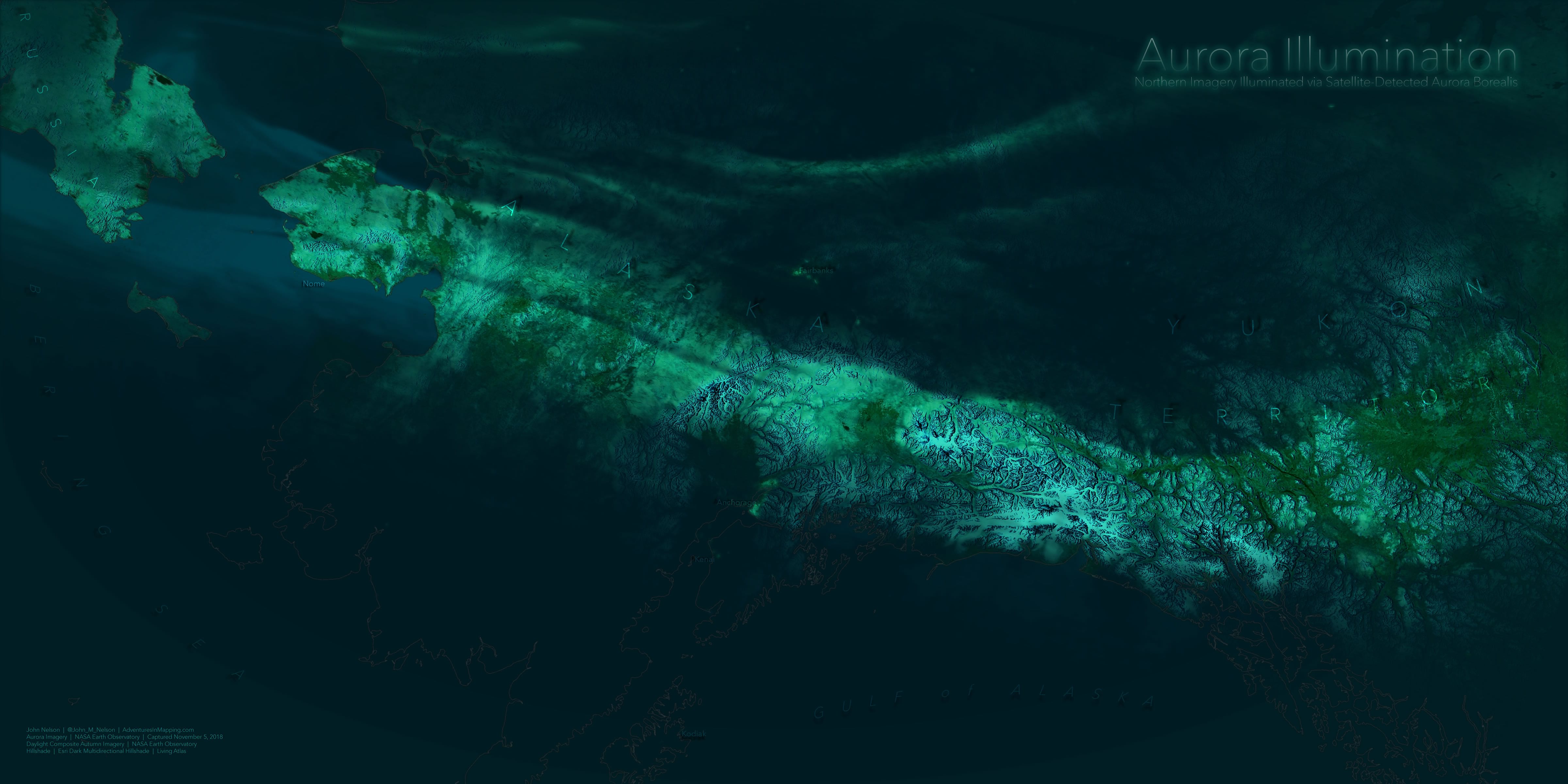
The Northern Lights have been particularly amazing this fall in arctic areas, to the extent that satellites capturing nighttime imagery actually detected the surface of the Earth—illuminated by the intense aurora.
Here is that remarkable imagery, via NASA Visible Earth…

You can actually spot the topographic relief, particularly in southern Alaska and Yukon Territory (one of my very favorite places in the world).
Auroras are pretty intense and the colors are a ghostly aqua. I’ve spent many dark nights in Michigan looking up in awe at an ethereal dancing light show as charged solar particles excite the thin upper atmosphere. Here is an enviable look from above, from the perspective of the International Space Station…

I wanted to take the actual satellite-captured imagery of the vaporous auroral band and mask the underlying autumn imagery below, to conjure some impressionistic sense of the ions lighting up the cold land below…
But How?
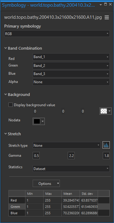
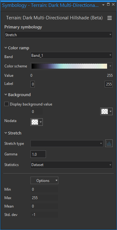
So easy! When I read this article I shot a Twitter message to the illustrious NASA visualization ninja, Joshua Stevens, asking for a GeoTiff of the aurora. He promptly complied. So I fired up Pro, and added an autumn-time imagery composite (also from NASA) and the new Dark Multidirectional Hillshade image service.
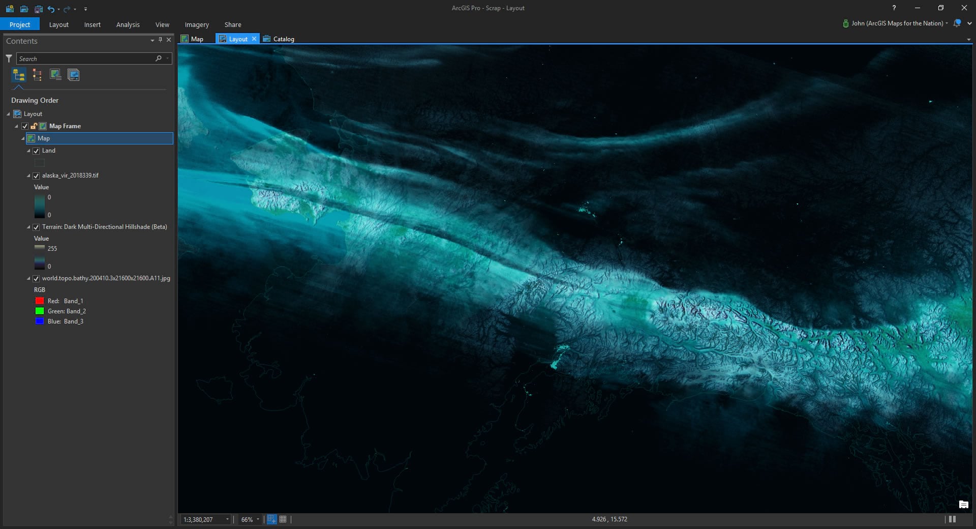
I tweaked the symbology of both images (yeah, you can totally tweak image symbology! Even image services from the Living Atlas) to make them look greeny/bluey like nighttime, like so…
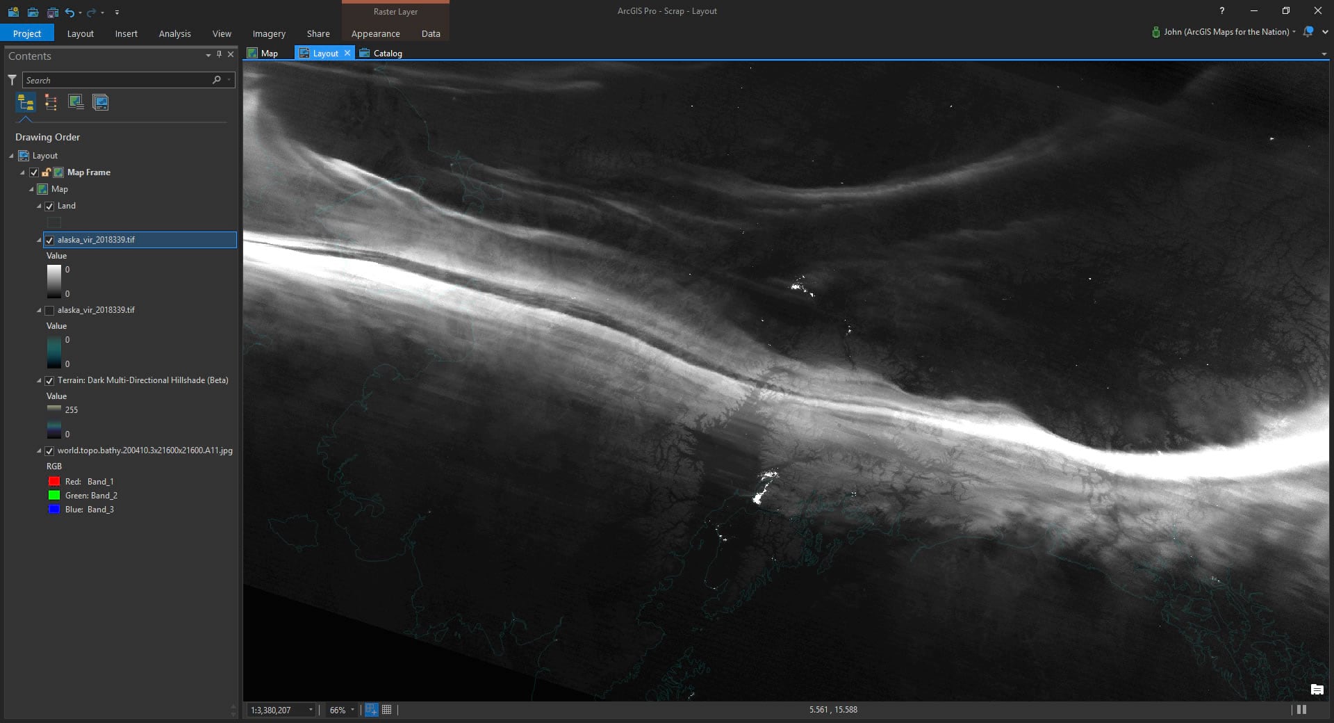
Which looks like this…
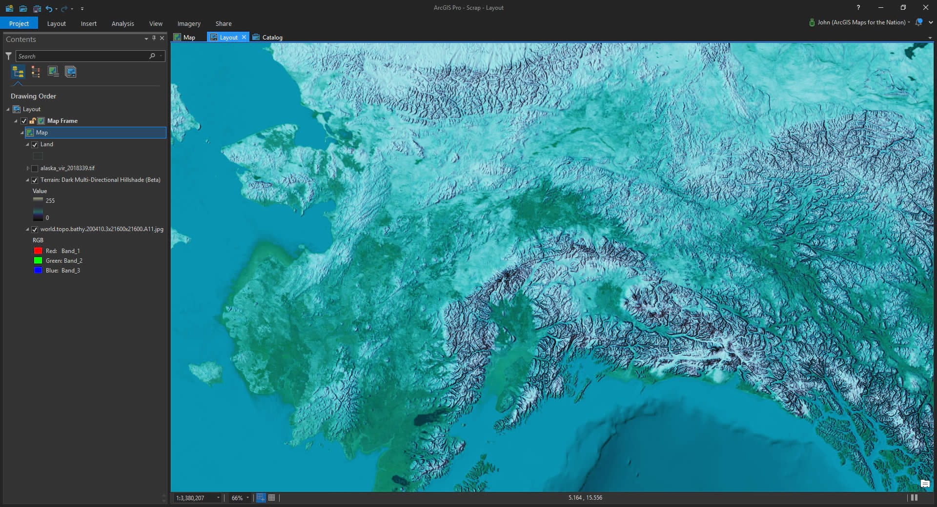
Then I added in the NASA aurora imagery. It’s a GeoTIFF so it registered to my map automatically (an Alaska Albers Equal Area projection). By default, it wants to look grayscale, like this…
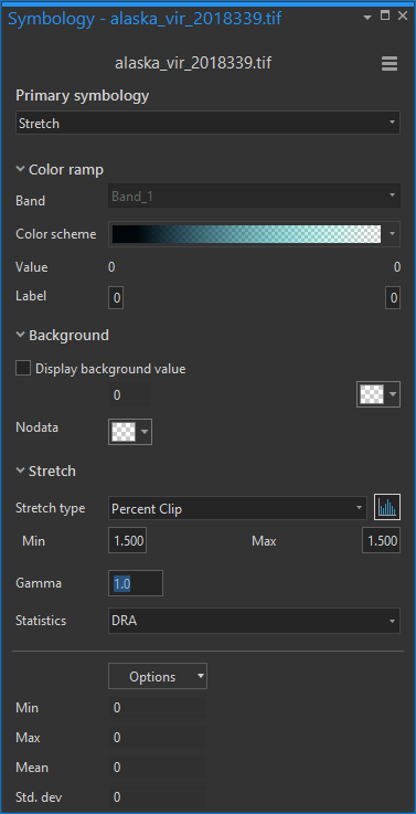
But shucks, you know what to do with defaults. You change them to do your bidding. So here is the symbology panel showing how I made the image a gradient of opaque dark blue to transparent cyan. Seemed pretty aurora-ish to me.
Now the cool wispy overlain aurora imagery serves as a mask to the underlying imagery…
There you have it, my friend!
If you are feeling adventurous, you can download this Pro project and kick the tires for yourself. Maybe you want to take a closer look, or maybe you’d rather make the aurora look like a solar flare roasting Earth with its terrible terrible radioactive abomination. Either way, you can do that. Here it is once more, submitted for your perusal…
Happy Aurora Mapping! John

Commenting is not enabled for this article.