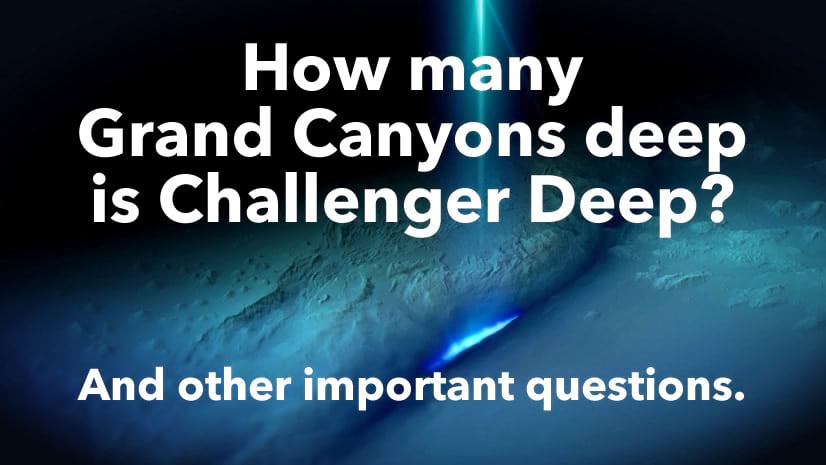
Oh my goodness, did you know that Esri’s chief scientist, Dr. Dawn Wright, is going to the bottom of Challenger Deep this summer? In order to help wrap our brains around this area of our undersea world, here is a “micro world” of Challenger Deep…

It is a 5x vertically-exaggerated cube extract of the deepest part of the ocean floor. If you are curious about how long it would take to freefall this distance, or what the pressure might do to you, then have a look at this StoryMap. If you are curious about how to make a not-bathymetric version of one of these, have a look here.
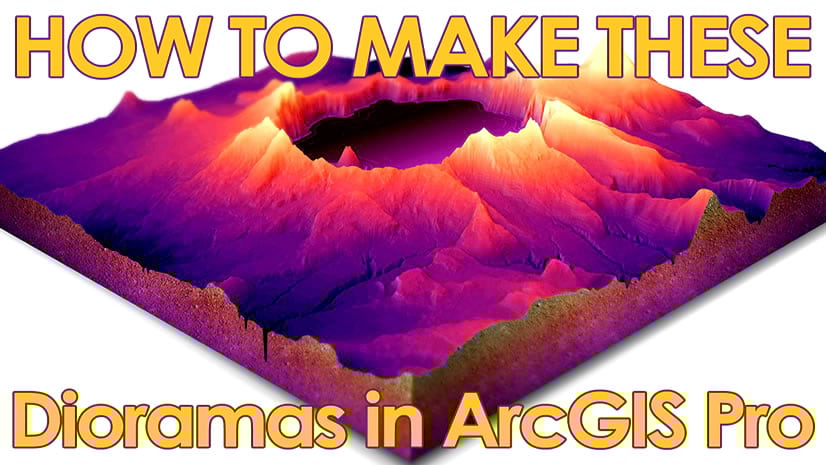
Here’s how to make this in ArcGIS Pro…
0:00 Standard fare intro, with my face mercifully covered for much of it.
0:19 Unabashed The Sound of Music reference introducing GEBCO bathymetric data, and how to download an extract.
1:50 Adding bathymetry image to a local scene AND as its elevation surface.
2:55 Vertical exaggeration to taste. I chose 5x.
3:34 Giving this bathymetry a nice blue gradient. And hillshade! Which is merged into the bathymetry with the “overlay” blend mode!
4:22 Creating depth references with polygon map notes, and applying a custom (negative) elevation offset to each instance.
8:50 Time for a layout! Get the perspective the way you like it because once we start drawing graphics we are locked in.
9:31 Manually drawing dirt curtains along the edge of the scene, to hack a geological cube. Like a block diagram, really.
12:25 Drawing a surface and giving it an image fill of waves. Sneaky! Extra credit: use this wave pattern in your glass walls.
22:22 Dropping in some manual labels to annotate the depth markers and three pools of Challenger Deep.
27:00 Sneaking in some silly little sparkle graphics to make it look like glistening airbrushed art from the 80s!
28:00 Shoot, now it’s time for a title. Also, if you use GEBCO data, be sure to cite it.
I hope you give this a go. It’s so much fun and actually has lots of practical applications for map-minded folks like us. Plus the results can be pretty engaging so maybe it’s a good option to consider to make a splash with your audience.
But wait, there’s more! Stay tuned for an upcoming blog post from Jesse van den Kieboom who will show you how to make a living breathing interactive version of these things using the ArcGIS API for JavaScript!
Love, John

Article Discussion: