Ah the Chernoff face. It was the 70s. There were lots of new ideas floating around and a general malaise for the pedestrian modes of communication. A statistician named Herman Chernoff noted our minds’ insanely keen ability to decode hosts of meaning from peoples’ minute expressions, so he thought to leverage it to encode data into cartoon faces for statistical visualizations. Each little bit of the face could represent some data value. Naturally it didn’t take cartographers long to start packing these multivariate symbols into maps. Are they worthwhile? It depends.
Like any multivariate map, there are some pretty profound trade-offs you make when you encode layer after layer of information into a single symbol. When illustrating the Chernoff page in the Cartography. book, I was initially inclined to go pretty basic and replicate the good old Beer vs Wine map, Chernoff-style…
The data is a pretty simple combination of two things…
- Relative preference of beer or wine
- How much you spend on them.
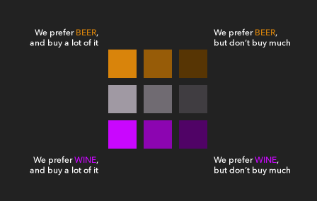
Since I could split this up into nine tidy little groups, my work in Illustrator was fairly simple. And fun…
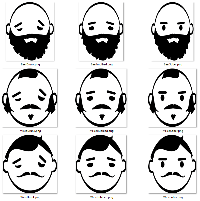
And wham! We have a Chernoff-like map…
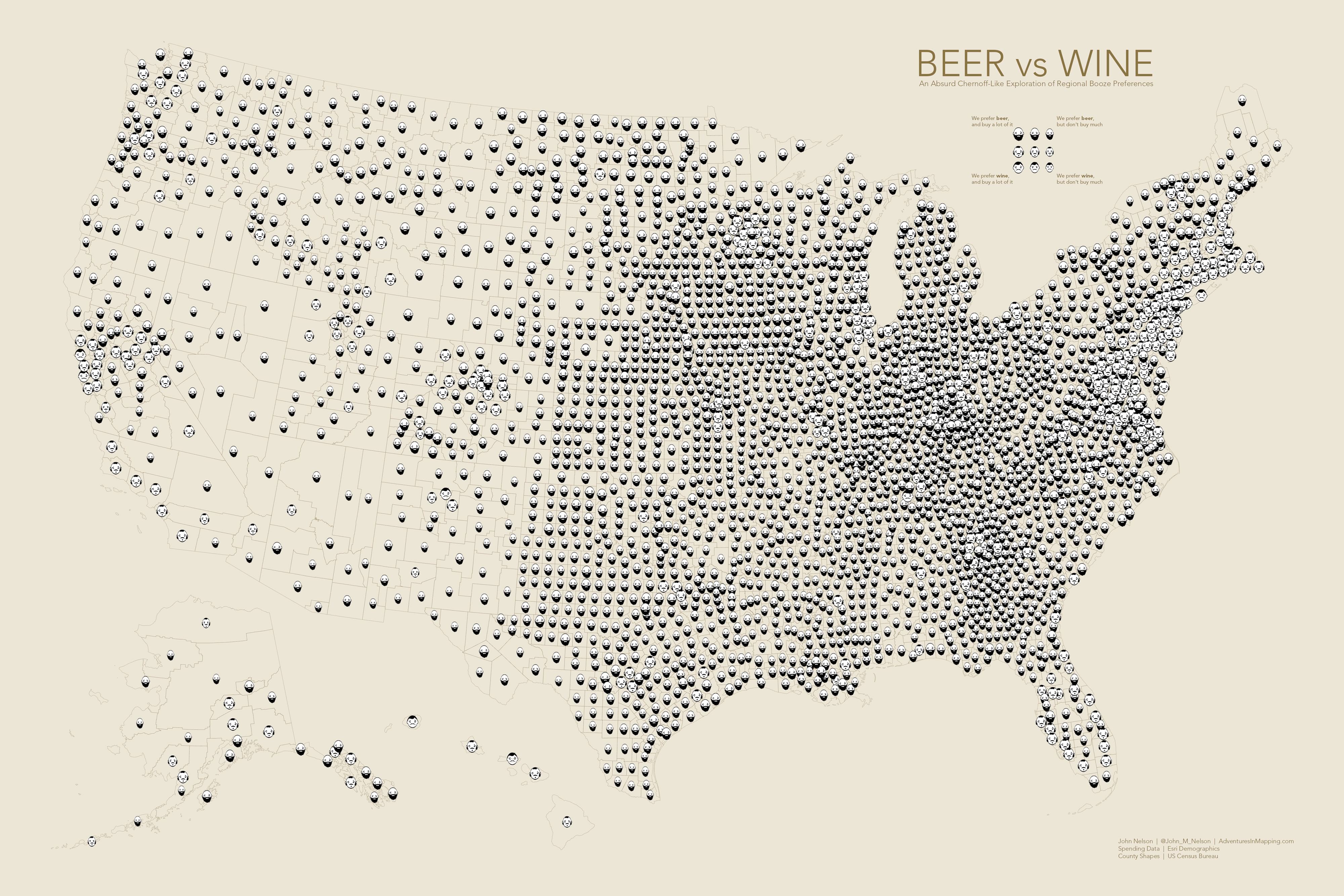
I say Chernoff-“like” because it may not technically be a Chernoff face since I think every little element has to be tied to a data value and my guys have cute little ears that don’t correspond to anything. Also I merged the eyes and eyebrows into a single value (increasing appearance of intoxication based on spending). Also probably a no-no, although Martin Elmer points out that this sort of combined-mechanics emotional cartooning is the only way that Chernoff faces have a chance of being effective. Whew.
In any case, while fun, we needed something more complex and stringent to adequately illustrate the subject for the Cartography. book. So I turned to the United Nations’ World Happiness Index data. For most of the countries in the world, the UN tries to statistically derive some of the reasons for survey results of how happy people in each country are. There are six factors they consider. Plus the overall happiness score. A more standard multivariate map might look like this…
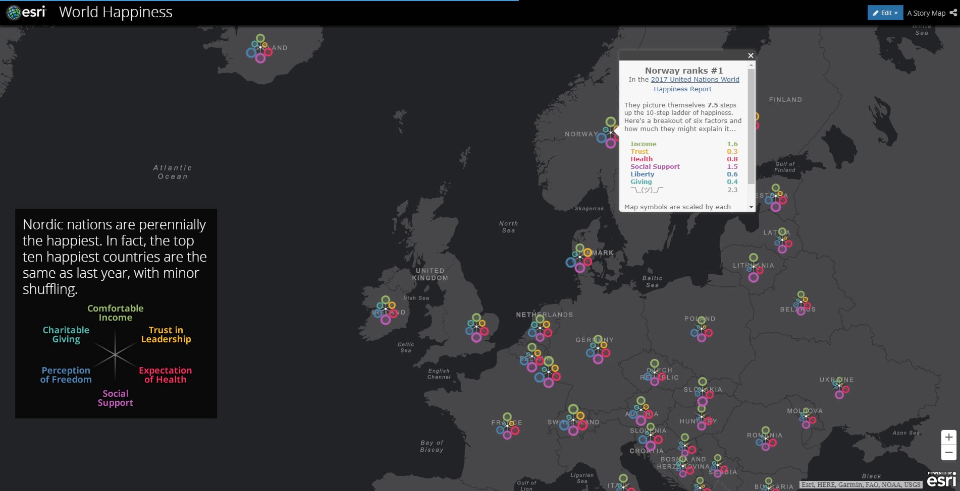
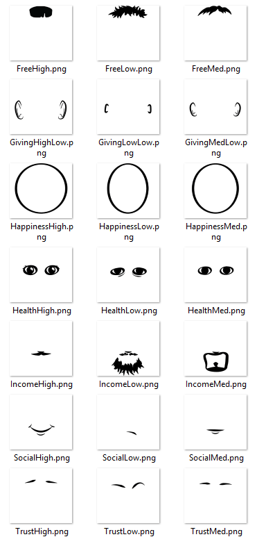
But notions of “standard” carry little weight in the world of Chernoff faces. So rather than a spoke of graduated circles, I drew some facial features for the six happiness factors (plus overall happiness, so seven), each with a high/average/low variant. It was 21 images I had to draw…
Then I just duplicated the map layer for each happiness indicator and applied the face-maker symbology individually…
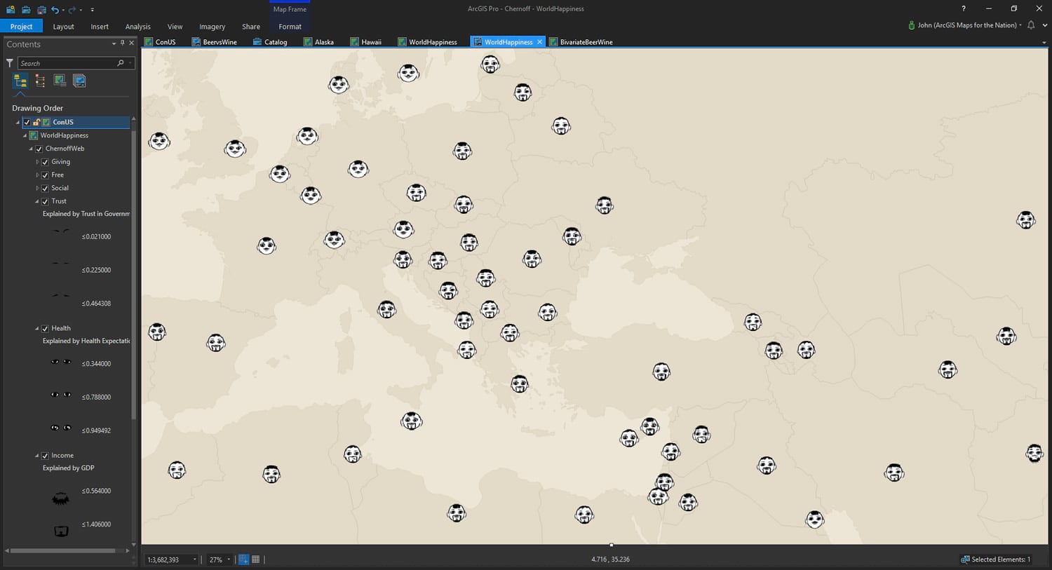
Here’s a little animation of each of the layers building up to contribute to an overall Chernoff face…

So you may be like, what does messiness of hair or beard type have to do with a person’s sense of freedom or income? Well that’s the thing with Chernoff faces. Sometimes it makes sense (like eyes showing varying health status), but most of the time you just have to pick some feature and there isn’t a good literal meaning to it.
And that’s one of the big weaknesses of a Chernoff face map. You still have to load into your leaky working memory fully abstract representations of data. We are good at interpreting emotions from cartoon faces. But when you have to convey something other than emotion, it gets shaky. And sometimes inadvertent connections are made.
This brings me to the second reason that Chernoff maps are potentially troubling. The theory behind Chernoff maps is that we are so familiar with the human face that our minds are primed to interpret it. But this can backfire in a hurry. When you encode features according to innocuous data values, perhaps innocently (or even arbitrarily), people can naturally ascribe racial and ethnic characteristics to them. And this can be, at best, distracting, but sometimes offensive. Heather Rosenfeld has done some interesting work in trying to obfuscate potential interpretations of gender and race by making zombie Chernoff faces.
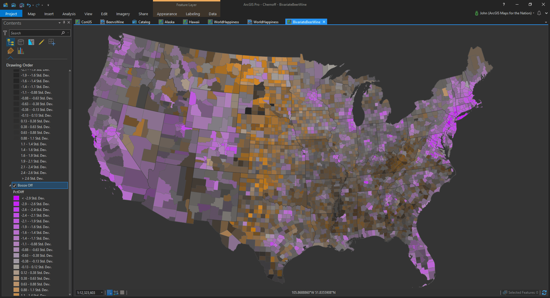
Anyway, if you are comfortable drawing little cartoon features and are feeling adventurous, stacking up these elements in Pro is actually pretty straightforward.
Happy Face Mapping! John

Commenting is not enabled for this article.