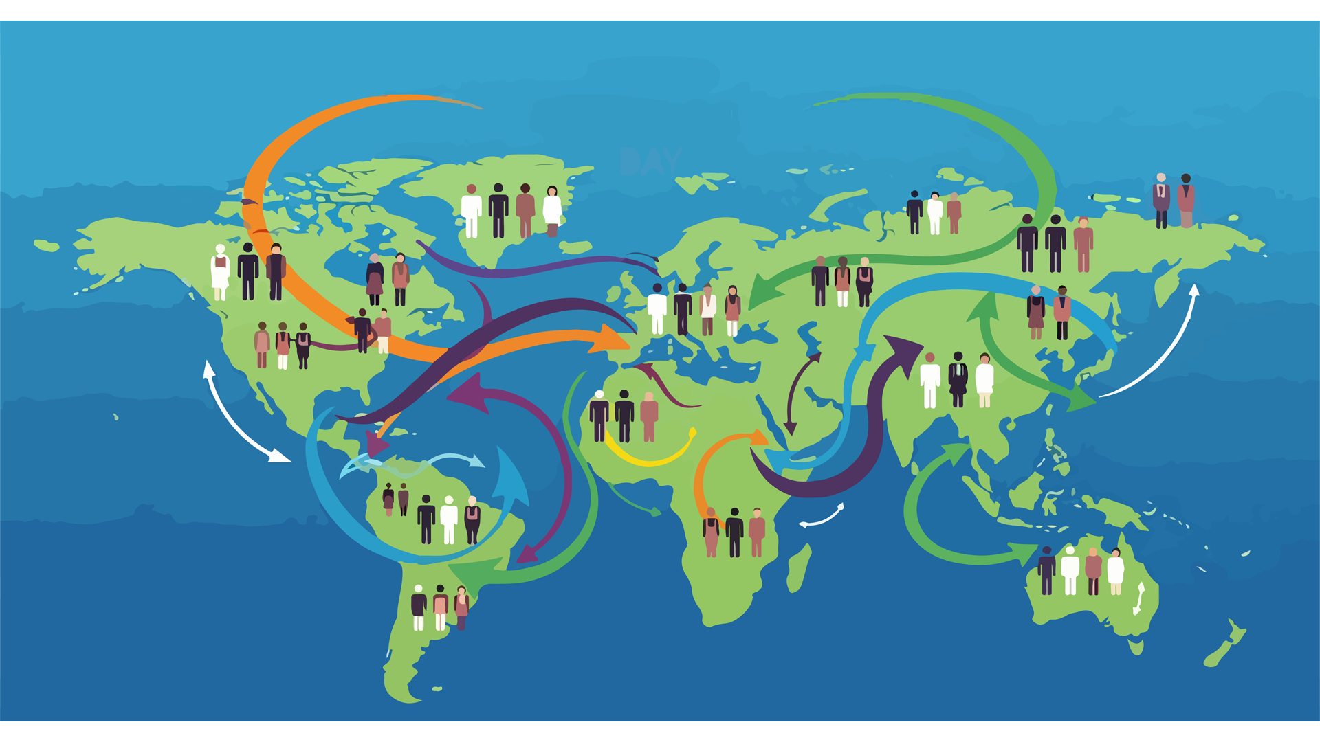
I spoke with customers about these many times as we considered adding Sankey or Alluvial Flow Maps to supplement the Directional Link Map offering in the ArcGIS Insights application before its retirement. Whether because of that or by chance, I had a few users come up to me more recently at conferences asking how I recommend making them today, and whether there is an Esri solution.
Well, the good news is that there is. In fact, there are several!
So, I wanted to share some of those options ahead of our latest user conference.
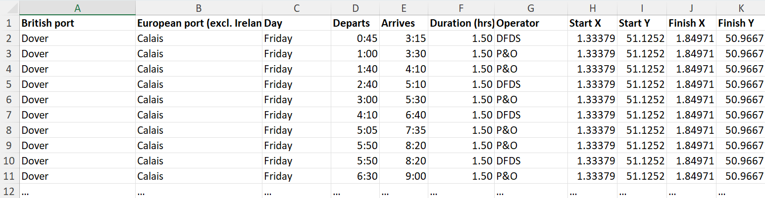
I’ll be using some data of weekly ferry crossings between England and Mainland Europe that I previously created to test and blog about Alluvial Charts. It’s not in the ideal format for our solutions, but real data rarely is.
Anyone who has searched for ArcGIS flow maps online will likely have been directed to an Esri provided tool you can add in to ArcGIS Pro called “Distributive Flow Lines”. This is probably the most “Sankey” like solution but, not wanting to reinvent the wheel, you can read all about that in an article by Bob Gerlt here.
This tool only works if you are routing from (or in reverse to) a single point feature. So similar to an approach my colleague Aileen Buckley blogged about back in 2011. The reason being it’s based on hydrology tools. However, I still tested its compatibility with my data: I had to first add a Route field – a concatenation of British port (origin or start) and European port (destination or end), run the Summary Statistics tool using Route as both Count and Case Field, and then run Join Field to add the Count or Frequency back to the start and end point layers.
With the single source and the impedance options, it’s a different solution to the one delegates were asking me about, which were more typical migration maps, route maps, flight maps, etc; so while it might be of useful in some scenarios, the delegates I spoke with were generally looking for “many-to-many” output more like the examples below.
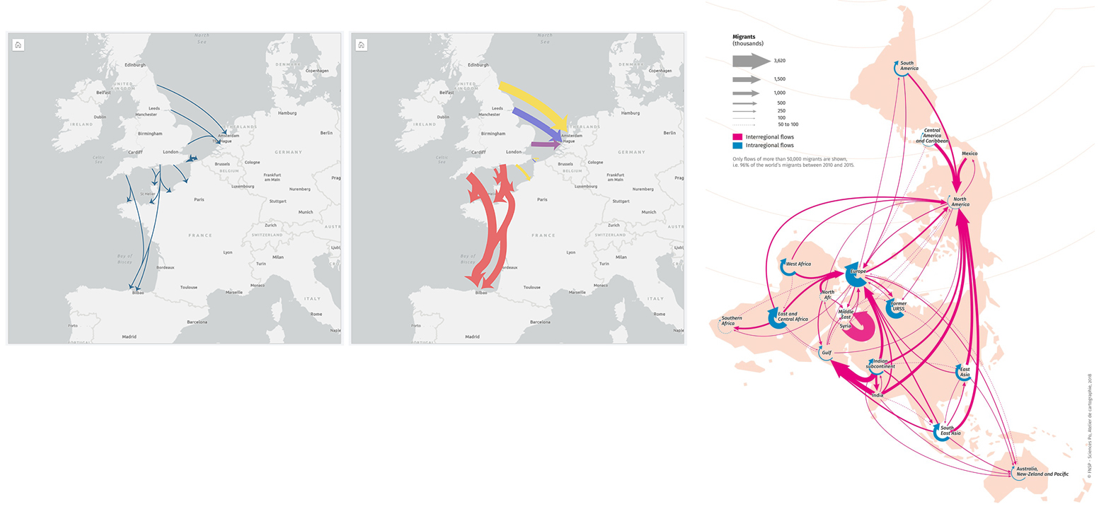
While a Sankey or alluvial flow would deal more elegantly with the crossing and merging paths and offer something more like the second and third maps above, I have settled on two simpler solutions.
SOLUTION 1
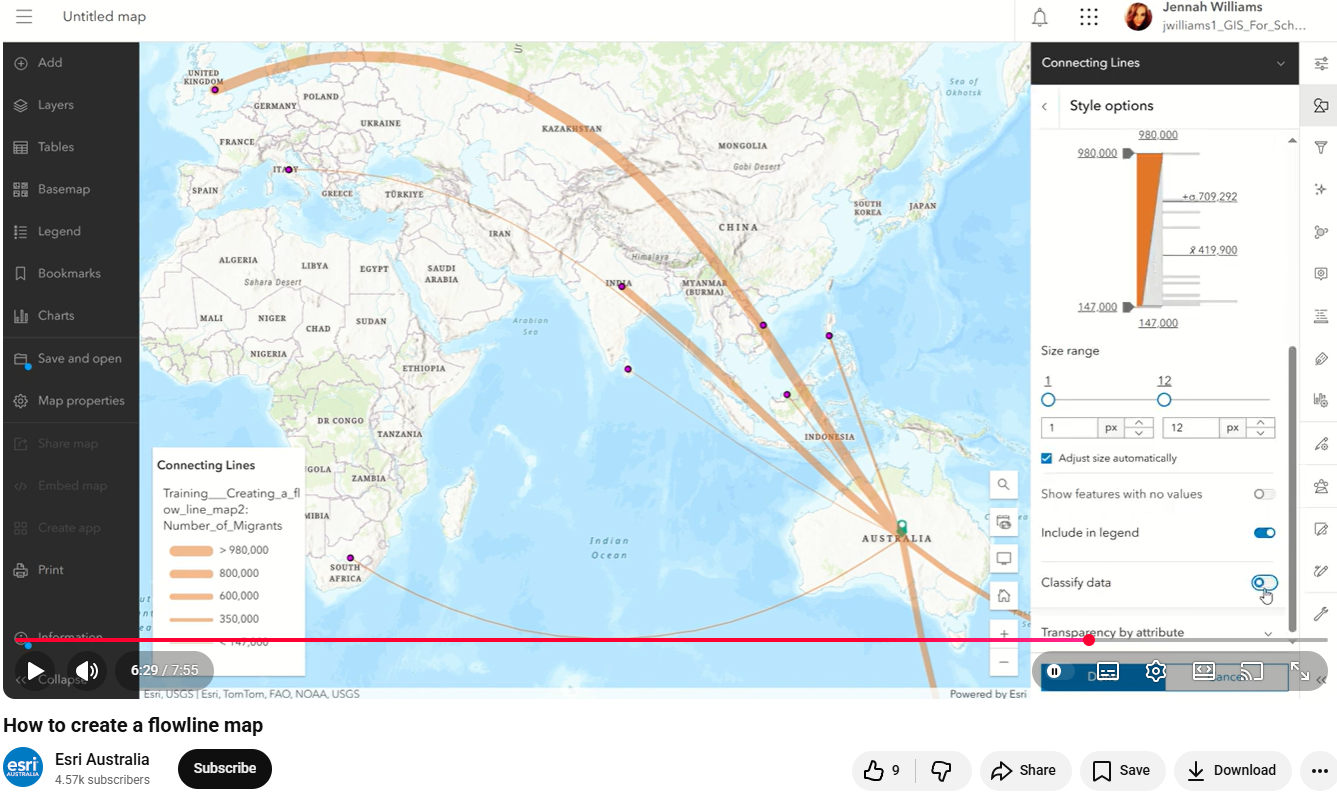
If you have a dataset of start locations and another with the end locations, and the paths are simply ALL to ALL, or ALL to ONE such as Esri Australia’s example of inward migration, then arguably the most straightforward option is within Map Viewer. You can use the Find Closest Tool. At small scale over long distances, lines will already appear curved.
Open Map Viewer, click on Add to add hosted content, or the dropdown arrow besides it to add a local file or from a URL.
If adding a table (e.g. from CSV and XLSX), then Map Viewer will prompt you to add any location fields, for my ferry route data I’ll show in Solution 2 that is to either geocode on the origin/destination city names or use the longitude and latitude values from my StartX, StartY/EndX, End Y fields.
Once you have your start points and your end points in Map Viewer, click on Analysis on the right-hand menu and navigate to Tools > Use Proximity > Find Closest. Make these your input layers and, just as Jennah did in her video tutorial, make sure to turn off the “Limit the number of closest locations” and “Limit the search range” toggles before running the tool.
As my data is sea crossings, I could also add all the land mass polygons for the area as barrier features if I so wished.
Once processed, restyle the lines based on your chosen field for the line thicknesses, either using raw values or by classifying the data, and arrowheads should you wish.
SOLUTION 2
To do this in ArcGIS Pro, you’ll create lines between origins and destinations, add a midpoint, and then smooth them. I’ll walk you through the steps below.
In most of the steps, the output from the previous step becomes the input for the next.
Step 1
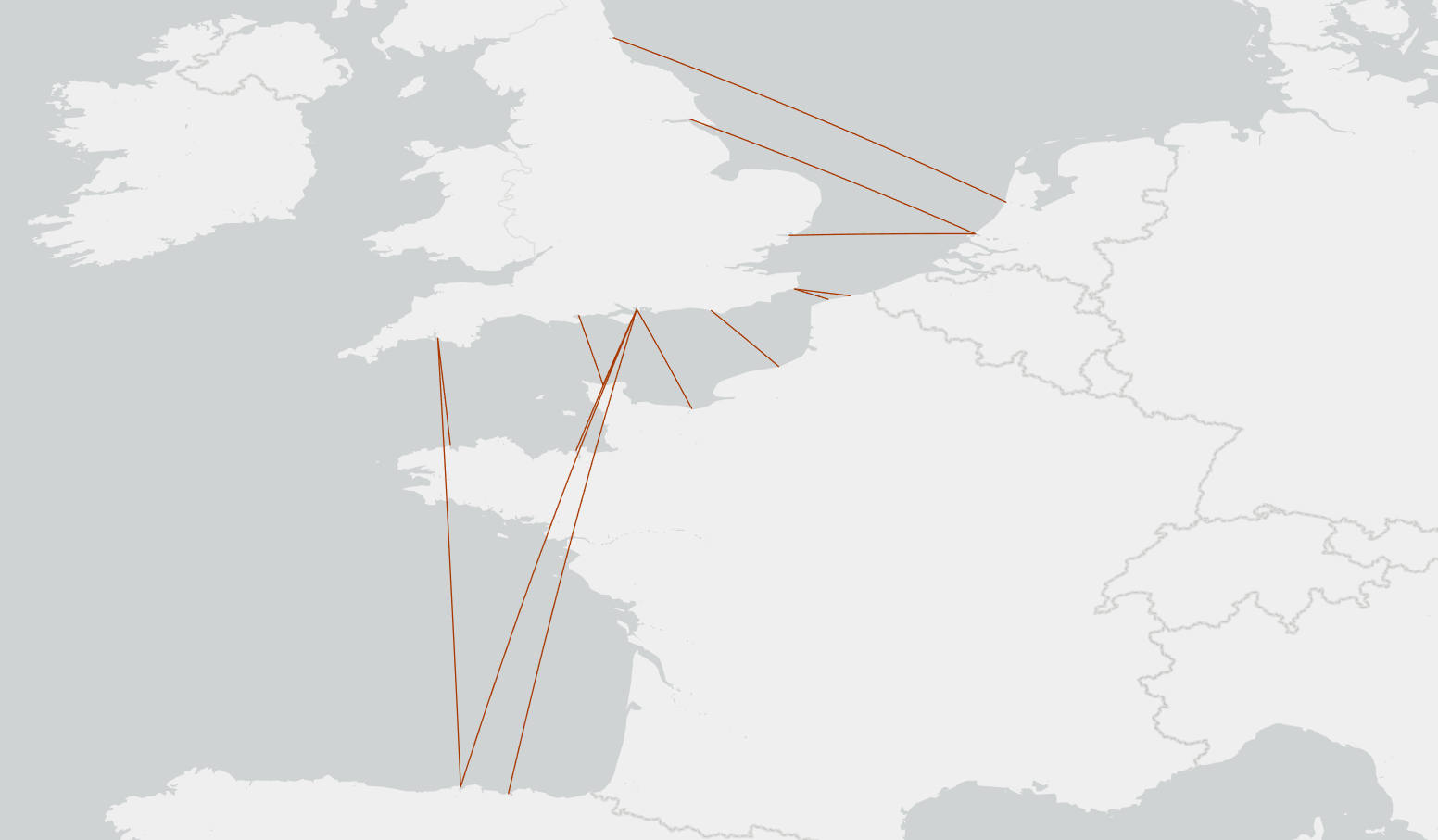
The easiest way to get started depends on your how your data is set up. If you have one table with all the route or path information including start and end locations, then I’d suggest using the data management tool XY to Line followed by Pairwise Dissolve. If you have two data tables, one with the start locations and the other with the end locations, then I’d use the Generate Origin-Destination Links analysis tool.
XY to Line method
Input data needs two fields for the origin and destination X coordinates such as longitude, and two for the Y coordinates such a latitude; and optionally a field to use to vary the thickness of our lines or arrows – this can be either a numeric field or we can use “count” on a text field. You don’t need geometries, it can come from a table.
Wait! I don’t have a Start X Field, Start Y Field, End X Field and End Y Field! No problem, you can use geocoding.
My example of ferry crossings was originally a CSV file with an origin city field, a destination field, and the name of the operating company. My instinct was to run the geocoding tool twice, once on origins and again on destinations, calculate the X and Y, and join them back to the data; but it is more efficient to start by creating a single lookup table of all the unique cities. Running Geocode Addresses on this creates a new point layer. Run Calculate Geometry Attributes on that to create a City X field and again to create a City Y field. Then use Join Field to add these back to the original table twice: once for the origin cities (Start X and Start Y), and again for the destination cities (End X and End Y).
Let’s recap those steps:
- Create unique city lookup table
- Geocode once
- Calculate City X/Y
- Join Field OriginCity → copy City X/Y as Start X/Start Y
- Join Field DestinationCity → copy City X/Y as End X/End Y
Next, we simply run the XY to Line tool.
I would suggest using a unique identifier field for the ID and checking Preserve Attributes to make sure you don’t lose any information.
Choosing Geodesic or Great Circle as the line type will create the curve-like appearance for small scale maps, however in many cases you will not see this if distances are too short as in my case of ferry routes between the UK and Mainland Europe. Therefore, we need steps 2 and 3.
Before that, let’s get rid of the overlapping routes. Using the Pairwise Dissolve tool, you can dissolve on the origin and destination fields to do that. Before clicking run, add to the Statistics Field any summary statistics you wish to keep. If varying the line thicknesses later then you will at least need to add the field for that. As I am using my “Operator” text field, I will select that as my field and Count as the type.
Ensure to add the Count of the UID field to summary statistics to get the total number of crossings.
Generate Origin-Destination Links method
Input data needs to be two sets of points – the origins and the destinations. Ensure you also have a common “route identifier” field in both, e.g. in my ferry crossings I concatenated the origin and destination city/port names into a new field, that you limit the Number of Nearest Destinations to 1 (not sure why but trust me), and also check the box Aggregate Overlapping Links.
The LINK_COUNT field automatically generated in the results is all you’ll need to symbolize line widths later.
Step 2
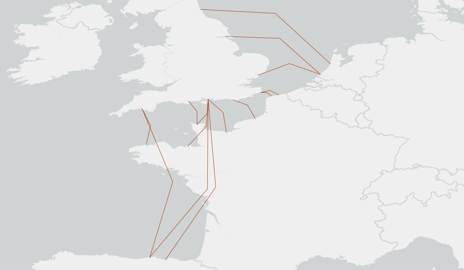
Next, you’ll want to add at least one extra vertex to each line (e.g. a midpoint) and then offset it.
The tool way to do this is a bit long-winded as you need to explode the line to vertices then rebuild the points back to a line (Feature Vertices to Points –> Transform Features –> Points to Line).
So, for the efficiency of doing this in a single step and for a better result, I used a Python script to offset the midpoint based on the length of the feature. An AI assistant can help here if you aren’t much of a coder. My script is here. I’m no expert but I believe that “get” commands is an alternative python method to mine, and I also came across a script from one of our users here.
Step 3

Now you can apply some line smoothing to make the line curved using the Smooth Line tool and we want to choose Bezier Interpolation.
Step 4
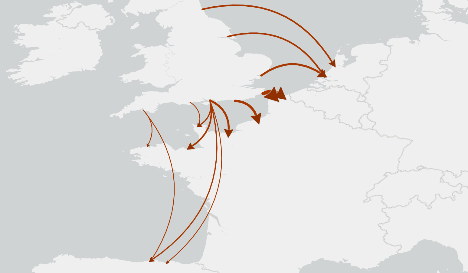
Finally, you can add line weights using the field from the previous step and style the lines (which in my case is the count of total number of crossings per week) to change the thickness, either with raw or classed values, and add arrowheads if desired.
The way I add arrowheads is to go to Symbol Properties > Structure, Add symbol layer and choose a Shape marker then, under Symbol Properties > Layers, choose Font > Esri Arrowheads and under Marker Placement choose At extremities and At End.
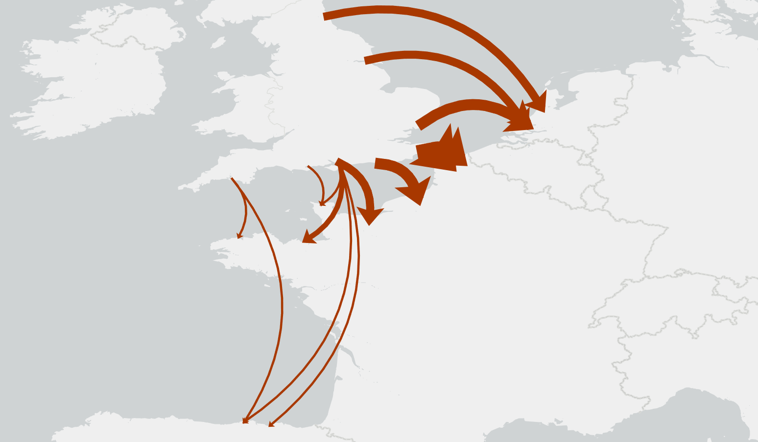
I’d usually prefer Proportional Symbols on my raw values, but given that there are so much more crossings from Dover than any other port, it made more sense in my case to use Graduated Symbols and classes.
The image above is a more diagrammatical look, and below more of an alluvial (or Dad’s Army) appearance.
That’s about it. Penn State has a very useful summary of flow maps I’d recommend taking a look at too.
I hope you get to try out the solutions, give them a go, and please reach out to us with any feedback. Thanks!

Article Discussion: