A follow-up Q&A on visual techniques for emphasizing an area of interest on a map, from blend modes and legends to printing and 3D scenes.
How do you draw attention to one part of a map without overwhelming everything around it? In Highlight What Matters: Visual Recipes for Guiding Attention, Esri cartographer John Nelson demonstrated techniques for emphasizing an area of interest (AOI) using ArcGIS Pro and Map Viewer in ArcGIS Online. During the question-and-answer session, attendees asked how to apply those ideas to their own maps, from working with blend modes and legends to printing and 3D scenes. Here are answers to some of those questions.
Do these techniques require geoprocessing or consume credits?
No. One of the ideas behind these visual recipes is that you don’t have to create and maintain additional data just to achieve a visual effect. The techniques demonstrated in the webinar use existing features and visual properties, including symbology, blend modes, grouped layers, masking, and effects. Because the ArcGIS Online workflows shown rely on styling and visualization instead of credit-consuming geoprocessing tools, they don’t consume credits.
Which blend modes should I learn first?
If the list of blend modes feels overwhelming, start with Multiply and Screen. Multiply retains darkness and eliminates lightness, while Screen does the opposite, retaining lightness and eliminating darkness. Those two concepts are behind several of the techniques demonstrated in the webinar.
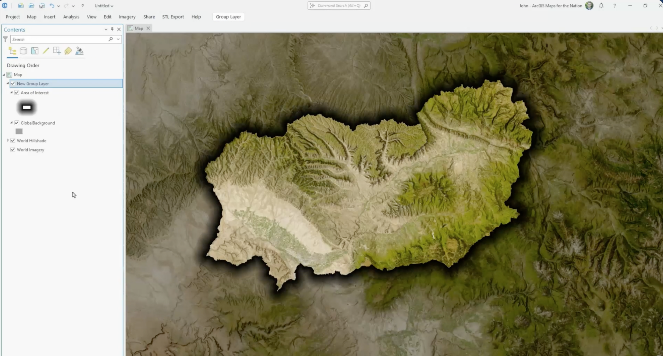
For example, the Outside Darken recipe combines a white AOI layer with a gray Global Background layer. Applying Multiply to the group allows the area of interest to retain its original appearance while its surroundings become darker. Reverse the concept using black and Screen, and you can lighten the area outside your area of interest instead.
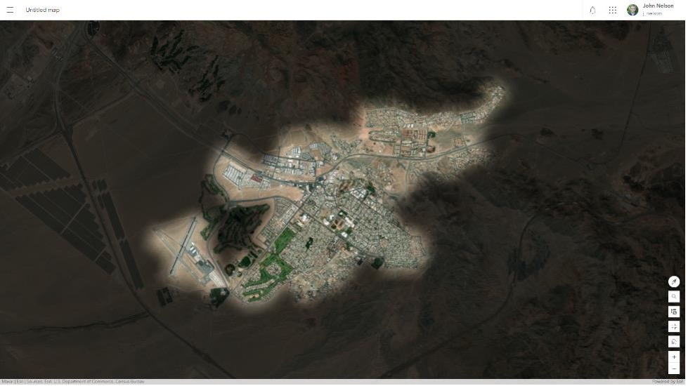
From there, experiment with options such as Hard Light, Soft Light, and Overlay. The goal isn’t to memorize every blend mode. It’s to understand how they interact with the layers underneath them so you can choose the right treatment for your map.
What happens to blend modes in a legend?
Blend modes affect how a layer interacts with the content beneath it. A legend patch doesn’t necessarily reproduce that interaction, so it might not look exactly like the feature appears on your map. When that difference matters, John Nelson recommends creating the necessary legend element manually with graphics or explaining the treatment another way. The important part is giving your audience the information they need to interpret the map.
Can I use blend modes in 3D scenes?
Yes. John Nelson noted that blend modes can also be used in 3D scenes, including with terrain to make hillshade more noticeable or allow underlying imagery to appear more vibrant. This is another reason it’s useful to understand what a blend mode does rather than learning only a particular recipe. Once you know how the layers interact, you can apply the same concept in different mapping situations.
Do blend modes work in ArcGIS Field Maps?
At the time of the webinar, ArcGIS Field Maps did not support the blend modes used in these recipes. John Nelson recommended submitting requests for this capability through ArcGIS Ideas. If you’re designing a map that will be used across several ArcGIS applications, test the final visualization in the applications your audience will use.
Can I use these techniques with lines and points?
Yes. An area of interest doesn’t have to be an area. Many of the same concepts can be adapted to lines of interest and points of interest. During the question-and-answer session, John Nelson mentioned rivers as one example of features that could be emphasized using similar techniques.
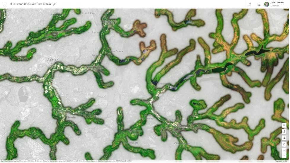
How can I keep the effect from changing the colors of my data?
Layer order matters. If you want an area of interest treatment to change the appearance of the basemap without altering your operational data, place the area of interest layers below your data layers. The effect can then interact with the basemap while your operational data remains above it. This is particularly useful when color already communicates meaning in your data and you need those colors to remain consistent.
What should I consider for accessibility?
Visual hierarchy can make a map easier to understand by helping people distinguish the most important information from its surrounding context. An area of interest treatment can contribute to that hierarchy, but it shouldn’t be the only way your map communicates meaning. Consider the map as a whole, including contrast, symbols, labels, text, and supporting context. The goal is to make the important information easier to identify and understand without relying on a single visual cue.
Can I create an inner tint or glow?
Yes. The tutorial includes techniques for making an area of interest in both ArcGIS Pro and ArcGIS Online. In ArcGIS Pro, the Inner Tint Band recipe uses the Donut symbol effect to retain a specified distance of a polygon’s fill around its interior boundary. In ArcGIS Online, the recipe combines two instances of the AOI layer, a thick outline, and the Destination-In blend mode to create a similar effect. Adding Blur in ArcGIS Online can soften the treatment further to create an inner glow.
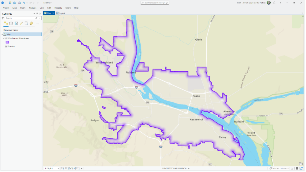
The workflows are different, but the principle is the same: start with the effect you want, then use the visual tools available in the application to create it.
Can I save these styles and use them again?
You can save specific symbology in a style, but a blend mode is applied at the layer level. That means the blend mode isn’t preserved as part of an individual symbol. If your finished treatment depends on blend modes, layer order, and grouped layers, consider preserving the map or ArcGIS Pro project so you can reuse the complete setup rather than relying on a saved symbol alone.
How can I make these techniques work for a printed map?
For layouts created in ArcGIS Pro, John Nelson recommends exporting at a high resolution. PNG is John’s preferred format because it is lossless, although PDF is also supported when your workflow requires it. Keep the resolution of your source imagery in mind, too. Increasing the export resolution can’t add detail that isn’t present in the source raster.
Can I create a drop shadow or glow in ArcGIS Pro?
Yes, although you don’t necessarily need a tool called “Drop Shadow” to create the effect. In ArcGIS Pro, John Nelson demonstrated a drop shadow using a thick gradient stroke that transitions from black to transparent black. Reordering the stroke beneath the polygon fill and applying Multiply creates the appearance of a shadow surrounding the area of interest. The same principle can create softer effects. The Dark Vignette recipe, for example, uses a thick gradient stroke transitioning from white to transparent white, grouped with the Global Background layer and combined using Multiply.
Keep experimenting
The techniques demonstrated in Highlight What Matters: Visual Recipes for Guiding Attention webinar are starting points. Try changing a blend mode, adapting a recipe to a point or line, or combining techniques to fit your own map.
For step-by-step instructions, download the Highlight What Matters: Recipes for Area of Interest Visualization tutorial, which includes 12 recipes you can recreate in ArcGIS Pro and ArcGIS Online. Watch the webinar recording to see John Nelson build and explain the techniques. The goal isn’t the effect itself. It’s using the right visual treatment to help your audience understand what matters.

Commenting is not enabled for this article.