If you are going to add a scalebar (or anything) to your map, you might as well own it, right? In this video series I’ll walk through the configuration and design options for scalebars in ArcGIS Pro. I have to admit, I rarely use scalebars (for several reasons, including laziness, frequent use of non-equidistant projections, and a tendency toward small scale mapping). But I like to make style resources so you can make maps that look all papery and inky and otherwise fun looking and engaging…and I have been derelict in my scalebar duties. So instead of making a style stuffed with weird scalebars I want to invite you to join me in a 2-part video where I design a scalebar based on a cool hundreds-of-years-old scalebar reference, then save it to a style.
In part 1 I explore the options for arranging a scalebar in Pro (you’ll be learning with me, as you’ll see) and then if you have the absolute temerity to join me once more for part 2, I tumble down the rapturous rabbit hole of symbology.
This is the way.
0:00 Friendly midwestern greeting
0:08 The inspiring Library of Congress Maps tweet
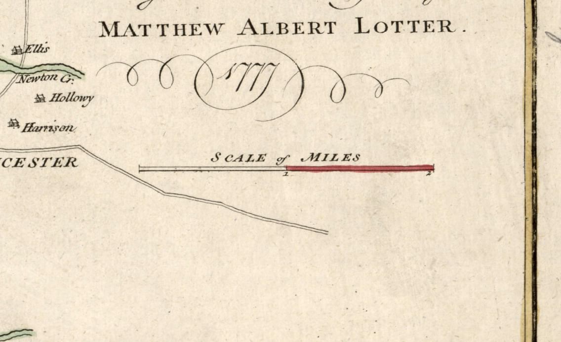
1:00 Closer look at that charming city plan of Philly from 1777
1:25 Danielle pops into the office not knowing I was recording
3:10 Quick large-scale/small-scale memory trick
3:50 Nod to the wonderful Moriarty Hand coastal linework
4:06 Adding a scalebar to a layout
5:36 Customizing the scalebar’s label
6:10 Setting up major/minor divisions
7:20 Choosing where, and how often, division distances are labeled
9:55 Assigning a different font for distance labels
11:00 Setting up the division marker lines
12:45 Controlling the appearance of the alternating bar graphics
13:15 Assigning a different font for the scalebar label
14:00 Nod to Heather Smith’s Woodcut font
14:08 Nod to Warren Davison’s Old Hand 1850 font
14:17 Nod to Sarah Bell’s Bell Topo font
14:33 Boosting the scalebar title’s letterspacing (you can almost never have too much letterspacing on a map)
16:10 Did I just sing ‘goodbye?’ Yes I did; voice of an angel
…
0:00 Spot-on impersonation of Wesley Jones and nod to his YouTube channel
0:30 A survey of our design goals while looking at the reference scalebar
1:00 Grabbing a background paper texture, just for context, under our scalebar
1:48 Pulling in my favorite layer ever, a big dumb global rectangle, and giving it the paper texture
3:50 Digging into the scalebar title’s appearance to make it nice and inky
3:55 Quick description of the glorious convenience of styles in ArcGIS Pro
4:28 Text is just another polygon; how to style that polygon
4:58 Adding a symbol effect (wave)
6:20 Tweaking the text color (including transparency) with the color editor
7:20 Stacking up semi-transparent symbol layers
9:10 Saving all that work as an embedded symbol so I can easily re-use it elsewhere (styles rule)
9:30 Applying the embedded symbol I just saved to to the distance labels (big time-saver)
10:40 Giving the bar symbol an old-time print look with wave and dash effects (and semi-transparent symbol layer stacking)
12:30 Closer look at the dash effect and how to use it
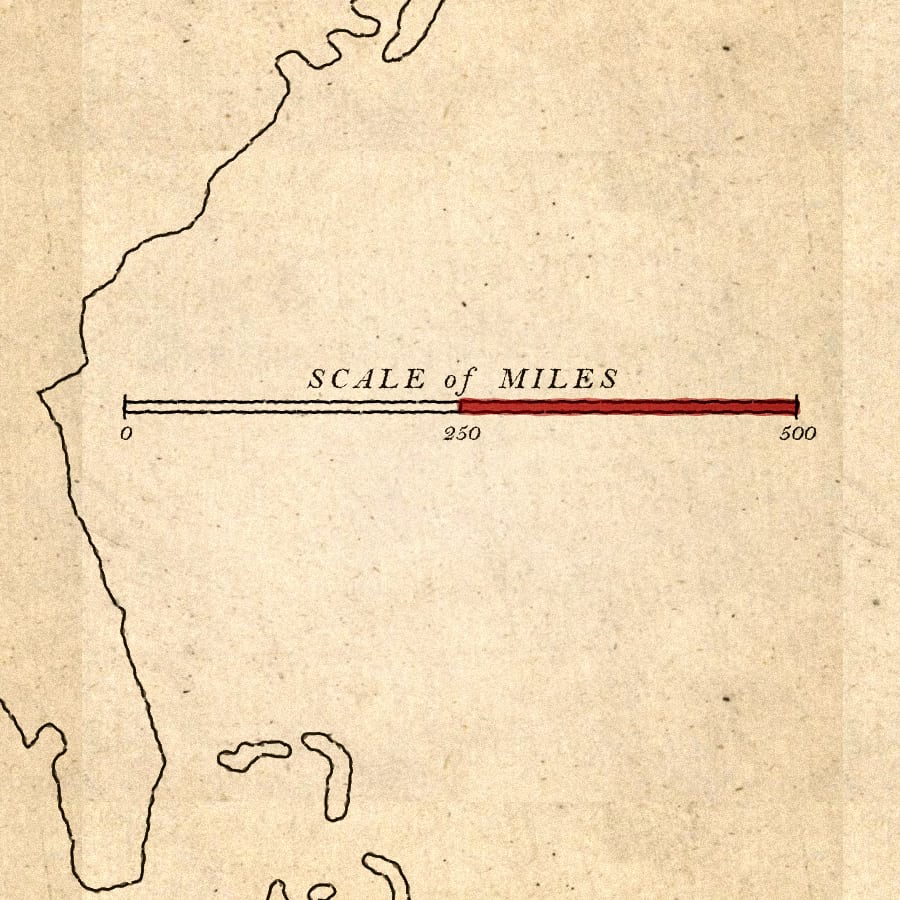
16:25 Approximating that hand-tinted (semi-transparent fills, random waviness) appearance for the red bar
18:00 Getting that wabi-sabi, thick brush spillover, hand-tinted look with the offset effect
21:28 Last but…well maybe least…styling up the division mark lines
22:41 Now you can save this scalebar to a style and use it over and over forever!
Looks like this…
And that is that, my map friends! Dive into the symbology options for scalebars and, shoot, while you’re at it, try it out on north arrows! And neatlines (I guess)! And share all that coolness with the mapping community by saving them to a style and sending them off into the world!
Love, John

Very nice job!
Hey thanks Alex! I hope it’s helpful…and fun.
Always a pleasant way to learn new cartographic tricks. I really like this scale bar! I appreciate that you also give credit to resources and people that inspire you.
Thank you, Jeanette! Citing influences is one of my favorite things. It’s a generous community and I benefit so much from the creativity and process-sharing of others. Even those who did their thing a couple hundred years ago. I have, in the past (and probably continue to) forgotten one of the influences of a map I’ve made and it can cause hurt feelings. So I’ve doubled-down on citing anything I can think of that went into the imagining/making of a map. And why not? It’s fun to cast a wide eye across all the cool makers out there.