Here’s how you can make the classic National Geographic sort of political style map, with inner tint band ribbon buffalo tint things, AND ensure no colors touch each other. We’ll use way more tools than you think and rely on a hotly contested mathematical theorem!
All from the comfort of ArcGIS Pro.

Here’s a closer look at the three component’s we’ll be styling up: an inner tint band of color (aka Buffalo tint), a thicker semitransparent band of color, and a dotted border line.

Buckle up, it’s time to get political! With our map styles…
0:00 Politically correct introduction
1:03 Behold! The donut symbol effect!
1:48 Color theorem calculation time
3:10 Unique value symbology
3:20 Hacking the “Favorites” style for quick symbol bashing
5:13 Customizing an individual color
5:24 Duplicating and modifying a layer
6:21 Setting a reference scale
6:42 Polygon to line, and topological integration insurance
8:40 Customizing a dash pattern
And that’s how you can make a handsome political-style map in ArcGIS Pro. But wait, there’s more!
- Don’t want to convert polygons into lines for that dotted border? Use the Set Control Point At Intersect tool in the cartography toolbox (thanks Craig Williams!).
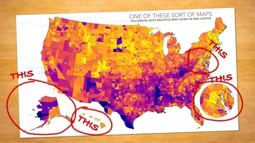
- Now that you have a political style map, here’s how to construct an ArcGIS Pro layout with Alaska and Hawaii insets.
- What about ArcGIS Online? Russell Roberts ported this style to the web and used the Inset instant app to nestle Alaska and Hawaii within view.
Happy political mapping! Love, John

Article Discussion: