There are a lot of things to consider when you assemble a map into a layout, but here are three overarching things to consider:
- A well-balanced composition. The map and all the other elements have a visual weight. A good looking layout will balance these items, like you’d balance plates on a cafeteria tray.
- Organized and distilled text. There’s a discipline to refining, referring, or omitting, what might otherwise be giant titles and paragraphs. A good layout does more showing than telling.
- Simplified surrounds. Sometimes an austere eye is needed to appropriately design, or delete, the non-map doodads.
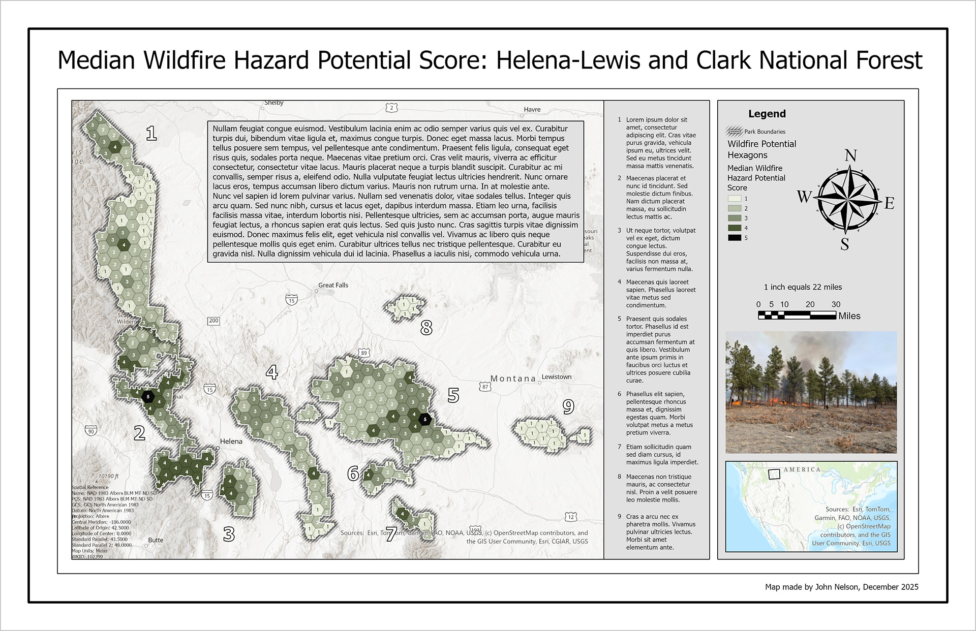
Here’s an example layout that has some issues.

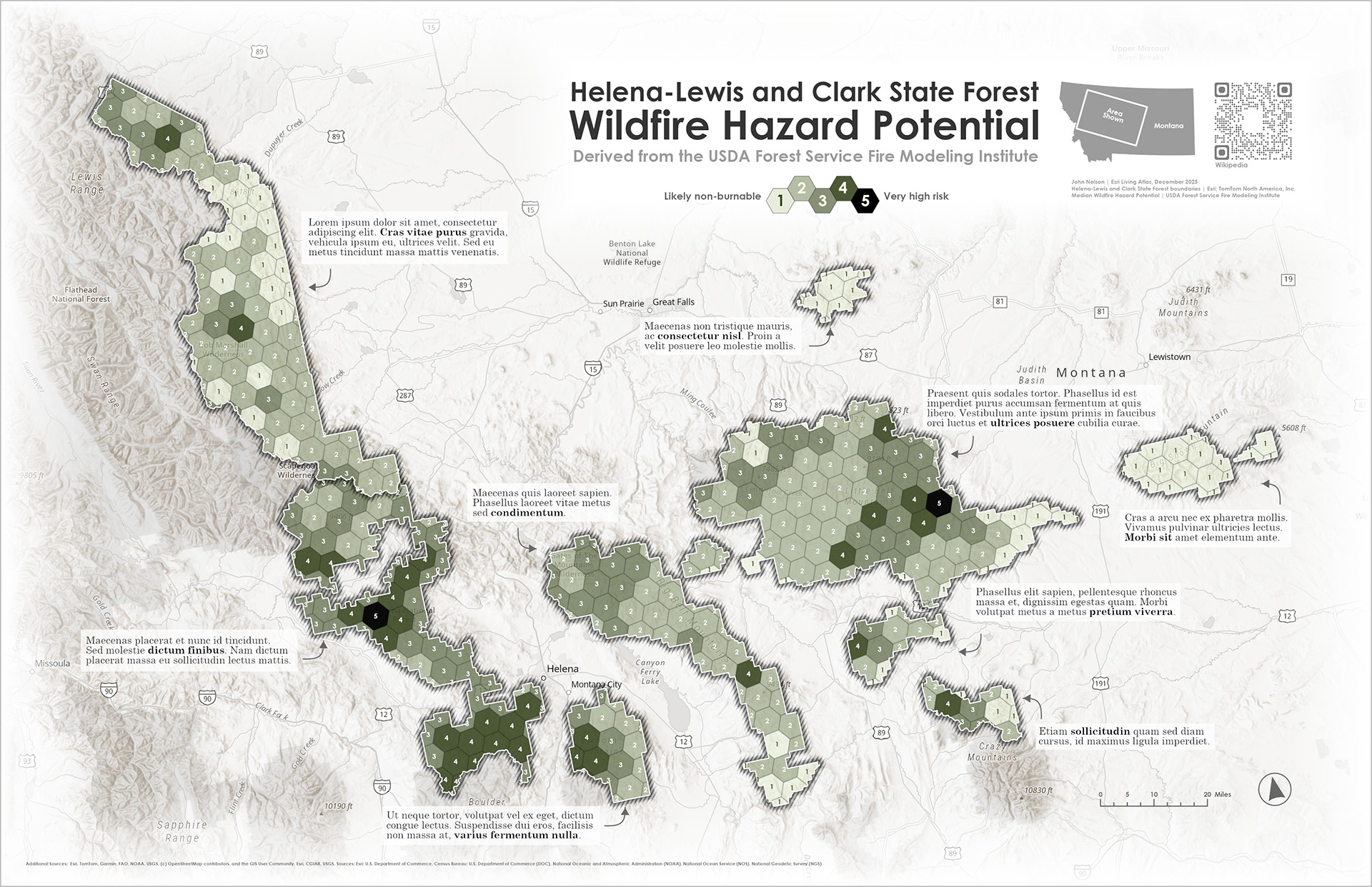
Those issues have been addressed in this update.

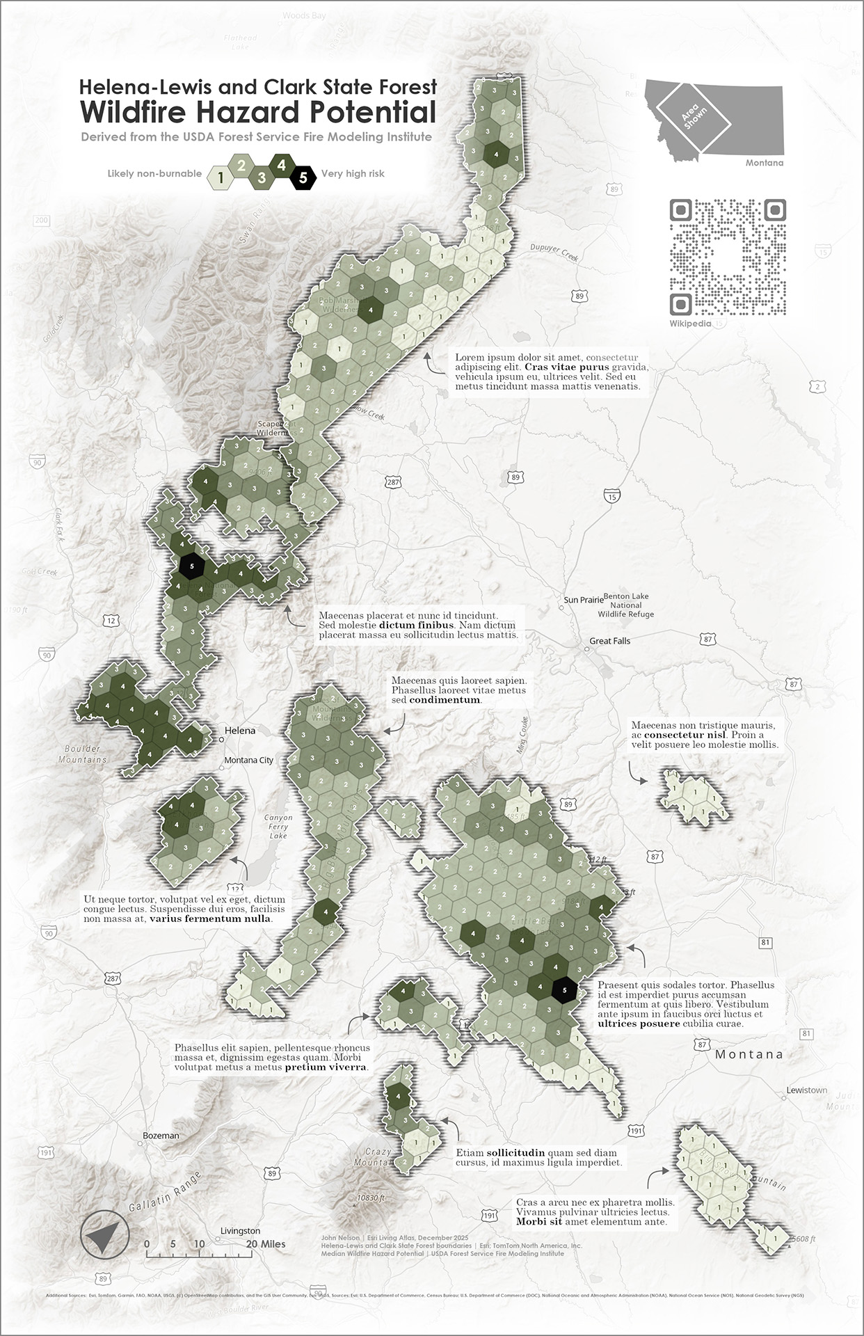
And here it is in a portrait orientation.

You can download this source ArcGIS Project package to take a closer look.
Of course, there’s no one right way to make a map, but you’re looking for a little bit of guidance, here are some ideas to consider that might take some of the guesswork out of a potentially challenging process.
Balance the composition
•Prioritize map size
•Area of interest best fit = layout orientation
•Area of interest breathing room
•Use surrounds as balancing agents
•Use layout guides
Organize & Distill text
•Only key words as title
•Secondary context as pre-title and/or sub-title
•Eliminate, distill, or defer copy
•Integrate annotation (selective bolding of key ideas)
•Professional attribution
Simplify the surrounds
•Remove unnecessary borders, backgrounds, and neatlines
•Simplify the legend (or integrate it into the title or chart)
•Simplify the overview (regional polygon, no basemap)
•Simplify or remove north arrow (smaller than your thumb)
•Simplify or remove scalebar (whole numbers, logical divisions)
•Remove photographs (or remove their backgrounds)
Here’s a video where I walk through the original layout’s design issues, and assemble a new layout given the above considerations…
0:00 Self-conscious introduction
0:37 Three key concepts for good layout design
0:45 Deconstructing a not-so-great layout
3:53 Recommendation list for layout design
4:17 Layout guides…rule
4:52 Full bleed map with vignette
5:35 Balanced like a cafeteria tray
5:54 Hierarchical title
6:58 Simple legend
7:51 Crispy overview
8:20 Show it, don’t say it
9:00 North arrow (and scale) rule of thumb
9:42 Embed rather than segregate
10:33 And in closing
Happy layouting! Love, John


Article Discussion: