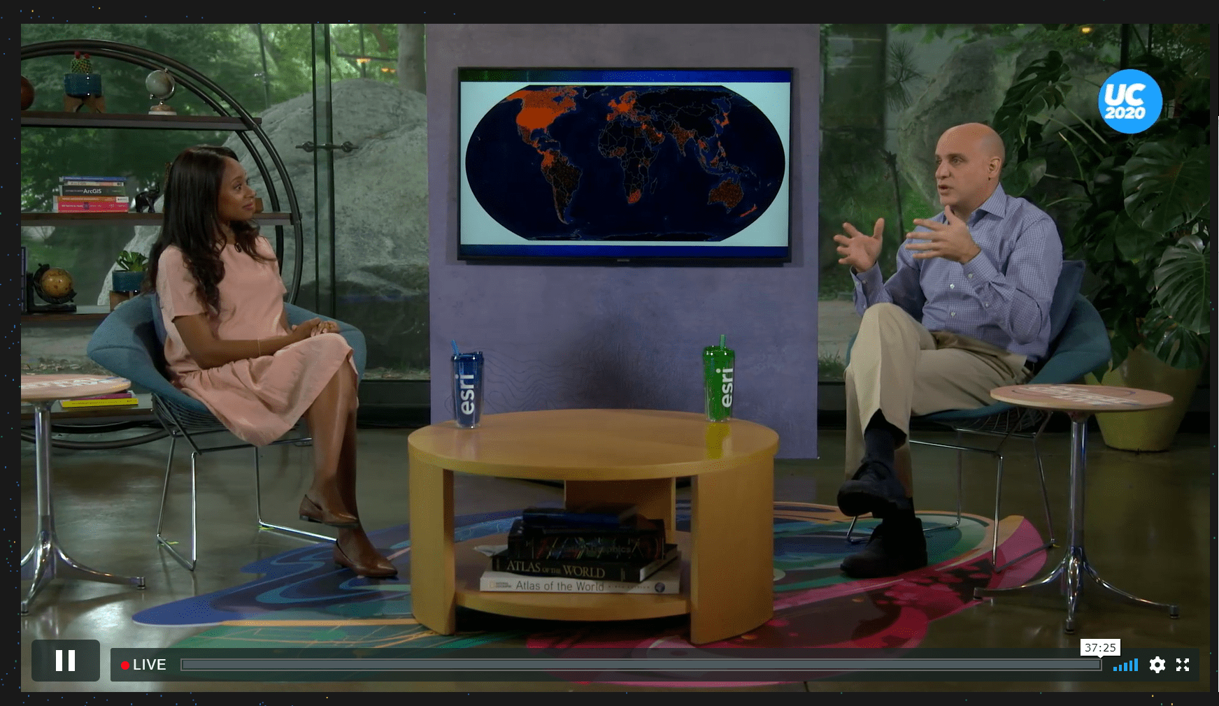
Like many events in the past year the 2020 Esri international User Conference went virtual. For many Esri staff it meant learning a whole new set of skills to prepare and deliver content online, and there were also some interesting peripheral activities that many were engaged in. For me, it included taking part in UC Central – a live tv style programme. And as part of that I made a map.
Except I didn’t have days or weeks to make the map. I got data at 9pm one evening, and had to deliver the map before 6am the following day.
In this blog I’ll explore some of the decisions I had to make rapidly, and the difficulties of wrestling with a dataset that contained a really difficult outlier. Maybe you’ll not have to make a map to such a tight deadline (though many in the journalism profession in particular will be familiar with the constraints) but some of the decisions I took might help whatever your deadlines demand.
The task was simply put: to make a map that can be shown on a large flat panel tv behind the presenters, and possibly shown full-screen, that showed the countries from where all the UC attendees were joining in virtually. The context, and narrative of the map was to illustrate the global reach, and interest that the UC had attracted. And bear in mind it was likely only going to be on screen for a few seconds so it needed to be immediate and obvious.
UC normally has around 15,000+ attendees in San Diego every year. Going virtual, and under the constraints of the coronavirus pandemic meant a virtual attendance of 70,000+ made up of those that registered for the whole event, and those that watched the plenary streams. The map needed to be of the world, so small-scale. And it needed to be made fast. Grab a coffee and…GO!

The data was sent to me as an excel file with each row being an anonymized attendee with two columns which would help me geolocate them, namely a column that identified the country, and a column that identified a city, town, or other relatively localized place.
It soon became apparent that the local level information was inconsistent and would take far too long to investigate or fix, and so I was left with just the country. Often the data you have dictates the limits of what you can do with it, and there was no going back to the supplier in this instance. The first decision was therefore made for me. This was going to be a map of country-level data, and the best I could muster was a sum of the number of attendees per country.
Before I got going with map design decisions the inevitable data checking and cleaning had to take place. Were country names consistent? No, of course not. Rarely are data nicely sorted and cleaned. More than that, was the country name formatting consistent, and the same as the various codes I had in my country feature layer I’d be using? No, of course not. A quick sort of the data in Excel and typing in a consistent country name, and copying down sorted the first problem. There’s likely a more elegant solution for this but the clock was ticking and this was good enough.
Given the second issue isn’t uncommon I also have a lookup table on hand that can link all sorts of admin level codes, alternate country spellings, and abbreviations. I joined the cleaned data to the lookup table in ArcGIS Pro which gave me a table of data with just over 51,000 rows. But wait, was there a problem with the data? If there were 70,000+ attendees where had I lost 19,000? At nearly midnight I had no way of finding out whether the data was missing or the file was partial so I cracked on into the small hours. More coffee.

Next decision was to decide whether to make a geographical map, or some sort of graphical map such as a gridded cartogram. This was an easy decision. There simply wasn’t time to begin making something too complicated in terms of production steps. I didn’t have time to make a map as an experiment, spend time tinkering only to have to jettison, and begin again. This was going to have to be a good ‘ol geographical map. You know, the sort that people find far easier to read immediately in comparison to some of the more graphical map types I often make for thematic data.
I joined the summed attendee data to a national boundary feature layer using ISO 3166 three-letter alpha-3 codes. Ready to map!
The display the map was to be shown on was a flat panel screen with a 16:9 ratio. Next decision was therefore what map projection is both suited to the display of thematic data, and what works for a 16:9 ratio. For thematic data the special property of the projection should (always) be equal area. That simply means whatever else is distorted, the size of areas across the map is maintained relative to one another.
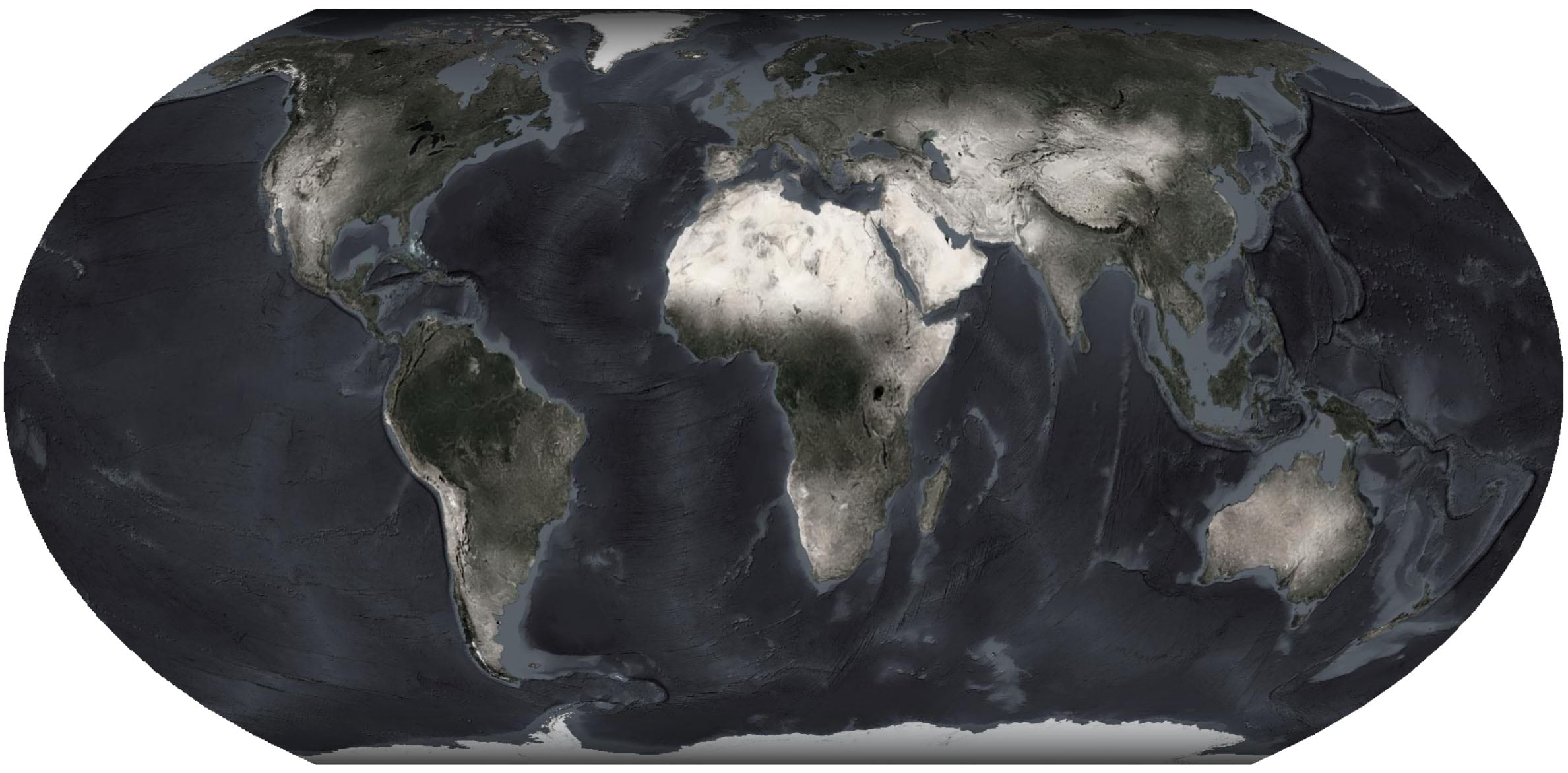
This is important for thematic maps to avoid an over or under emphasis that might be caused by a projection that doesn’t preserve areas. I chose the new(ish) Equal Earth Projection because it not only preserves areas, but delivers a well-balanced appearance.
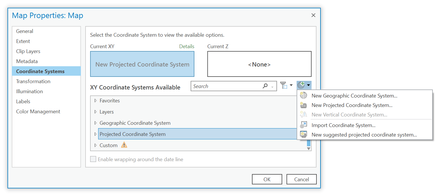
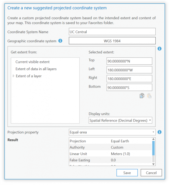
If you’re unsure of what projection to use for your study area or map requirement then fire up the ArcGIS Pro Create New Suggested Projected Coordinate System dialog which will guide you to a good decision. In this case, it’s small scale and a world extent, and I wanted equal-area as the property to preserve. I also shifted the central meridian to 11° East to avoid the antimeridian clipping at 180° and leaving that pesky piece of Russia floating on the left hand edge of the map when it deserves to be merged with its main landmass on the right edge. This decision took no time at all and is worth the effort.
Now to map the data? Not quite…
What sort of overall design should I consider given the mode of delivery? The screen would be a HD OLED type which delivers high contrast ratios, and saturated colours. It isn’t back-lit so it delivers visible light and can display very deep black levels. This led me to decide on a dark background which would also suit the set of the TV programme.
Whatever map symbols I eventually chose would be bright and colourful on a dark background. If this were a map to be projected onto a screen I’d likely have gone with a light background and dark symbols. With no time to make my own background basemap I simply looked at the basemaps in the Living Atlas of the World and brought Firefly Imagery Hybrid and also the Nova Map into my ArcGIS Pro project. I could delay a final decision until later but I was after a basemap that had barely anything other than the general shape of the countries. I didn’t want borders, or labels or anything else to clutter the image. There was no need for that sort of detail for this purpose and viewers wouldn’t be able to read them anyway as the display would likely only take up 10% of the real estate on camera.
Now to map the data? Yes…
OK, head to the default – a choropleth (graduated colour) map of attendee rates. This is a per capita map of the data (note, showing raw counts on a choropleth map skews the visual perception of the pattern of the actual data so totals can’t be mapped using this method).
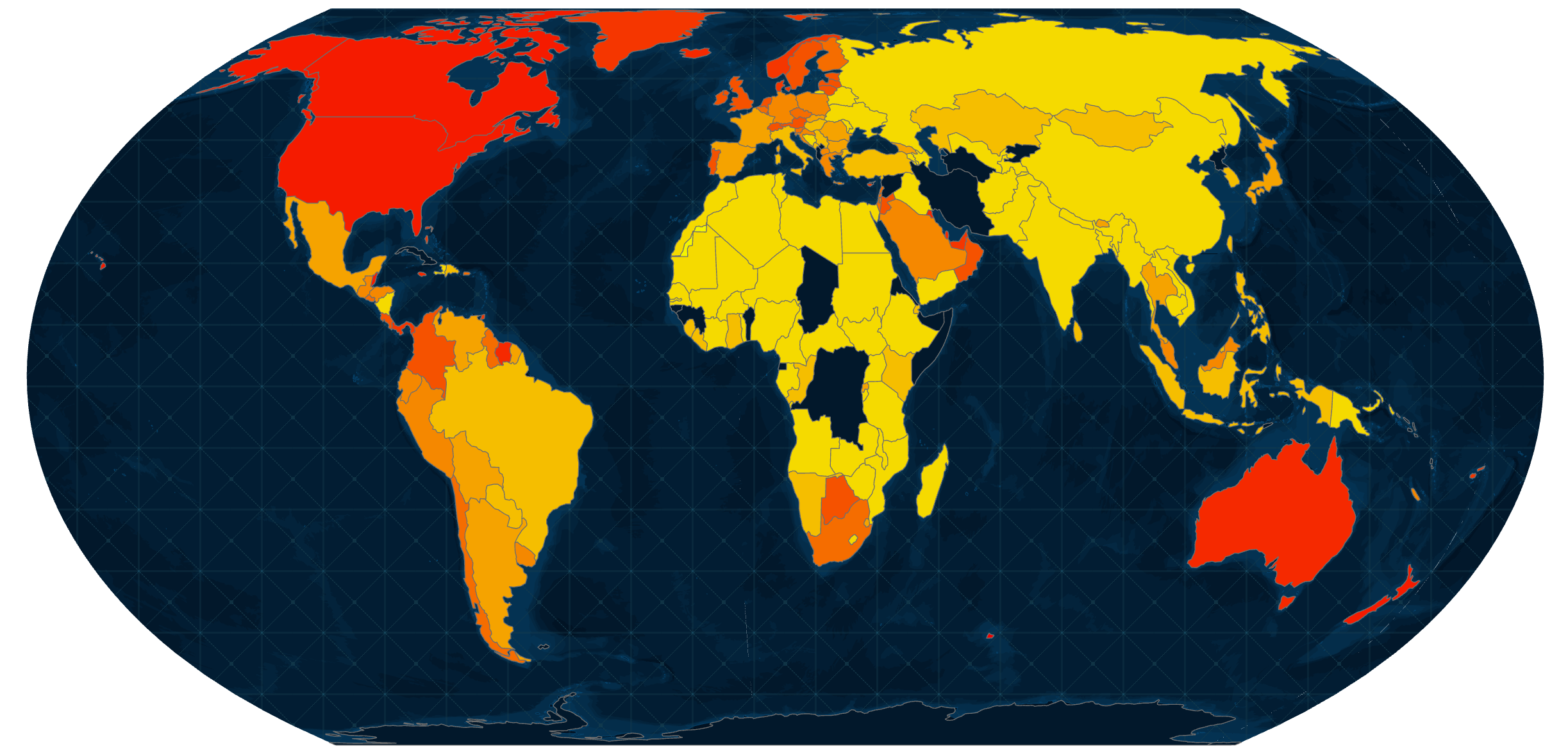
Woah, step back a moment…what exactly do I (pondering what the producers want to show) want the map to show? Is rate of attendance the critical message here? I doubt it. In fact, raw totals is probably a more useful metric for the presenters to discuss so I rejected a choropleth map almost immediately for this, and a few other reasons.
At a country level the number of attendees from the US is one big, humungous outlier in the data. Around 67% of attendees were from the US. This is perhaps not surprising but causes headaches when trying to classify data into meaningful classes on a choropleth map to support the comparison of rates of places across the map. The US would really need to be in a class of its own but a choropleth map wouldn’t easily show the extent of the gap between the US attendee numbers and the next closest which happened to be Canada, with seven times fewer attendees and 10% of the overall share of attendance. Though bear in mind the US has a much larger population which is why, on the per capita map above the US and Canada look the same.
There’s also an eight-fold gap between Canada and the next highest country, Colombia, at just over 1% of total attendees. Many countries had low three-digit numbers, and even more were double or even single digit. Yet these are weeds into which the presenters are likely neither going to, or want to, veer into. If the map needs explaining on screen it’s failing.
This was a monster of a dataset to try and map. It doesn’t follow a normal distribution. It’s highly skewed, and it contains wild outliers. This was my problem to solve and make something that made visual sense.
With a choropleth disregarded for these reasons, and the fact that a map of totals told the story better, the most obvious choice of map type would be a proportional symbol map where each country gets a symbol (e.g. a circle) which has its area sized in relation to the data value it represents. They’re generally a decent choice and work well on world maps. So here goes…
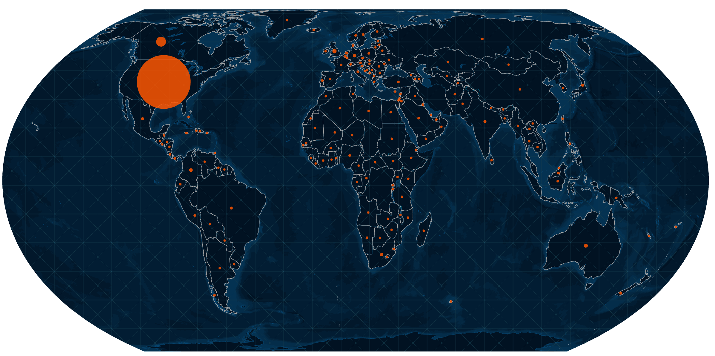
Hmm…that’s not a particularly interesting looking map.
With most countries having just single or double digit numbers the map would appear to have measles, with a solitary large symbol representing the disproportionately large number of US attendees. This is simply a function of the linear scaling of data values across symbol sizes. I could easily counter this problem by using a logarithmic scale for the data values which has the effect of rescaling data to approximate a normal distribution, and visually at least the map would appear more balanced. Like so…
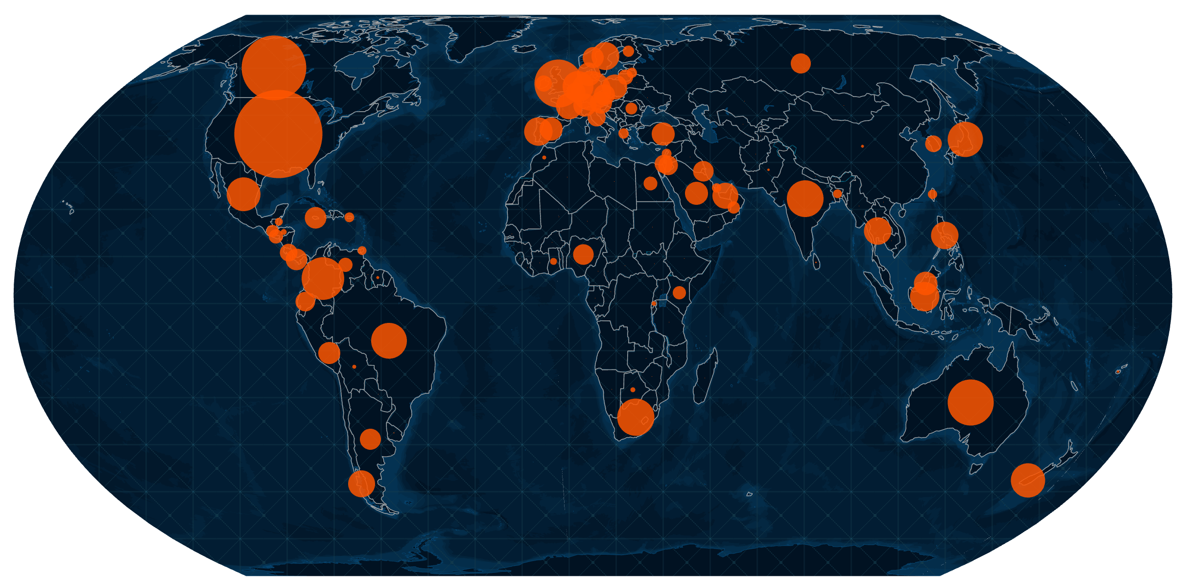
Except this introduces more complex visual processing that requires the map reader to understand, so that they can properly interpret the symbol scaling. It really needs a legend, and that wasn’t an option for this display. The hosts were not going to go into any level of discussion about the vagaries of cartography with this map. Over-thinking it is to the detriment of the simple message it needed to convey.
So, the proportional symbol map was jettisoned. But there’s always another technique to consider.
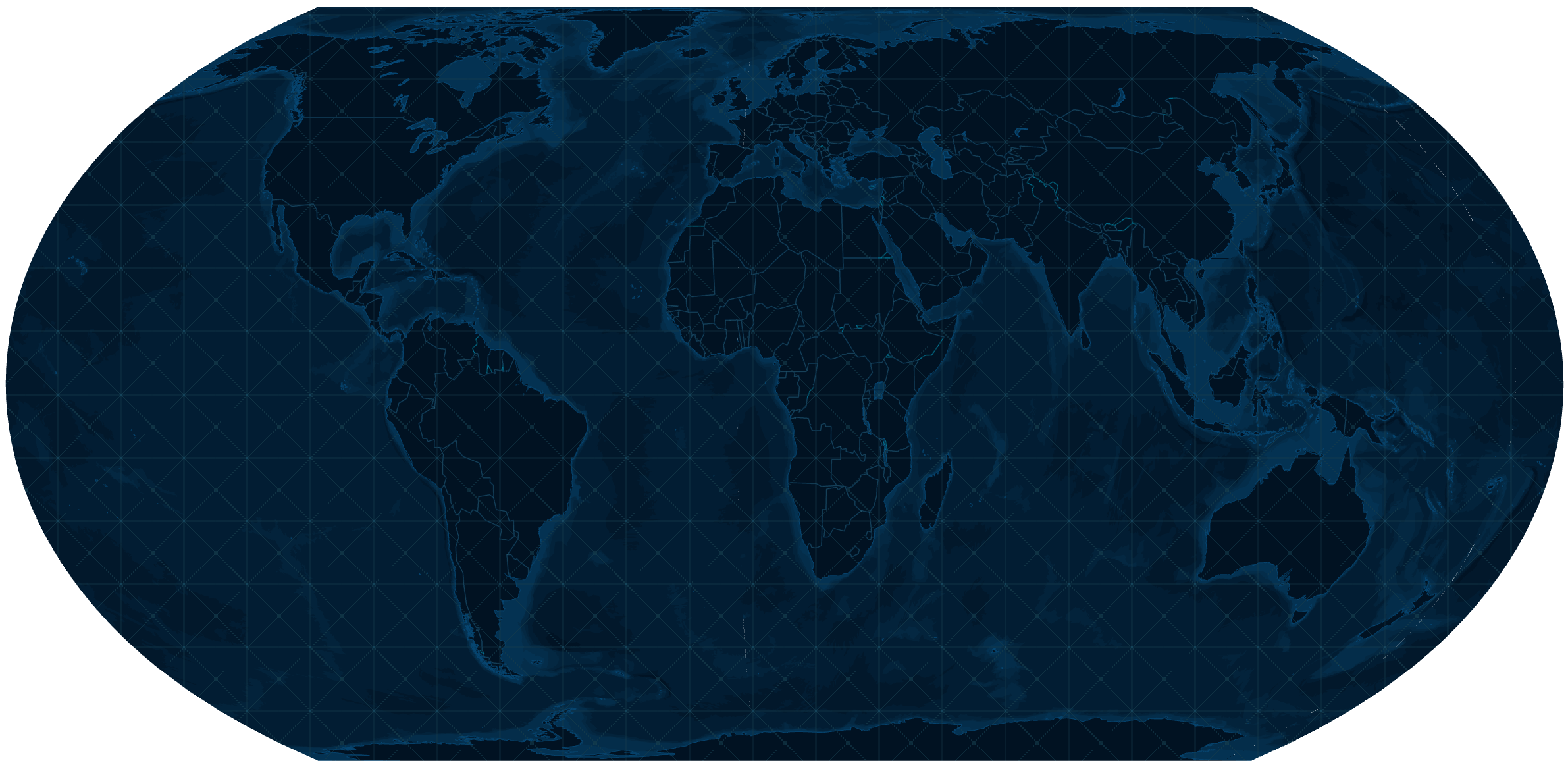
Enter the dot density technique. It’s a great technique for exactly the scenario I had. Each dot is given a value that represents a multiple of the data, or, alternatively, a single dot can represent a single attendee. I can literally put every attendee on the map which is what I ended up doing using a fire red 2pt dot with 40% transparency. The transparency helps mute some of the sparse areas a touch, while allowing areas with many dots to coalesce to an extent, and create more of a glow of intensity. The technique naturally gives the map a sense of the density of the data for each area. In this case, the density of attendees per country:
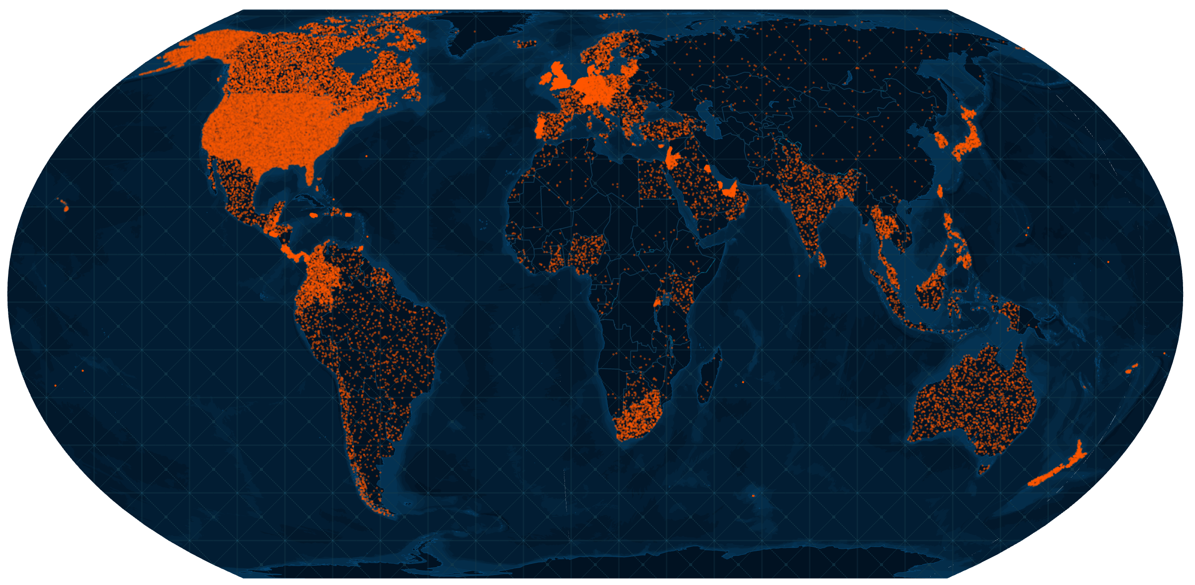
It allows countries with only a few attendees to be seen, while not having the US and Canada be so overtly dominant. They are dominant, of course, and showing the large number of attendees in the US and Canada is important to the map, but variation, and magnitude among other countries can be seen. Additionally, small countries (e.g. Belgium, United Kingdom, New Zealand) which often look lost on world maps shine like a light as their dots coalesce to create a small cluster.
Dots are randomly positioned and don’t show the location of a particular individual. At small-scales it works really well to show the overall density of a dataset and deals quite well with the problem of outliers. It also deals well with the impact of differently sized areas and the impact that has on our visual interpretation of the data. Far from many small countries having a small number of attendees, the map illustrates the distribution of non-US attendance better than alternative maps.
Of course, no map is perfect and given I was using country level totals the sparsely populated state of Alaska gets the same density of dot distribution as the contiguous lower 48 states. For the US, I did have data disaggregated down to state level and created a version of the map where the US was shown at state level while everywhere else shows country level:
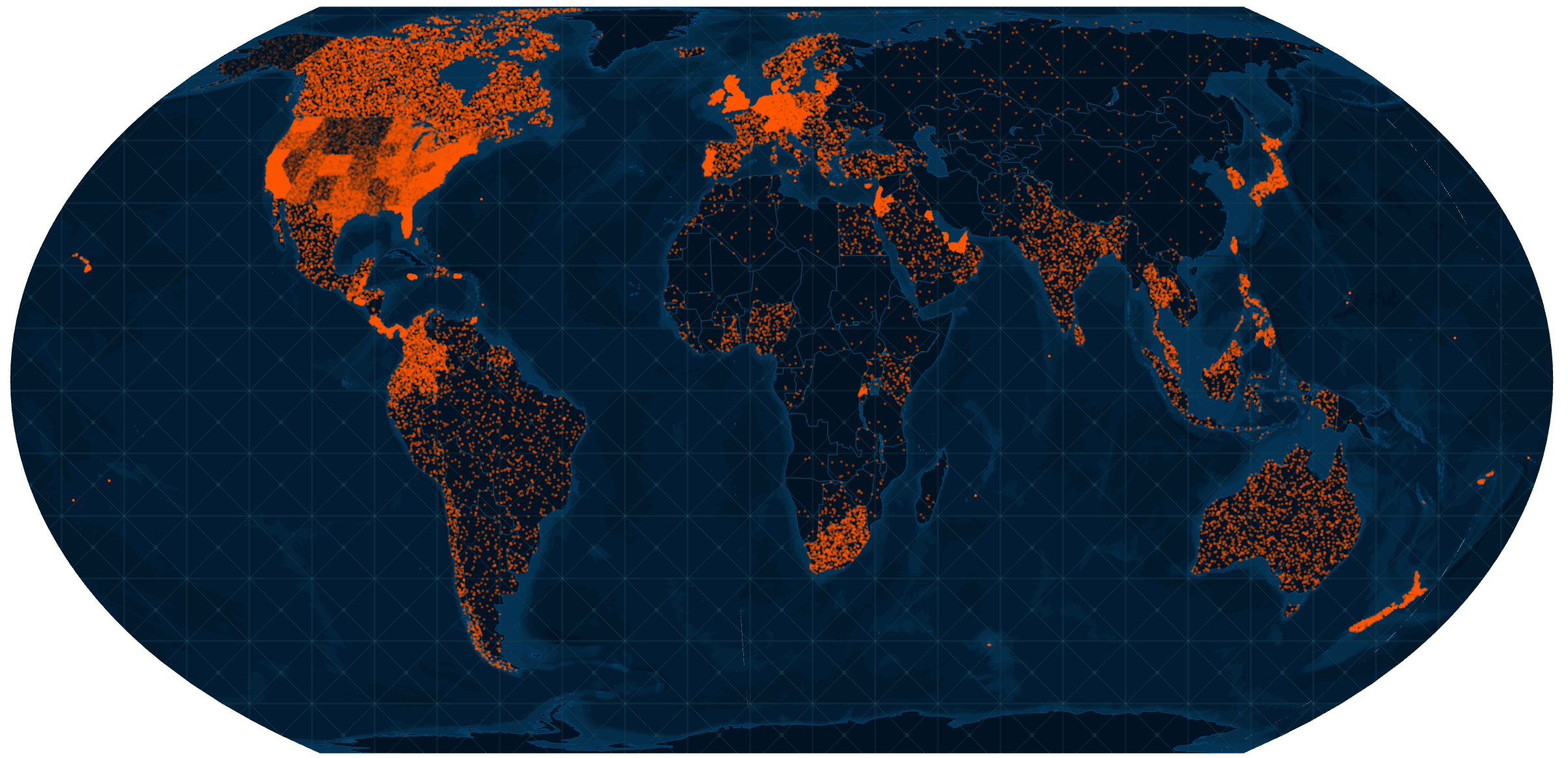
I don’t like mixing geographies in this way as it can create confusion. For instance, Canada with it’s even distribution of dots is juxtaposed against bordering US states that are at a finer level of geography. It just doesn’t seem to work. Leaving the US as a single value and evenly distributing dots regardless of state was a compromise I felt was acceptable for this particular use. If the map was only going to show US attendees then of course, state level works. And beyond that we might even get into dasymetric techniques.
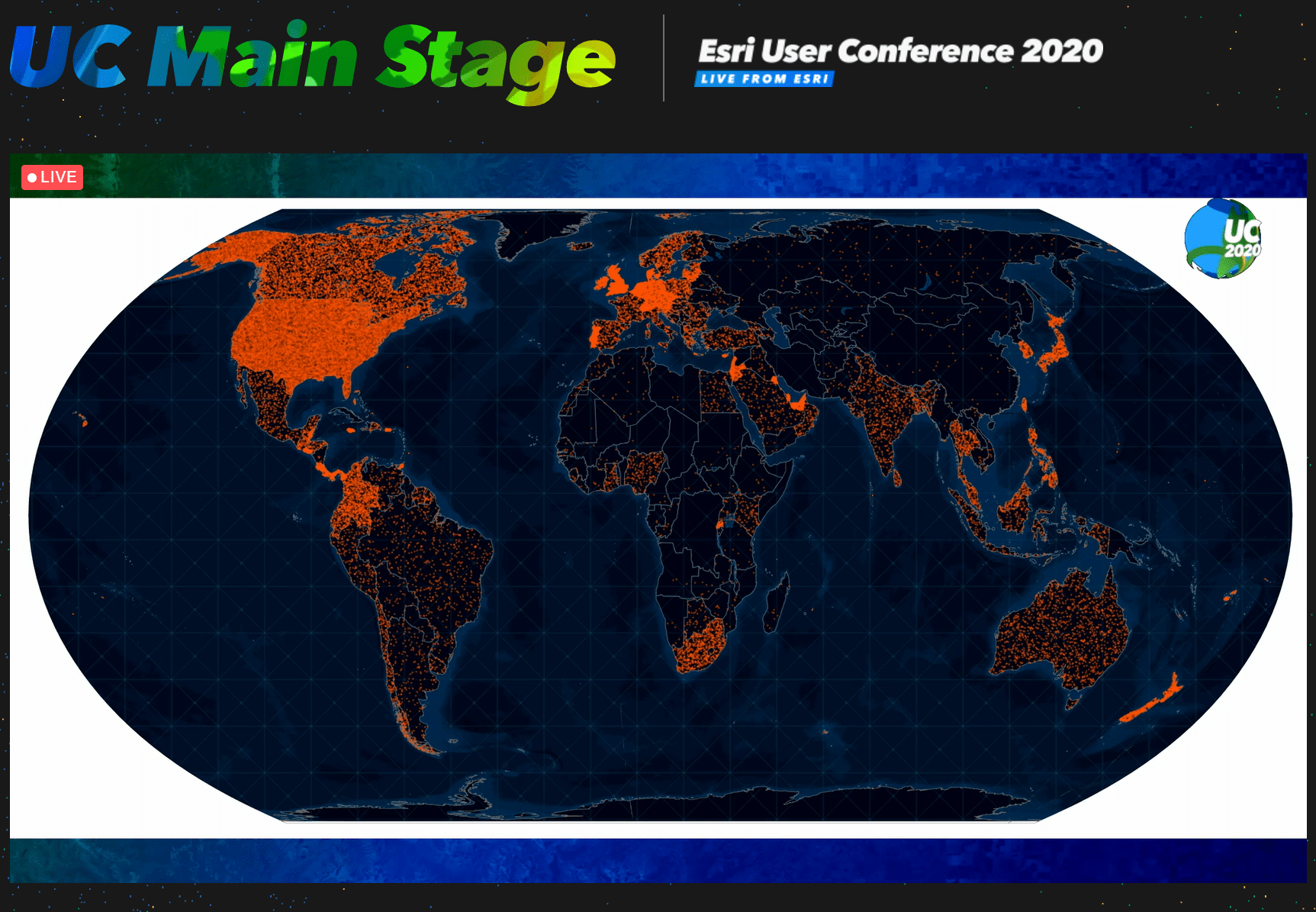
And at around 2am I exported the map to PDF. I sent one version for each of the two basemaps. And at around 8am the UC Central programme went live. The producers had gone with the Nova map version and here’s the map, on screen for about 12 seconds including a close-up!
So with a small amount of time I was able to fashion something that balanced the competing needs, the circumstances in which the map was to be shown, and viewed, and make it intelligible without making it cumbersome to read or interpret.
Maps often need to be made to very short order. You simply don’t have the time to finesse or experiment. Sure, given a week and a different set of circumstances I would almost certainly have designed it differently but for this map…job done, and only one thing to do. Have a morning coffee and take Wisley the dog for a walk.

A couple of final thoughts.
Firstly, whatever happened to those 19,000 attendees that were seemingly missing? It was a simple explanation and was the difference between the registered attendees (the data I was sent) and those who signed up to watch the plenary streams.
Finally, sometimes giving yourself a tight deadline sharpens the mind and helps lead you to a good final product. It may not have all the hallmarks of a masterpiece that took forever, but not all maps need to be long-term projects even if you have the time to spare. Even simple, quickly produced maps, done well, can suit the short-term purpose for which they are designed. They shine bright for a short while, then they’re gone (until they reappear in a blog!).
Happy mapping!

Commenting is not enabled for this article.