How many maps can you make using a single dataset and single theme of population based data? For many, the ubiquitous choropleth (graduated colour) map might be the only real solution they’re aware of. It’s common. It’s well understood. It’s an obvious choice.
But there are other choices available and while I can’t definitively answer the question I just posed, it’s worth thinking of the different options as part of the map-making process. I built a gallery of maps for the 2012 Presidential election and, I’ve just updated and expanded it (with a couple thrown into the mix by John Nelson) and created a new gallery for the 2016 Presidential election data to showcase 30 (and growing) different techniques.
What’s the point?
Simple. To shine a light not only on the fairly common thematic mapping techniques but, also, to showcase the wide range of alternative approaches that might enable you to tell a different story. Put simply, fitting your data into a specific thematic mapping technique and expecting it to fulfil your needs is not necessarily going to work. Thinking about the story you want to tell alongside the benefits and drawbacks of different techniques will give you a way to make a better choice and to make a smarter map. Sure, you may end up making a positive choice to use a choropleth map, and that’s perfectly fine. But let’s at least explore alternatives so you can make that choice from a deeper understanding of the options available.
For each of the map types in the gallery there’s a detailed information panel which goes into the pros and cons of the technique. It explains how a map reader will be decoding the way the information is presented and if we understand that process we can design the map to take advantage of its benefits and to hook key messages off it. It also helps to appreciate how the map can be misread and, again, some of the pitfalls of different techniques are highlighted. There’s context too, such as what you may need to do with your raw data to make the map work properly. Or, perhaps, there’s some very specific considerations for the colours or symbols you might use that can optimize the message or, at the very least, avoid ambiguity.
Let’s focus one one of the maps…
All of the maps have been created using ArcGIS Pro. Some are out-of-the-box and use standard renderers. Others have involved some data processing to get to the final result. Let’s focus on one of them…a dasymetric dot density map.
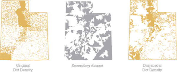
A dot density thematic map represents quantitative (numerical) data by using dots to show the amount of the mapped phenomena. Each dot is assigned a specific data value and the sum visual total of the dots tells us where there is more or less of the mapped phenomena. The ‘dasymetric’ moniker means we’re taking data collected and usually shown at one spatial unit, and re-allocating it to another spatial unit. It’s a spatial manipulation of data into a different geography, a disaggregation of data into more natural geography and one that reflects a truer distribution of the phenomena being mapped. It’s a technique developed over 100 years ago by Benjamin (Veniamin) Petrovich Semenov-Tyan-Shansky, though unfortunately rarely used today because it requires just a smidgen of effort. In the following illustration the left map shows a typical dot density map. The middle layer is a secondary set of data. The final map, on the right shows all those dots reallocated to the new areas. As an aside you can also create dasymetric choropleth maps.
In 2012 I made a similar map for the Obama/Romney election. It was made using ArcMap and a product of the web mapping technology of the time. At the smallest scale 1 dot = 1,000 votes. At the largest, 1 dot = 10 votes and if you printed the map out it would be as large as a football field. It took me 3 months to cajole the largest scale map onto the web (I lost a lot of hair in that process but I did get it to work)!!!
I wanted to update the map, and the four intervening years have also brought new software capabilities. For 2012 I had to generate up to 12 million points and position them. Now, using ArcGIS Pro I can use the dot density renderer and let the software take the strain and if I were going all out then why not try and make a map where 1 dot = 1 vote and put 130 million dots on the map. So the map is a technical challenge, a way to demonstrate the improved cartographic capabilities afforded by ArcGIS Pro, and I’d not seen a 1 dot = 1 vote map attempted so why not!
The secret sauce…
So how to make the map? Well, it’s a product of a number of decisions, each one of which propagates into the map. In summary, I needed to move data values held at one spatial unit (in this case counties) and reapportion it to different areas. I was also going to ensure I adhered to the pycnophylactic reallocation modelling technique developed by the late Waldo Tobler, that is I needed to ensure that the quantities of data I was transferring from one set of areal units was the same in its new configuration.
When you think about counties, they exhaust space yet people are not distributed across space in the same way. We live in cities or other urban, semi-urban or rural communities. In between is a lot of emptiness…trees, mountains, deserts and last time I looked coyotes and rattlesnakes don’t get a vote so why make a map that visually emphasizes geography and, at the same time suggests, visually, some homogeneity across space. Why not map the data using areas where people live instead of the rather arbitrary administrative units used to collect, sum and report data? The point of a dasymetric map is to show where people live and vote rather than simply painting an entire county with a colour which creates a map that often misleads [as an aside, Waldo sadly passed away recently and I was running the model when I heard of his death. I met him a few times and his legacy to computational geography and cartography is immense].
I used the National Land Cover Database to extract urban areas. It’s a raster dataset at 30m resolution. I used the impervious surface categories and extracted those to a new raster dataset. Since 30m resolution was way too detailed for my needs, I resampled the dataset to 500m and, then, converted the raster dataset to a feature class where polygons were attributed as one of three classes: dense urban, urban, and rural. I then intersected this land cover polygon dataset with the USA counties election dataset and I had a feature class with all the information I needed to set about making the new map – land cover classes, county ID fields and area and the election results. Now for the data wrangling.
First, I calculated the area of each of my land cover polygons as a proportion of the area of all similarly classed polygons, per county. So for each individual polygon I now know what percentage land cover it is in relation to all polygons of the same land use class in that county. These proportions help me know how to reallocate the election data.
Now to reapportion the Democrat and Republican total votes at county level into the new polygons. There’s some weighting involved so the dense urban polygons get (in total) 50% of the data from the county total in which they are situated. The urban polygons get 35% of the data and the rural polygons get 15% of the data (remember, the weighting must sum to 100% so you don’t lose any data values during the reallocation). It’s a guesstimate on the density of population across different land cover types. So there’s a little bit of maths…lets work it through using the example below.
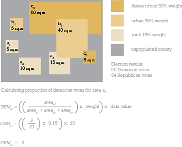
In this simplified example for a single county, there’s 2 areas of dense urban area totaling 55 sq miles. There’s 2 areas of urban totaling 45 sq miles. There’s 3 areas of rural totaling 30 sq miles. There’s a lot of the county that is unpopulated. Let’s concentrate on rural area a1, which is 5sq miles.
We divide that value by the total area of rural polygons (30 sq miles) then multiply by the weighting value (15%, therefore 0.15) and, finally, multiply by the data value we want to find a proportion of. In this case it’s 90 as we’re wanting to find out what proportion of Democrat votes from the county level need to be reallocated to area a1. And the answer is 2. So we now know that if we’re creating a 1 dot to 1 vote dot density map then 2 of the dots need to be randomly positioned in area a1.
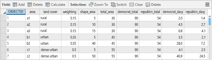
All of this calculation can easily be done in the attribute table of the feature class. It needs a few new fields adding and then simply use the field calculator to populate the new fields but it’s a simple process. What you end up with is a field that holds the number of Democrat votes which have been reallocated to the new polygons. Repeat for another column to calculate the number of reallocated Republican votes. This is what the attribute table would look like for the above example we’ve just worked through.
Making the final map…
Then I simply used the dot density renderer in ArcGIS Pro to draw the dots, one for each vote and with two variables mapped – blue dots for Democrats and red dots for Republicans and BOOM! – a map of the country with nearly 130 million dots. Well, not exactly boom…it took a few minutes to draw but hey…think about it, your computer is placing 130 million individual dots on your map for you. Give it a break…that’s a lot of dots!
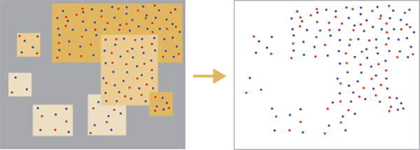
In our simple example from above you’d end up with the following and you’d remove the polygon boundaries and fill because they’re redundant in the final map.
And here’s the web map of the actual results. 130 million dots living in an online map that published in minutes!
The map pushes the data into areas where people actually live. It leaves areas where no-one lives devoid of data. It reveals the structure of the US population surface as evidenced through the voting patterns of the 2016 electorate. Most maps that take a dasymetric approach will all end up like this but I think there’s value in the approach. To me it presents a better visual comparison of the amount of red and blue that the standard county level map that maps geography, not people, and over-emphasizes relatively sparsely populated large geographical areas.
There’s a few things to keep in mind. With any dot density map, there’s always the potential for someone to read the dot’s location as a real location. When you’re mapping 1 vote per dot that danger is even more real. Remember, though, that the data comes from county totals. Each dot is positioned randomly according to the choices made in how to reallocate and what weighting to employ. You can avoid problems by not making your map zoomable to a very large scale. That way, individual locations can’t really be identified.
So, that’s a bit of detail on the dasymetric dot density map. But if it doesn’t do what you want then just try out a different technique. There’s plenty of thematic map types to go around. Check out the gallery and explore the rich variety of options.

Commenting is not enabled for this article.