Not all maps look the same. Even maps of exactly the same place can look profoundly different. This is perhaps no more pronounced than when you see a cartogram which, let’s be honest, pretty much destroys geography in order to try and emphasize some aspect of the thematic data it is trying to communicate. They’re also divisive, in the sense that people tend to either love them or hate them. We’ve even seen people argue over the relative merits. In the UK they’d be referred to as “Marmite” – a yeast extract spread with a strong, salty, savoury flavour often enjoyed on toast for breakfast. But people either love it or hate it. Well, you’ll be delighted to know there’s folks at Esri who love cartograms (admittedly there’s a few who don’t… no names!). Over the years there have been various scripts and tools built as add-ins to support their construction in ArcMap and ArcGIS Pro. But now they’re going primetime, and in ArcGIS Pro 3.5 (available mid-May) we are launching the first in a new toolset of cartogram generating tools.
Used for thematic mapping, cartograms are a particular class of map type where some aspect of the geometry of the map is modified to accommodate the problem caused by perceptually different geographies, such as the different sized areas on most choropleth maps. On choropleths, we have a tendency to see larger areas as more important, regardless of the variable being mapped, and this can cause confusion. Cartograms tackle this by modifying the geography itself, effectively normalizing the geography rather than the data variable to create a map where each area takes on a new shape and/or size based on the variable being mapped. Cartograms therefore depict geographical space diagrammatically as they lose their relationship with true coordinate system geometry.
Cartograms broadly fall into one of four categories: contiguous, non-contiguous, graphical and gridded. Each of which represent the mapped variable differently as Ken explains in the GIS&T Body of Knowledge. Dorling cartograms for example, which Ken has previously shared a Python toolbox for, are a form of graphical cartogram. These are symbol-based and more abstract.
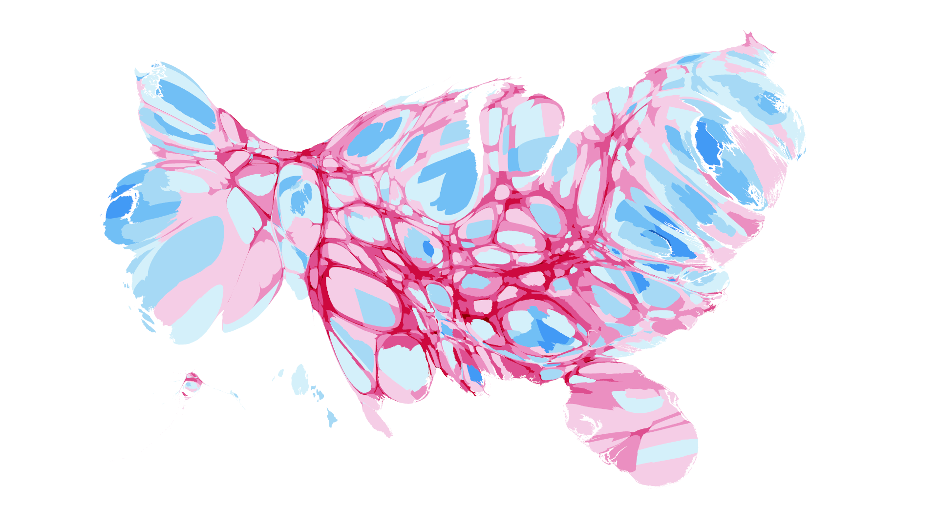
The first tool we have introduced with this new toolset is one that generates contiguous cartograms. These are maps where the sizes of polygons have been altered (contorted, warped, deformed, squashed, and stretched) to be directly proportional to a chosen numeric variable. Common examples include maps of population, election results, and gross national statistics.
Additionally, contiguous cartograms maintain the connectivity between adjacent geographical areas, i.e. neighbours remain neighbours. Preserving this spatial relationship while controlling the distortion to acceptable recognition was hailed as somewhat of a holy grail of cartograms until Michael Gastner and Mark Newman proposed the diffusion method of flow in 2004.

There are both benefits and drawbacks to these density-equalising cartograms. Whereas choropleth maps necessitate the conversion of data from totals into rates (e.g. percentages) to overcome the problems caused by different sized areas, cartograms are designed with totals in mind as the sizing of the output polygons negates any original differences in density. In fact, they don’t perform as well with rates because rates have already done the job of normalization.
Cartograms can also give a good impression of data distribution; the ability to identify patterns and trends, or to visually emphasize dominance, influence and relationships. Because the areas have been normalized, the amount of colour you see on the page or screen is visually comparable to all other areas. Your cognitive system doesn’t have to try and interpret large areas (possibly with low values) and small areas (possibly with large values but which are visually suppressed in the overall geographical map).
The drawbacks? It’s really just the loss of geographical fidelity, and the familiarity of a known set of shapes. We get quite wedded to the map as it exists geographically so to see it deformed can be a challenge (to the point of hatred apparently!). This issue becomes more acute the less familiar the geography is, or where data variables have such a large range that the distortion is too pronounced to be useful. It is for this reason that we’d generally recommend the use of labels as ways to anchor the newly distorted shapes to a reality that is known. When you see a label for a place you know, it helps decipher the ‘where’ of what you’re looking at.
So, how does the tool work?
The first tool we’re releasing in the new toolset is called “Generate Contiguous Cartogram” and can be found in the Cartogram toolset under Cartography Tools. There are very few parameters to be concerned about.
Simply choose the input feature class you wish to display as a cartogram and the numeric field you wish to size the output polygons by.

Choose a name for the new feature class the tool will create, and your preferred method of the two options available: Flow-based, and Diffusion.
These terms are based on the original work of Gastner et al. used as our foundation. Both methods adopt principles of fluid dynamics to resize and reshape polygons on a grid, allowing higher density regions to effectively flow into lower density ones, such that the areas become proportional to the chosen value while preserving topological relationships.
They differ in the choice of equations and the strategy used to perform the computation. The diffusion method reassesses more often the flux that controls the growing or shrinking of areas in order to complete the overall cartogram, while the flow-based method introduces smoothing of density variations (less and less as the process goes on) and linear interpolation to perform the transformations in small steps.
The detail of the two methods is somewhat immaterial… hit Run, sit back and give the tool a little time to process (hey, there’s some complex Maths and Physics stuff going on in the background!), and simply see if you like the result. Try the two methods. Pick the version you like the look of the most. It’s that simple.
Without any changes to your coordinate system or projection, the tool will create a spatial grid, then iteratively warp it to resize each polygon based on your chosen attribute while maintaining the spatial relationship and shared edges between them. Polygon boundaries are then drawn back in their new positions and you get your new cartogram feature class containing the transformed polygons. Existing layer symbology and labelling are retained.

Here’s a few more examples to whet your appetite and persuade you of the goodness of cartograms. If your output is single symbol and you simply want to add color to make the polygons more identifiable, then try the Calculate Color Theorem tool to help symbolize your data as we have below showing population totals for California. (Note the use of labels – they help right?)

To take things further, try using the cartogram tool to size polygons based on one attribute (e.g. population) and style the polygons by color based on another category or value field, even a rate.

Contiguous cartograms can be applied to far more topics than population statistics and election results, and to any set of polygonal geographies. If you have a thematic map that uses polygons, and data stored as totals then you have all the necessary bits and pieces to make a cartogram.
If you want more detail about the methods then keep reading but you can stop here and enjoy making contorted maps, perhaps over a nice slice of toast with marmite.
Addendum: Into the weeds of the methods
The tool will use whatever coordinate system your map is set to at the time the tool is run. Although we recommend using an equal area projection (which you should be using for any thematic map anyway).
Both of the methods use grid-based techniques and account for gaps between input polygons such as sea boundaries between territories.
The tool runs up to 100 iterations to try to ensure the accurate sizing of polygons. If there is an extreme difference in value range, then we will warn you if the iteration limit has been met. It is likely the output is visibly acceptable because most of the inaccuracy will be in the smallest polygons.
If the value range was too great and the tool did run out of iterations before achieving accurate sizes for all geographies, an optional extra step could be to apply a minimum value in the same way as a cartographer would apply a minimum symbol size based on the scale of the map. This won’t fix their accuracy but will give a safe and consistent way to represent them. To do this, you can create a new field. If we take an example of US mineral imports (measured by thousands of US dollars) which has a value range from 2 to 2,533,752, and call the original value field Input_original and add a new field called Input_revised, then we can use either the Python reclass function or an Arcade expression to calculate new values where everything less than 1000 will be shown as 1000.
Python
Input_revised = reclass(Input_original)

def reclass(Input_original):

 if (Input_original is None):

 return 0

 elif (Input_original <= 1000):

 return 1000

 else:

 return Input_original
Arcade
var input = $feature.Input_original

if (IsEmpty(input)) {return 0}

else if (input <= 1000) {return 1000}

else {return input}
The output of the cartogram will often look the same, but the smaller polygons will now have a constant value rather than inconstant accuracy.
References
Gastner, M., & Newman, M. (2004). Diffusion-Based method for producing density-equalizing maps.
Proc. National Academy of Sciences, 101(20), 7499-7504.
Gastner, M., Seguy, V., & More, P. (2018). Fast flow-based algorithm for creating density-equalizing map projections. Proc. National Academy of Sciences, 115 (10), E2156-E2164.
Disclaimer
The use of trademarks in this blog post is for analogous purposes only and does not imply any endorsement from the trademark holders. We are aware that to our Australian customers, there are other yeast extract spreads out there 🙂


Commenting is not enabled for this article.