Circles are perfect. No, wait, they really are. They’ve been used for centuries, and in every culture to represent the whole, infinity, perfection, unity, and completeness. In geographical circles (pun intended) we see them everywhere, not least in the shape of planets, moons, and other celestial bodies. Circles gave us wheels, they drive geometry, and calculus, are used in the Olympic logo, Chinese Yin and Yang symbology, vinyl albums, CDs, and hard disk drives. In mapping we use circles all the time from historical T-O maps, to hemispheric maps, azimuthal projections, and circular-based symbology.
But why are circles so ubiquitous, and visually compelling? They are symmetrical regardless of any specific line drawn through the centre point that represents the axis of symmetry, and that, in turn, leads to a harmonious image. They have no start or end point, and have a smooth, perfect curvature to their perimeter. Circles appear in nature and humans tend to gravitate to such imagery. The Greek scholar Proclus (500 AC) wrote: “the circle is the first, the simplest and most perfect form”. Case closed!
Yes, you in the back with the raised hand, do you have a question?
“What about the pie chart? They’re circular and no-one likes them.”
Do(ug)h! I knew someone would ask. Hmm…the pie chart. That much derided graphical delicacy. Perhaps the only circle that doesn’t enjoy universal appeal. Let’s grab a slice and chew on this a while.
Because of our natural obsession with circles it makes sense that in the realm of data visualization generally, and mapping they are also widely used. Circular layouts are commonly used to report data, and convey information. Many chart types have also been developed to lean into the circular shape such as polar area graphs, chord diagrams, radial bar charts, and gauges.
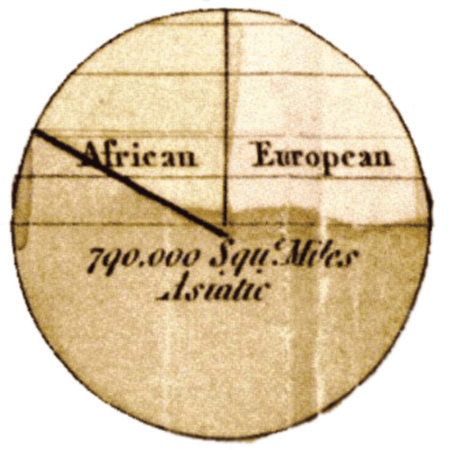
Along with the bar chart, area chart and line graph Scottish economist William Playfair also invented the modern pie chart, in 1801. In his publication entitled “Statistical Breviary” he illustrated the Turkish Empire’s landholdings by slicing a circle into three wedges, whose sizes were determined by land area. In colouring Asia’s wedge green, Europe red, and Africa yellow he not only displayed empirical proportions but differentiated the qualitative components by colour.
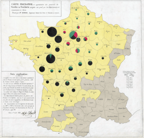
French engineer Charles Joseph Minard was one of the first to position pie charts across a map in 1858 to represent the proportions of cattle sent from around France to Paris for consumption, and in the same year he used pie charts coupled with proportional symbols to depict dimensions of coal production.
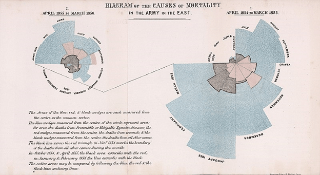
And of course, In 1858 Florence Nightingale published her polar area charts which are a circular chart that broadly takes the form of a pie chart with segments made proportional in area to the phenomena they represent. The additional metaphor that Nightingale used was that of a clock face so the graphs could be read in the same way as we read time. Since the data was temporal the visual metaphor worked well. Sidenote: we’ve also shared a tool that allows you to create these type of polar area charts in ArcGIS Pro)
Yet, despite such lauded evidence, pie charts have become somewhat derided. Why? They’re really quite elegant devices to show part-to-whole relationships. Each segment illustrates a particular category of the overall data set and its proportion compared to the other categories. What could possibly be contentious about that?
Leaving the more extreme criticisms aside there’s a few arguments that have some merit. Principally, pie charts can be difficult to read and interpret despite their apparent simplicity. Humans aren’t especially good at estimating the area of graphical objects, and comparing areas, particularly when they are of a similar size. Therefore assessing the value of a segment and its relationship with similarly sized segments can be problematic. This argument is often supported by showing that bar charts of the same data are much easier to read, and that’s because humans are better at estimating lengths in both absolute terms, and compared to bars of other similar lengths. And yet people often use pie charts even though they’re potentially not as good as a well-crafted bar chart. A bar chart doesn’t have that special property though – the ability to infer the ‘whole’ through its perfect circular shape.
Of course, as with any form of data presentation there are also issues that depend more on the design of the chart than anything more fundamental. For instance, using too many segments, and having too many slivers of pie (no-one likes a small portion of pie!), ordering the segments in an illogical way, using colour or patterns that are hard to distinguish or are too similar to each another, and that most egregious faux-pas – tilting the pie chart into 3D and exploding the segments. There’s logic in all of these design issues because they all render the chart harder to read, and make it more difficult to parse the information contained therein. And possibly the fact we see many of these errors is what leads people to be critical of the chart type. But all chart types, as with maps, can suffer from poor design. Maybe it’s just that poor design is seen more often when pie charts are deployed. For instance, by punching a hole through them and making a doughnut chart! But we’ll leave that food-related argument for another day.
But pies come in all sorts of flavours right? So rather than dwell on the standard pie perhaps we could taste a different recipe. Recipes are often associated with particular chefs and for this recipe we’re grateful for the work of Robert Kosara, expert in data visualization and currently a Data Visualization Developer at Observable. Kosara’s work on exploring circular chart types and their ability to support part-to-whole comparisons has been fundamental to the development of a new circular chart type – the moonpie chart.
Kosara’s research centred on exploring how respondents fared when shown a circle with a fractional section of different designs. The basic premise was to test the accuracy of estimating the fractional value (percentage), and response time among different part-to-whole designs where area was the visual cue (as it is with a pie chart).
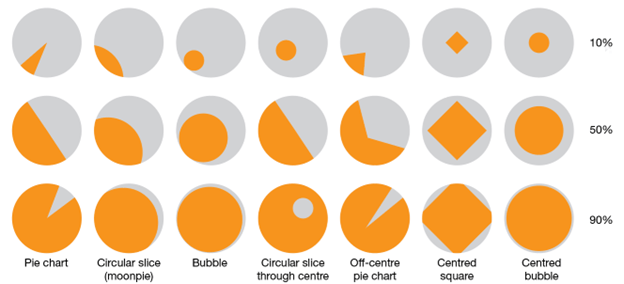
And so, if the pie chart is really as heinous as often made out then the expectation would be that most, if not all, the six alternatives would fare much better. Yet they didn’t. In fact, all the alternative chart types performed worse than the humble pie chart…that is, all except one. The circular slice performed the same as the pie chart in terms of people’s ability to estimate the fractional value but, significantly, the response time from respondents was faster.
Kosara gives the circular slice the following definition: “This chart represents the value by sliding a second circle of the same size over the base circle. The edge within the circle is curved at a constant radius (the same as the containing circle). In terms of metaphor, this chart is very similar to the way lunar eclipses occur.”
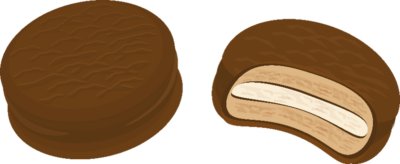
Kosara might be credited with inventing, or at least providing evidence of the value of the moonpie but it was Júlia Borsi and István Korompai who coined the term moonpie. They distinguish the moonpie from the pre-existing moon chart, the latter of which takes on the appearance of the phases of the moon as viewed from Earth. A moonpie looks more like a shadow passing across the moon, as in the lunar eclipse that Kosara noted. By including the reference to a pie they maintain the connection with the original pie chart and keep the connotation that the moonpie is for illustrating part-to-whole datasets. But they also have one eye on a little playful food-related humour in that in the United States there is such a thing as a moonpie cookie, and if you take a bite out of one you’ll have a bite mark that resembles a partial circular section nibbled out of the cookie.
And all this talk of pies, and cookies to get to the nub of this blog post, namely that I’ve created a style file for use in ArcGIS Pro that contains 100 moonpie Scaleable Vector Graphics (svg) symbols, each of which represents an integer percentage bite out of the whole moonpie. You can download the style here. Download, unzip, then add the style to an ArcGIS Pro project.
The default position of the percentage bite is to the right of an imaginary full circle that occupies a square symbol envelope with its geometry centred on the envelope rather than the substantive symbol. Here’s the 50% symbol for example.
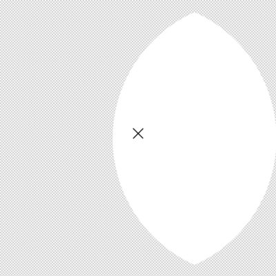
The original colour of each svg symbol is white on a transparent background but you can colour the symbol and its outline as you wish. The following illustration shows a set of background circles symbolized using the 100 symbol in one layer, with each of the other percentage symbols in another layer above.
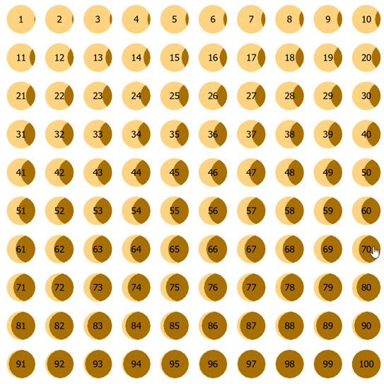
You can then use the symbol as you would any other point-based marker symbol and assign to any point feature, resize them (perhaps even as a proportional symbol), rotate them, or use the Match Layer Symbology To A Style tool to apply symbols to an attribute that represents percentage values. This process relies on linking the symbol names (e.g. 078) to the values in your attribute (e.g. 78) using an Arcade expression in the form:
Text($feature.Percent, ‘000’)
[where Percent is the name of the field containing the percentage values]
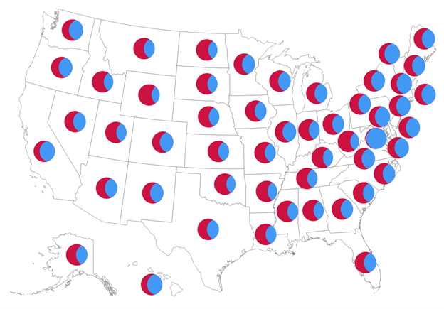
This allows you to match the numerical attribute value to the text string used for the symbol name. In this way you could easily use moonpie symbology to create an election map showing the percentage share of the vote for Republicans (red to the left) and Democrats (blue to the right). Here’s a version of the 2020 US Presidential election result using the technique which isn’t one of the 101 alternative techniques I proposed in my most recent book on Thematic Mapping which is still available from all good online retailers. So there’s now 102 different techniques (and counting…).
You can also stack layers with different symbols to create multi-part moonpie symbology. If you decide to do this then there’s a little bit of additional work involved. Consider the following pie chart which illustrates values for 40% (lightest), 30%, 20% and 10% (darkest).
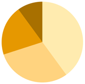
If you stacked four layers, assumed that the background symbol (100) would represent the largest portion of moonpie, and used the symbols for 030, 020, and 010 you’d get this:

The proportions of each slice clearly don’t look right but that’s because stacking layers obscures part of the symbols that are sandwiched between the top and bottom layers. In order to eliminate that occlusion we have to account for it in selecting symbols that generate the correct visual result.
The bottom layer can still use the 100 symbol so the background layer will represent 40% of the moonpie once the additional layers are positioned on top. The top layer can still use the 010 symbol to represent 10% because it is always fully visible. But we have to change the two in-between layers. Instead of 020 for the 20% layer, we use 030 (to reflect the 20% value we want to see, plus the 10% occluded by the layer above), and instead of 030 for the 30% layer we use 060 (30% + 20% + 10%). This accounts for the occlusion by adding the amount of occlusion to the percentage value, and shows each part of the multi-part moonpie in the correct proportions:

And before there’s an outcry that creating multi-part moonpie charts/maps is falling into the same trap as multi-segment pie charts in becoming hard to decipher then Robert Kosara has you covered again. He followed up his earlier work by exploring the readability of multi-part moonpie charts compared to pie charts (and a few other multi-part chart types) and found that multipart moonpies performed better than the pie chart equivalents.
Beyond the use of moonpie symbols to create charts, and charts on a map based on data values there is the more obvious use of using them to create maps of solar eclipses and other astronomical phenomena. And putting pie in the sky is actually why I developed this set of symbols to help build a map of the 2023 annular eclipse.
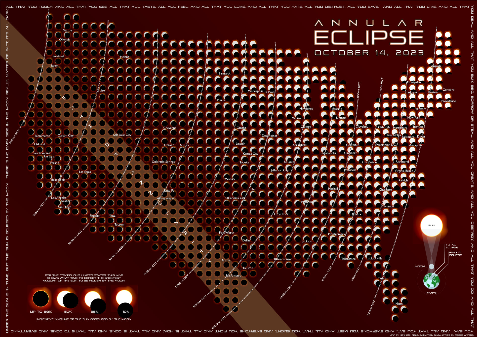
Look out for the same approach on a forthcoming map on the 2024 Total Solar Eclipse due on Monday April 8th. Or, perhaps, use these symbols to build your own eclipse map, or for some other creative endeavour.
In the meantime, happy moonpie mapping with thanks to Robert Kosara for the original research, and inspiration to create a set of moonpie symbols for ArcGIS Pro, and to my colleague at Esri, Shannon Gonzales who helped troubleshoot a glitch in the symbology pipeline we discovered during this work.

Commenting is not enabled for this article.