In late February I wrote a blog called Mapping coronavirus, responsibly to share some best practices for thematic mapping. The blog has been viewed a quarter of a million times (!), and as the Covid-19 pandemic has rapidly spread, so have the number of maps from news organisations, and individuals keen to explore the data and create something. The maps tend to be either a choropleth (graduated colour) or proportional symbol map. This is no surprise since they are arguably the two most common thematic mapping techniques, the most widely recognised by the general public, and therefore the most commonly supported in mapping software. They become the de facto defaults when maps are made of any thematic dataset but they do have some inherent limitations. This blog showcases an old mapping technique which we can resurrect to overcome such limitations, and share resources so you can make your own.
There’s been various discussions across social media relating to mapping of totals on a choropleth (don’t), about the projection you should be using (equal area), about colour choice (preferably not red), and whether symbols (on a map or in a chart) should be scaled linearly or logarithmically (how about both, given they are both useful?). Many organisations have updated their maps to reflect best practices which, in turn, improves the messages that the general public are exposed to. Yet the maps we’re seeing are limited in what they can show. Most are limited to showing the current data as a slice of time, but so much of what we want to know about the pandemic is temporal and for that we need context. What are the number of cases, or deaths, today compared to yesterday for instance? How rapidly is an outbreak taking hold? How might one country’s pattern of outbreak mirror trends we’ve seen elsewhere? Line graphs show this well but how do you show this on a map?
One way is to animate the time slices so we see them in order. A drawback is ‘change blindness’ as we struggle to retain information about the different time periods. But is there a mapping technique that shows temporal dimensions of the data in the same view? Yes. We can use coxcomb charts across a map. Here’s a portion of the map we’re going to make:
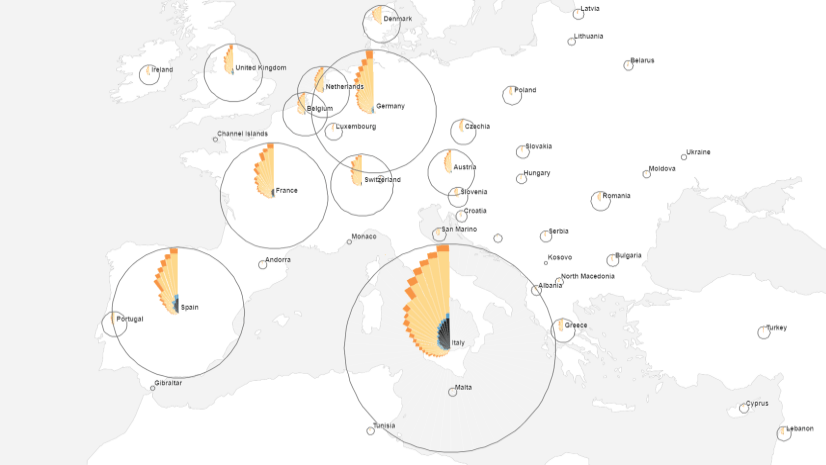
A coxcomb is a variation of the pie chart where each segment is constructed using equal values but where the radius of the segment differs according to the underlying data magnitude. This results in segments that differ in extent away from the centre of the graph. It is usually used to show temporal phenomena in line with the original use by Florence Nightingale in her classic 1858 diagram of the mortality of the armies of the east.
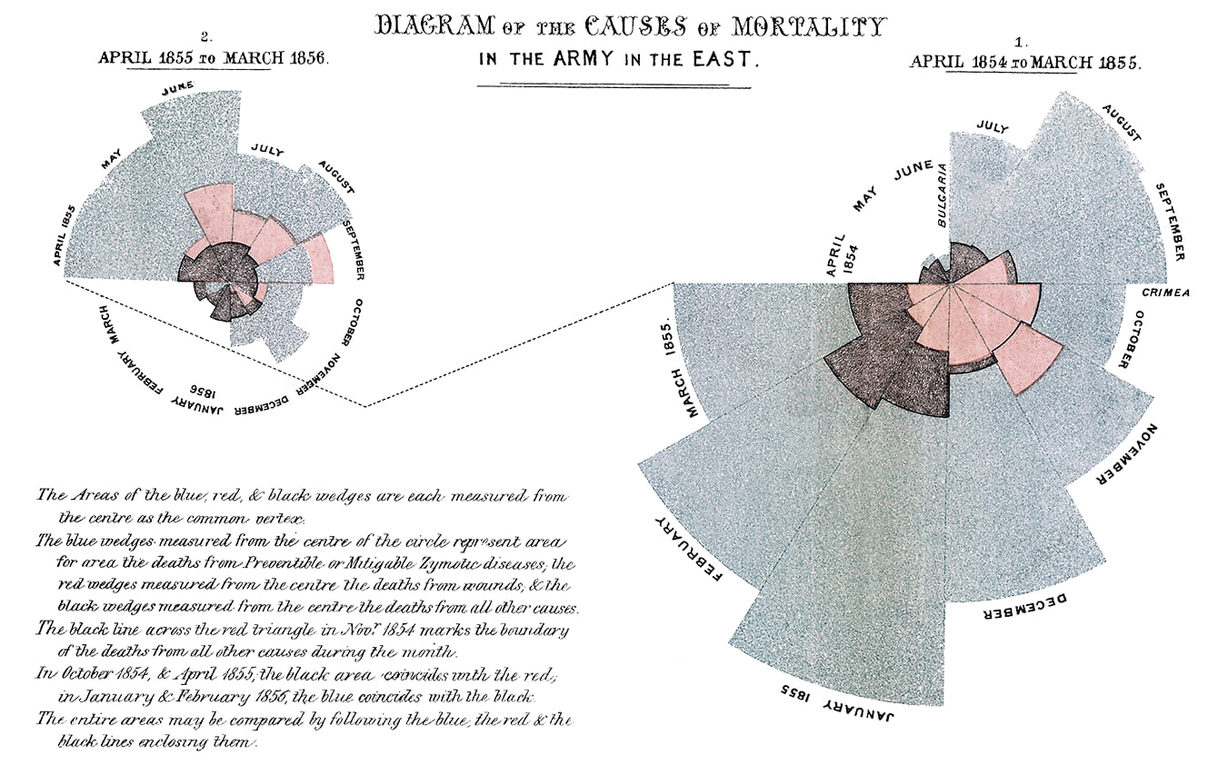
Yes, you read that correctly – 1858. Like so many thematic mapping techniques we simply have to delve back through history for great ways to map data, so we’re making old coxcombs new all over again. Nightingale used 12 segments, each showing mortality data for a single month. The radius of the sector is calculated as proportional to the square root of the data value (which can be modified using a constant to increase or decrease all segments in relation to one another). The entire graph becomes a collection of proportional symbols that also encodes time. The coxcomb is read clockwise and you get a sense of how the data increases and decreases over time, as well as how different sub-categories also change as proportions of the overall segment.
For the coronavirus data we’ll make coxcombs, by country, showing daily confirmed cases and the proportions of active cases, recovered patients and the deceased. The data is downloaded from the John Hopkins University dashboard. And how are we going to make them? Well, Linda Beale created a tool for ArcMap some years ago, and Craig Williams has recently updated it for use in ArcGIS Pro. You can download the latest version here and simply add it to your ArcGIS Pro project as a toolbox.
The first task (as with most mapping projects) is getting your data into shape. Firstly, data needs to be stored as point features. From the raw time series coronavirus data download you can add the csv file to ArcGIS Pro, right-click, display xy events and then export that as a new point feature class. For the coxcomb tool to work data needs an ID field that identifies some common data item that will be used. This can be a field ID, but we’ll use the Country field since we want a single coxcomb for each country.

Each coxcomb segment is then calculated from separate fields in the data. As the attribute table shows above, cumulative totals of confirmed cases are stored as separate fields. C20200122 holds data for 22nd January 2020. Each subsequent field updates the data for the next day and so on to March 18th giving 57 fields (the last date I downloaded the data). For coxcombs to be built in the correct order it’s important that fields are in the correct order. You can reorder them in the Table > Fields view in ArcGIS Pro if necessary.
Before running the coxcomb construction tool, ensure your map is in the projection you want your final map to be in. The coxcomb tool creates circular coxcomb charts, and if you subsequently change your underlying projection after making your coxcombs they will be reprojected and distorted. Since this is thematic data, and I intend to make a small-scale map I’m going for Equal Earth. Why wouldn’t you? Different projections exist to help you make your map right. Use them.
Now run the coxcomb construction geoprocessing tool and enter the following parameters in the Coxcomb construction pane:

Input Features is the point feature class containing the time-series data.
Output Features is the polygon feature class of coxcombs to be built.
Coxcomb Group ID is the common item that will be used to build coxcombs around, and which will also form the centre point of each coxcomb.
List Fields shows you a list of fields in the attribute table of your input features. Select all those for which you want a coxcomb segment building. If you select a total number of fields that totals a number that is not a factor of 360 there will be a gap towards the top of your coxcomb.
Coxcomb Scale Value is the maximum size of the largest coxcomb as it will appear on the map in map units. All coxcomb segments across the map will scale to this size.
Scale Value Units are the units of measurement that define the coxcomb scale value entered.
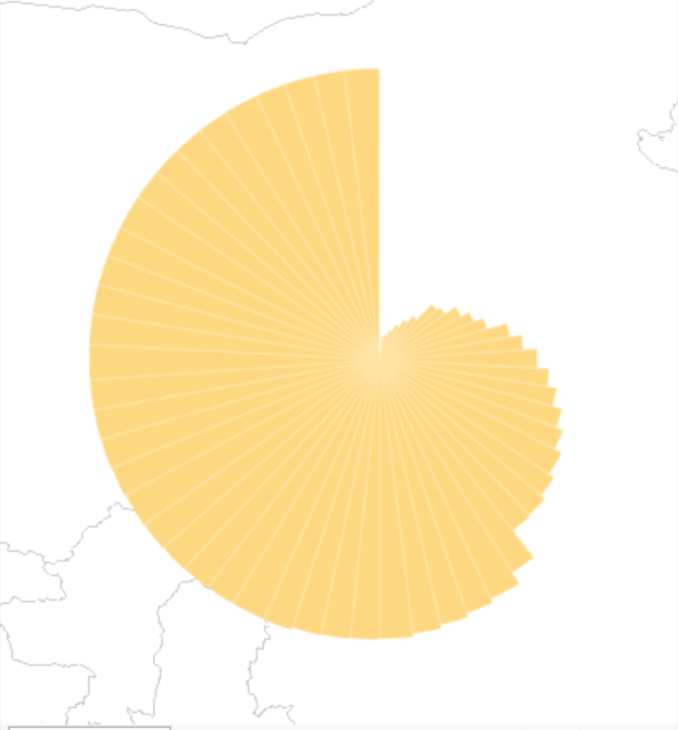
When you run the tool, individual features will be created for each coxcomb segment, centred on the feature class of your input points, and the resulting polygon feature class will be added to your map. In the example given here, the maximum data value is around 81,000 for March 18th in China. This segment has a radius of 1000km on the map. There are 57 segments per coxcomb which leaves a small gap towards the top since 360 / 57 does not create an integer that is a factor of 360. Here’s the result of running the tool for China:
I repeated the process to create coxcombs for datasets that represent the number of people who are new cases, recovered cases and deceased. There are two ways to configure the individual coxcombs. First, you can simply stack them on top of one another. The assumption here is that the reader is able to understand that segments are stacked and that smaller segments obscure some of the larger segment underneath. The alternative is to ensure that the relative areas of each segment are filled with the correct proportions of the variables that they comprise. Here’s the coxcomb for China that shows the four variables with equal area per segments:

How do we interpret the coxcomb? A legend is vital. A simple #screenshotforthewin and a few labels added in Illustrator produces this one based on China which we’ll use later as a graphical legend in the web map:
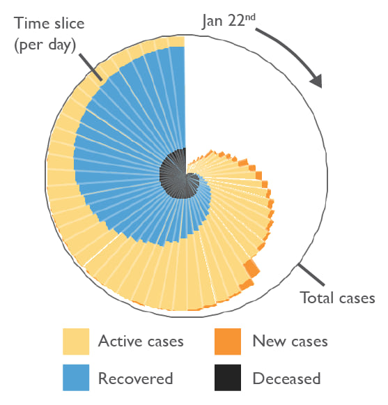
The overall size of the coxcomb is a proportional symbol. This allows comparison of the extent of the outbreak per country. It’s a proportional symbol layer of the overall confirmed cases with a hollow fill and grey outline that sits behind the coxcomb.
The 57 segments are read clockwise from the top from January 22nd round to March 18th. The total area of each segment shows the number of confirmed cases, split into four categories: active; new; recovered; and deceased. The different colours allow easy identification. Red is deliberately avoided, as are effects such as glows or highlights because the intent is neither to alarm, nor to stigmatize countries or individuals who are counted within the data.
There’s a lot of information packed into each coxcomb chart which gives way more than a choropleth, proportional symbol, or animated map can in the same view. In fact there’s 229 pieces of information per coxcomb and that’s before we think of what overall patterns within a coxcomb, and amongst all coxcombs are worth exploring. Add in location, labels and popups to the web map and the technique allows an immense amount of detail in a very efficient and elegant design. It’s almost like Florence Nightingale knew what she was doing!
As with any map, there are benefits of the technique, and drawbacks. For coxcombs showing this data these might be summarized in the following ways.
What the map does show you:
- A summary of the number of cases across time, aggregated for country totals
- The pattern of onset and rise as the disease takes hold
- The point at which the number of new daily cases begins to fall
- How the number of recovered patients rises through time
- The number of deaths and whether the total keeps rising or is abated
- The lag in onset for different countries compared to China (the first case)
What the map does not show you:
- Live updates to the data
- Individual risk
- Mortality rates
- Local patterns
- Spatial diffusion pathways of the disease
- Advice for your own health and safety
In some respects this approach provides a spatial way of seeing the way in which the exponential curve of a disease outbreak becomes logistic as the proportions of new cases lessens and the proportion of recovered patients increases.
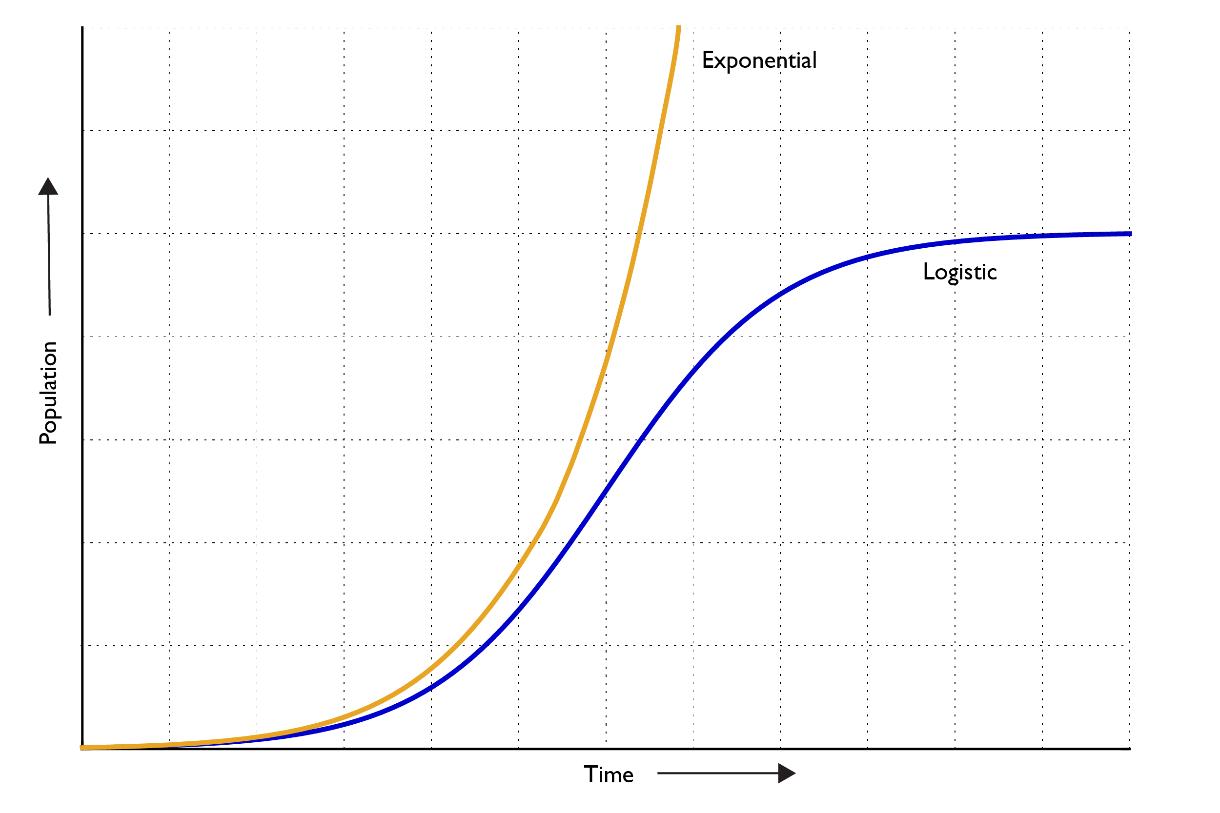
While this is no place to begin to espouse any sort of detailed epidemiological inference (cartographers rarely know anything about the domain of epidemiology though I did study it for my PhD, and taught it for 10 years so I have a smidgen of knowledge in this domain), we can see some basic patterns that we know tend to characterise how a disease develops over time. Disease outbreaks tend to follow an exponential curve during the first phase where the time it takes to double the number of people who are infected decreases exponentially as the disease takes hold in a population. If there was no arresting the outbreak, hypothetically a disease would infect an entire population pretty quickly. Except different responses, testing, intervention, treatment and control mechanisms slow rates down and the disease becomes logistic where the number of new cases slows, the number of recovered people increases, and overall the total number of confirmed cases slowly peaks. On this map, China is currently displaying a pattern consistent with a logistic curve.
Since each coxcomb begins on January 22nd it’s easy to see how different countries exhibit a lag effect, and it’s possible to compare the first few weeks of an outbreak to the trend of countries whose outbreak was much earlier. The following matrix of a few select countries shows these differences and trends. As of March 18th, other than China, South Korea and the Diamond Princess cruise ship, each country is still in an exponential growth phase. In fact, some countries appear to have a growth rate of confirmed cases higher than China did in its first few weeks.

OK, enough with the analysis, and interpretation, though it does demonstrate how much more you can glean from this map type than many others.
The final part of making the map is sharing it. It was built in ArcGIS Pro and so we can simply share the map to ArcGIS Online. The coxcombs are features so all that’s needed is to share the map as a feature layer to an ArcGIS Online account. Ordinarily I’d be caching vector or raster tiles to allow me to make my web map in a custom projection, but not for this. My good friend and colleague John Nelson has built a number of custom vector basemaps in equal area projections for different parts of the world. What a time-saver! And not just a time-saver but a clean, unembcumbered design devoid of a lot of clutter you often see on basemaps that just gets in the way of thematic maps.
So making the web map was easy. Add the Equal Earth world vector basemap as the basemap. Add my coxcomb features, add some labels and configre the popups and that’s it. Custom cartography, in an equal area projection on a web map. Simple. Dismiss the information popup in the embedded version below to view the live map here, or go full screen here.
In summary, coxcombs provide a clean, elegant way of encoding multiple pieces of information into a symbol to overcome the limitations of univariate techniques like the choropleth and proportional symbol. It helps map this data because, at a glance, it allows you to see the onset and development of the virus, per country, across time. This supports the exploration of how the virus is progressing, at a population level, within a country by showing the breakdown of stages of the disease and the population numbers they relate to. It also allows you to see the circumstances of different countries, and how they compare to one another at different stages of the disease. Finally, it might help in the study of how an outbreak might look for different testing, treatment and social policies that are implemented in different places. The map cannot tell you the answer, but it can help you ask more questions.
If you want to experiment with coxcombs yourself you can download the Coxcomb Construction tool (for use in ArcGIS Pro) here.
Enjoy making coxcombs in isolation, then wash your hands, keep your distance from others, stop hoarding groceries, and raise a glass to Florence Nightingale. Many thanks to Linda Beale, John Nelson and Craig Williams for helping with this tool and blog.

Commenting is not enabled for this article.