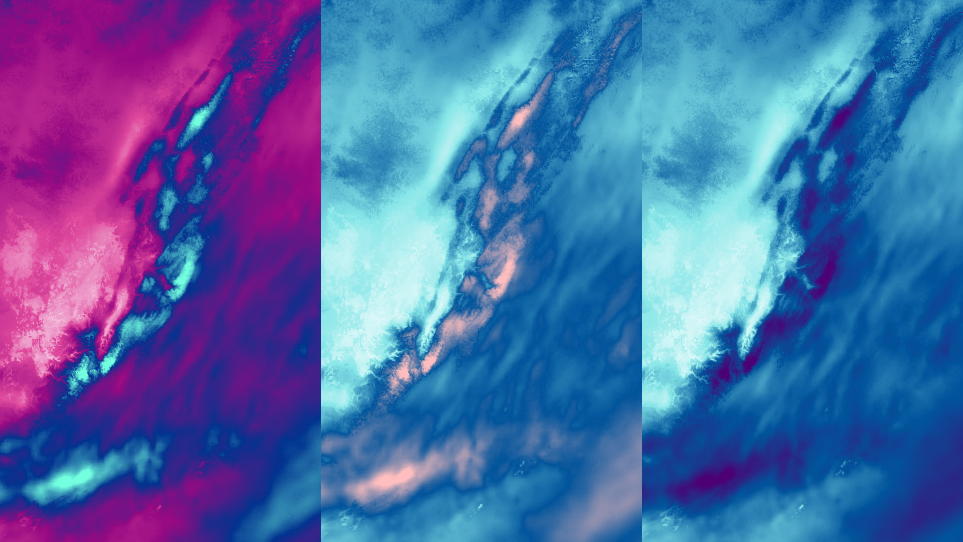
Last year I published a blog post that featured a map of a snow storm, using a continuous color scheme I designed in ArcGIS Pro. At the time, I was really excited about this color ramp, with its bright magenta and turquoise.
About a week after I published the blog, I realized I never checked the map to make sure the color scheme was legible for different color vision deficiencies. Rookie mistake. I circled back to my project in ArcGIS Pro and used the Color Vision Deficiency Simulator tool.

It turns out, the color scheme I designed was difficult to read for three of the four most common color vision deficiencies.

High values and low values are legible for normal color vision and Tritanopia, but they are difficult to tell apart for Deuteranopia, Protanopia, and Achromatopsia.
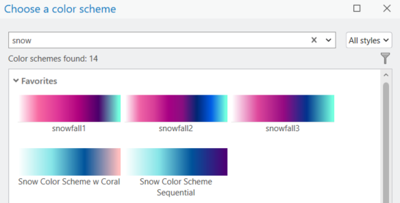
A little over a year (and another snowstorm) later, I decided to design two new color schemes. My goal was to improve the legibility of the highest and lowest values across vision types.
Improving color scheme accessibility
First, I started with the original color scheme and incrementally changed colors and tested them with the Color Vision Deficiency Simulator tool.
This tool is one of a number of accessibility features in ArcGIS Pro. The ArcGIS Pro user interface can also be adjusted to make it easier to read for users with color vision deficiencies. The Use Color Filters documentation was added recently to help set this up in a Windows environment.
In the end, I landed on two new color schemes that better differentiated the high and low values for different vision types.
The new color schemes

While New Color Scheme #1 is my personal favorite, it is not easy to decipher the highs and lows for Achromatopsia. Therefore, I designed New Color Scheme #2, where the highest value is now the darkest to accommodate for this vision type as well.
Then, I saved all of my color schemes to styles, so now when I map snow depth in the future, I can easily search for previous creations.
Check out this short video to learn more about accessing this capability: Search for Colors and Color Schemes in ArcGIS Pro
Revisiting past maps and keeping an open mind about areas of improvement is all part of the learning. Don’t be afraid to revisit past work and find ways to improve and grow in your cartographic journey.


Commenting is not enabled for this article.