Do you have a layer that’s rich with attribute information, but you are conflicted about which one to display, or maybe you want to show two of them together? If you are in this situation, a bivariate map may be the answer for you.
Since geographic phenomena are often influenced by multiple factors, a bivariate map is a type of thematic map that displays two distinct variables at the same time. These kinds of maps allow the viewer to better understand the relationship and interactions of what’s being mapped so they can immediately recognize patterns and trends. Bivariate maps use blended colors as their visualization cue, and this helps to make comparisons, reveal unknown spatial relationships, or detect correlations or anomalies.
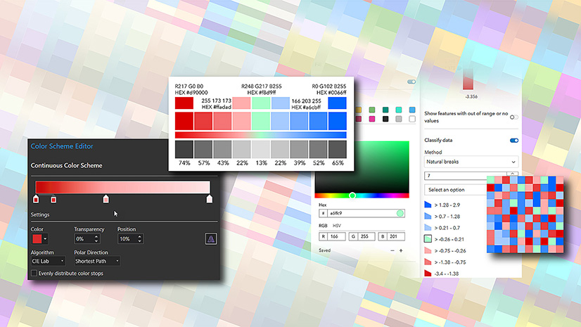
How the color scheme is designed
It’s a grid, usually with 3 or 4 tiles on each side (You can go higher, but the more you add, the more difficult it becomes to create distinctive colors). It combines two variables with quantity to represent how they work together:

Quantity or value is represented by the tone. Low values are light and high values are dark (This may be reversed if you are working on a dark background):

The two variables are represented by color:

In a perfect world, the high and low values should be a blend (Note that it does not need to be an exact blend of that color and you will see examples below that defy that). Adjust it if you need to, but it should have the appearance of being a blend:

The intermediate colors should create a gradient between these extremes. Again, you can adjust the colors to give a perception of the gradient, rather than using exact values:

For more information about how to create the gradients see this blog here.
The final palette works like this:

Don’t be afraid to adjust your palette once you apply it to your map. It’s only then that you will find out if it is giving you a successful result.
Working in ArcGIS
In ArcGIS Online the bivariate palettes are not editable, but we’ve given you 25-30 options, so hopefully one will suit your purposes
In ArcGIS Pro you can build your own. Navigate to Symbology, choose ‘Bivariate colors’, then ‘Color scheme properties’. Select each box in turn and insert your own color.

Choosing color
Bivariate maps can quickly become visually complex since you need to interpret two variables at once. Taking the time to choose intuitive colors helps reduce the mental effort needed by guiding viewers toward the intended story rather than forcing them to constantly decode the legend. Let’s look at three bivariate map examples that use color very purposely to make relationships easier to understand. All three maps were created in ArcGIS Pro and use data from the Living Atlas.
This first map of Los Angeles is from Jack Dangermond’s book The Power of Where and uses color symbolism to reinforce the story. Green represents an eco-forward combination of high transit access and low car ownership, showing downtown Los Angeles and Koreatown as walkable, transit-rich areas. Orange evokes exhaust and pollution, highlighting neighborhoods with higher car ownership and fewer transit options. The map’s intent was to challenges the idea of Los Angeles being uniformly car-centric and instead it reveals a vibrant urban core shaped by transit and walkability.

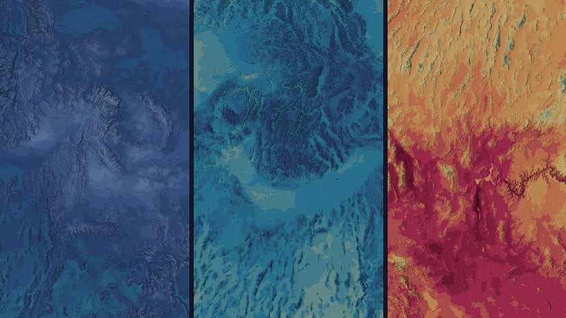
The second map of storm frequency and duration uses a water-inspired palette of blues, turquoise, and purples, with blended colors visually linking storm behavior to rainfall and flooding. As frequency and intensity increase, colors merge and deepen, allowing areas of overlapping risk to emerge naturally on the map. The darkest purple signals the most dangerous combination—storms that are both frequent and intense—immediately drawing the reader’s eye. This is what’s so great about color blending on bivariate maps, it makes the interactions between two variables emerge as a single and readable spatial pattern.

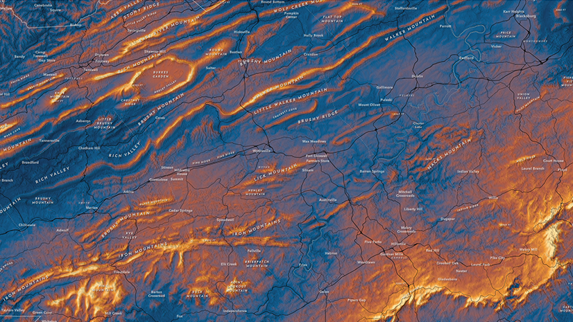
The third bivariate map pairs projected gross water demand and blue water availability to reveal future water stress. The color palette emphasizes contrast: orange highlights places where high demand collides with low availability, purple marks regions with both high demand and abundant water, light blue shows lower demand with higher availability, and beige indicates areas under relatively low pressure. The difference between warm, dry tones and cooler, water-rich colors makes patterns of stress and balance easy to interpret, turning complex hydrological projections into a clear story about future water risk.
 shows the relationship of projected gross water demand (white to orange) and blue water availability (blue to purple).")
Bivariate maps can be really powerful, and it’s quite possible that you see some unexpected results when you apply the effect for the first time. Be ready to play with the settings as your map takes shape. You want to get the most out of the results you get, and the colors you choose are a part of that. Please reach out to us with comments or questions.


Article Discussion: