Sometimes those bright shiny icy polar regions can be so…bright. Maybe you’d like to tone them down a bit and feather the edge of your map into the background color of your layout. The insanely great transparency support of ArcGIS Pro means you can slap this vignette layer into your map and burn-in some darker poles (or dodge-in some lighter poles).
Get it here. Start throwing shade today.
Examples
Here are some examples showing the vignette layer, and showing the same map without the vignette layer, as reference…
Here’s the vignette, left in its default blackness, used to push back the visual prominence of the icy polar regions of this Mercator map…

But because this is a spatially aware image layer, you can smash it into whatever projection you like. Here it is in Berghaus Star…

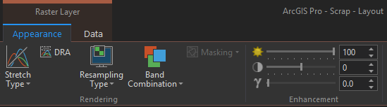
That’s cool. But sometimes your map, or the layout it lives within, is light in tone and the black vignette would look pretty nasty. Worry not, adventurous cartographer, you can just flip the tone to white via the “Brightness” slider (little sun icon) in Pro’s “Appearance” tab.
Here is the vignette in white, atop a lovely little Bonne projected map…

Anyway, you get the idea.
Why Vignette?
I minored in photography in the days of actual darkrooms and negatives and paper prints. I would flip on a timed light bulb to project light through a negative onto an awaiting blank photo paper. So much raw potential. It was magic. The longer the light bathed the photo paper, the darker, more burned-in, the print would appear (after soaking it in a sequence of toxic chemical baths). So we crafted crude little tools to wave over the paper while it was being exposed to selectively darken or lighten parts of the image.
Here is a highly-accurate illustrative schematic of the process…

Our field is informed by all sorts of cool history. Pre-digital cartography was all photo-plate based.
Get this: vignette is a French derivative of “vine.” Back in the day manuscript illustrators would fill in the margins of their pages with ornamental designs like vines and stuff, to visually frame the text content. I like knowing that sort of thing, and if you have read this far there is a chance that you do too.
So here’s that link again, if you’d like to download this vignette layer and start throwing shade on your maps!
Other Less-Geographic Vignettes
This is a geographically aware vignette layer, so that the poles will remain muted no matter the projection. But don’t feel like this will meet all your vignetting needs. There is still a tremendous amount of utility in adding a rectangle to a layout and giving it a transparent (radial or linear, depending) gradient fill. And if you need something more than that, like something with a material texture that matches your map, you can check out this resource.
Happy Vignetting! John Nelson
P.S. When opening an old notebook to hastily scribble that dodging/burning illustration above, I found this fantastic page written by my then-seven-year-old son, Juneau, who also wrote the essay at the end of this post. Enjoy…


Commenting is not enabled for this article.