Part 1 (Visualization)
Part 2 (How To)
Ok, I’ve rationalized all the visual components of the Tornado Migration layout, now it’s time to look behind the scenes at how these things were made in ArcGIS Pro!

Let’s start at the very beginning (the very best place to start). I downloaded the tornado data (since 1950) from the fantastically helpful and insight-laden NOAA Storm Prediction Center. I showed the overall seasonal movement of this data in a montage layout of three different techniques. I’ll separate each map and share its ArcGIS Pro origin story.
Choropleth
These tornadoes are all scaled by severity (Fujita, and Enhanced Fujita). They are also colored by month. How can you create a quick bivariate map in Pro? Hang tight, we’re going in!

Color
There is a numeric month attribute in the tornado data. I used that to symbolize the tornadoes by a color scheme that I made to denote seasons.

Size
The result is a seasonally tinted map of tornadoes. At this point, though, EF0 tornadoes look the same as EF5 tornadoes, which just isn’t fair. You can use additional symbology methods to the same layer to make what’s called “multivariate” maps (or “bivariate”, if you just have two concurrent symbologies). For this map, we’ll make the bigger tornadoes actually look bigger.
In the little hamburger menu button at the top of the Symbology panel, there is a “Vary symbology by attribute” option.

In there, I chose Size as the additional visualization method and pointed it at the Mag attribute (which is the tornado EF scale). Now, minor tornadoes look minor and massive tornadoes look massive. The way it ought to be.

Background
The background of this map (which, admittedly, it almost entirely covered by the tornadoes) uses the absolutely awesome TopoBathy hillshade service from the Living Atlas. But we can’t be bothered to stick with the pedestrian old grayscale color scheme it comes with by default. We are empowered cartographers who cast a thoughtful eye on all defaults! I gave it a very dark plumb colored gradient, inspired by this cool looking map. Consider boldly choosing your map’s overall background color or tone.
Atop the wrinkly plum topo, I added a state border reference layer. I gave it a semi-transparent white stroke and a shadow effect. Here is a quick how-to for that sort of thing.

Layout
In a new layout, I added color-coded month labels and put together a quick legend for tornado size. It happened to look a bit like a tornado funnel, which was serendipitous.
Mean Center
The weighted mean center diagram shows the average location of tornadoes, by month. The tornadoes are weighted (so that big tornadoes count more, naturally) and the symbols are scaled by the cumulative weight to show a seasonal shift in severity in addition to their average location.

Weighting
First, I needed to calculate a somewhat-respectable weighting value for each tornado. The Fujita scale isn’t a quantified value, but is rather a qualitative ordinal ranking based on the tornado’s potential for damage. The rankings go from 0 to 5. I came up with the following ridiculously crude formula, which is nowhere near as good as the formulas that you should use if you are a tornado expert.
EF number, plus 1, squared. I used the trusty Field Calculator.

Mean Center calculation
A mean center is an average location of a bunch of features. You can think of it this way: if you were to balance a map of tornadoes on your fingertip, where would you have to put your finger so the map doesn’t tip over? By selecting each month’s tornadoes, then running the Mean Center tool, I generated 12 points, each point the average weighted location of tornadoes that month. When seen all together their seasonal migration traces a fascinating figure-eight path in middle America.

Graduated Symbols
I merged all of these 12 monthly mean locations into a single layer, then symbolized it to match the tornadoes map: colors represent month and size represents cumulative severity.

North America is home to something like 95% of all tornadoes. Australia gets some, too. North America is the only large land mass situated directly beneath where a warm Maritime Tropical air mass and a cool Continental Polar air mass meet. Their border morphs northward in the spring, dissipates, and shifts back down in the autumn. A migrating fault line of violent weather.
Small Multiple
While the weighted mean center diagram aggregates the galaxy of tornadoes into a discrete path, sometimes it’s helpful to show the map reader a bit more. This small multiple layout lets a person wander through the seasonality of this phenomenon at their own pace, allowing them to make their own ad-hoc connections and comparisons. A small multiple is like the frames of an animation, without being tied to the animation.
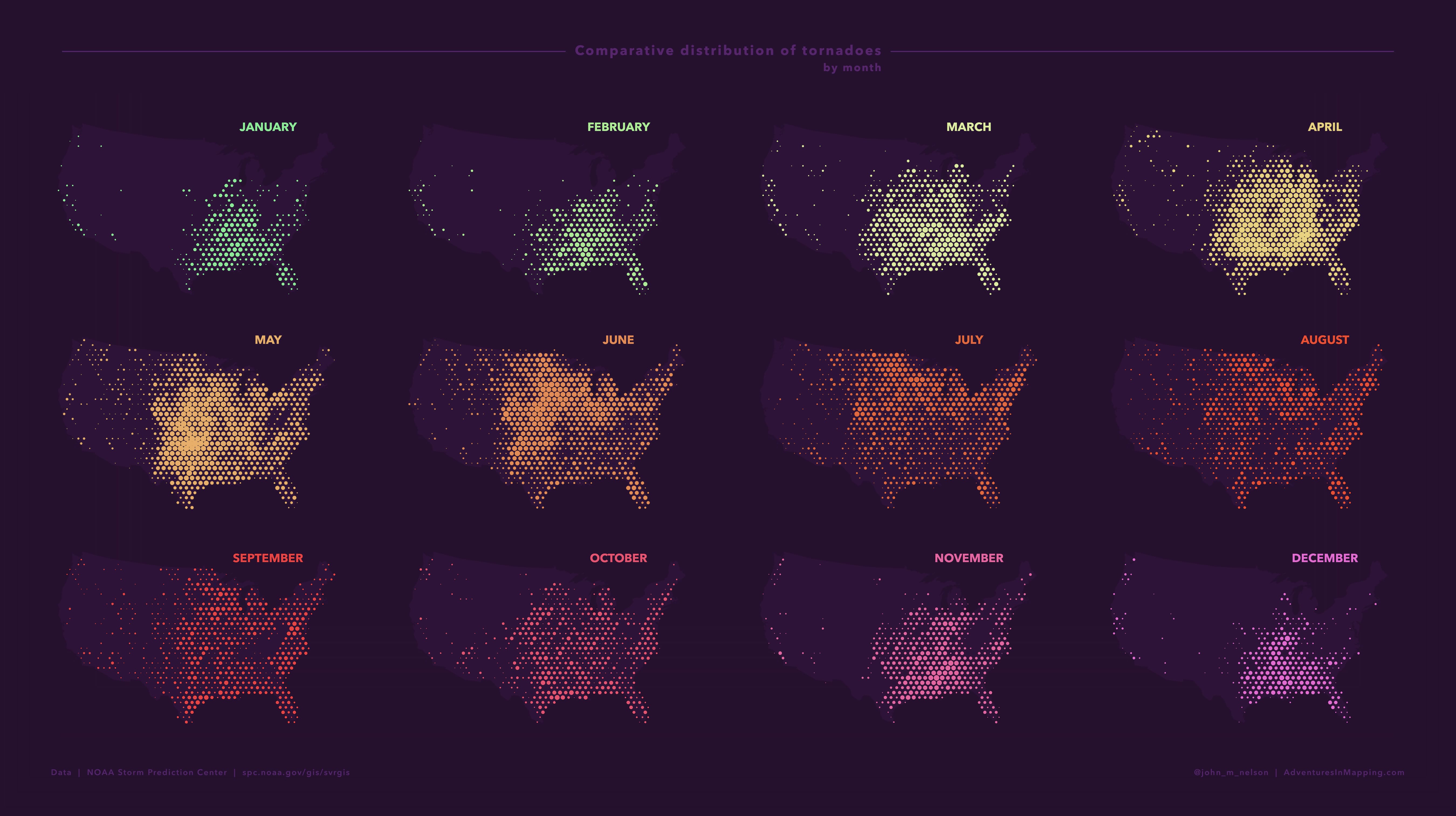
I created a hexagonal tessellation (“Generate tessellation” tool) atop the continental United States. Within each hexagon, I added up the sum of the tornado weights. I did this for each month, filtering the tornadoes by month.

The 12 resulting monthly cumulative tornado layers contain an aggregate tornado severity per cell. I symbolized them using graduated symbols.

Then I applied the exact same symbology rules to all 12 month layers for a fair visual comparison across all the months. You can apply the symbology of one layer to another by clicking the hamburger menu in the symbology panel and choosing “Import symbology”. This opens a dialog that lets you blast your symbology rules into all the other 11 layers (one at a time, anyway). I changed the symbol color for each month, to correspond to my month colors.

I duplicated the map into 11 other maps, and turned on a single month in each. Then I pulled them into a layout and arranged them into a grid.

I labeled each month and gave the label the same color as the layer. This effectively provides a legend for my entire map layout.
Summary
In my unified Pro Layout, I arranged all the map elements, added titles, sources, and labels, and shared it as an image. This blog grew to be much longer than I bargained; thanks for hanging in there, brave cartographer! I hope, if you made it this far, that you found it useful and helpful. If you try these techniques out on any sort of data I do hope you leave a comment (or Tweet) and share your work. I’d sure love to see it.
Happy Mega-Layout Mapping! John


Commenting is not enabled for this article.