Part 1 (Visualization)
Part 2 (How To)
Here is a map of the seasonal migration that tornadoes take.

Tornado migrations can be mapped like birds or wildebeests or commuters. Like just about everything else on this amazing planet of ours, they have a seasonal circuit and an ebb and flow. I live in Michigan, where I’m coming out of another winter. Believe me, the cool damp smell of earth in Spring isn’t lost on me, and I’m keenly aware of my progress toward more direct, and longer, sunlight. Especially the day I made this map, which happened to be the opening day for the Detroit Tigers. Another harbinger of spring.
So this map is a combination of three ways of showing the movement of large amounts of data. They are…
- Impressionistic Choropleth
- Weighted Mean Center movement diagram
- Small Multiple
Together, they provide a multi-dimensional view into a single phenomenon (seasonal tornado migration) by showing alternate methods of illustrating the same data, using the same color key. Concurrent alternate visualizations of the same phenomenon like this provide a more rounded-out presentation, and offers map readers with different learning styles and experiences a buffet of hooks into understanding. More opportunities to discover, all reinforcing each other. Let’s take a closer look at each method individually…
Impressionistic Choropleth
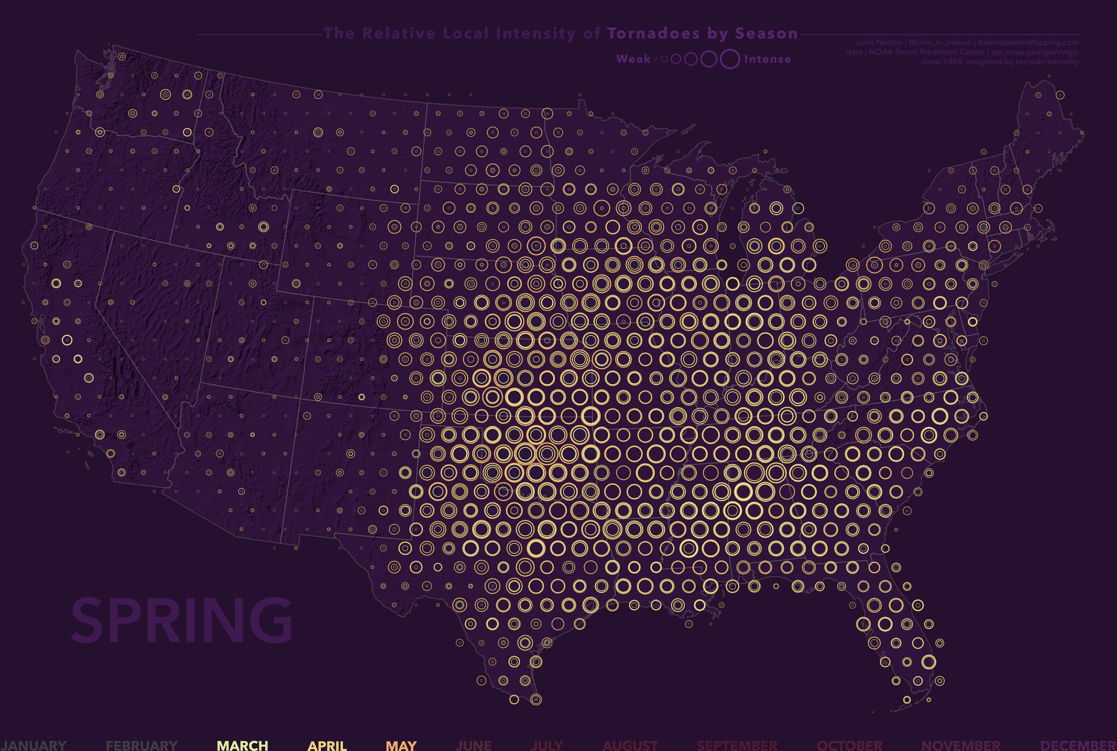
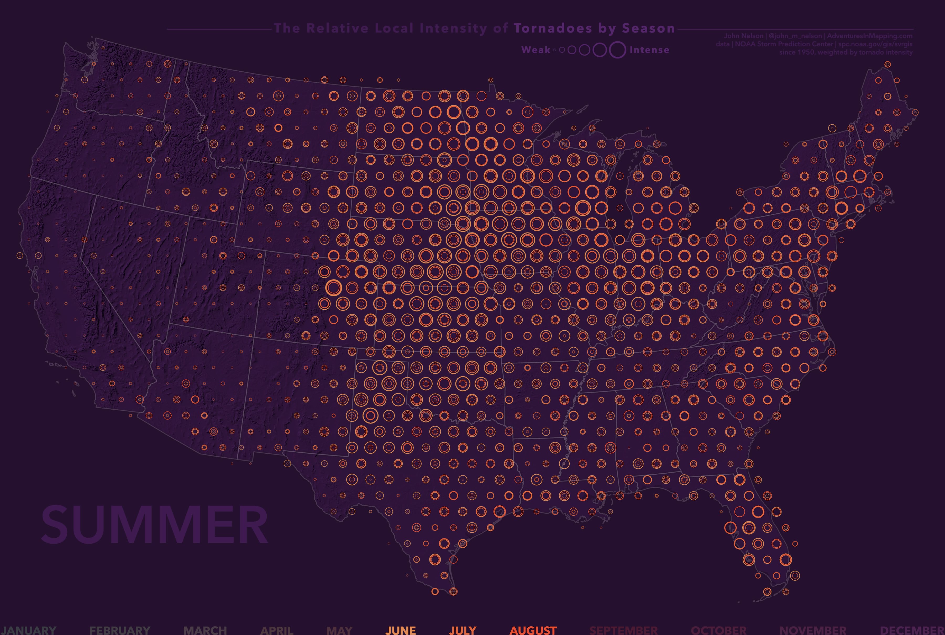
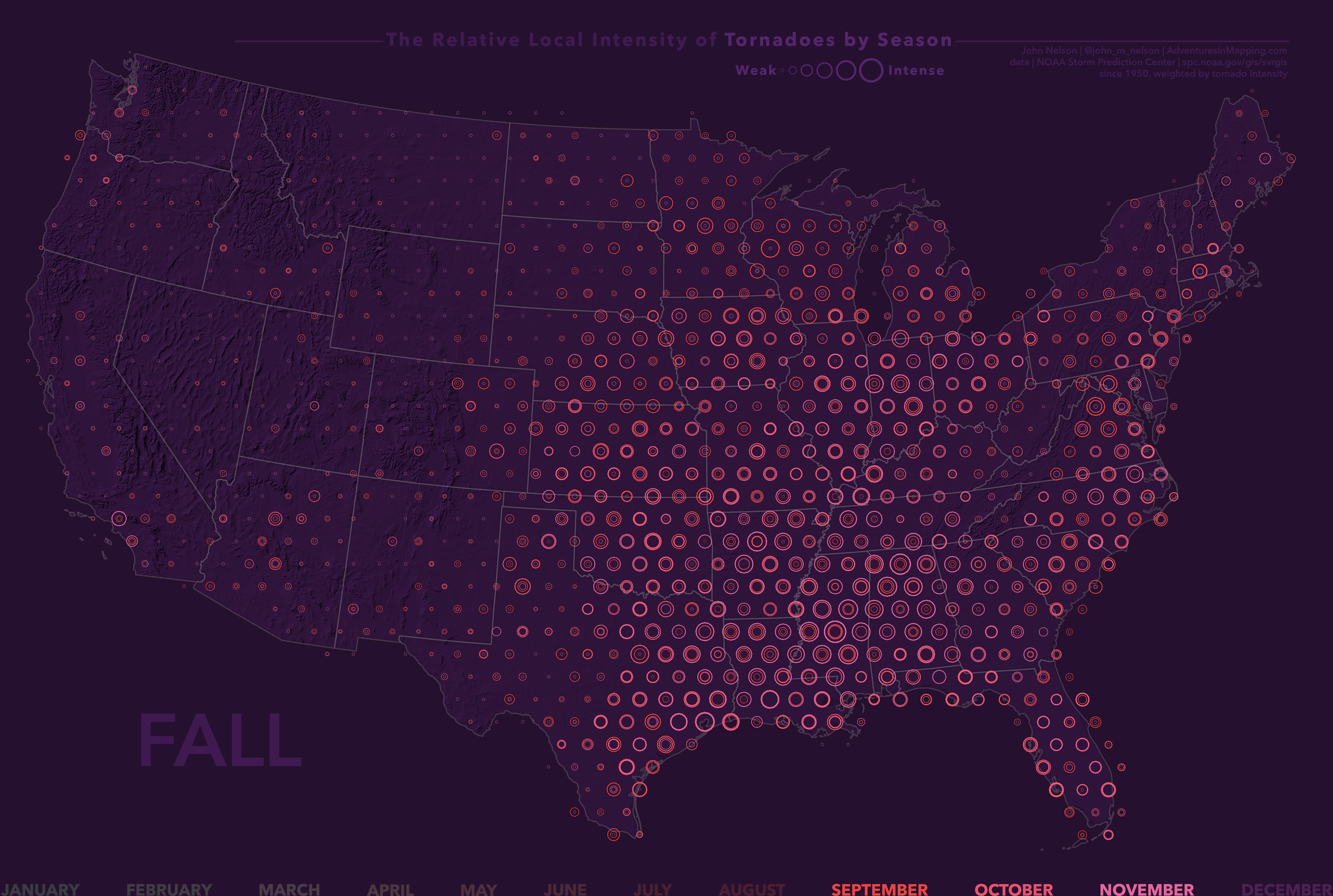
Often, a cartographer or GIS analyst’s gut instinct is to aggregate large data into fewer, larger, areas, to make the map more manageable. But sometimes you can miss the forest for the trees this way. Sometimes a nice grand look at the trees themselves can reveal a trend. I think of choropleth maps that just go ahead and show all the nitty gritty data at once as an Impressionistic Choropleth. Once you key the wave of seasonal colors into your working memory, you can stand back and look at an overall tendency of tornadoes of various months to inhabit different parts of the landscape. Maybe it takes a tilt of the head or a blur of the eye, but there are impressions of chromatic patterns.
Would this be the best way to visualize the seasonality of tornadoes, on its own? Probably not. But in conjunction with the other movement methods, it is a nice canvas for the overall layout.

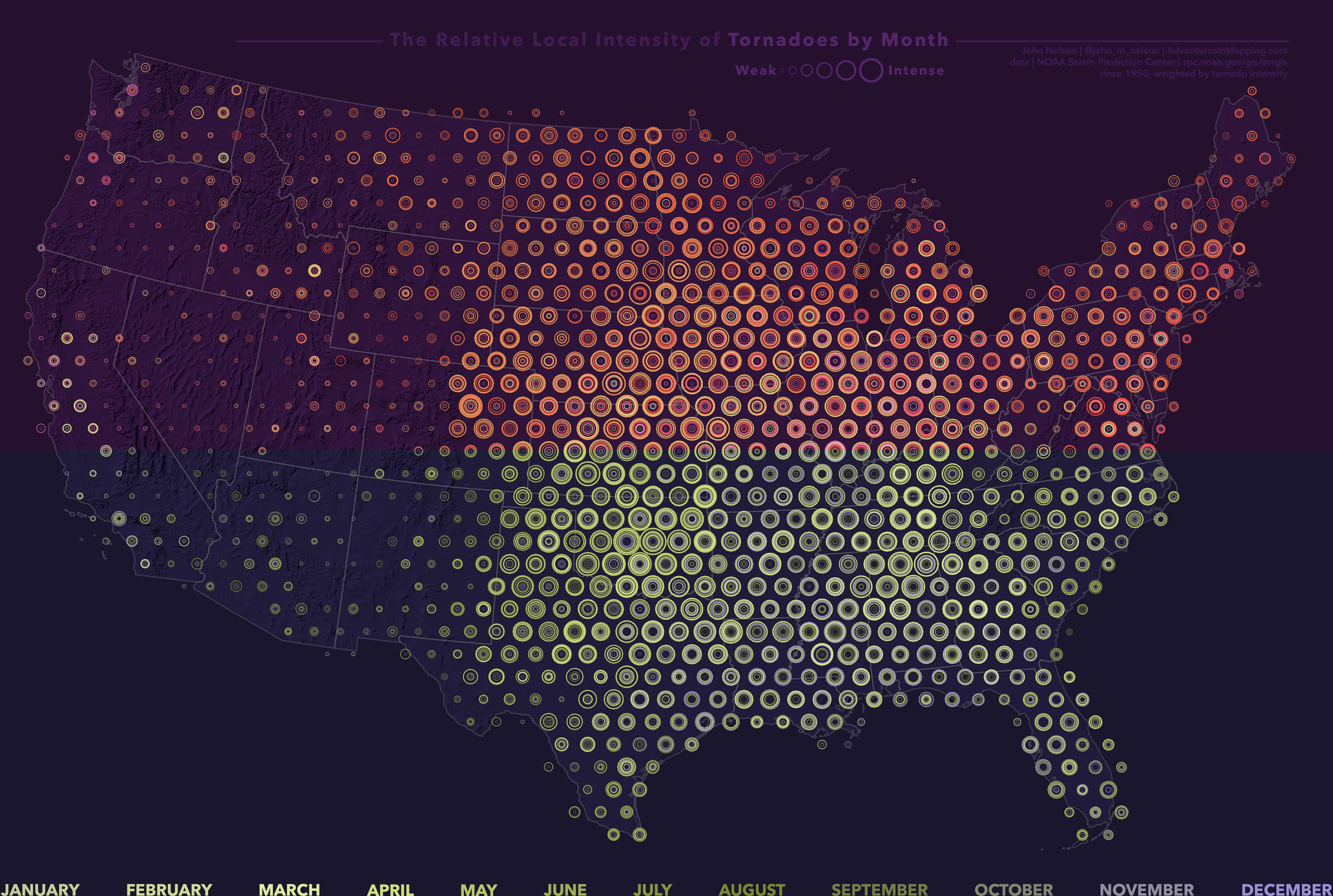
Weighted Mean Center movement diagram
Here is a closer look at the wandering average center of tornadoes throughout the year. It is a set of 12 locations, each corresponding to the mean center (each tornado weighted by intensity) of tornadoes for that month. A line connects them to reinforce their chronological sequence.

Looks remarkably like this thing…

An anelemma is a confusing little thing you might see on globes from time to time. It’s a diagram that illustrates the wandering position of the sun in the sky, at a fixed time of day, throughout the year. The sun appears to have a variable location because of our earth’s tilted axis, coupled with our annual trip around the sun. Spherical geometry and the physics of orbiting bodies is beyond me (clearly, since it’s why calculus was invented), but I get the concept. I certainly feel it. The migration path of tornadoes is an echo of this grander phenomenon, not a coincidence. Few things are.
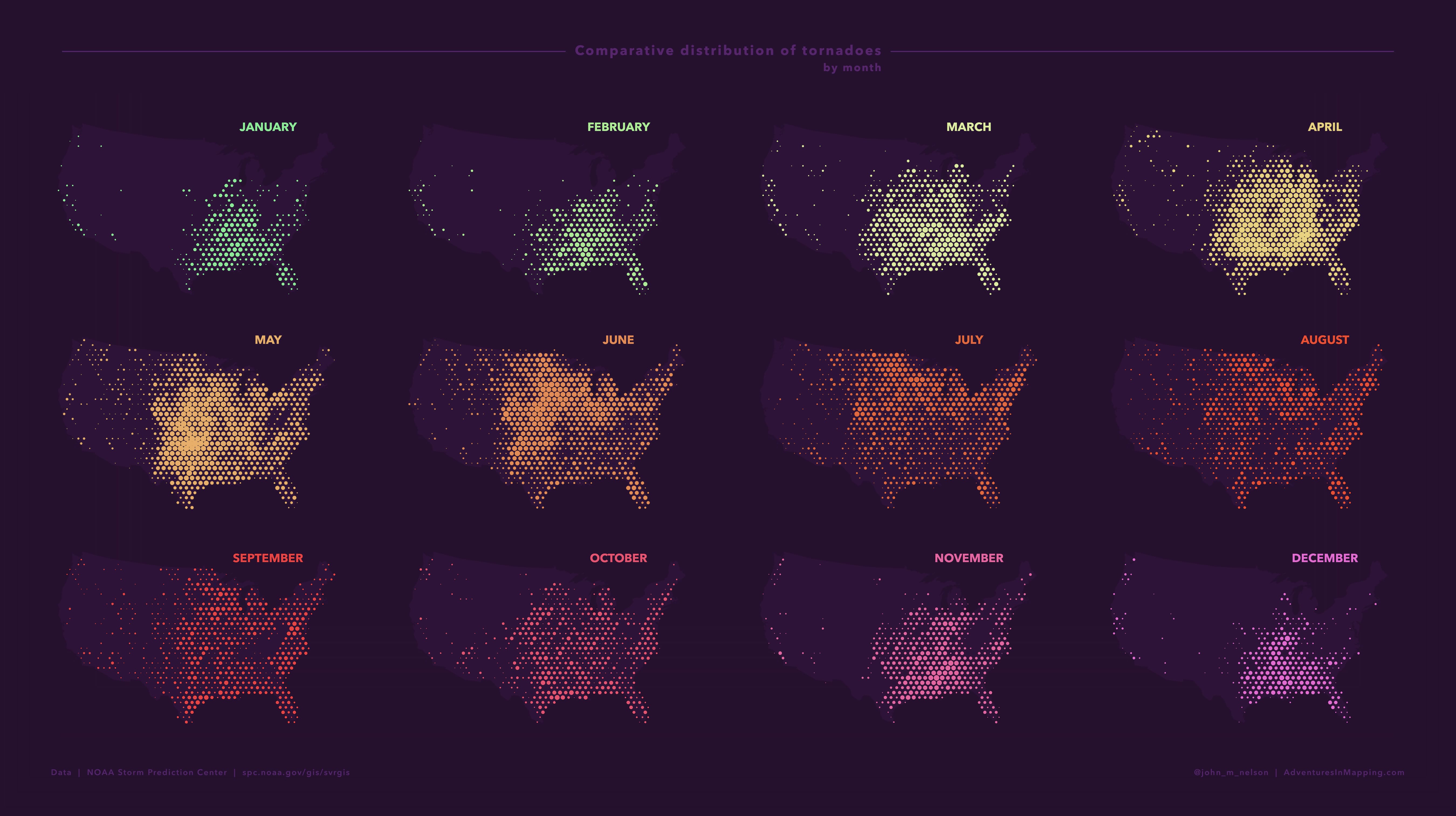
Small Multiple
Here’s a closer look at the small multiple of tornadic distribution. That sentence was only an excuse for me to use the word tornadic (right-click, add to dictionary). These 12 small maps not only serve to provide a discrete static view of a moving phenomenon, they also serve as the overall color-key of the whole layout.
Small multiples are some of my very favorite things. They are a lot like an animation, but free you from the tyrannical linear exclusivity of a play-through. Your eyes are free to dart around and connect whatever dots you see fit. Your cognition does the job of interpolating and creating a change narrative as you look through the frames. Like reading a comic strip, as opposed to watching a cartoon, your mind is in complete control over pacing, and ad-hoc comparisons of various frames.
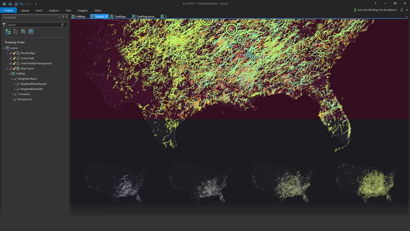
These are only three ways to visualize movement. They seemed the best combination to me, for this layout. But here are a couple alternative visualization methods that you can make in ArcGIS Pro.
Alternates
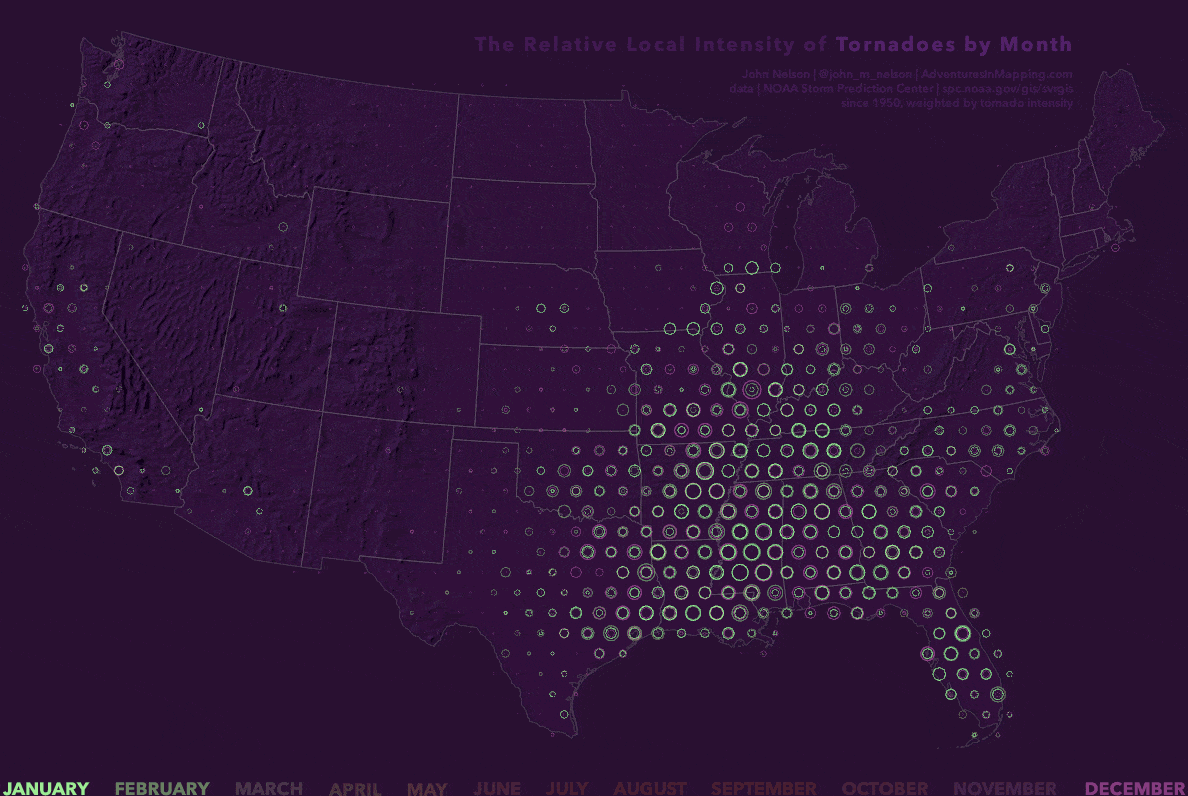
This is a variant of “Tree Ring Symbology”. Tree Ring Symbology (which is a term I just made up, so someone should quickly stub in a wikipedia post) shows several color-coded rings of time. This is a variant because instead of the rings being ordered chronologically, like the rings of a tree, they are scaled by overall intensity. The color, in this case, is what denotes time. Not a terribly practical method for 12 discrete month rings, but fun enough to share. Would be useful with fewer rings. P.S. I am collaborating with Jonas Baughman on a tree ring symbol map of precinct crime, which we’ll share in an upcoming post.
If you are terribly and irrepressibly intrigued by this Tree Ring Symbol map, here are some more thoughts that I have about it.
And here is a version that stacks up all those small multiple images into a fun little animation. When it comes to animation vs. small multiples, my perspective is, you already bought both, might as well show them off. What I mean is, an animation is made up of keyframes, and a small multiple is a layout showing all those keyframes in one view. So publish both and enjoy each for the visual benefits they provide.
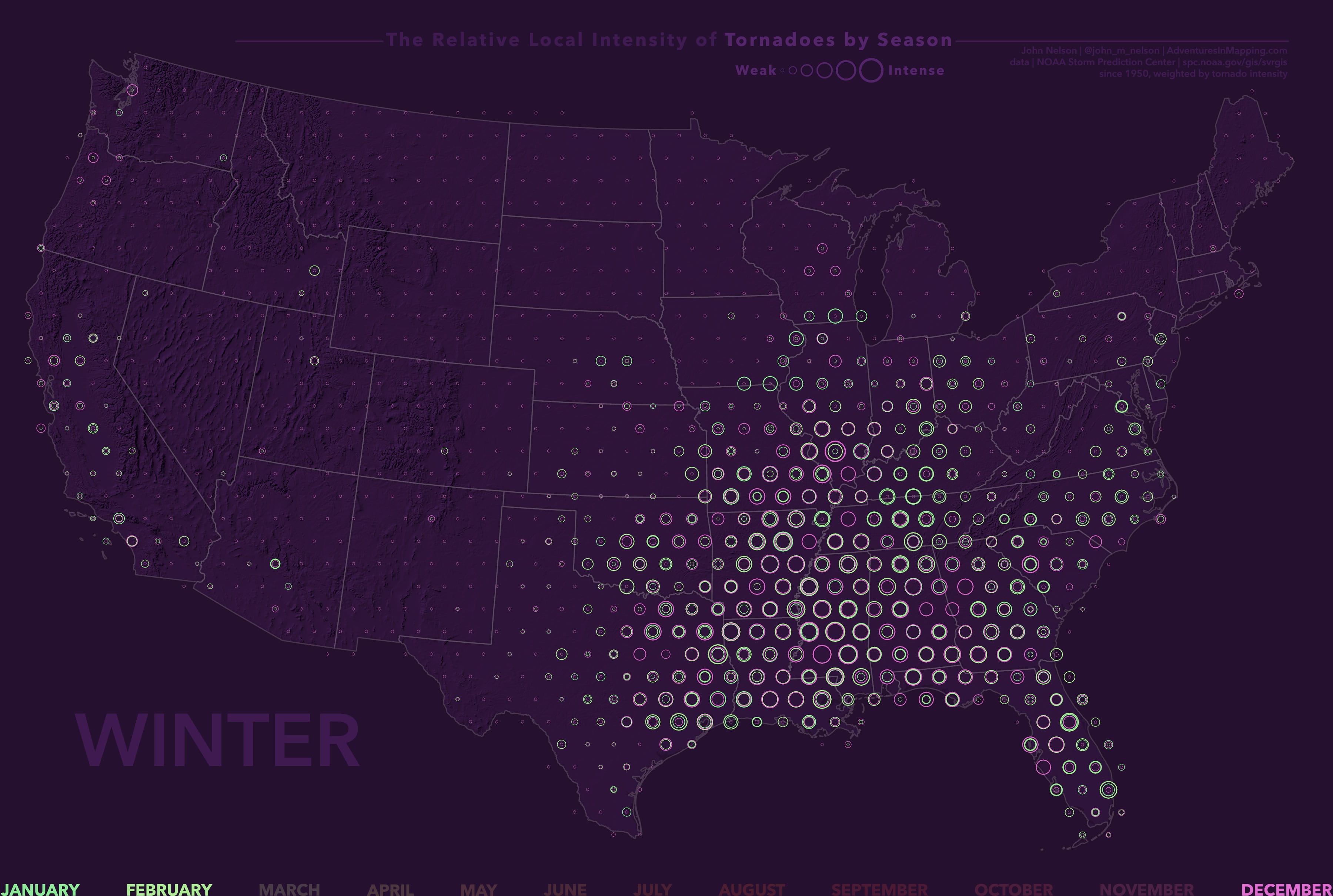
And, to give your brain a rest, here are those images coalesced into four seasons.
And that’s the end of that chapter!
Thanks for checking out the maps and indulging my wordiness. If you are feeling dangerous, I’ve followed up this post with another, walking through some of the steps of creating them in ArcGIS Pro. Because, making maps is awesome. Sharing how maps are made is even awesomer.
Until then, happy mapping! John

Commenting is not enabled for this article.