On April 8th 2024 parts of the United States will experience a total eclipse. This occurs where the moon crosses the path of the sun, blocking the sun on earth for a short while. The shadow created by the alignment of the sun and moon plunges those in the ‘path of totality’ into darkness. At distances away from the path of totality a partial eclipse can be observed with diminishing amounts of obscuration of the sun.
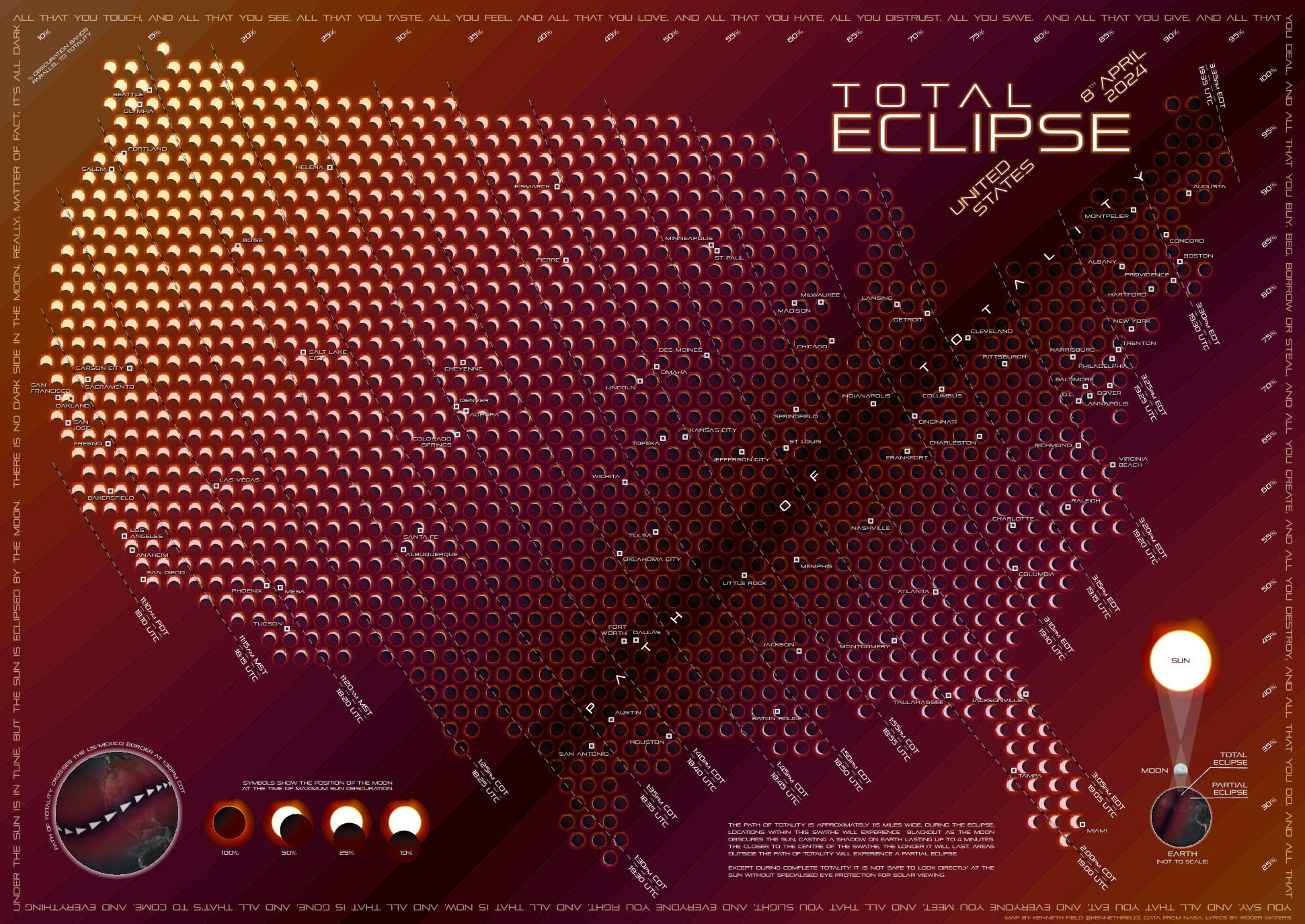
In this blog I introduce a new map of the total eclipse to help you prepare for this rare event. While most maps show the path of totality, and the times that you can expect to see the maximum amount of obscuration of the sun I wanted to go further, and create a map that actually illustrates precisely what you will expect to see (assuming cloud-free cover) on April 8th. I took the new symbol style I previously documented and developed ideas I’d used when creating a map of the annular eclipse in October 2023. Both the moonpies style I use, and that previous map can be downloaded from my previous blog.
So, here’s the new map, and if you want to skip the short discussion on the value of critique that I’m about to document then just go right ahead and download a hi-res PDF of it here.

There were several design ideas or motifs I wanted to use on the map to evoke a particular feeling. We are naturally curious about what our own place or situation is like so a map of the general path of an eclipse across a vast continent only goes so far.
By creating a grid of small symbol sets of the sun, and the moon’s position at the time of maximum obscuration the map helps people identify how the eclipse will appear where they are, not just where someone else is. That required a fair bit of maths to figure out the moon’s obscuration (as a percentage) and position relative to the centre of the sun (as a symbol rotation and offset). These will all be discussed another day but it’s all achieved using attribute driven symbology in ArcGIS Pro. The result is 1,500 small vignettes of the sun and moon that are all different and location specific.
I added an overlay of parallel buffer zones with a continuous gradient fill from darker (in the path of totality) to lighter the farther away you go. This was to accentuate the idea of the darkness experienced during totality, and how the effect is less pronounced with distance. There’s timelines that traverse the map showing the times that maximum obscuration will be reached on April 8th.
So the map functions to give you a way to determine how much of the sun will be obscured where you are, the position of the moon relative to the sun, and what time to go take a look (using solar viewing glasses!!!). The rest of the map contains the usual marginalia – a title, a neatline (using text rather than an actual line), an explanatory diagram of what an eclipse involves, a small globe showing the transit of the eclipse, an illustration of obscuration percentages, some explanatory text, and labels to give a sense of the geography of the United States across an otherwise abstract backdrop.
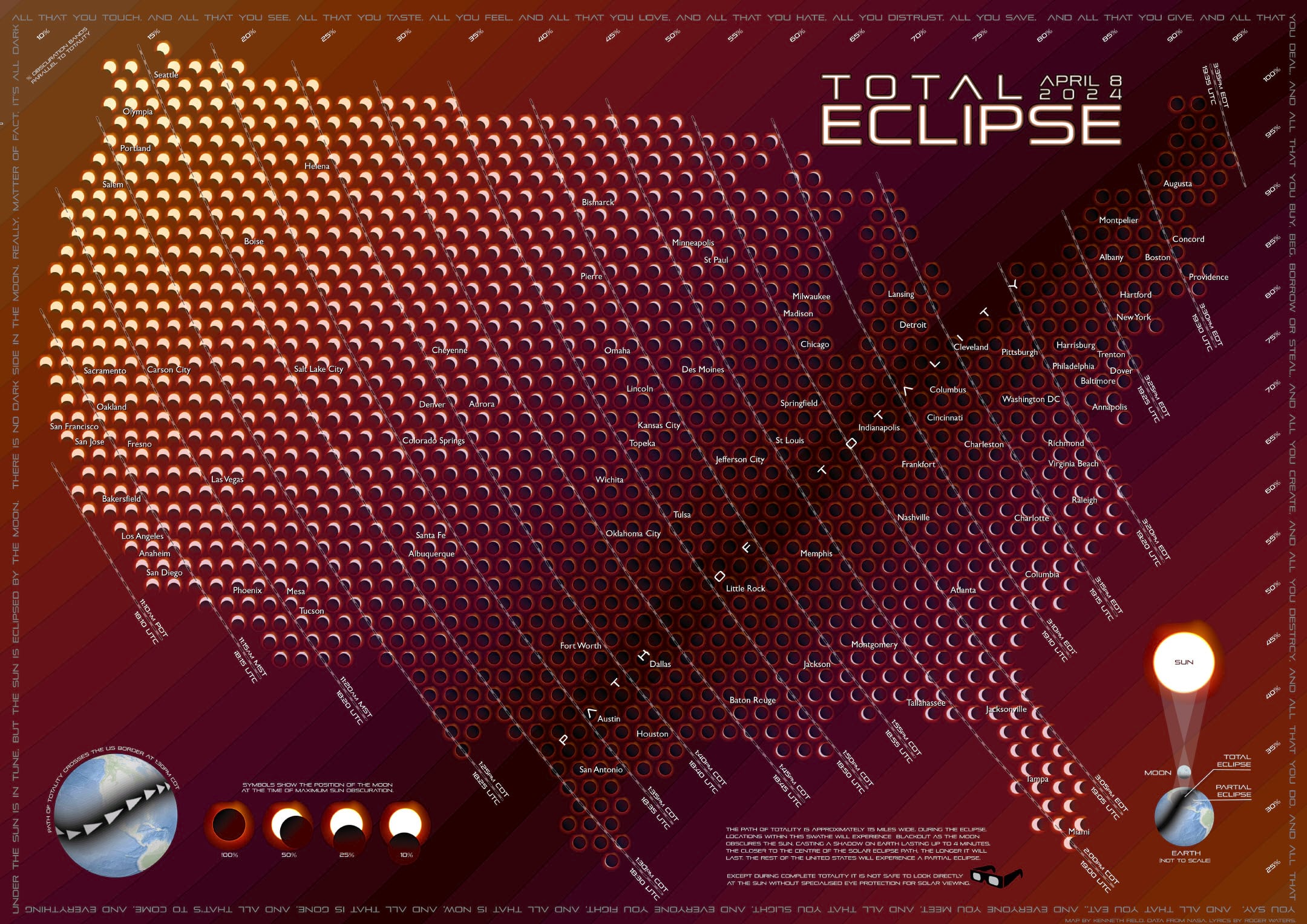
I created my map, spent a good while scouring it for errors and was generally pretty pleased with it. And at that point I could have unleashed it and sat back. Instead, I paused, and I sent it to a few of my colleagues for a review, sometimes called a critique. The whole purpose of this was to get eyes on the map before it gets published. Are there any obvious errors? Is the purpose, and messaging of the map clear. Is the symbology and graphical approach obvious, and does it fit the map? Is there anything missing that might improve the map? Are there superfluous elements that can be deleted? In simple terms…could a range of people understand what the map was showing!
Here’s that first draft of the map:

And whilst at first glance the draft and final map might look pretty similar, here’s a range of comments I received back, in no particular order:
- One thing you could try is to add a point to the city labels and then tilt them 45 degrees so they look like they are in the path of the eclipse.
- Maybe test out bringing the value of the total eclipse strip down even more (near-black) to draw the most attention to it, and adjust the other colours accordingly to keep the gradient nice.
- Try making the hue of the total-eclipse stripe the same colour on the main map as the inset map just to connect the hues.
- What if the title text, instead of a gradient that ends with opaque black, ends in transparent cranberry; more like a glow?
- All the text is a futuristic font except the city labels. Might look nice if they were the same font.
- City labels might benefit from a small location dot.
- The perimeter neatline text is great. If it were me, I’d try a semitransparent version of your sun yellow rather than grey.
- The locator globes don’t match the aesthetic. I’d consider swapping that basemap for a simple land/water globe in colours from your palette.
- I think I would swap the tone of the dashed time lines to be a dark background and light dashes.
- My initial impression of the sunglasses graphic is that it’s 3D glasses. I don’t think you need it.
- There’s an extra comma in the border text, just above your name.
- For clarity, maybe add ‘Mexico’ to the text above the inset globe because the graphic also shows the path crossing US-Canada border too.
- Some of the explanatory text could use more consistent phrases for the layperson to find it easier to read.
- Typo in the obscuration legend – !00 instead of 100.
Now, I will admit that my reviewers were on the whole very complimentary of the map and their comments and advice were really just about offering suggestions on things I might try. Critique is important in figuring out if your map is the best version it can be for the intended purpose so giving these comments fair consideration is a critical part of the work on the map. Often, other people bring different, or better ideas to the table. So even if you’re really experienced I’d always recommend you pause before publishing a map, and just see what others think of it. Take a deep breath and be prepared for comments that might be across a whole spectrum from overly complimentary to pretty damning!
Let’s, then, consider some of these and what I did with them.
Labels – I was hesitant to use the same font for the city labels as the rest of the map. I just didn’t think they would be legible enough. But I tried it, adjusted the sizing, and the drop shadow so the combination of light text with a dark shadow would work across different light-dark backgrounds. It seemed to work so I kept it.
City label points – I hadn’t included them originally to avoid too much additional symbology clashing with the sun and moon graphics. I also almost always use round point symbols for cities – and that would have clashed. But what if I use small squares, and combine a larger white square with a smaller internal black square? It works. It’s sufficiently different to the main graphics to not get in the way, and it certainly helps anchor the city labels themselves. I experimented with tilting them and adding shadows and locational specific angles but it got too convoluted and unnecessary. Know when to stop!
Path of totality strip – I darkened it. And it helped create a better range of depth of colour across the map.
Inset globes – I changed the basemap, and I made the obscuration buffers match the main map. Boom!
Title text – Simply by changing the glow effect from a black that was intended to fade into the background to an orange glow (one might almost call it a firefly look and feel) makes the title seem far more grounded in the overall map design.
Neatline text – A simple change from grey to yellow to match the map palette took seconds and makes a huge difference.
Timeline lines – Changed from black dashes on a white solid line to white dashes on a black solid line with a smidgen of transparency. Brilliant! Much better.
Sunglasses graphic – Agreed. Superfluous and a little contrived. Deleted.
Neatline and legend text typos – Errors! There always are, and you’ll never ever spot them all yourself. Corrected. Phew!!!
Typographical improvements – All implemented, and they clarify and read much better.
Many of these suggestions might seem pretty small, even irrelevant, but these marginal gains all add up to a much better overall composition even if I chose not to implement them all. And in the process of making the adjustments there were a few other small changes I made like curving the subtitle text in the title, and adding ‘United States’. It may be obvious where the map is, but possibly not to everyone so I thought it was important. Most of the map labels needed slight adjustments given the updated font, and to avoid the brighter parts of the background where possible. The ‘Path of Totality’ text was modified to increase the letterspacing so it spread a little more across the full path on the map, and adjusted so that the individual letters avoided clashes with other map detail as far as possible. I added an atmospheric hazy glow around the globe insets. Because…why not! And I made a lot of the text a very light grey (5% black) rather than pure white. In fact, on most maps I make I rarely use solid black or white as they can be a bit harsh. Softening the colours even a little helps tie everything together.
And with that, I published my map, with grateful thanks to my reviewers who gave their time and expertise to help make the map better. I hope that this short discussion of their comments, and how I implemented them, helps illustrate the value of map critique. And I hope the map helps you prepare for the total eclipse on April 8th.
You can download a hi-res copy of the map here. And don’t forget your solar viewing glasses!!!
Happy Mapping!

Commenting is not enabled for this article.