Are you skeptical of AI, but still kinda curious about vibe coding and its applications in cartography? Join me on my reflection of experimenting with generative AI for the #30DayMapChallenge Day 10: Prompting.
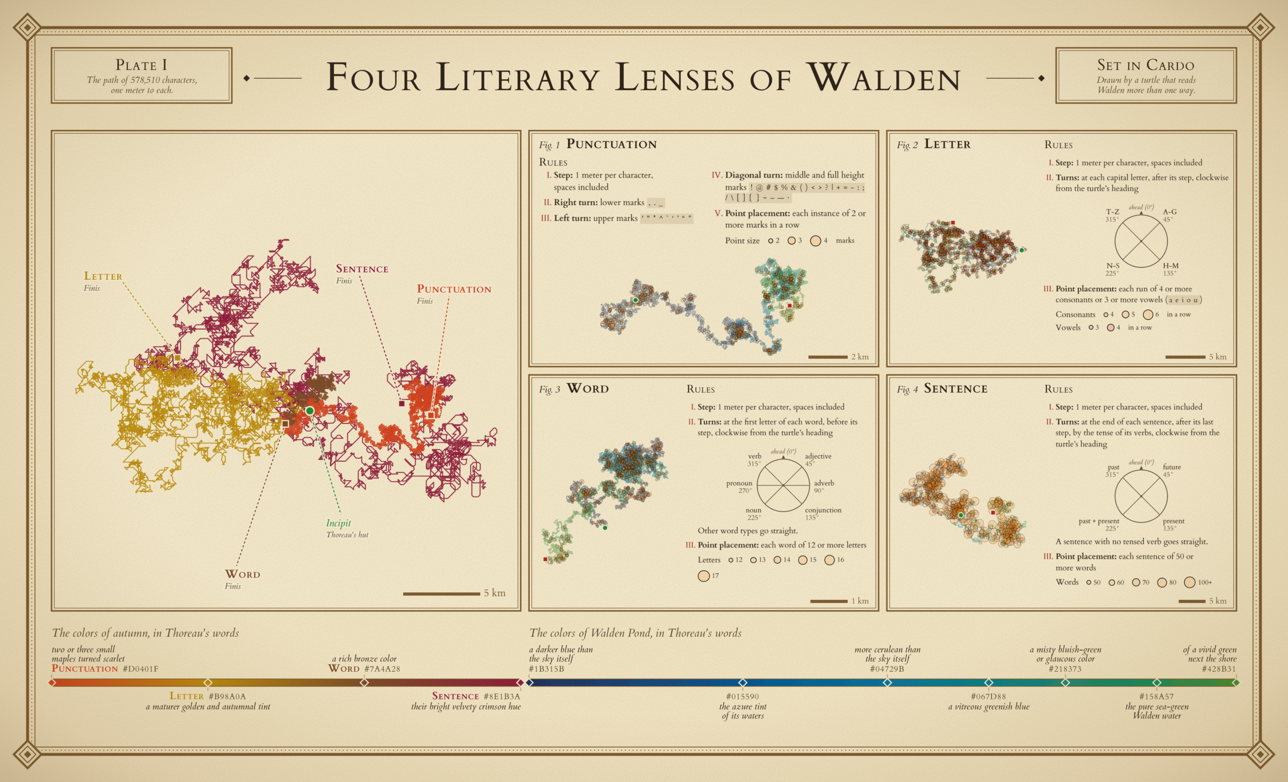
Four spatialized journeys of Walden, where each path is directed by a set of rules that respond only to a particular element of the text. The four paths share the same origin point and are plotted at various scales, according to the paths’ density. View the interactive map here.
As a designer and artist, I’m hesitant and a little suspicious about AI, especially for generative purposes. I’ve used Claude in the past to help process and create data for making maps, such as pulling In-n-Out Burger locations from their website and creating a .csv from which to plot points, but never to generate something new. I try to use it strictly as a tool to accomplish things I could do myself, but don’t have time for. Even so, I’ve been curious about the potential AI has for cartography and to see if it can generate a meaningful and beautiful map de novo. So when the opportunity to make a map for the #30DayMapChallenge “prompting” theme arose, I jumped at the excuse to put AI through its paces.
In my work, past (landscape architecture) and present (cartographic design), I strive to create detailed drawings and maps with extensive attention to detail, hand placed labels, carefully selected colors, and thoughtful composition design. Giving up direct control over the details was a challenge for me; though AI can certainly iterate more quickly than I, it’s hard to relinquish control of one’s own creative vision (especially when it doesn’t fully understand my request the first 10 times).
Screen capture walking through the interactive map, demonstrating the custom pop-ups, symbology, and overall functionality of the web map.
The final interactive map twists together the Situationist International pyschogeographical concept of Dérive with early programming logic to generate a series of maps that spatialize Henry David Thoreau’s Walden. These are not maps of the book’s Massachusetts setting, but of the text itself.
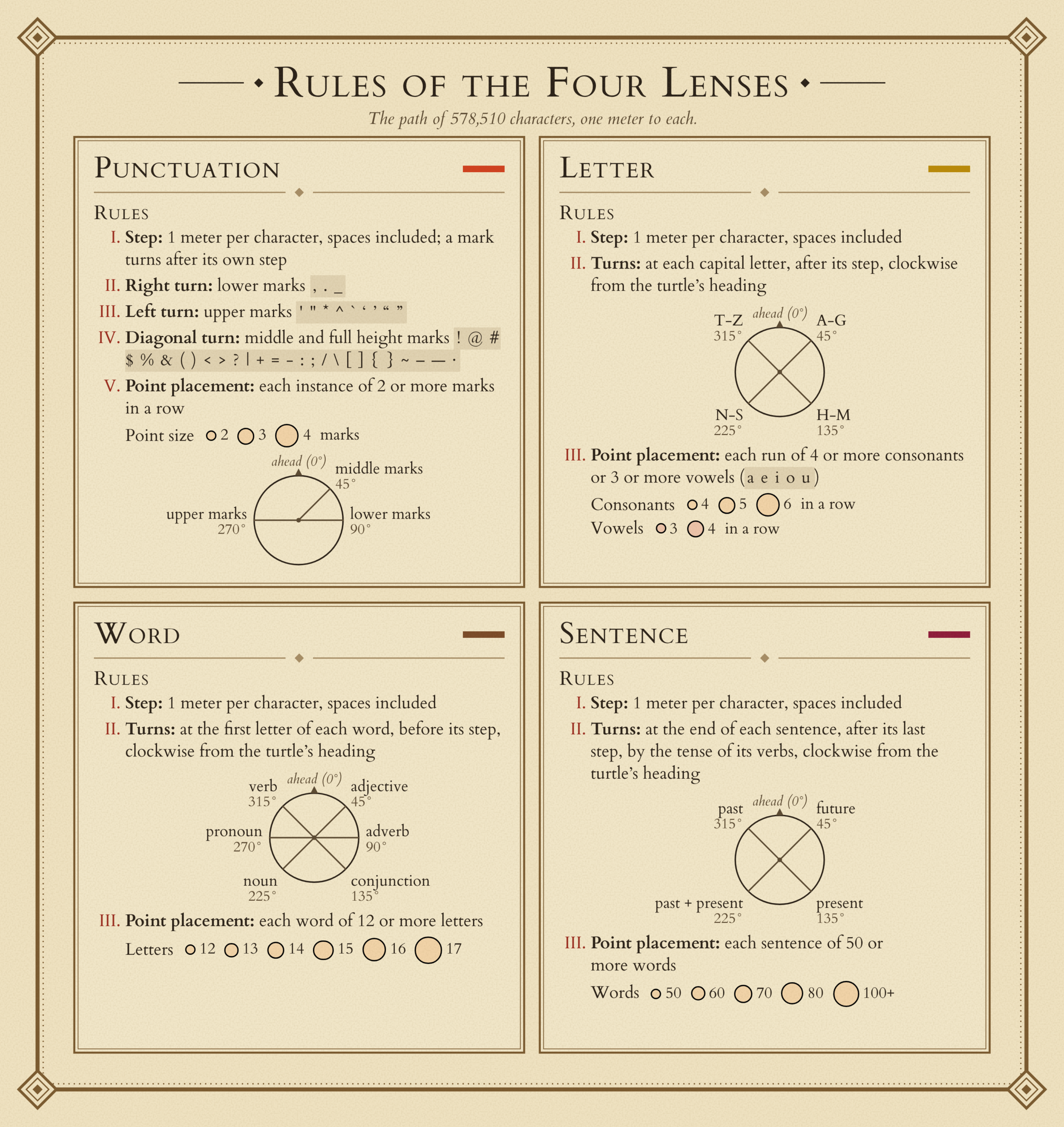
The text is interpreted through four different lenses, with each getting progressively more specific about the language used to craft the narrative: punctuation, letters, words, and sentences. The rationale behind how the paths are created draws inspiration from Logo turtle graphics, an educational programming language in which commands for movement produced a drawing of vectors, either by an on-screen cursor or small robot (the “turtle”). The four lenses are each composed of a set of rules that dictate how the turtle “reads” Walden and draws its interpretive path across the map. Essentially, the rules act as directions and tell the turtle to navigate across the screen.
Using the selector bar at the top, you can view each lens map individually or see them altogether in the overlay view. The color scheme is derived from Thoreau’s descriptions of the landscape around Walden Pond while the typeface and aesthetic of the map is inspired by a battered old copy of Walden I have on my bookshelf. I also worked with Claude’s Sonnet 5.5 to produce a static version of the map, a human-readable code package, and a guide on how to understand and edit the code. Now, let’s talk about how this was made.
The Idea
AI can be tricky. It makes assumptions, quiet changes to your work, and tries to cut corners by providing answers based on working memory and not actual verification. Question everything it gives you! In an attempt to mitigate these deficiencies, I preface any project with Claude with a version of this disclaimer (and sometimes you still have to remind it to do these things):
“Do not make any assumptions. Ask any clarifying questions before you begin a task. Disclose any pivots you made any why. Cite all sources.”
Here was my initial prompt:
“I want to write a python script that automatically draws a polyline in GIS based off of a set of rules I create to analyze a piece of literature. Before we dive in, does that make sense to you?”
As I was working out my ideas, I experimented with many different texts and many different techniques of rule-writing. Here are the three approaches I considered:
1. Map multiple texts from the same genre and use a set of rules that help tease out the essence of this collection of texts.
This set of rules would look at things that are more specific to the genre, such as adjective use, sentence length, frequency of particular words, etc.
2. Map a single text that I know really well and create a single set of rules that are highly tailored for that text.
For example, in The Fellowship of the Rings, one rule could be how often Tolkien says the word “ring”.
3. Map the same text multiple times with a different set of rules each time.
By examining elements like punctuation, word length, sentence length, adjective density, and lexicon, I could develop a set of rules that go from more generic to more specific. The goal here would not be to tailor the rules to a particular text, but rather to the written English language.
Designing the Rulebook
After some iteration, I chose Walden as my literary input paired with a refined version of the third approach listed above. Claude helped me dive into the minutia of the rules, uncover caveats and particularities, and visualize the impact that each decision would have on the overall form of the path.
While each lens has its own set of specific instructions, a few basic rules apply to all 4:
- Every character of the story (meaning the text’s letters, punctuation, spaces, etc.) dictates a step forward.
- Each step forward is equal to 1 meter.
- Each lens begins from the same origin point.
- Each new turn is made from the turtle’s current heading. Meaning, if the turtle is moving south and is prompted to turn right, it will turn toward the west.
- When a turn is initiated, the turtle first takes the step for that initiating character, then turns. That new direction applies from the next character on.
Creating the Interactive Map
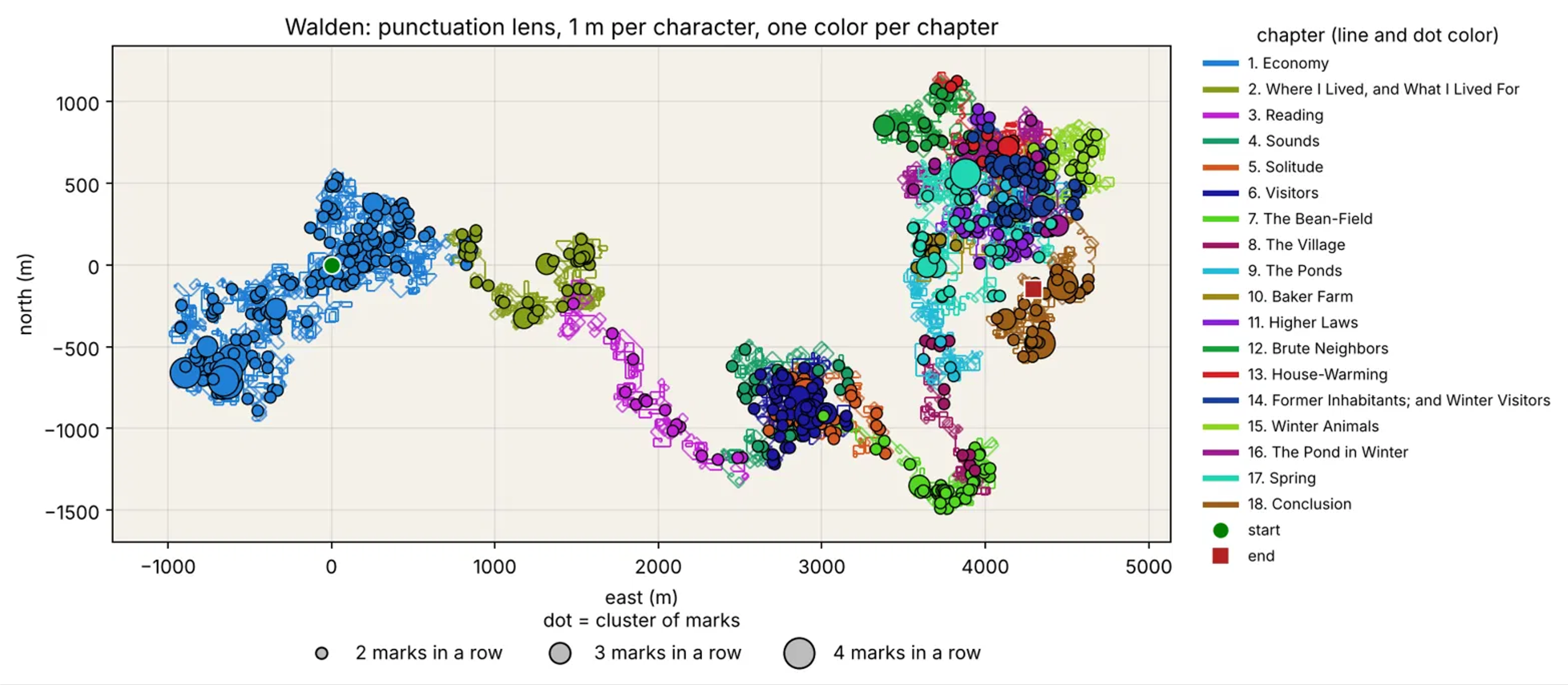
After establishing the initial set of rules I experimented with (which evolved into the punctuation lens) and clarifying that I want all of the mapping to happen within the AI environment, Claude produced a static map (which was really more of a graph at this point), an interactive web map, geojson of the path, and a zip of all the scripts it used to build that map – totally unprompted. At no point in the conversation so far did we discuss map medium, though I was envisioning a static map. I later asked Claude why it produced an interactive map and it responded with the following:
“Short answer: it was my interpretation of two things you said, and I should have flagged it as a choice instead of just doing it.
The first was “I want this to be an actual map, not a graph,” which you said right after an earlier test, where the output was a plain plotted path with no real coordinates. The second was that you’d said you didn’t want to bring anything into ArcGIS Pro at that point. Together, those read to me as wanting a georeferenced path on a real-world location, viewable without GIS software. In my head, the usual way to show that is a web map, so I built an HTML file with Leaflet, with pan, zoom and hover tooltips on the preposition points.”
Below are the first examples of the Walden static and interactive maps.
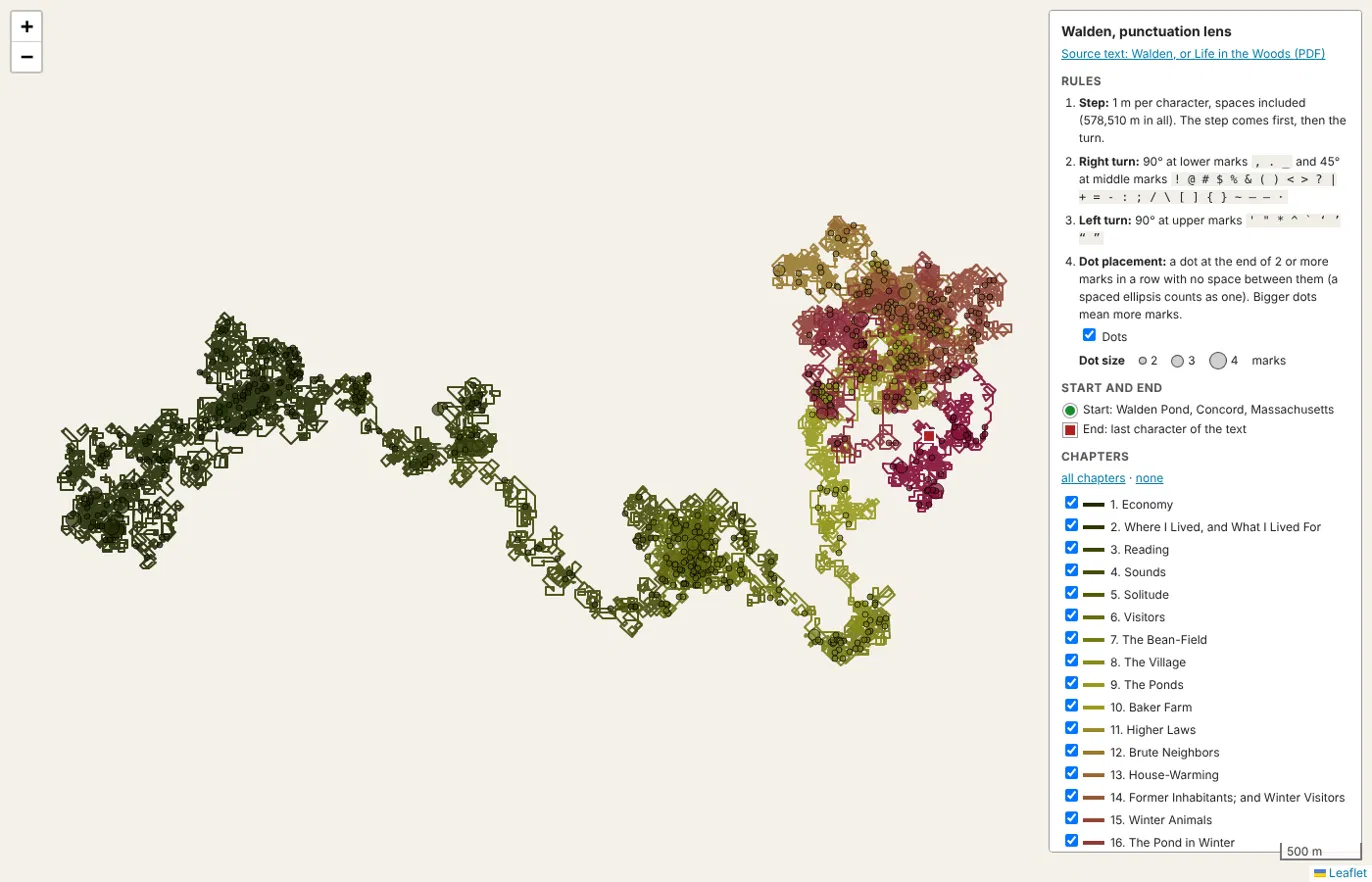
Initially Claude created the interactive map with Leaflet SDKs, but I later asked it to switch to ArcGIS Maps SDKs and it did so with only a single minor change to the functionality of the map (a slightly different zooming experience). It also created the early iterations as a static .html file so I later asked it for a React app so that the code is more human-legible. At the end of the web map portion of this project, I asked Claude to create a package that contained annotated code and a guide about how to use it, how to edit it, and what each bit means. You can check that out on my github repo.
The Aesthetic
When giving Claude the feedback about not wanting a graph, I was envisioning a more refined static map that did not have axes or guidelines and perhaps some color, so the web map was an unexpected surprise. To hone the aesthetic of this interactive map, I gave Claude this prompt:
“I’m interested in making this have the vibe of an old print copy of Walden: beautiful, vintage, beige-yellowing pages, crafted with care. What suggestions do you have to achieve this?”
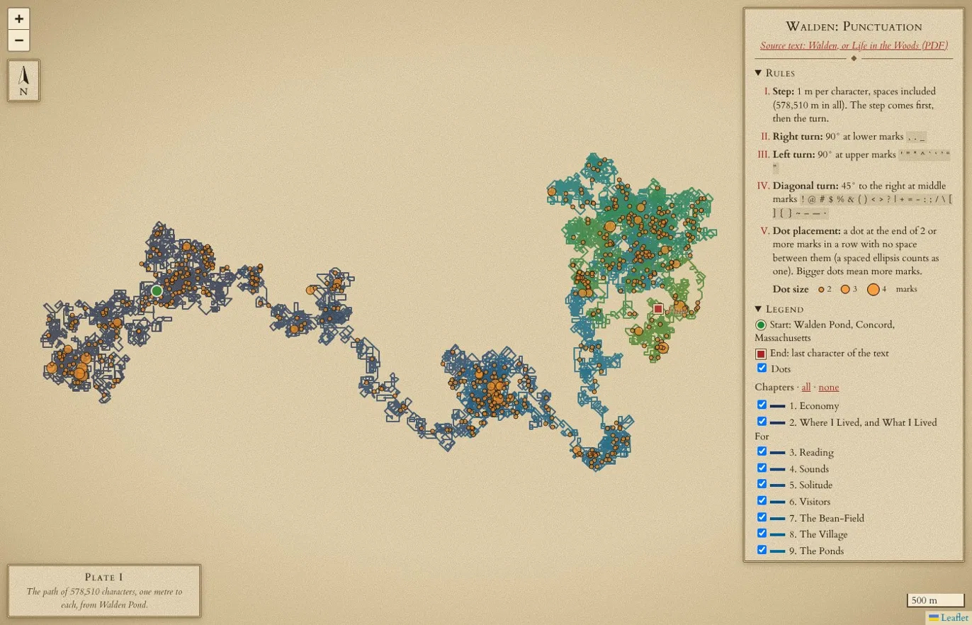
I asked Claude to implement all of its suggestions and its result was quite close to the feel of the final product. The finer details of the experience were something that needed a lot of refinement from me. You can see in the snip above that it generally understood the aesthetic I was going for, but it overlooked many of the small details that are essential for a cohesive experience. For example, the zoom icons, scale bar, and scroll bar are a brighter white than the background. The placement of the north arrow and scale bar is funny. The blue check boxes feel incomplete.
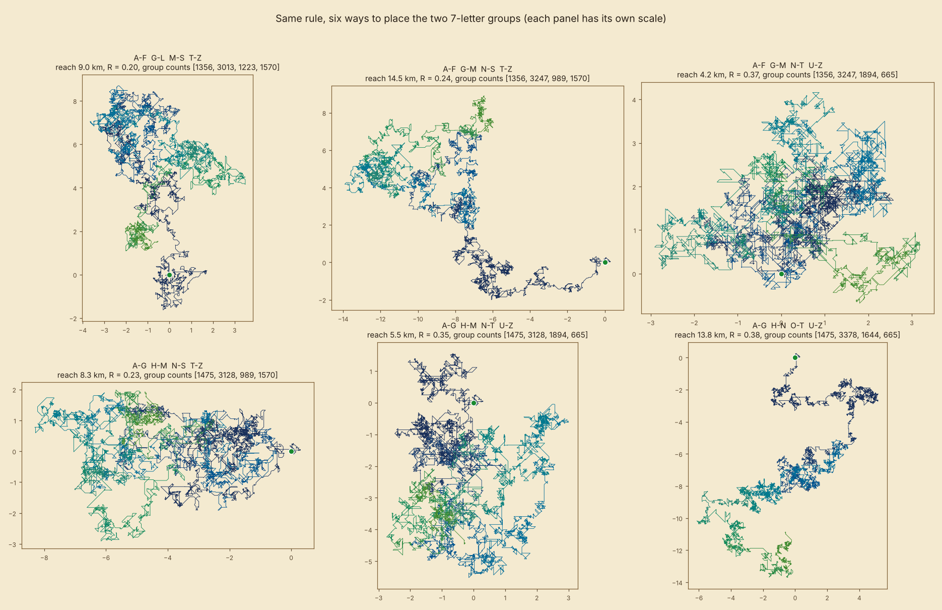
As I was working out the rules for the Letter Lens, in which a capital letter triggers one of 4 possible turn directions, Claude visualized for me, unprompted, what the path would look like based on how the alphabet was divided. This was a key consideration for this rule because the alphabet does not divide evenly by 4. Understanding how the most common capital letters in Walden (like I, T, and W) are distributed among the directional groupings has a direct impact on the drawn path.
Claude’s Design Sensibility
Claude made many small design choices that I was happy with but did not prompt it for: the Plate identifier, colophon, silhouettes of the path shapes on the top selector bar, and detailed popups with highlighted bits of text. I refined the design of these over days of back and forth. However, it struggled to get the symbology of the points on the map legible. I went through multiple iterations of color (I described the color I wanted instead of providing a hex code), sizing, and blend modes to ensure visibility of both the points and the line beneath across all zoom levels. Once I was satisfied with the look of the map, it did not automatically adjust the legend symbology to match. Claude’s maintenance of margins, consistency of typeface and color use, and overall organization of information within the interactive map throughout the iterative process were pretty spot-on and did not require much input from me. I’m surprised to say that Claude was (eventually) able to achieve every single thing I asked it to do. Sometimes it took 1 or 2 iterations, sometimes it took 20.
Creating the Static Map
Creating the static map with Claude is where I finally threw my hands in the air in frustration. While some of the elements like typeface, general aesthetic, and color choice carried over in the initial drafts, all of the finer details that had been worked in the interactive map were thrown to the wind here. There is overlapping text, conflicting leader lines, inconsistent text and paragraph treatments, poor marginalia, odd graphic embellishments, lost map symbology, and overall poor composition. Attention to standard typographic rules of thumb was lacking and Claude had a difficult time maintaining my requests when the layout of the page changed. Frequently I had to ask it to adjust the text, or frame that the text was in, to prevent orphaned words and to correct line spacing. In later iterations that had the color bar at the bottom, Claude struggled with the text placement and paragraph justification of the labels along the gradient.
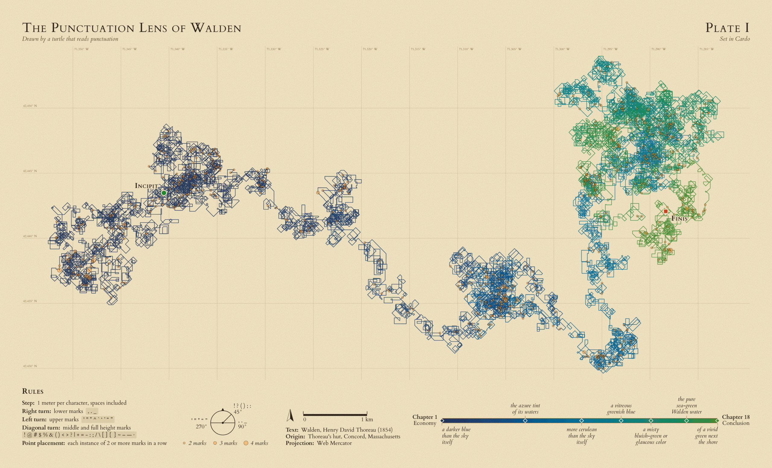
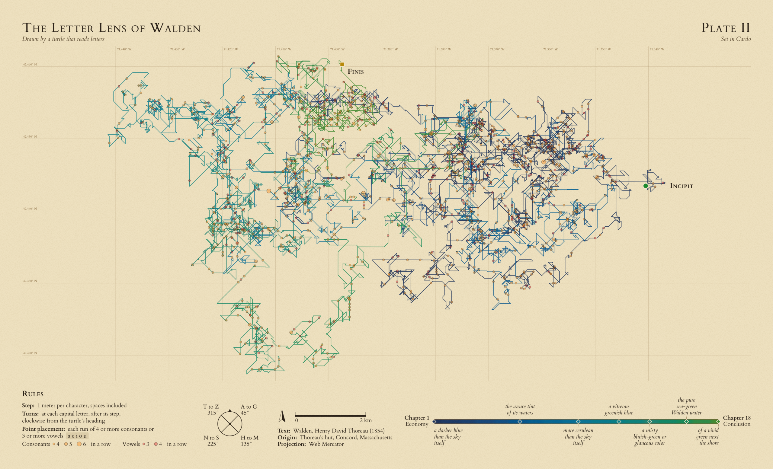
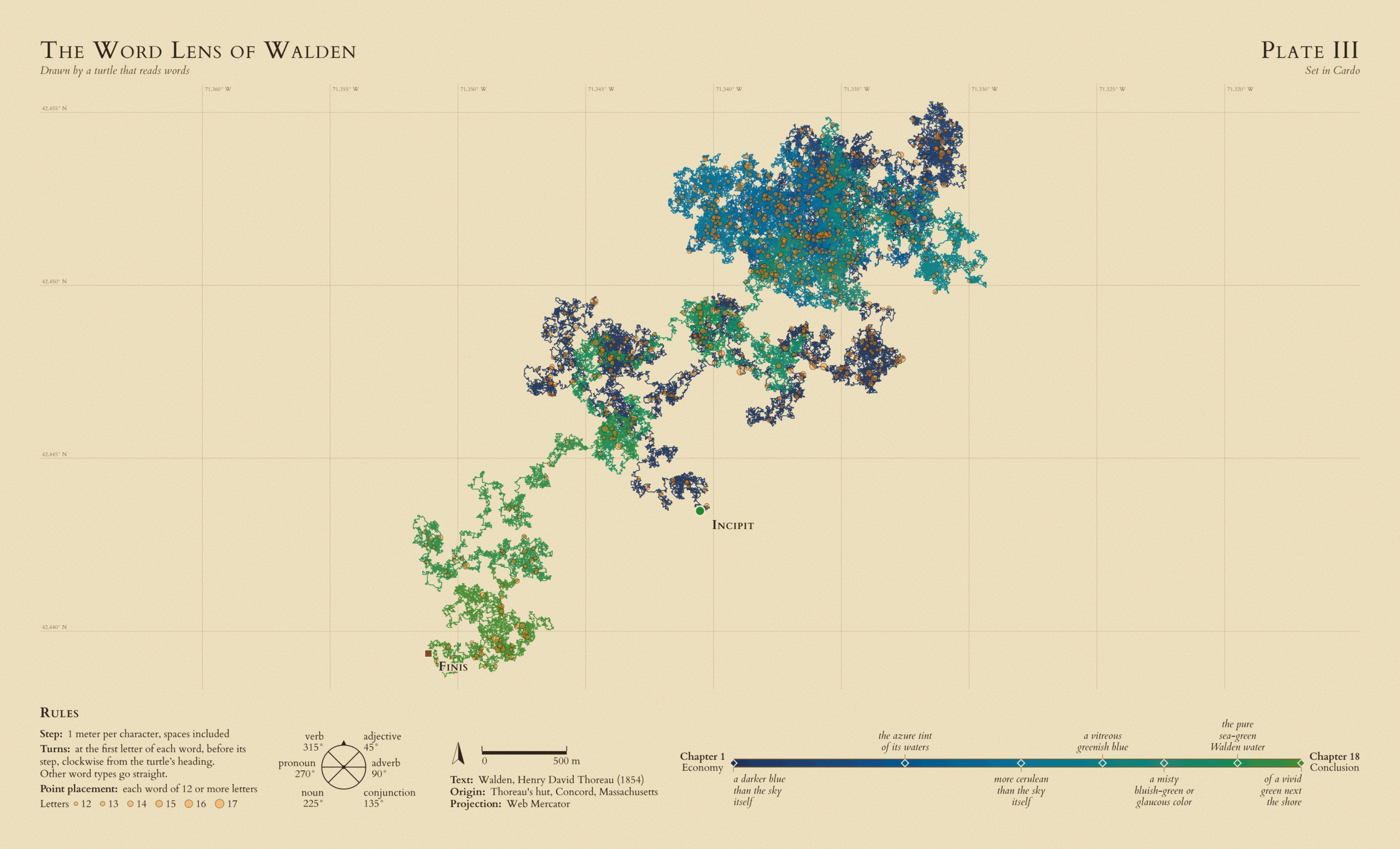
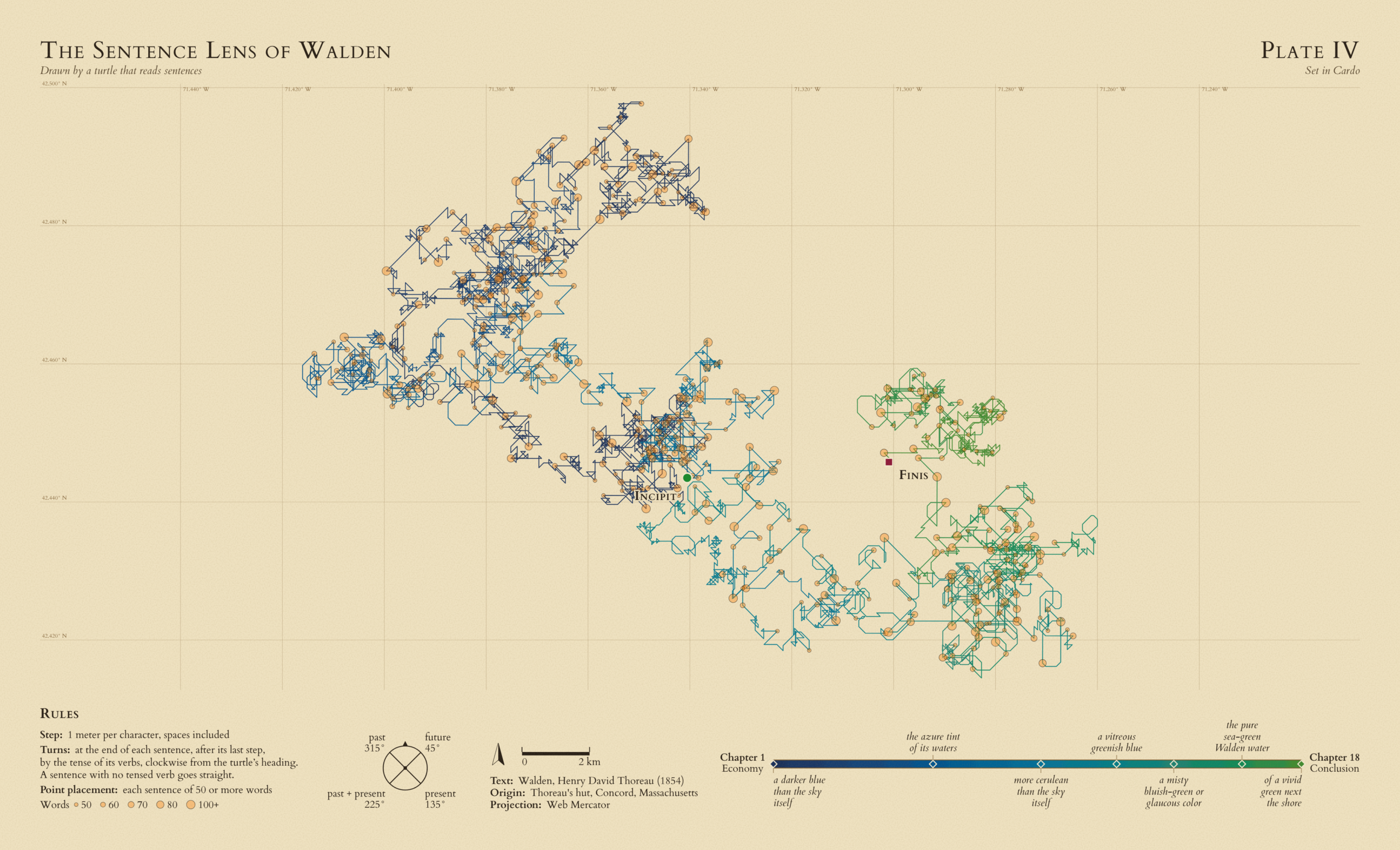
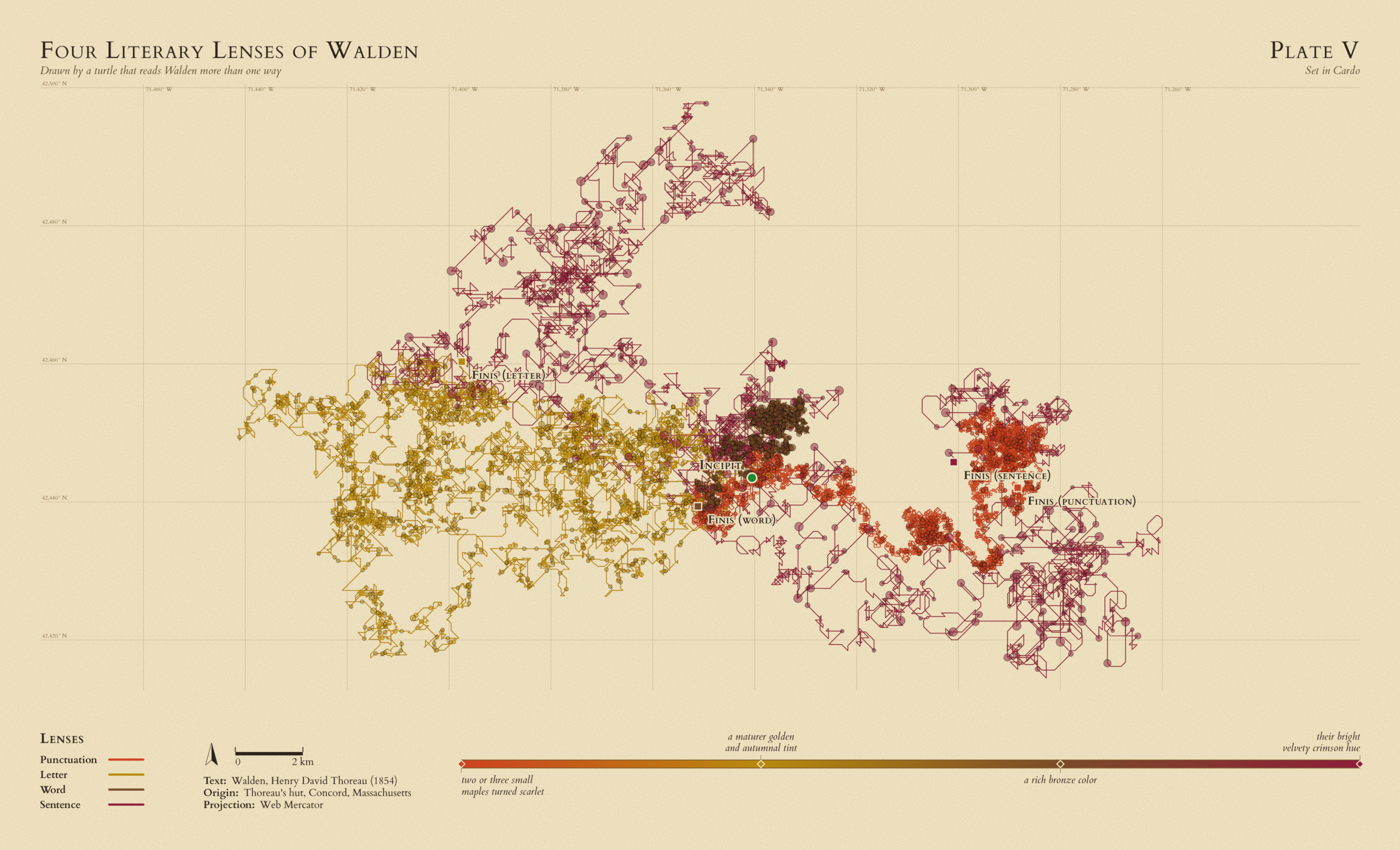
The initial goal of this project was to create a static map using AI and, while that goal was achieved, I consider it a rather lackluster success. I can envision 10 different ways to make it better, and now that I’ve said that I suppose I have to. Have you seen the video where a dad has his kids write instructions on how to make a pb&j sandwich, and he does exactly what is written rather than what they meant? Yeah, it felt like that. I would not use Claude, nor any other AI, again to generate a static map. It is not worth the frustration. I would, however, experiment using Claude again to develop web maps. It’s powerful but not without flaw. Knowing this, I would do a few things differently next time:
- Begin the prompt with the request for code that is human-readable, structured as a React app, and with the SDKs of my choosing
- Use it primarily to build the framework of the app that I can then tinker with outside of the AI environment
- Ask it to comment on every section of code about what it does and how/why/when to adjust it
- Be as detailed and specific as possible in my prompts and consider using images to convey an idea
Have fun and use AI responsibly!

Article Discussion: