ArcGIS StoryMaps is the professional tool for harnessing the power of maps to communicate your work using place-based storytelling. The easy-to-use builder enables you to combine maps, 3D scenes, embedded content, multimedia, and more to create an interactive narrative that can inspire interest — and action — from your readers.
Each month, our team uses community feedback to help inform new capabilities that can enhance your storytelling adventures. Check out what’s new this month!
Quick links
Infographics
Enhance understanding. Support visual learners. Highlight key points. Infographics simplify complex information by combining visuals and text, which can help your readers better understand your narrative and keep them engaged. And that’s why we’re excited to introduce the Infographic block, making it easy for you to enhance the data visualization of your stories and briefings!
From the block palette, select Infographic and then choose from four options: Basic, Stacked, Compact, and Titled. Your selection will bring you to Edit infographic, where you can customize your Data by specifying the Number, Description, and Icon (with over 100 icon options). Also, in the Settings tab, you can change your Layout and customize the Colors of your infographic.
Want to incorporate data visualization into your story or briefing? Check out this collection of stories that showcase the power of data visualization in communicating a message.
360 images
ArcGIS StoryMaps has long made it easy to combine multimedia to create an interactive narrative that immerses your readers in places around the world. Now, it’s time to take those immersive storytelling capabilities to the next degree — or the next 360 degrees, that is. 360-degree images enable your readers to explore a place as if they were physically there, which can deepen the emotional and sensory engagement and increase the stickiness of your stories and briefings.
Select 360 image from the block palette to add your supported JPG or PNG image file, which must be under 25 MB and have an aspect ratio between 1:5:1 and 3:1. After adding your image, you will find a familiar menu of options by hovering near the top of the 360 image viewer, along with accessible mouse and button controls to navigate the image and Enter full screen mode at the bottom of the viewer.
Read more about immersing your readers into an experience in this story about Nine steps to great storytelling.
Video playback options in briefings
Including videos with your narratives can enhance engagement by capturing your audience’s attention. Videos also often improve understanding of your topic by catering to different learning styles. Stories have long had a selection of video playback options that we’re excited to include in briefings now.
Find the Playback tab in Video options to determine how viewers will be able to interact with the video:
- Click to play: This video will start when readers click the play button.
- Autoplay without controls: This video will automatically start on mute and continuously loop. Readers won’t see controls and will not be able to enable audio but can pause the video by clicking it.
- Autoplay with controls: This video will automatically start playing on mute. Readers can pause, skip ahead, and enable audio if they choose.
Additional enhancements to boost accessible videos in briefings and stories include:
- Videos will stop playing when you navigate away from their slide in briefings.
- Video motion supports browsers set to prefer reduced motion in stories and briefings.
- Videos without controls can be clicked to pause in stories (to include sidecar and map tour panels) and briefings (to include cover videos).
Ready to create a briefing for your visual communication needs? Check out these Great examples: Briefings to get inspired!
Axis customization in charts
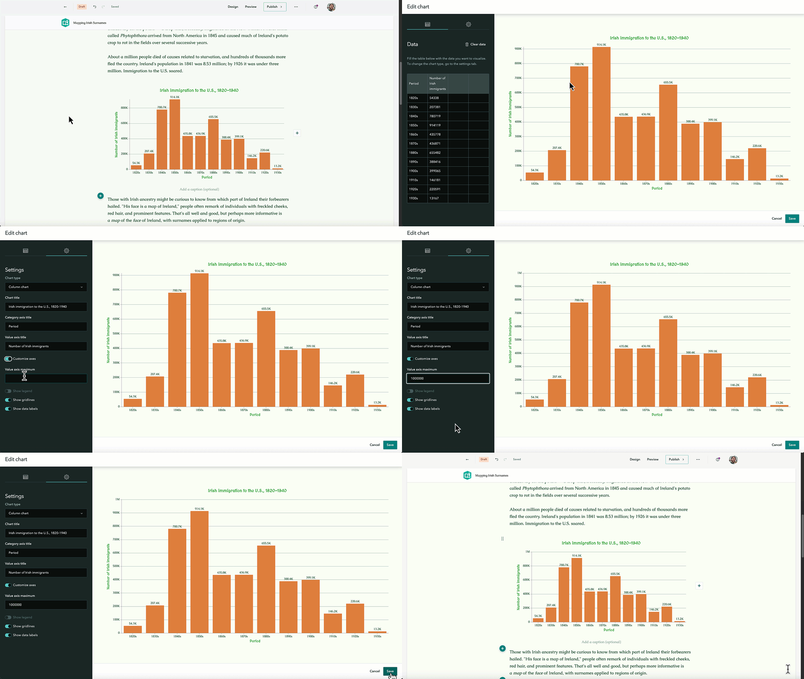
In December 2024, we introduced the Chart block to level up the visual power of your stories and continue to enhance this impactful feature. Now, you can customize the axis by modifying the Value axis maximum to suit your data visualization needs best. For instance, if the value is too high, slight differences between data points may appear insignificant. Or you could use the same axis maximum to ensure consistency across multiple charts, making comparisons more intuitive.
In Edit chart, go to the Settings tab and toggle on Customize axes. This will reveal the maximum field on the value axis.

Learn more about including side-by-side charts in your stories.
And more…
- Seven themes have been added to the Featured themes gallery.
- Map tours now support the button grid, which enables a row of up to two buttons in text panels.
- The batch image upload time to create a map tour has been significantly reduced, now taking several seconds rather than several minutes.
Check out the release notes for more details about other small changes and fixes released this month.
Thank you to Ashley Du and Will Hackney for their contributions to this post.
All Adobe Stock images are © 2025 Adobe Stock. All rights reserved.


Article Discussion: