ArcGIS for Microsoft Fabric enables organizations to leverage location analytics to drive insight generation within the Microsoft Fabric analytics environment. With Esri’s integrations across Fabric, we can bring location context to your analytics workflows, unlocking the power of where in your data.
In this blog post we will demonstrate analytics at scale using ArcGIS GeoAnalytics for Fabric and then show how to leverage those analytics for insight generation using ArcGIS for Power BI.
In our example, we will explore a set of oil and gas pipeline data to understand their relationships to competitors, critical infrastructure, and environmental habitats of interest. At scale, these analyses benefit from the performant computing, analytics, and reporting capabilities within Microsoft Fabric, and allow an organization to drive insight, reduce risk, and elevate their operational awareness. With critical infrastructure data and analyses like we work with in this post, reducing time to decision is a priority. Time to decision needs to be minutes, not hours or days, but the scale of the data makes this challenging. ArcGIS GeoAnalytics for Fabric leverages a scalable analytic platform to slice through large volumes of geospatial data in the time needed for insight.
But, driving insights isn’t just about being able to analyze large volumes of data; we also need to be able to put our results to work to generate information products that put exploration and insight generation in the hands of everyone across the organization.
Let’s take a look at what we can do!
Data
For this example, our main dataset is oil and gas pipelines from Rextag Energy DataLink. This dataset is the largest and most complete database on energy infrastructure assets in North America. With it, we are working with more than 1.5 million pipeline segments across North America.
Organizations rarely have a single location where all data is stored, and no one wants to duplicate data unnecessarily to make that data accessible. Microsoft Fabric can help tame these data challenges by allowing access to data across a variety of platforms. With the ArcGIS integrations, we can open even more doors and allow easier access to spatial data, including your data within the Esri ecosystem.
Using GeoAnalytics for Fabric, we can bring in data from a variety of data sources and analyze them together. For instance, if we have our company pipeline dataset in ArcGIS Enterprise, we can read the data as a feature service and analyze it in relation to other contextual datasets read from OneLake in Microsoft Fabric.
While we will just show a few data sources and analytic capabilities with our examples, GeoAnalytics for Fabric can work with a wide range of spatial and non-spatial data sources, and has more than 180 spatial SQL functions, track functions, and tools to tailor your analytics to meet your organizational needs. There is no moving of data, we simply read it into our Spark data frames and start generating insights. This sets us up for exploratory analysis of the results within Fabric using Power BI.
Analyzing our pipeline situation
To understand the pipeline data, we can start with understanding where our company pipelines intersect competitors. We can do this using the ST_Intersects and ST_Intersection functionality. This can tell us which segments have overlaps, and where these occur. To calculate this between almost 19,000 company pipelines and more than 1.4 million competitor pipelines takes just over 28 seconds in Fabric!

We can scale this out and look at larger problems, for instance, where our company pipelines intersect with or are near to critical transportation infrastructure, such as roads or railways. In this case, using GeoAnalytics for Fabric we can identify the over 59,000 points of intersection between our 19,000 company pipelines and more than 16 million road segments in just under two minutes! This type of analysis is important to understand potential risks to the pipeline network from incidents along the transportation corridors, as well as to improve coordination with local agencies.
Since incidents don’t just impact a point location, we might also want to scale this up even further and identify all of the pipeline segments that are nearby to the roads. In this case, we set a threshold of 100 meters, and identified all of the locations where the pipelines were within this distance of the roads – in just over one minute of analysis.

We could perform these same types of analysis with other datasets of interest, such as critical environmental habitats, so that we can understand the potential regulatory issues for our pipelines near to habitats, or to have rapid details on impacted species and habitats in case of an incident. In the next section we will set up our data to interactively explore this analysis of pipeline proximity to critical habitats.
Sharing our results
To use the results of our analysis more broadly for data modeling or interactive exploration, the datasets generated using GeoAnalytics for Fabric can be written to Fabric’s OneLake or back into your Esri environment for further use and sharing across your organization.
The analysis we performed with GeoAnalytics for Fabric to assess proximity to critical habitats resulted in two datasets that we saved to OneLake and ArcGIS Online so that they were accessible for a variety of downstream uses.
First, the enriched pipeline data with all attributes for modeling or reporting were saved in OneLake. This makes the dataset accessible to organizational users across the Fabric workspace and will be used directly in Power BI as a data layer. This dataset does not have geometry enabled but has key attributes that will link it to geometry in Power BI.
We also wrote a dataset directly as a feature service in ArcGIS Online. This dataset has geometry for visualization and can be used for mapping and modeling across the Esri ecosystem, but can also link to our Delta table in Power BI to facilitate map-based exploration in our dashboard.
Together, these datasets allow users to visualize the data on a map using ArcGIS for Power BI alongside other Power BI report charts and tables, enabling stakeholders to engage with the data, ask informed questions, and make more informed decisions.
Visualization and analysis in Power BI
Now let’s take a look at how we can use these value-added datasets that were generated through analysis with GeoAnalytics for Fabric. In this section, we will demonstrate picking those results up to visualize the results to generate an interactive dashboard that can be used across our organization to evaluate the situation of our pipeline infrastructure relative to critical habitats.

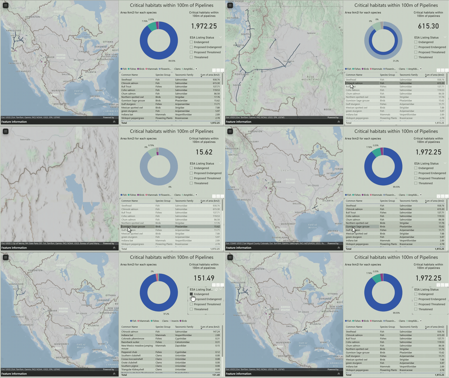
Our goal was to create a dashboard that not only helps us understand the potential regulatory issues for our pipelines near habitats, but also provides rapid details on impacted species and habitats in case of an incident. By leveraging interactive maps and visualizations, we can craft a narrative that tells a cohesive story about our pipeline infrastructure and its relationship to surrounding habitats. This enables effective collaboration and insight-sharing with our team, facilitating a more comprehensive understanding of the complex issues at hand.
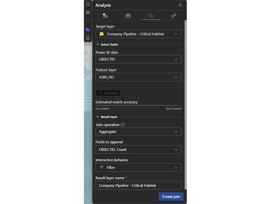
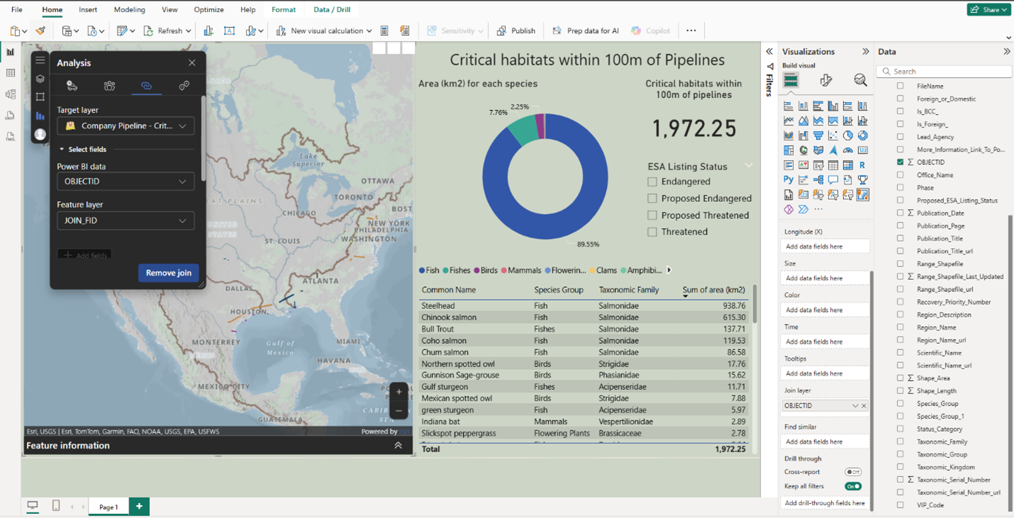
To get the data in shape for interactive exploration in Power BI, we start by connecting to our two data sources in OneLake and ArcGIS Online to set up the necessary data relationships. We have geometries in our feature service in ArcGIS Online and our critical attributes in OneLake. Using a common key, we can join these two datasets together by setting up a relationship in Power BI.

Now that we have our datasets linked, we can generate our dashboard and create various visuals, such as bar charts and graphs, to illustrate the extent of damage to critical or endangered species within 100 meters of our pipelines if an incident occurs.

By creating an interactive and intuitive dashboard, we can facilitate effective communication across teams, allowing everyone to explore the data, identify key trends, and gain a deeper understanding of the potential risks.
Conclusion
This blog demonstrated how ArcGIS for Microsoft Fabric can be used to analyze oil and gas pipeline data, understanding their relationships to competitors, critical infrastructure, and environmental habitats. The capabilities shown here are not limited to the energy sector, they can be applied to multiple business problems across various industries, significantly enhancing decision-making by providing deeper insights into complex spatial data. ArcGIS GeoAnalytics for Fabric enables organizations to integrate, transform, enrich, and drive location analytics at scale, driving insights and informed decision-making. By combining ArcGIS GeoAnalytics for Fabric and ArcGIS for Power BI, teams can analyze complex spatial data, visualize critical relationships, and share insights effectively across the organization.


Article Discussion: