Business Analyst Web App users have been mapping with hexagons since February 2024, using them as a geography option in popular workflows: color-coded maps, smart map search, and suitability analysis. Although they are simple six-sided shapes, hexagons are actually quite complex mapping tools. This article will guide you through scenarios where hexagons may be useful in your mapping and analysis.
Why should I use hexagons in mapping and analysis?
Hexagonal grids and hexbins are preferable when issues of connectivity, proximity, nearest neighborhood, or movement paths are crucial aspects to understanding the interactions of place-based data in analysis.
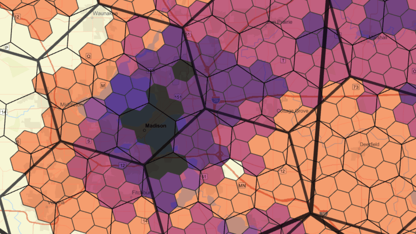
There are well-known challenges with displaying color-coded or otherwise symbolized data in standard geographies that vary significantly in size (such as block groups, ZIP Codes, and counties). Hexagons are particularly good at overcoming some of these challenges. The data in hexagons in Business Analyst have also been apportioned or aggregated to each specific resolution, reducing the biases that are introduced when mapping areas with large size variations. When using standard geographies, like census tracts or ZIP Codes, data in large polygons can be over-emphasized because of the polygon’s size, biasing perception that this geography is more important.

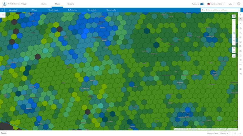
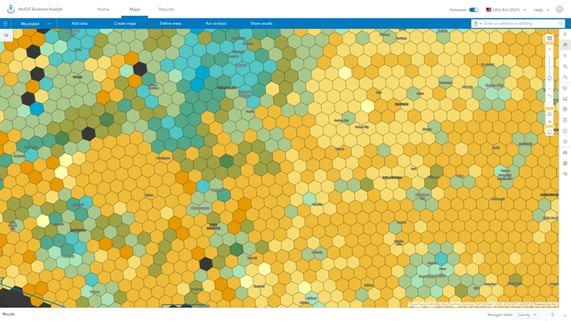
The images above show the total population of Minnesota, mapped at the county level (left) and with resolution 5 hexagons (right). Notice that the large polygon representing St. Louis County in the northeast draws the eye due to its dark purple shading and its size compared to the other counties. But when mapped with equally sized hexagons, the area’s sparse population is revealed.
Hexagons can be used like heat maps (density surfaces) to show the pattern of variation using color or different mapping techniques. They can represent discrete, quantitative variables in a more continuous and consistent way than heat maps. Heat maps are prone to the effects of weighting, clusters, and extremes of local variation. The consistent size of hexagons allows highly localized variations to be smoothed out and summarized. Esri’s choice of H3 hexagon resolutions strikes a balance between optimizing data for analysis and mapping, without compromising detail and data integrity at high H3 resolutions, below two miles in average area.
What are some common use cases for hexagons in mapping?
The first, and often best, use of hexagons in Business Analyst is in mapping and visualizations. When you create a thematic map of a formal geography, like a county (known as color-coded maps in Business Analyst Web App), large polygons are over-emphasized because of their size. This introduces bias and often hides variations and patterns that are important within smaller areas. With hexagons, the size is consistent and the data has been apportioned into each hexagon based on the underlying distribution of population, households, and businesses. This means that each variable is represented equally in terms of both size and distribution, eliminating some of the bias and providing new opportunities for visualization and analysis.
In the examples below, I have mapped the relationship between median income and median home value in Riverside County, California. With census tracts as the level of standard geography, you are drawn to the large areas of color; the variation in census tract size is very noticeable.

Using resolution 7 hexagons, which are about 1.5 miles in diameter, the pattern is much easier to see. I can pick out the large variations in Palm Springs and the Coachella Valley, and because we don’t provide hexagons where no one lives, such as unpopulated forests, mountains, and deserts.
One pattern that immediately stands out using hexagons is the clustering of higher-income households in lower-value homes near the Arizona border and around the city of Blythe. This pattern does not show up when using census tracts as the mapping unit.

The biggest drawback to using hexagons is that the familiar shapes of states, counties, etc. are lost. In Business Analyst Web App, you can use an analysis extent to draw the boundary of the area being analyzed, overlay boundaries and labels, and make the hexagon layer more transparent so that you can see the underlying basemap and reference place labels.
When zoomed into smaller areas, such as the City of Riverside, hexagons are still useful, but the 1.5-mile-diameter hexagon may be too big to show essential details and variations that are present in the data. Block group data can be used in color-coded maps at this scale, and many of the variations between individual block groups paint a pattern of variation across the city, with the wealthiest and most expensive homes being concentrated in the southwest corner of the City of Riverside and shown in blue using bivariate mapping.

With hexagons, this pattern is still obvious, but much of the unique and interesting pattern of variation to the north of this area is lost because a single hexagon covers multiple block groups.

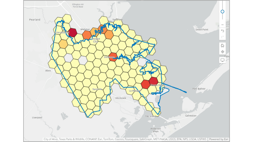
When using smart map search, hexagons can also help focus attention into areas with target conditions and characteristics. Using the same median income and home value variables, I have filtered the map to only show areas with median home values over $500,000 and incomes over $100,000. Block group-level data highlights the urban areas and some more rural communities that meet this pattern, but I still have potential interpretive bias because I am drawn towards the largest block groups. Those block groups border areas that are less populated, but when using hexagons these are excluded. I can trade off the generalization of the data into hexagons as I get a more consistent impression of the variation by using hexagons of the same size.


Hexagons are fast and highly responsive to changes in filters and adding/removing variables in smart map search. I often use hexagons to explore the data and relationships between variables, looking for clusters of communities, interesting patterns in the data, or conditions I never knew existed by using hexagons as my first geography type.
I then switch to using geographic areas such as block groups or census tracts to examine whether this pattern is real, rather than an artifact of apportionment. Hexagons are my go-to way of letting the data tell its own story, after which I switch to formal Census-based geographies to do further analysis and test my observations and ideas that I have seen in the hexagons. Sometimes those ideas are wrong, but I can live with the trade-off and flexibility that having both geographic and hexagon areas available for mapping offer.
What are some common use cases for hexagons in analysis?
With the upgrades to suitability analysis that happened in February 2024, hexagons are now a standard geography type in Business Analysis Web App. You could always bring your own hexagon or grid maps into the application, but starting with the February 2024 release, suitability analysis supports hexagons for all 15,000+ U.S. variables.
Suitability analysis combines multiple variables via a user-defined weighting model and ranks the locations based on the model. Hexagons are an alternative geographic representation that allow you to approach problems at different geographic scopes and scales, while removing the impact of the different geographic scales of the individual geographic units like counties or ZIP Codes. For example, in social science you might want to look at factors that call for changes in policy or apply to a range of communities, but you want to remove the biases associated with the original collection method. Hexagons allow you to do this, and you can use different scales (hexagon resolutions) to show the impact and outcomes defined in your model.

In the above example, housing indicator analysis at the block group level, larger block groups dominate the map. When using H3 hexagons at resolution 7 (0.8-mile radius) as shown below, the pattern is subdued but the highest- and lowest-scoring locations are much easier to see. The combine values scoring method, together with the use of hexagons, has rebalanced the range of scores in line with the true distribution of housing units.

Where local solutions are best targeted to individual communities, hexagons can also be applicable because they can summarize issues and remove the complexities of large variations between traditional geographies. Suitability analysis provides a range of advanced but easy-to-use techniques to adjust your model, refit data, and handle different data distributions, making it a powerful tool made even better by the opportunity to use hexagons.
Using a more refined model, which uses quantiles and breaks the model into ten equal classes rather than using five natural breaks, we can better understand how some variables compound to have negative effects on the model. Outliers have less influence and some of the more local variations, clusters, and changes become more obvious.

Can you provide examples of when hexagons are better to use in my analysis, and when I should use standard geographies?
One of the advantages of hexagon grids is that they tend to make the finding of related neighbors and clusters easier. They also remove the tendency of fishnet (square) grids to create linear data artifacts (rows, columns, or diagonals of data) that draw the eye to visual superficialities.
Hexagons have centroids that are dispersed such that each neighbor is equidistant. With a fishnet (square) grid, the neighboring centroids which are above/below/right/left (known as the Rook’s Case) are N units away, while the centroids of the diagonal (Queen) neighbors are farther away (exactly the square root of 2 times N units away).
Since the distance between centroids is the same in all six directions with hexagons, if you are using a distance band to find neighbors, summarize competitors, or group data by aggregating points, hexagonal grids are better than a fishnet grid or standard geographies.
The type of analysis or visualization that you do will strongly influence when you should use hexagons rather than standard geographies. In general, areas with large variations in size (as is often the case with standard geographies) over-emphasize values when using thematic mapping. Hexagons are also a more effective way to consistently aggregate points to improve your ability to visualize patterns and clusters in your data, especially when many points overlap each other.
Can I make a hexagon map of the whole of the U.S. or another country, or a specific area like a county?
You can use any area of interest to create hexagons in Business Analyst Pro. This could be an outline of the U.S., a state, ZIP Code, or another country. You can use GeoEnrichment to add demographics data as needed.
When creating your own hexagon layers, Business Analyst Pro calculates all the hexagon or grid centroids that fall within the area of interest (also known as the analysis area). Hexagons will be created for every centroid and some of the hexagon shapes may fall outside of the boundary of the area of interest. You can also create hexagon and grid centroids in addition to area shapes. All outputs can be edited to remove unwanted areas or centroids.
Business Analyst Web App does not support the creation of custom hexagon maps, but a map generated using color-coded maps, smart map search, or suitability analysis can be shared to ArcGIS Online.
How does the area of an H3 hexagon change due to projections?
When working with large mapping extents, all tessellations will distort due to how the shapes of the grid lattice are projected onto the Earth’s surface. This means that the areas of H3 hexagons vary across resolutions. For this reason, we summarize the area and edge length of hexagons as averages. Actual measured areas and lengths for individual H3 hexagons may be different.
In Business Analyst Web App, we also round the dimensions to one decimal place to provide readable descriptions for each resolution. This makes them more understandable to users. For example, a resolution 5 H3 hexagon has an average area of approximately 252.9 km2 or 97.6 miles2 and an average edge length of 9.9 km or 6.1 miles, while an H3 resolution 7 has an average area of approximately 2.0 miles2 and an average length of 0.9 miles.
A resolution 3 H3 hexagon has an average area of 4,785 miles2 but the true geodesic area varies between approximately 2,300 and 5,800 miles2.
You can see projection-based distortions in shape and area in this example in Alaska using H3 hexagons at resolution 3, which have an average radius of 98.2 miles. Hexagons near the top are larger than those at the bottom of the state.

What are some of the drawbacks with hexagons across different spatial resolutions?
Unlike squares and triangles, you cannot perfectly divide or merge hexagons to another resolution without parts of the underlying hexagons falling beyond the edges of the larger hexagon that encloses them. This means that aggregating or disaggregating data across scales is not consistent, introducing errors associated with how different parts of the underlying shapes are assigned to the next larger- or smaller-resolution hexagon lattice.


Multiresolution hexagons cannot form a continuous multi-sized tessellation like squares can, due to the way that smaller-resolution hexagons overlap their larger parents. Dissolving the boundaries of the hexagons results in no hexagonal shapes. With squares and triangles, any area of interest can be subdivided into a range of different-sized polygons using multi-resolutions polygons within the same area of interest.

Is the bivariate mapping style available to use with hexagons? What other styles are available?
As shown at right, bivariate mapping is available with hexagons in color-coded maps. This style is one of my favorites because it’s a great way to experiment with, experience, and understand the relationships between two variables.

You can also use other techniques such as color and size, where the size of a shape is proportional to its value. Adding color emphasizes this property or the relationship with another variable. It’s a technique related to bivariate mapping.
A color and size map of Riverside County showing the relationship between income and home value, where the range of income is shown from low (blue) to high (red) with the size of the dot representing low home values (small) to high values (large). Pockets of both high home values and income show up as large red dots at the center of the hexagons, while low income, low value homes are small blue dots.

Dot density is a technique that randomly distributes dots within the hexagon based on the attribute value. The higher the value, the more dots. By adjusting the hexagon outline to be fully transparent, and adjusting the dot density, hexagons create a really pleasing continuous display that shows clusters well and avoids spare pixels where there are no hexagons.

Dot density can be used with colored areas to add extra context and visual cues to the reader to understand the patterns better. In the example below, I have classified income into 20 classes, applied a continuous green color ramp, and removed the boundaries by setting the transparency to 100%. This creates a heat map-type effect in which the dots add to underlying color variation to emphasize places with high values.

The same data displayed using the same color ramp alone does not have the same impact.

How does hexagon analysis improve the handling of outliers?
On their own, hexagons do not improve the handling of outliers. Hexagons—and the analysis that Business Analyst Web App supports—make it easier, in some cases, to identify and reduce the impact of outliers. Some of the techniques include better visualization of data ranges using distribution graphs and filtering, understanding correlations and r-squared values, and other tools that support data exploration and engineering.
Why are there gaps when using hexagon mapping compared to standard geographies?
When creating the H3 hexagon layers, Esri decided to not show hexagons where no one lives, such as unpopulated areas like the sea, lakes, forests, mountains, and deserts. Hexagons with zero population are excluded when using the mapping and analysis techniques.
When people live on lakes or water bodies, and they fall within a hexagon, those populated areas are included.


Article Discussion: