The latest update of Business Analyst Web and Mobile Apps is here! This update allows you to create dot density maps, use infographic templates across organizations and countries, edit site attributes and validation, and much more.
Here are the highlights:
Create Dot Density Maps
Visualize data using dot density symbology that allows to represent the data variable value using density of dots in an area. For example, show 2018 US population by state using dot density symbology where each dot represents 15,000 people.
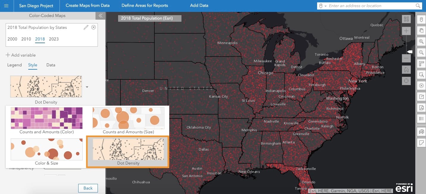
This new visualization style is available as part of the Color-Coded Maps workflow. Go to the Style tab and choose the Dot Density option from the available style options. Then easily configure how you want to style the dot density map. Define the value for each dot, distribution (e.g. density) of dots, and dot size and color to generate the best visualization for your data. The lock option for Dot Value allows you to maintain a fixed value for each dot at different zoom levels.
Use Infographic Templates Across Organizations and Countries
Let’s say you are a member of multiple ArcGIS organizations. You create a great looking infographics template in one of your ArcGIS organizations that members of other ArcGIS organizations want to use. Currently, you can do this by sharing your template to a group in your organization and adding members of other organizations to that group in ArcGIS Online. Now you can download infographic templates from one organization and import them into another ArcGIS organization. The download option provides an additional way to collaborate with other organization members who don’t want to make their user profile public (that allows adding them to the groups outside their organization).
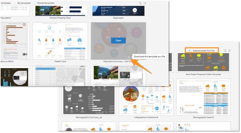
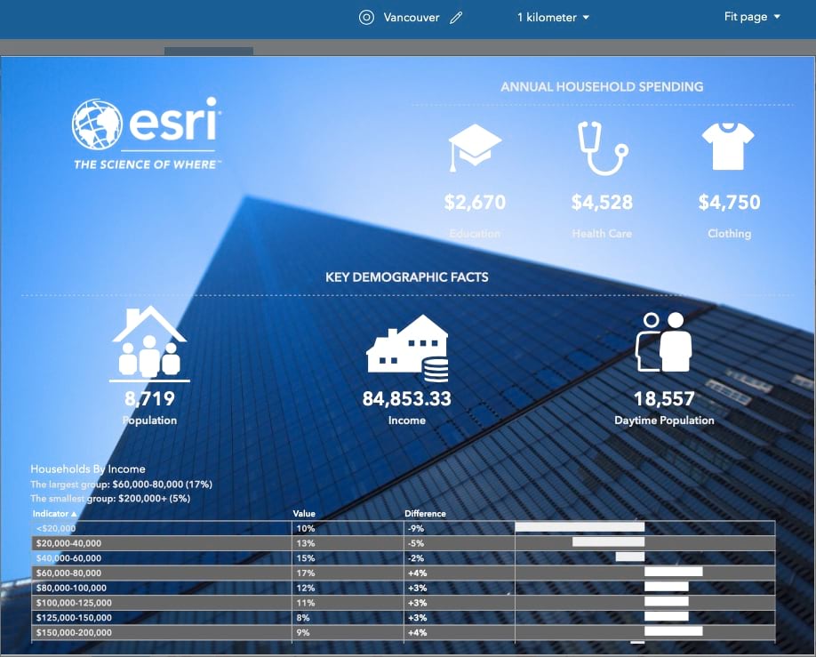
You can also import the downloaded template in other countries. This helps leverage the US based infographic templates in other countries. For example, the infographic below shows the Skyscraper template for the US being run for Canada.
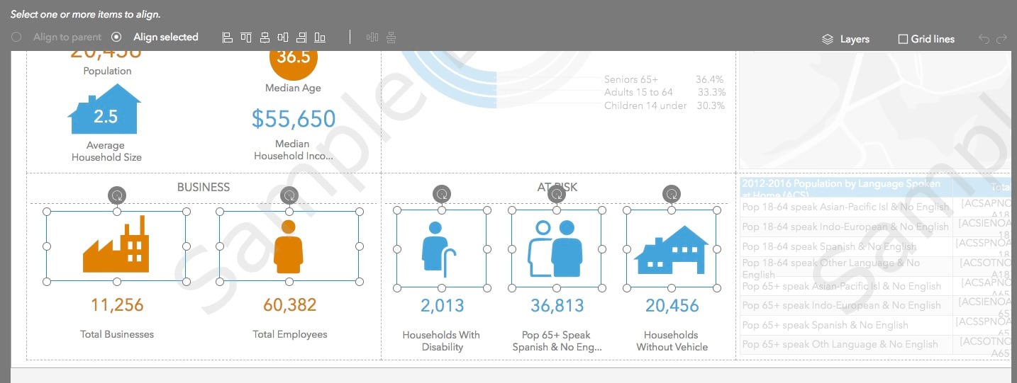
Additionally, you can use a new set of alignment tools to create more polished and advanced infographics templates. Align content within one panel and across multiple panels, use layer of objects to control their drawing order, and much more.
Categorize and Browse Your Own Data More Easily
Using your own data, as well as data gathered from public agencies and third-party vendors is a critical part of your market analysis. For example, store sales, number of customers, crime records, economic indicators, and regional demographic data provided by vendors in your country. Often these datasets have a large number of variables and categories similar to Esri Demographics data. Using the custom data setup workflow, you have already been able to bring in and use such data in BA Web. Now you can create your own data categories and sub-categories to display in the Data Browser and assign them with custom icons. You can then easily distribute and organize your data variables in these custom categories; essentially creating your own data browsing experience similar to the one available for Esri Demographics data.

Edit Site Attributes and Validation
When the project is first created, you can define attributes and setup attribute validation for the default point layer. Now you can change and update the attributes after the project is created. Additionally, you can edit attributes and validation for other site layers added to your project.
Let’s say at the time of creating your project, you defined Traffic, Year Built, and Visibility as the default attributes. You also setup validation on the Visibility attribute with High and Low values. Afterwards you gathered information on the number of parking spaces and price for the potential site locations you are analyzing. You can add these additional attributes to the layer that has potential site locations. Additionally, you can update the attribute validation whenever needed. For example, add Medium Visibility as another validation option for the Visibility field.
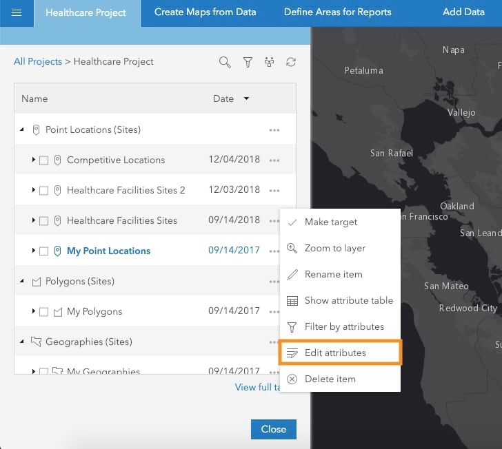
You can use the edit attributes option in the layers action menu, update the attributes and validation values, and save your edits. Please be cautious when making attribute and validation changes since this could affect existing records.
New Way for Sharing All-in-One PDF Reports
Using the all-in-one PDF reports option, you can run a combination of different reports for a location, merge them into one single PDF file, and have them emailed to yourself and others.
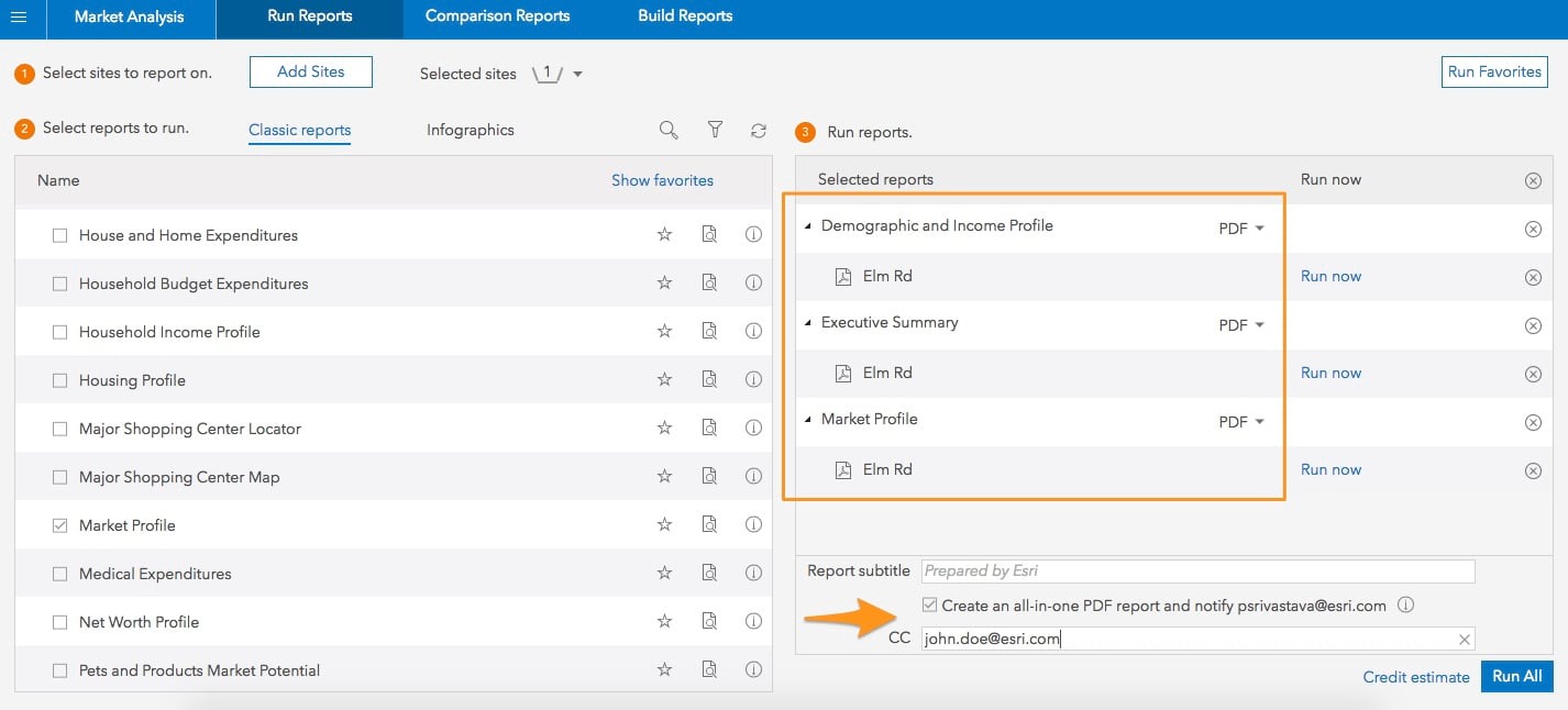
Now when you are adding someone’s email address to CC, you can control how you share the all-in-one PDF reports. You can keep them private, make them public, or share them with your organization members and groups of members.
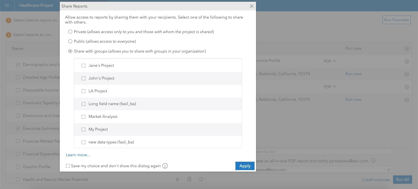
If you are emailing the all-in-one PDF report link to others, you need to share the report with the recipients using the applicable sharing options shown above. You can always download and email the all-in-one PDF reports to others.
Other Enhancements
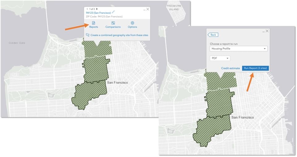
- Select multiple sites on the map and run reports for all the sites without merging them. For example, select three Zip Codes in San Francisco and run the Housing Profile report for individual zip codes in one click.
- Change chart colors and print benchmark reports in New Comparison Reports.
- Additional Map Legend customization and print options.
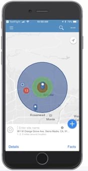
Use Customization on Business Analyst Mobile App
App Customization made in the Business Analyst Web App is now available on the mobile app such as custom application theming to reflect your organization’s branding and the list of classic reports and infographics customized by various ArcGIS roles.
Additionally, you can edit site name to enter custom names that help you identify the site more easily. By default, site names show the default geocoding result e.g. 123 Main St. But you might want to rename it to say ‘Prospective Location in Anaheim’ to easily remember what this location represents.
Data Update
- Additional 2016 Census data for Canada
- Germany data from Nexiga updated to 2018 vintage
- Michael-Bauer Research data updated to 2018 vintage for 26 countries including Australia, Brazil, Japan, Mexico, Singapore, and South Korea
Login and start using the new Business Analyst Web App features today!

Commenting is not enabled for this article.