The European cross-border data source combines thirty-nine European countries into one group and can be used for mapping and analysis in Business Analyst. This data source is provided by Michael Bauer Research (MBR). Initially released in November 2024, this data source is now out of beta and in general availability. It is available for Business Analyst Web App Advanced and Business Analyst Pro.
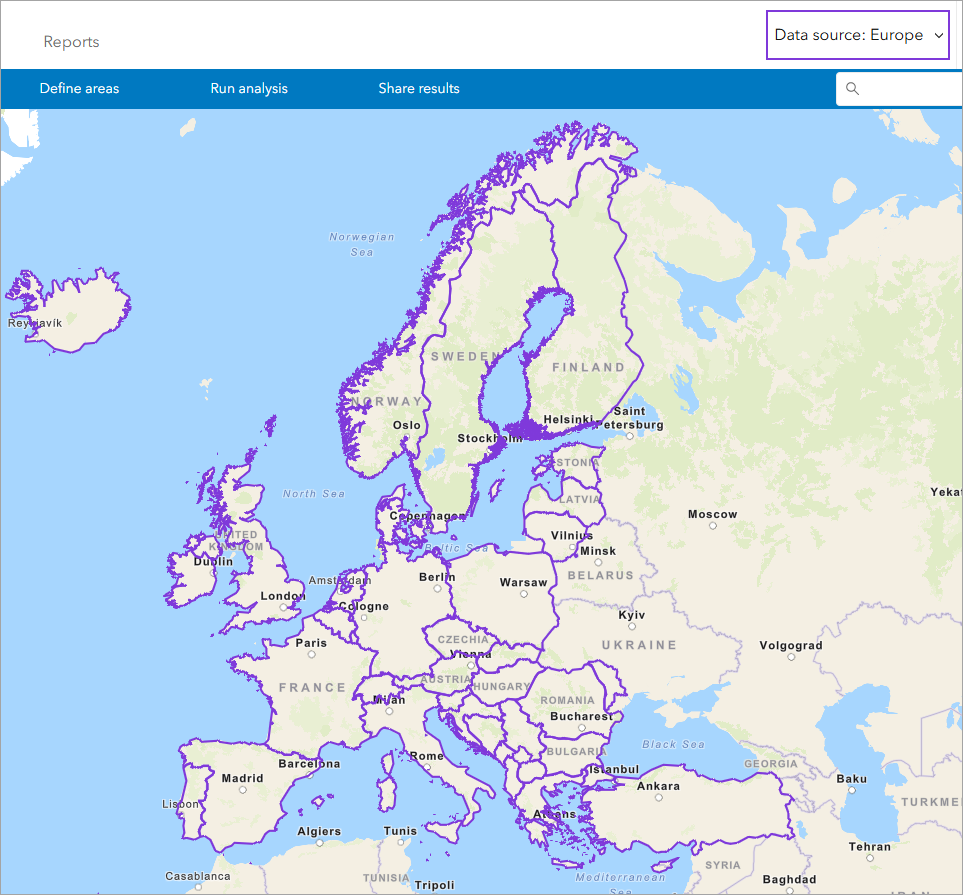
The Europe cross-border data source provides customers with the ability to create maps, run reports, and perform analyses that span country borders. Currency values are in euros (€) to facilitate cross-border comparisons. This aggregated data source provides a broad variety of sociodemographic and consumer data. The sixty-six available indicators include:
| Population | Marital status |
| Household data (including household size, households by type, and households by income) | Employment and unemployment |
| Sex and age | Purchasing power (a household’s disposable income) |
| Education | Consumer spending by product groups |
Data are available on internationally comparable geographical levels and hexagon grids. Data are compiled on administrative, postcode, and micro levels compatible to existing available boundaries.
In Business Analyst Web App, read the data source description by clicking the Click to show data source details button.
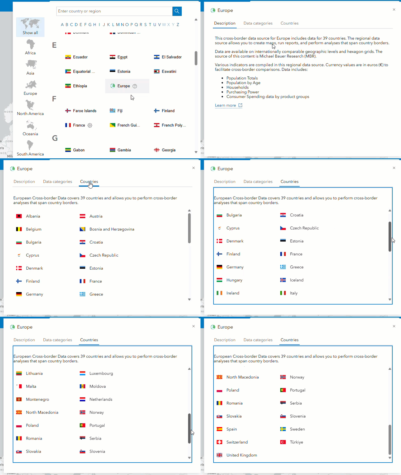
Use European cross-border data in Business Analyst Web App Advanced
In Business Analyst Web App Advanced, use the Data source drop-down menu to set the data source to Europe.

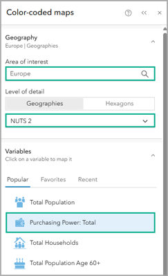
An example of how we can use this cross-border data source is to analyze purchasing power across countries in Europe using a color-coded map. On the Maps tab, click Create maps and click Color-coded maps. In the Geography section, use Europe as the area of interest. For the level of detail, use NUTS 2 boundaries. Policymakers use NUTS 2 regions to define areas that are eligible for structural funding and regional policy support and to visualize where EU investments are focused. For the variable, select 2025 Purchasing Power: Total.
Let’s use the Dot density with area color map style and change the color ramp to a pink color scheme with the High to low theme.
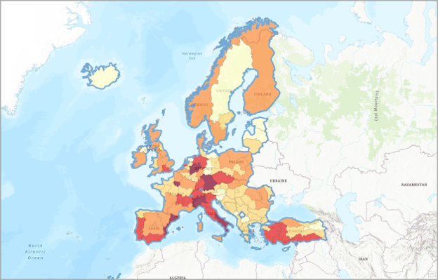
The darkest color on the map (in this case, burgundy) represents the highest purchasing power value whereas the lightest color (in this case, pale yellow or ecru) represents the lowest purchasing power value.
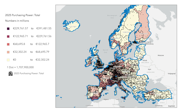
This example uses a color-coded map to visualize purchasing power for the 39 countries included in the Europe data source. Cross-border analysis with the Europe data source can be utilized with any mapping and analysis capability.
European cross-border infographics
Let’s run infographics in Business Analyst Web App Advanced. There are two infographic templates specifically designed for the Europe data source: Population and Spending Summary (Standard) and Europe Summary Report (Tabular).
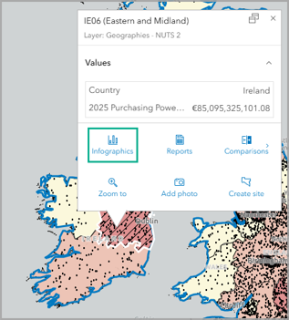
Use sites from the color-coded map visualizing purchasing power. For example, click on the eastern NUTS 2 boundary in Ireland: Eastern and Midland. Click Infographics on the site’s pop-up menu, select Population and Spending Summary (Standard) from the drop-down menu, and click Run infographic.
To compare the Eastern and Midland boundary with other geographic levels, click the site detail and turn the Compare with geographies toggle button on. The infographic runs, comparing Eastern and Midland with larger geographies like Kildare, Ireland, and Europe.
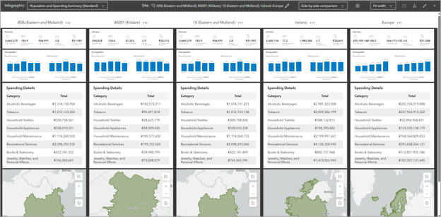
In the infographic builder, we can view a different infographic. Click the infographic name to expand the infographics drop-down list, expand Standard infographics, and click Europe Summary Report (Tabular).
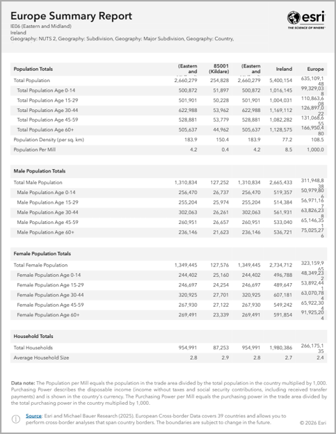
This tabular infographic template displays data tables with a comprehensive overview of population totals disaggregated by gender, household totals, purchasing power, expenditures by category, and area of the site.
Use European cross-border data in Business Analyst Pro
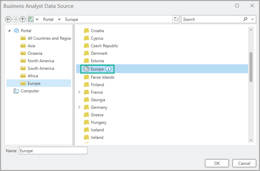
In Business Analyst Pro, in the Business Analysis menu, click Change data source to choose a portal or ArcGIS Online data source. Under Portal, click the Europe folder and then select Europe as the data source.
Let’s use Business Analyst Pro’s color-coded layer workflow to create a 3D hexagon map of the total population in an area of interest that crosses European borders. From the Business Analysis menu, click Color Coded Layer. The data browser opens right away, allowing you to select a variable to map—click Population, then Common Population Variables, and then choose 2025 Total Population and click OK. This variable within the Europe data source represents the total population for every country in the dataset.
The 2025 Total Population variable is immediately mapped for the 39 countries in the Europe data source:
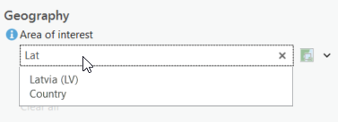
Set the area of interest by entering country names. For this example, let’s use three Baltic states: Estonia, Latvia, and Lithuania. Enter the names one at a time in the Area of interest field. As you add locations, the map automatically updates.
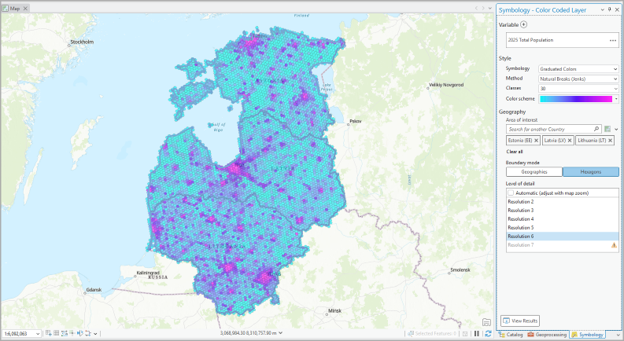
Now let’s map using lots of granular hexagons! For Boundary mode, click Hexagons and then select Resolution 6. To create more variety in the map colors, and break the data down into smaller groups, set Classes to 30 and choose a color scheme of your preference. Here’s the map and workflow pane at the end:
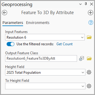
To make these Baltic hexagons three-dimensional on the map, we’ll use the Feature To 3D By Attribute tool. This tool is a natural fit, since you already have an attribute in this layer (2025 Population) that the three-dimensionality can render in the height of the hexagons.
In the Geoprocessing pane, search and open the Feature to 3D By Attribute tool. Choose the Resolution 6 hexagons as the input layer, name the output Resolution6_hexagons, and for the height field pick 2025 Total Population.
After you click Run, the 3D-enabled hexagons are saved as a new layer. They can’t be seen as 3D on a flat map, though, so let’s make a scene!
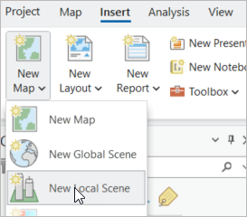
On the Insert tab, click the New Map menu and select New Local Scene.
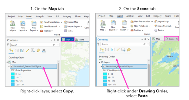
Once you’ve got a new scene in the project, you can just copy and paste the 3D layer you created into the scene’s Contents pane.
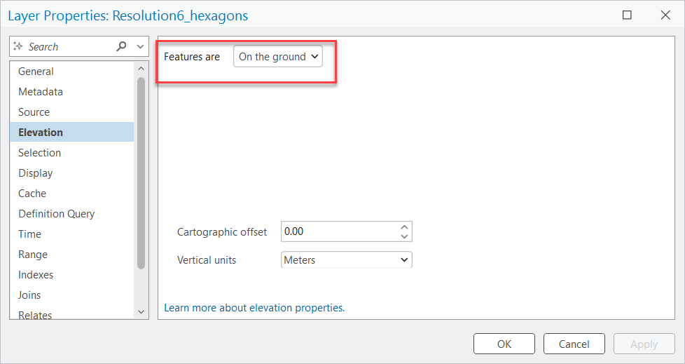
From here, it’s just a few more steps to seeing those gorgeous geode-like hexagons. First, in the scene, right-click the layer you just brought in and select Properties. In the window that opens, select Elevation on the left-hand menu. Set Features are to On the ground and click OK.
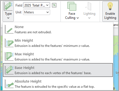
Now click the layer in the Contents pane to select it, then click the Feature Layer tab at the top.

In the Extrusion group, for Type, select Base Height, and then use the Field menu to choose 2025 Total Population as the attribute that will determine the hexagons’ height in three-dimensional space.
Once you select the field to be extruded, you’ll see those hexagons pop up right away! It’s very exciting.
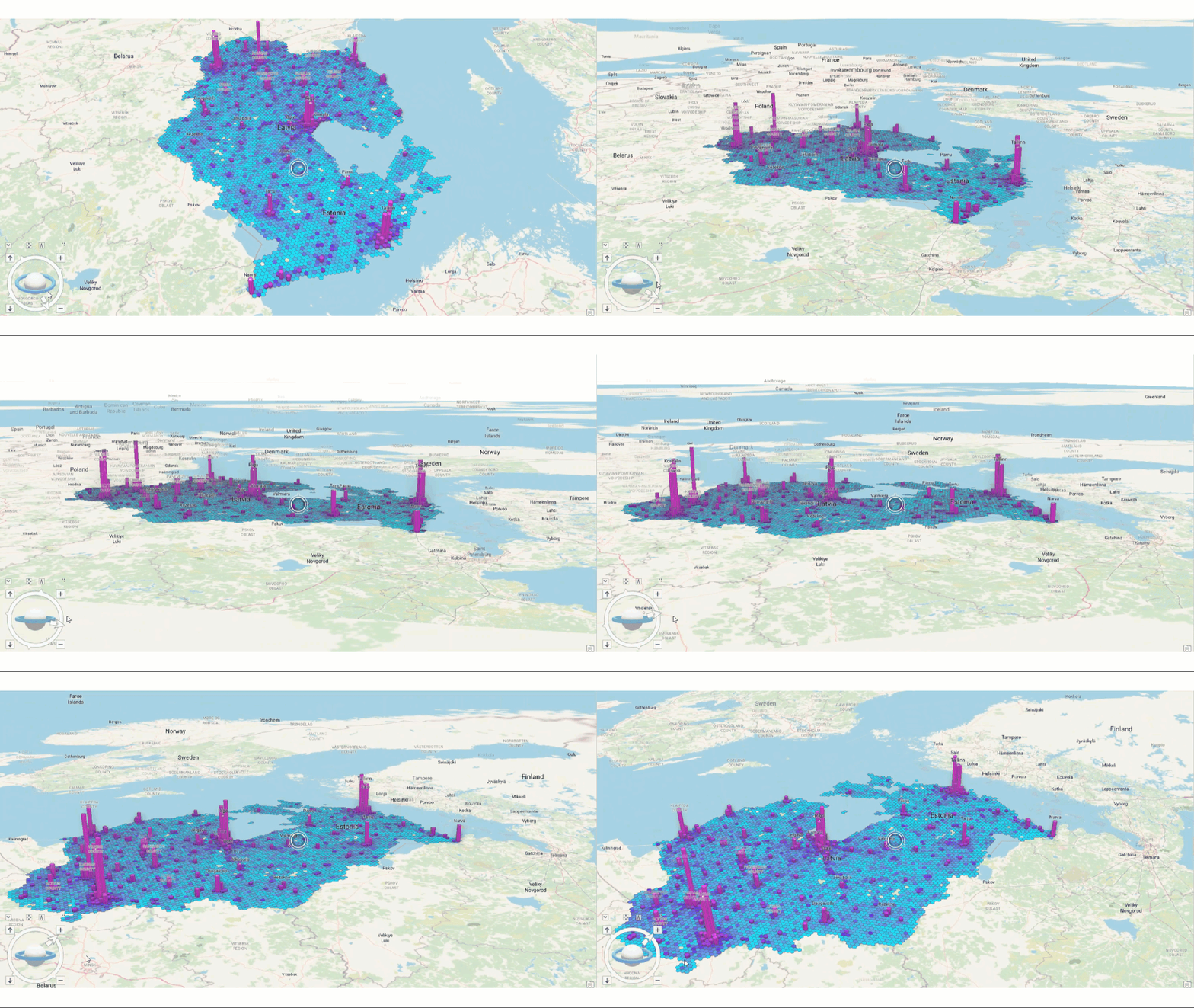
Cross-border analysis can be used in any ArcGIS Business Analyst Web App Advanced or Pro workflow with the Europe data source. In this blog article, we explored a color-coded map and infographics in Business Analyst Web App Advanced and color-coded layers with 3D hexagons in Business Analyst Pro. Both examples analyze populations across countries in Europe and enrich maps with data for demographic comparisons.
How will you use the Europe data source? We welcome your feedback! Please use the feedback option at the bottom of this blog article or post on Esri Community.


Article Discussion: