In the article Build your own Frankenstein infographic, we used different parts of other templates to create something new. Now, we can take that infographic and use it to figure out how promising a neighborhood is for trick-or-treating.
The charts on the infographic already give us a lot of information about trick-or-treating potential. We know that trick-or-treating is more likely to happen in areas where there is a higher population of children, and the waffle chart lets us see those values. The home type chart shows us the types of housing that’s most dominant in the area. Row housing and semi attached housing mean less walking up driveways and a shorter distance between doors–especially important in Canada, where in many places it’s already getting cold outside. Then, the PRIZM Lifestages gives us a glimpse of family structure. Older families likely won’t have children of trick-or-treating age and are more likely to be home giving out candy, while school-age families might more likely be out trick-or-treating.
The top panel with key demographic variables tells us some information about the area, but not in a way that’s useful for trick-or-treating. Let’s change some of the variables in the demographics panel to ones that can help us find the best spots.
Who is home to give out candy?
Right now, we have the Total Population Median Age variable. This information might be good to understand the demographics of the neighborhood as a whole, but doesn’t really mean anything to trick-or-treaters.
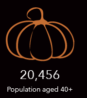
Instead, we can modify the variable to show the population above the age of 40—the prime demographic for candy givers.
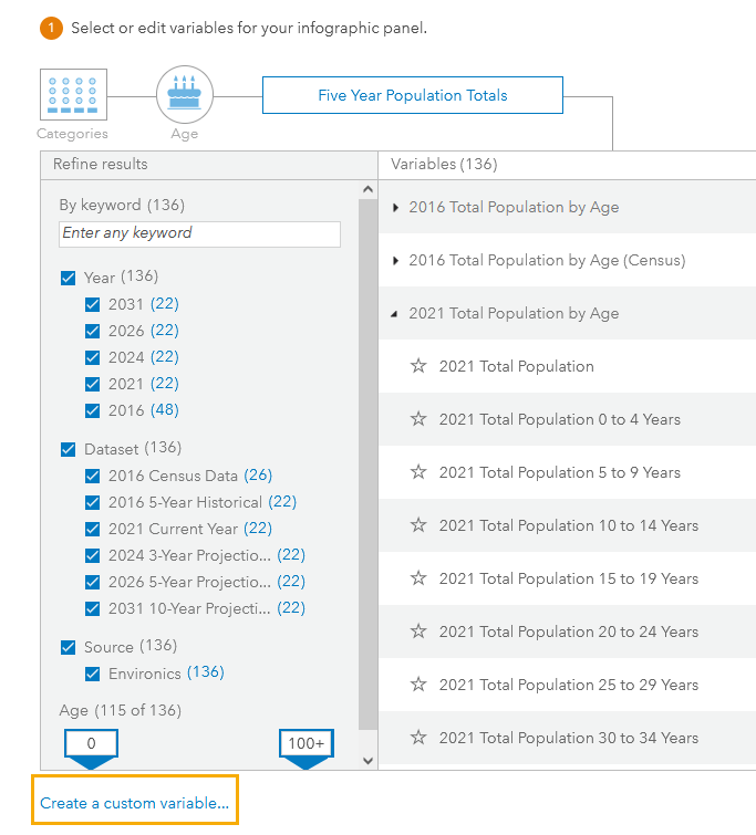
To do that, we’ll create a custom variable that sums the relevant age ranges from the 2021 Total Population by Age variable. Start by clicking Create a custom variable… in the data browser.
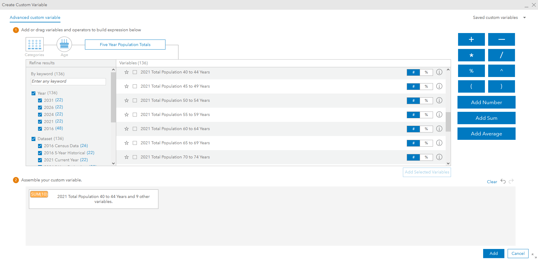
In the Create Custom Variable window, we’ll select all the age ranges we want to include and add them as a sum.
Once we’ve created the custom variable, we can add it to the infographic panel and remove the median age variable. We’ll also want to add an icon to it so that it matches the other variables. We can use an image of a pumpkin to keep with the Halloween theme.
Where are the full-size chocolate bars?
After trick-or-treating in your own neighborhood, it’s time to head over to the neighborhood that gives out full-size chocolate bars and bags of candy.
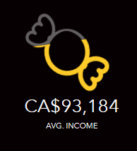
Let’s assume that the higher the average income of a neighborhood, the greater likelihood residents can spend more on candy. We already have the average income variable, but it doesn’t indicate anything more. We can use the variable icon to better visualize the likelihood of full-sized candy by having it fill proportional to a value.
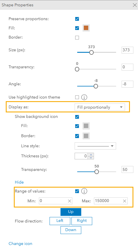
In Shape properties, we’ll change the Display as setting to Fill proportionally. Then, we’ll click Advanced settings so that we can set the range of values that the fill level will be based on. For our case, we’ll say that the closer the average income is to CA$150,000, the higher chance that residents of that neighborhood are able to spend more on candy.
We’ll also change the icon used here to be a piece of candy. Now, we still have the average income variable, but the icon’s fill helps identify how that variable relates to the candy being given out.
Run the infographic for your neighborhood
Now that we have all the variables that we need to evaluate the trick-or-treating potential of an area, we can run the infographic on different neighborhoods.
Let’s see where in Ottawa, Ontario the best trick-or-treating is.
This map already has sites created for each of the neighborhoods in the city. The sites were made by adding the City of Ottawa’s Neighbourhood Boundaries layer to Business Analyst and creating a site for each neighborhood.
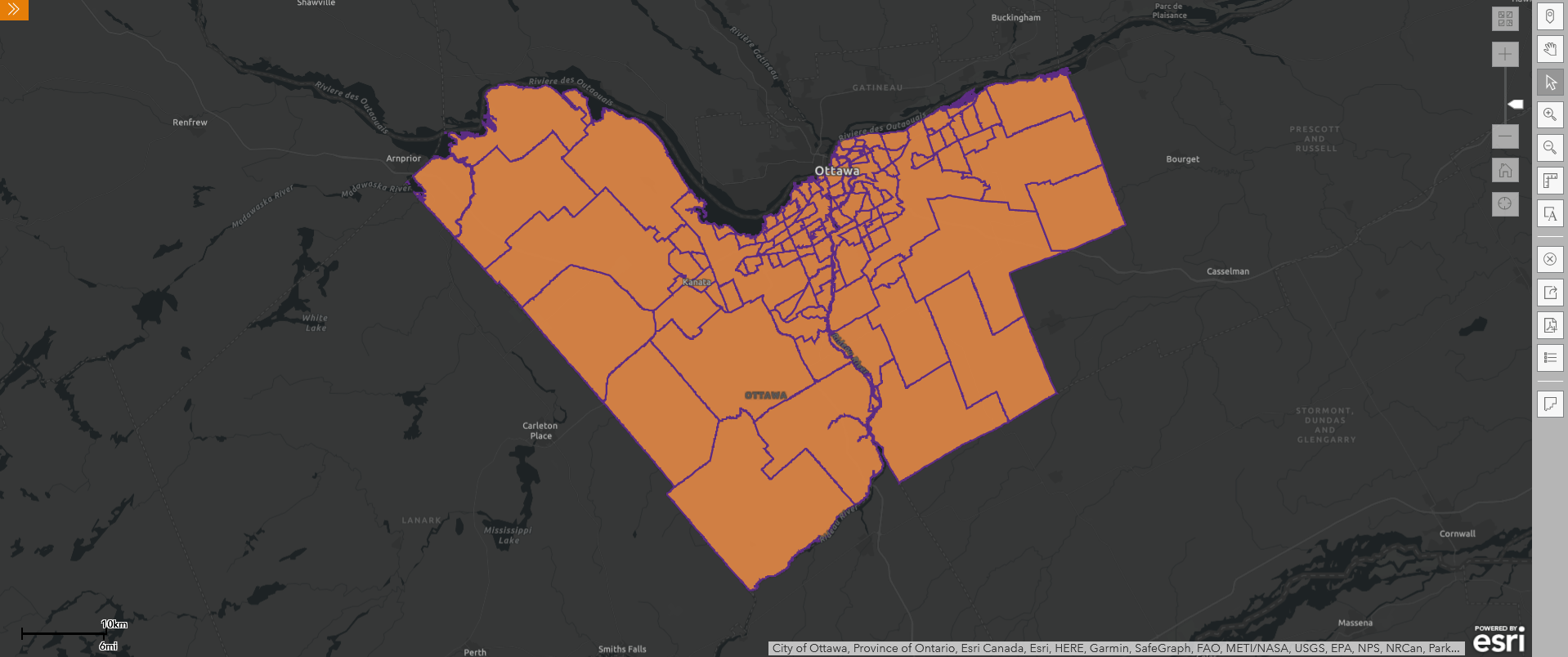
Now, we can click on a neighborhood and run the infographic to see if it’s a good spot to go trick-or-treating.
Let’s check out the neighborhood of Centretown.
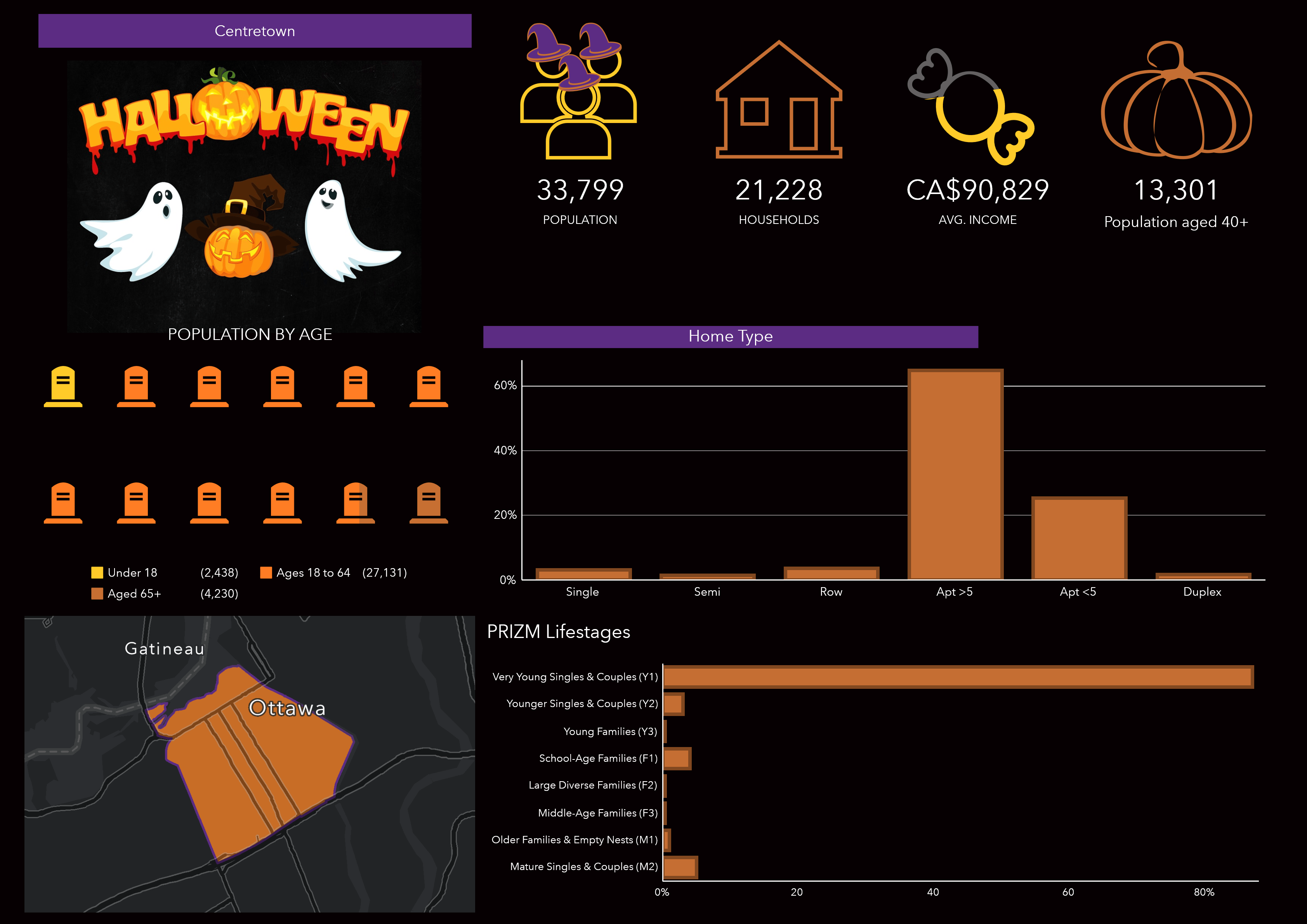
While the population is high and there are a lot of households, there is only a small population under 18. There are also mostly apartments, which are not always easy to go trick-or-treating in as they usually have secure entries. Lastly, most of the population are very young singles and couples, who might be more likely to go out to celebrate Halloween. Overall, probably not going to get a good haul over there.
We can also do a side-by-side comparison of two neighborhoods to see if maybe walking over a few blocks might be all it takes to get a better candy haul. After we run an infographic on one of the neighborhoods, we can add more sites to compare.
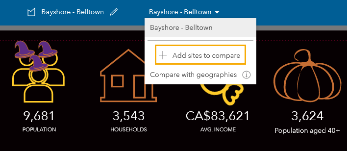
Let’s compare the neighborhoods of Crystal Bay and Bayshore.
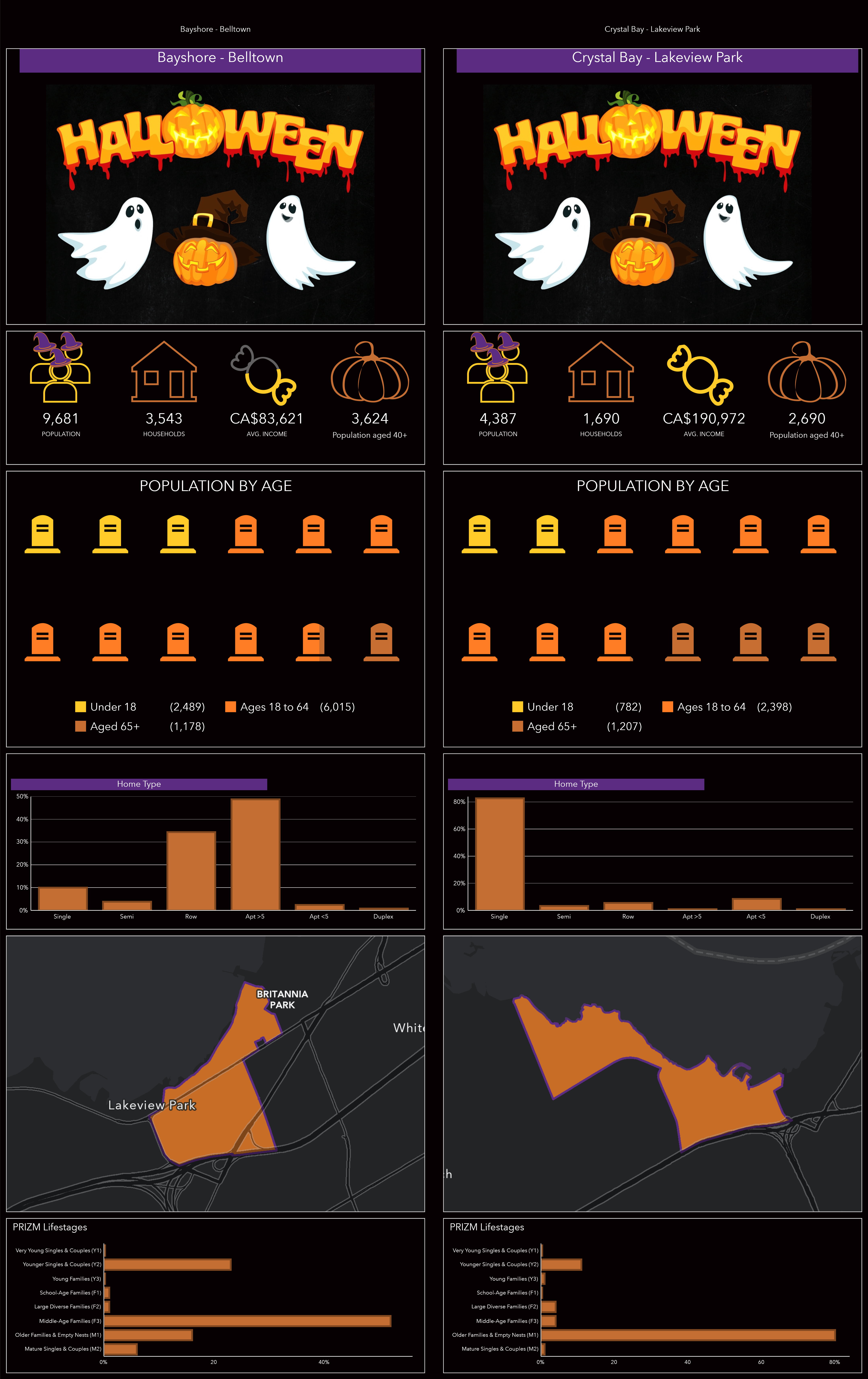
Comparing the two, we can see that both have their own merits. Bayshore has a larger population under the age of 18 and a lot more row houses, which makes trick-or-treating faster. However, there’s a significantly greater number of younger singles and couples, and middle-age families who might not be home to give out candy. On the other side of the street, there are more older families and empty nesters that are more likely to be home. Additionally, the Crystal Bay households have a much higher average income, meaning they have a better opportunity to spend more on candy.
My suggestion? Do a quick sweep of the Bayshore area and then head over to Crystal Bay afterwards for those full-sized chocolate bars!
Put on your costume and try this out with your own neighborhood or surrounding ones this Halloween to find the best spots to trick-or-treat.
Happy Halloween!
Card image: Photo by Nick Fewings on Unsplash
Banner image Photo Ehud Neuhaus on Unsplash

Article Discussion: