In 1818, Mary Shelley wrote about the fictional Dr. Victor Frankenstein, who stitched together a creature using a combination of parts. You too can build your own creature from the parts of others. And by creature, I mean infographic. Spooky, right?
As you build a custom infographic, you can add various elements that help tell your story–but did you know you can actually add panels from other existing templates?
Much like Frankenstein’s monster, your infographic can be a mashup of different panels from different templates. Whether you’re starting from a blank template or altering an existing one, as you add and replace elements, you can choose Add panel from another template to find the bits and pieces you need.
Let’s build an infographic using panels from a variety of templates to create a Halloween-themed template that can be used to find the best trick-or-treating spots in Canada.
The infographic mash
First, let’s figure out which data will help us decide whether a neighborhood is going to be filled with treats or whether it’s a trick. We want to know the age breakdown of the population (more kids, more candy), the home types (more doors, more candy), and some other key facts that will help us maximize our candy haul.
We’ll start building our infographic from a blank template and add panels from other templates that highlight population and household stats.
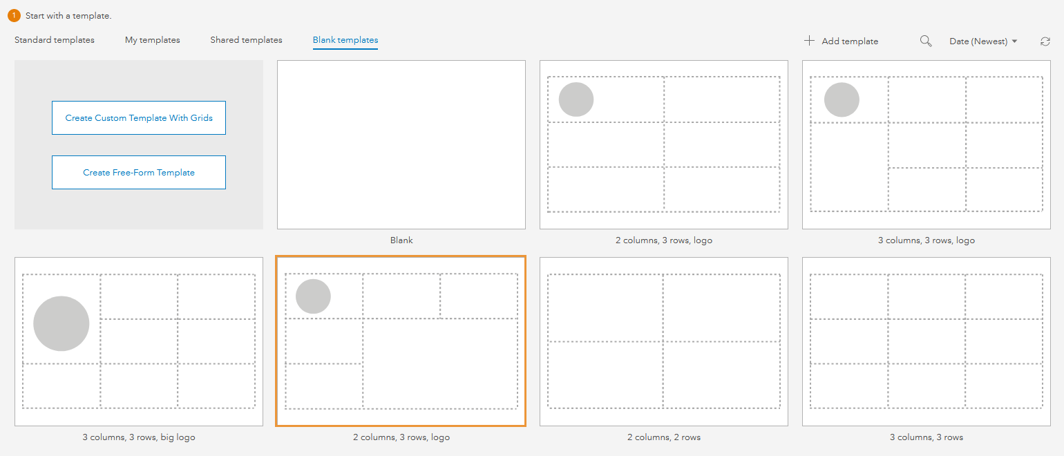
In the infographic builder, we can choose a completely blank template, or start with a general layout. For this infographic, we’ll use the 2 columns, 2 rows, logo layout.
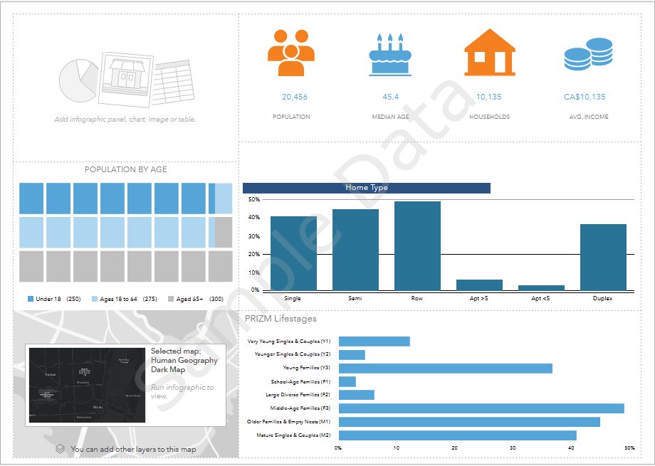
At the top, we will start with key neighborhood facts (population, median age, number of households, and average income).
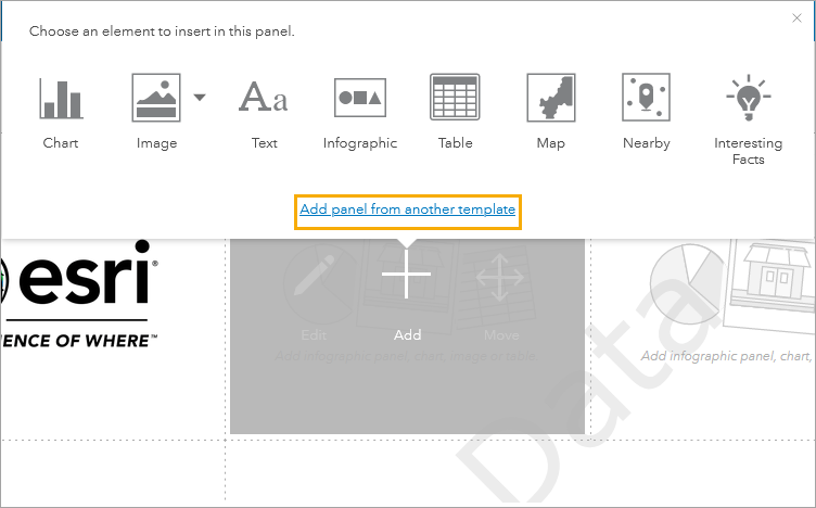
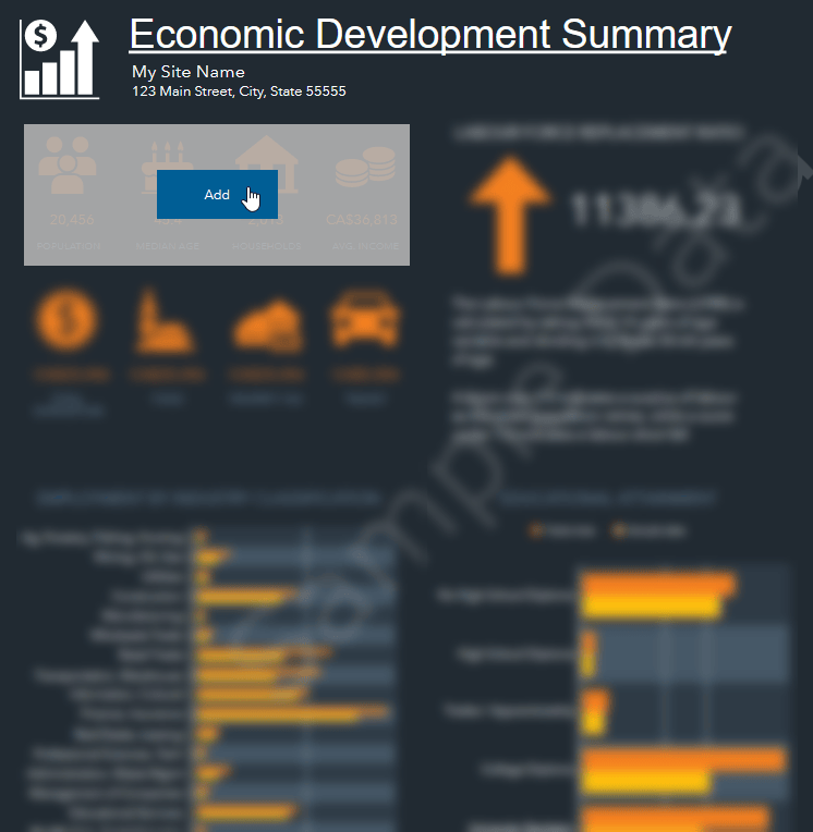
We can get this panel from a few different templates, but for our infographic, we’ll take it from the Economic Development Summary template, since those four elements are grouped together in a single panel. When we add a panel from another template, the theme of that template does not come with it. That’s okay since we’ll customize the theme of our template later.
Next, we’ll add a panel showing a breakdown of the population by age since we’re looking for areas that have a larger population under the age of 18. We can find that panel over in the Population and Key Indicators template.
In the center of the infographic, we’ll include a breakdown of home types in the area (which we can get from the Population and Key Indicators template), and a view of the life stages (which we can get from the PRIZM Profile template). The home types panel is what will give us an idea of how many doors we can knock on in the area. For example, row houses are closer together than single homes, which means a greater volume of doors knocked on in a shorter amount of time. The PRIZM Lifestages panel shows us the family structure of the population, which can help determine whether there will be people at home to give out candy.
Lastly, we’ll add a map to the bottom left corner.
With all those pieces in place, our sewn-together creature has all its parts–but it’s not yet alive.
Spark your infographic to life
Since we took panels from different templates, there is no consistent theme they share. We can fix this by customizing the theme for the entire template.
First, the background. We’ll make the background black and apply it to the infographic as a whole and to the panels. Then, we’ll change the icon color and highlighted icon color to two different shades of orange. Lastly, we can change the text color to white, so it stands out against the dark background.
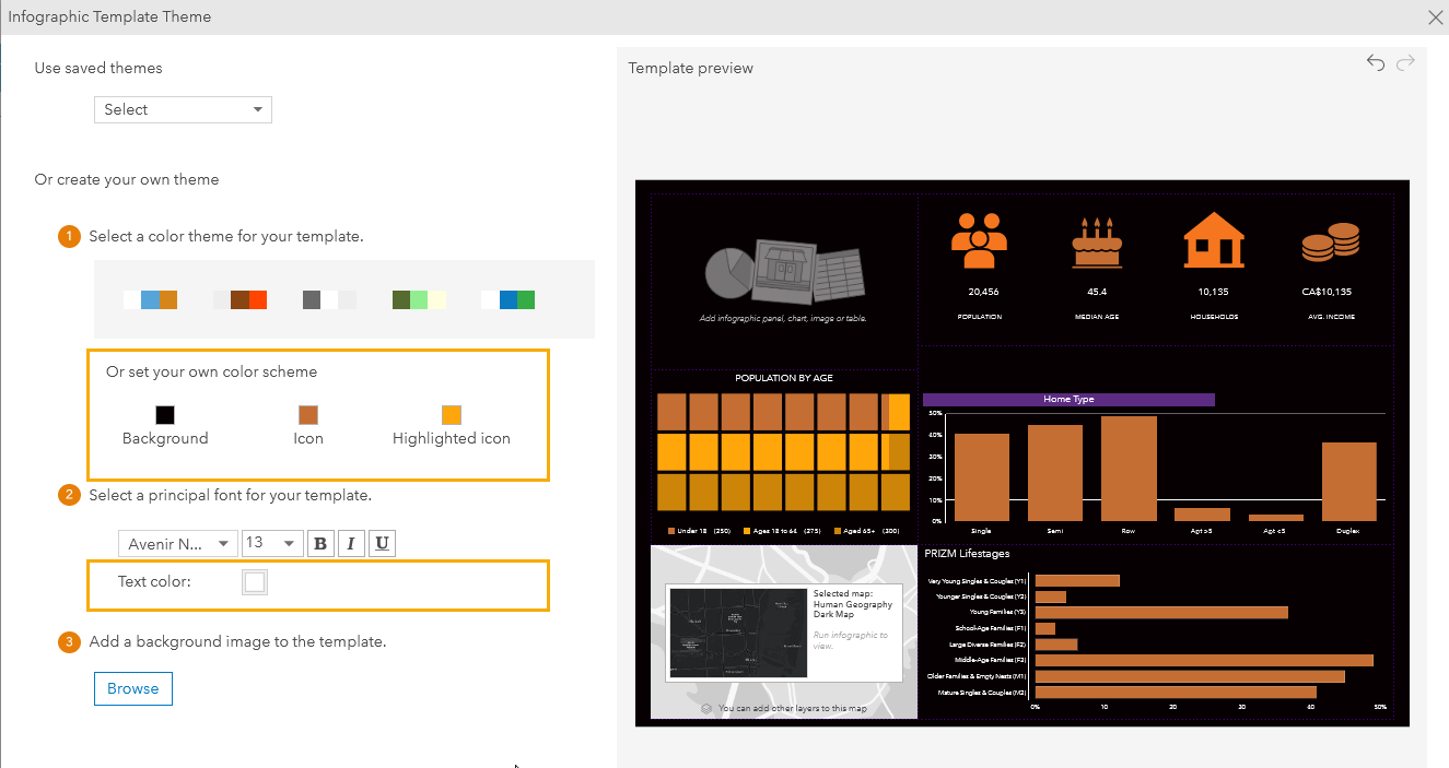
Now that we have the infographic in the right colors, we can add some other small, spooky tweaks.
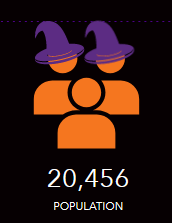
For the population icon, we can add witches’ hats by adding an image element to the infographic and aligning it with the icon. The hat we’re using is a custom made SVG graphic.
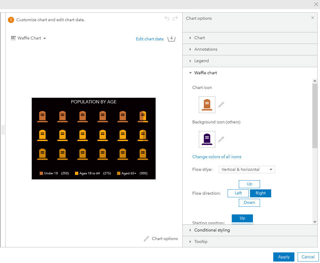
We can also change the icon used for the waffle chart. In the chart options, in the Waffle chart section, we can change the icon from squares to tombstones.
Finally–we can add an image to the top left of the infographic to round it all out.
It’s….ALIVE!!!
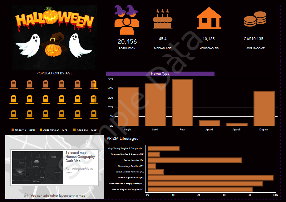
Once your creature is alive, you can unleash it on others. Share your template so that others can take it to run their own infographics.
Now that we’ve shared this spooky trick, it’s time for a treat. See how you can use this infographic to find the best trick-or-treating spots in Ottawa.
Card image: Photo by freestocks on Unsplash
Banner image Photo by Łukasz Nieścioruk Unsplash


Article Discussion: