The latest update of Community Analyst is here! This update includes 2018/2023 demographic data for the US, a new feature to summarize nearby locations, ability to filter layers using attributes, enhancements to comparison reports and infographics, and much more.
Here are the highlights:
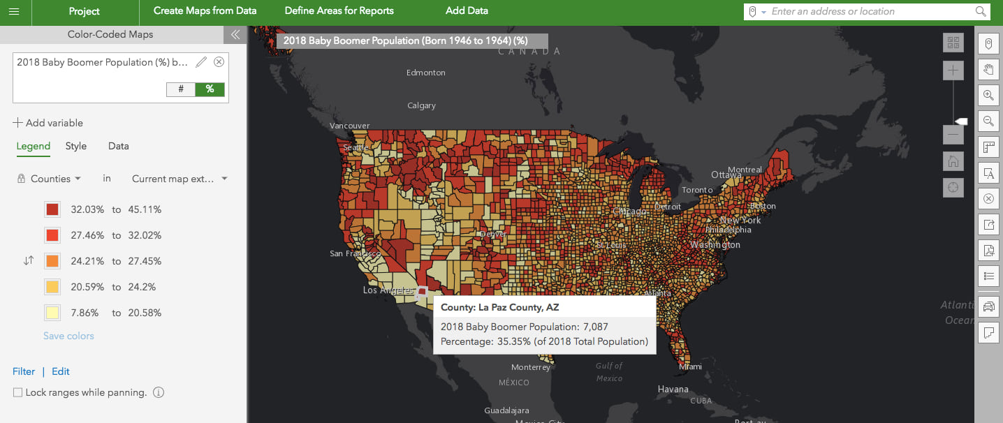
Access 2018/2023 U.S. Demographics and Global Data Updates
- 2018/2023 demographic data estimates and projections for U.S. demographics
- 2018 daytime population, consumer spending, market potential, Tapestry segmentation, business locations, shopping centers, traffic counts and more
- New population by generation data for the US. For example, understand how many Millennials and Baby Boomers are in California.
- 2012-2016 American Community Survey (ACS) Demographics
- Michael-Bauer Research data updates for 30+ countries primarily in Europe
Explore What’s Nearby
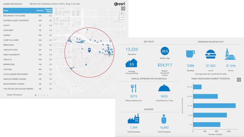
Summarize businesses or any point locations around a location using the new Nearby capability in Infographics and Reports. Easily answer questions such as how many and which restaurants are within a mile of a location, what intersections around my site have high traffic counts, which schools and how far they are located within 10 minutes from a location, and more.
Simply select a location and run the new Nearby Restaurants infographics template to see a summary of nearby restaurants including their names, count, distance and direction from the proposed location and an interactive map. You can get this in just a couple of clicks for any US location.
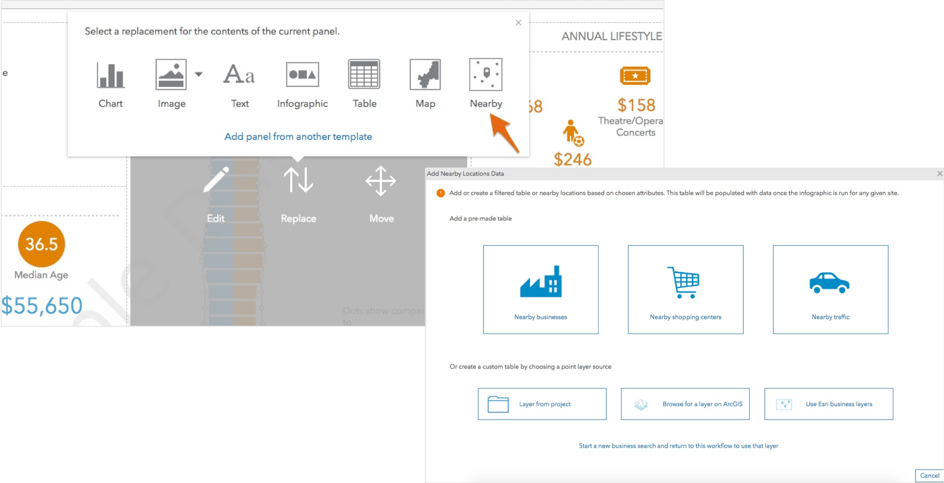
Easily customize any template using the Nearby option when building infographics or reports and adding a pre-made table of the data included with Community Analyst such as businesses, shopping centers, or traffic counts. Choose specific businesses (e.g. schools), select attributes (e.g. number of employees), and include distance and direction from your site to create a summary table and a map showing the nearby locations.
You can also use your own point locations data from ArcGIS, for example vehicle accident locations to understand road safety around your site. Add a point layer, select attributes to include in the nearby table, and optionally customize it.
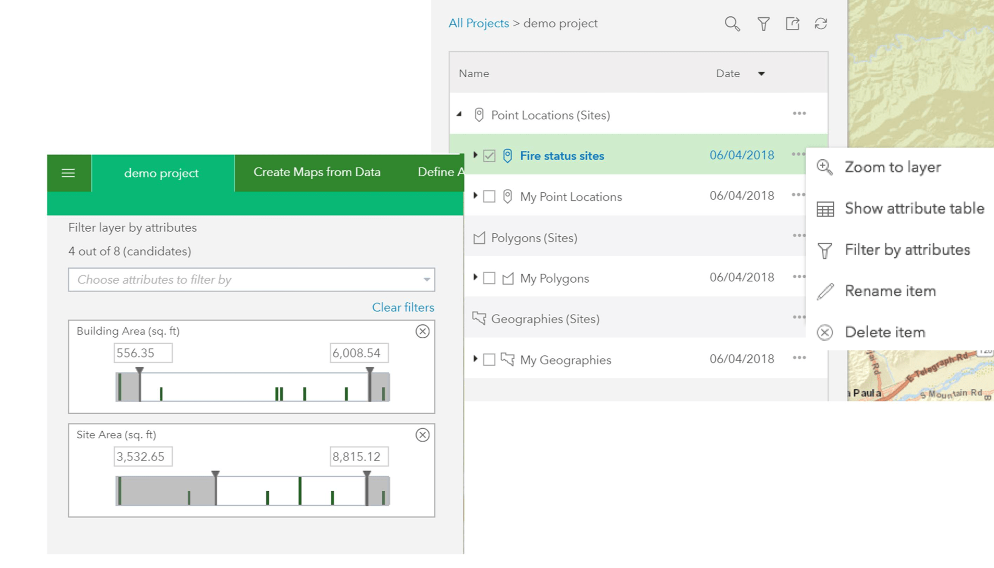
Use Filtering to Show Locations that Meet Your Criteria
Apply attribute-based filters and limit the locations shown in your sites or ArcGIS layers. For example, let’s say you bring in a crime layer from ArcGIS Online and you only want to show arson fires that occurred within the last month. By filtering the crime layer based on crime type and time, you can show patterns of where recent arsons occurred and help your police department prevent future arson attempts.
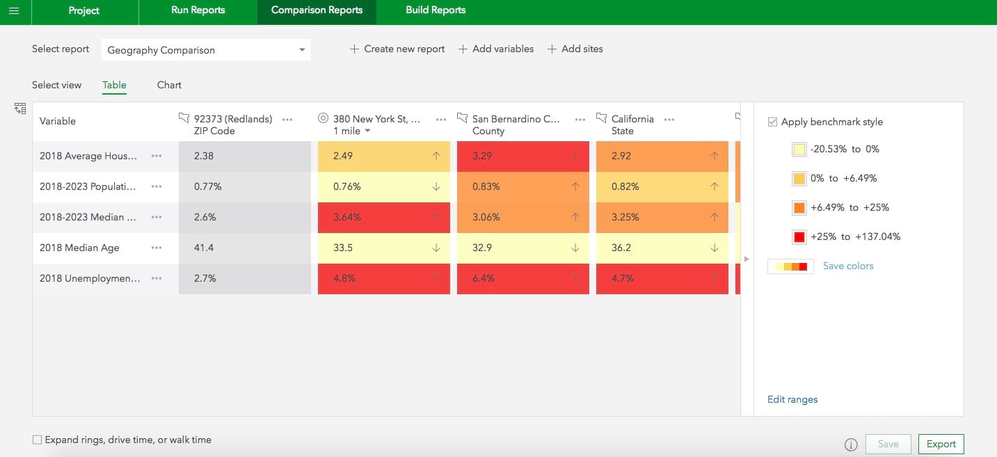
Compare Sites with Geographies in One Click
Use the new Geography Comparison template to quickly compare the key demographic facts for a location to the geographies where it is located. For example, compare population growth rate and average household size for a 1-mile ring around 380 New York St., Redlands to the geographies where the ring is located, i.e. zip code: 92373, county: San Bernardino and state: California.
You can also use the Compare with Geographies option for any site and create a geography-based comparison when working in any Comparison Reports template.
Benchmark your sites interactively and use a good performing location to evaluate other locations against it.
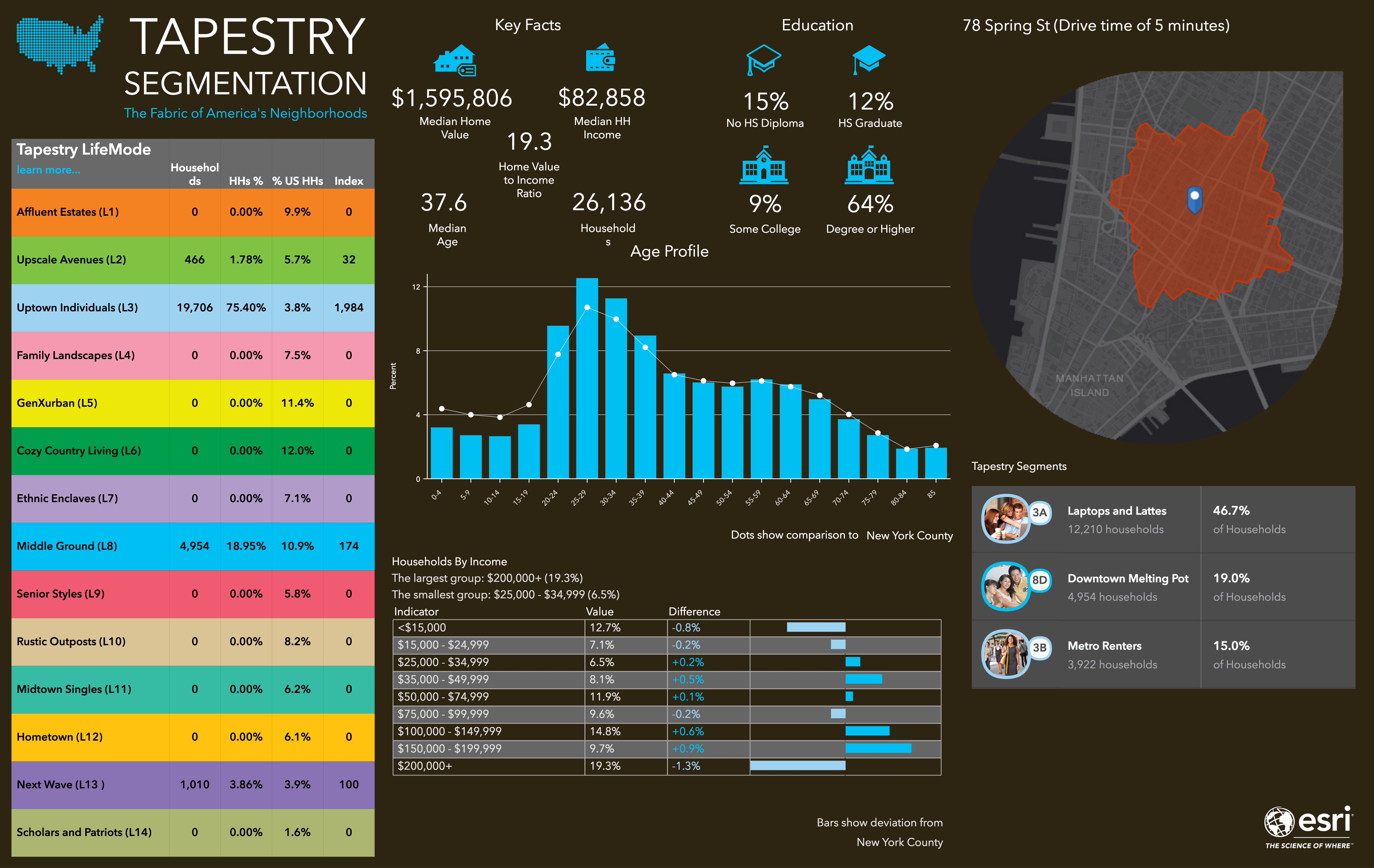
Get a New Tapestry Poster Style Infographics
Like the Esri Tapestry poster? Now get your infographics in a Tapestry poster style look and feel using the new Tapestry Profile template. Understand Tapestry LifeMode groups, Tapestry segments, age profile, education and more for any U.S. locations.
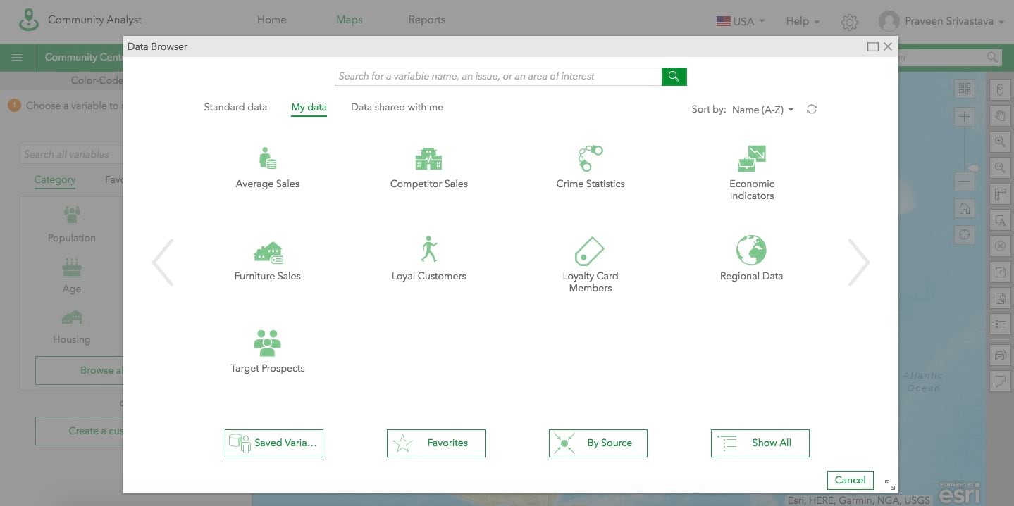
Easily Categorize and Browse Your Own Data
Using the custom data setup workflow, you can already use data such as crime statistics or economic indicators. Often these datasets have a large number of variables and categories similar to Esri Demographics data. Now, you can create your own data categories to display in the Data Browser and assign them with custom icons – essentially providing an experience of using your own data similar to the experience available for Esri Demographics data.
Login and start using the new Community Analyst features today!

Commenting is not enabled for this article.