The latest update of Community Analyst is here! This update includes 2018 data update for Canada, new customization options for admins, and enhancements to comparison reports, infographics, map legend and more.
Here are the highlights:
Data Update
Updated Demographic data for Canada, US, and several other countries available now:
- 2018 Canada data update from Environics Analytics. Current year estimates and three, five, and ten-year projections for demographic variables, and Daytime Population, Household Spend, updated Census data and PRIZM5 segmentation for the year 2018.
- US Traffic Counts updates using the Q2 2018 data from Kalibrate.
- US Major Shopping Centers updates using the June 2018 data from Directory of Major Malls.
- US Business Locations updates using the July 2018 data from Infogroup.
- Michael-Bauer Research data update to the 2018 vintage for China, India, Malaysia, Indonesia, Philippines, Thailand, and more.
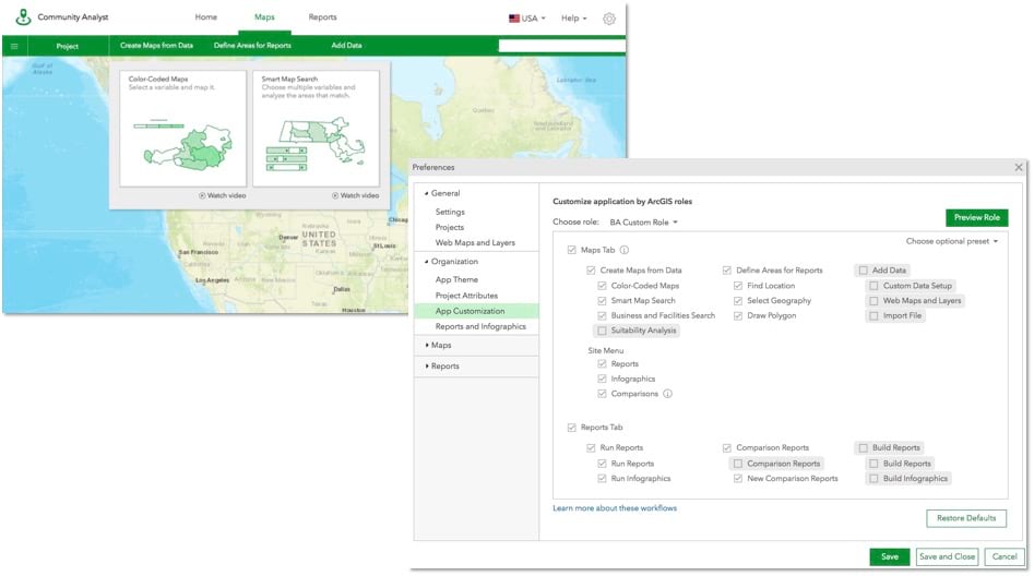
Customize the Application by User Roles
As an ArcGIS administrator, you can already customize the logo, title, and the theme color to give the application your own branding. Now you can also:
- Disable and enable different workflows in the application to create a more tailored application experience according to end user needs.
- Customize the classic reports and infographics available in the application to simplify experience by giving users access to only the reports and infographics they need.
For example, let’s say you have two custom roles in ArcGIS Online. Users in the first custom role are occasional users who primarily view maps, create sites, and run Community Profile and Age Profile reports in the Community Analyst. Users in the second custom role are power users who create and setup custom data and report templates so others in the organization can use them. To simplify the application experience for the occasional users, the organization’s admin can enable only the mapping, site creation, and report running workflows with only the Community Profile and Age Profile reports and hide all other workflows and reports. Similarly, for the power users, the admin can keep all the workflows or enable only the Custom Data Setup and Build workflows for Reports and Infographics and hide other workflows.
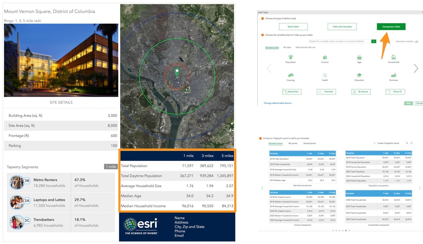
Compare Multiple Study Areas in Infographics
Summarize information for multiple study areas in a single summary table. For example, compare key demographic facts such as population, income, age, and household size for 1, 3, 5-mile rings around a location. Having this information in a summary table also helps you minimize switching between different study areas when comparing information for them.
You can simply run the globally available new Esri starter template called Multi-ring Comparison, use one of the Esri starter panels that provide comparison summaries on different set of variables, or create your own comparison tables.
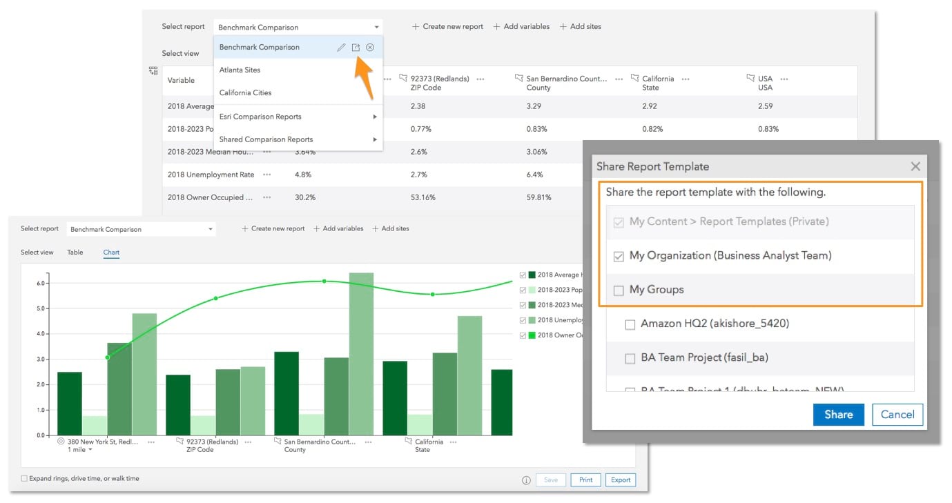
Share Comparison Reports with Others
You can already build interactive comparison and benchmark tables and charts to understand information about multiple locations using the New Comparison Reports workflow. Now you can share comparison report templates with other users in your organization as well as use the comparison reports that others have shared with you.
For example, let’s say your organization is often using key demographic variables (e.g. population, income, age) and custom data (e.g. health indicators) variables to compare multiple sites. You can setup a comparison report template with these variables and share with others that can be run for any set of sites without having to recreate the template – providing a more efficient and consistent comparison report output across your organization.
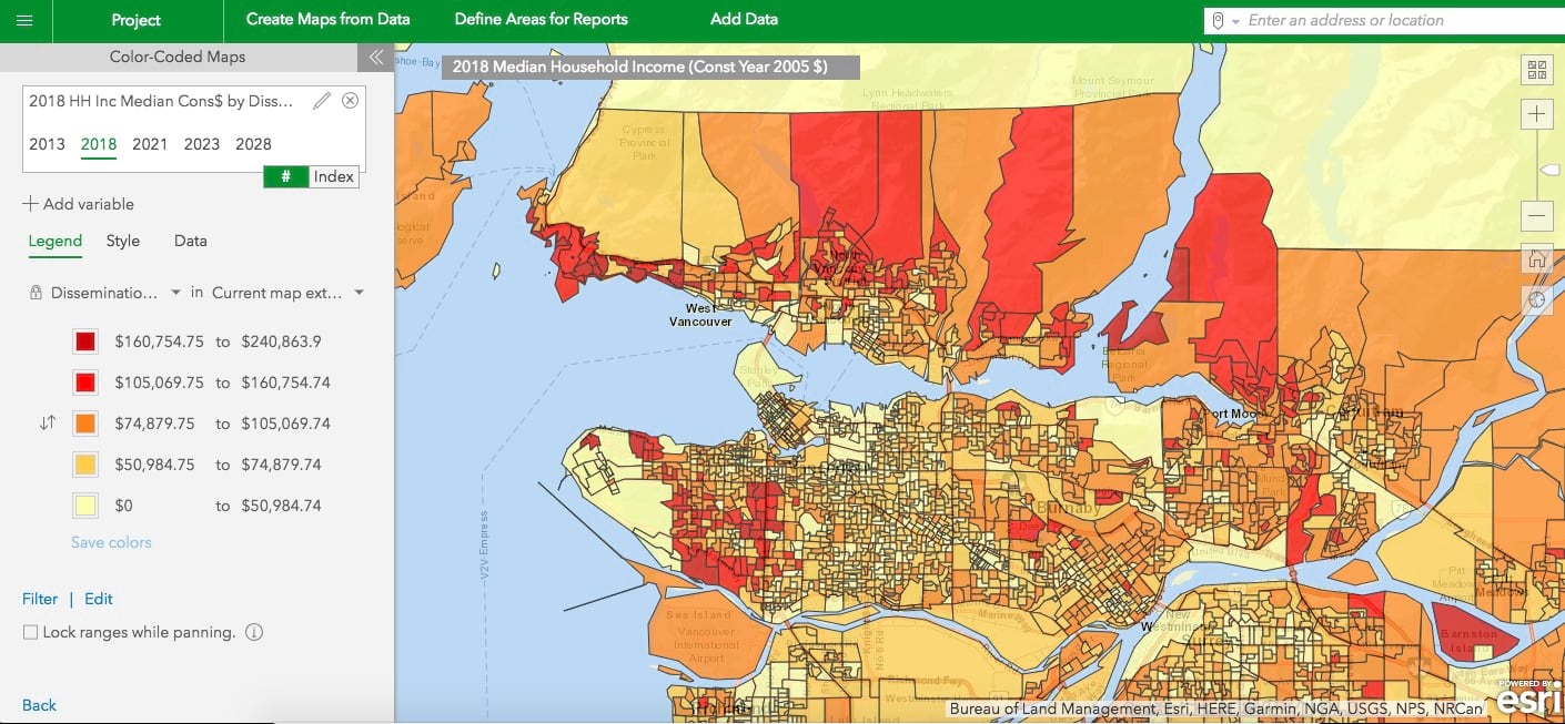
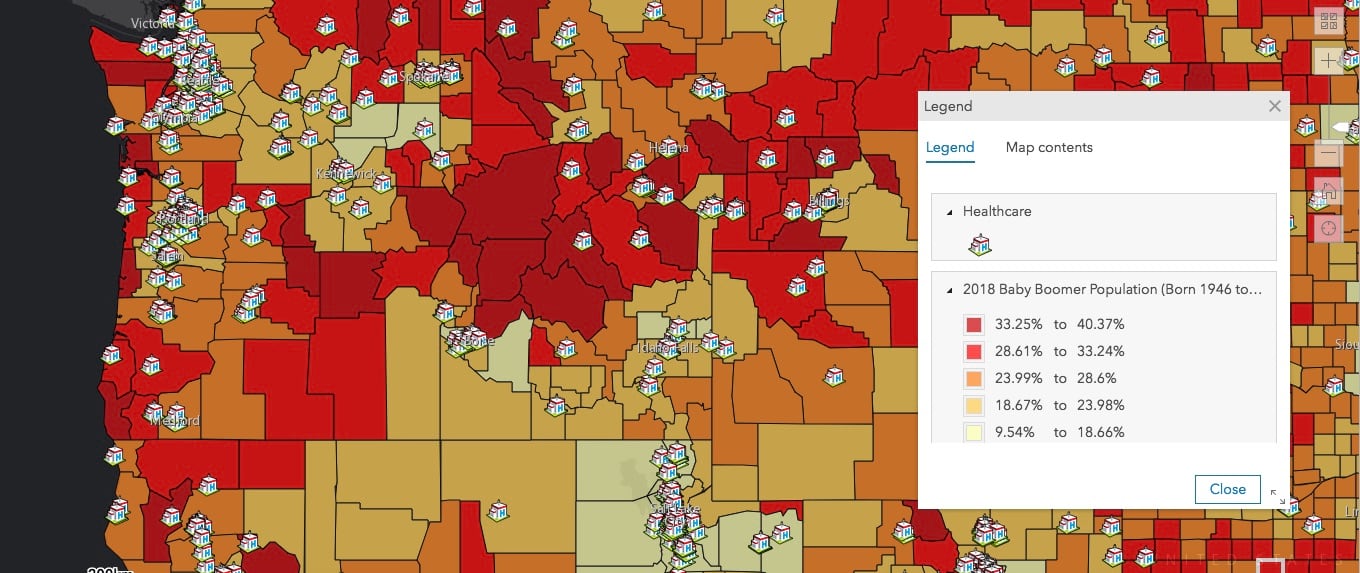
Use Improved Map Legend Styling
With the new map legend dialog, you can present maps so that map readers can easily understand the meaning of symbols used to represent map content. Adjust the size and view of the legend using the expand and resize options.
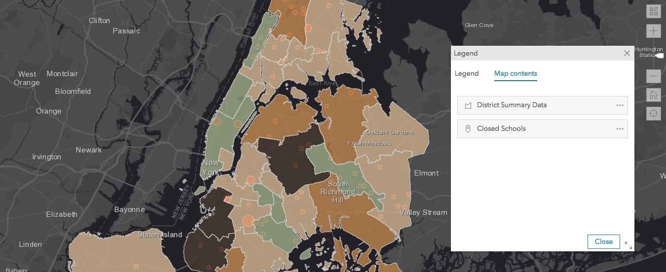
Reorder Layers on the Map
Organize the display order of layers on the map. Using the Map Contents tab on the new Legend panel, move layers up and down to adjust their drawing order for better visualization and understanding of data. For example, drag a layer of school locations up to show it on top of the school district layer.
Login and start using the latest Community Analyst today!

Commenting is not enabled for this article.