I’m a big fan of visualizations that mix realistic elements with cartographic ones. The user gets both the realistic environment which we’re all familiar with and the statistical insights from a thematic dataset. Should we call this reality enhanced cartography or cartographic enhanced reality? No idea, but I want to show you a few tricks to create visuals for thematic data using ArcGIS API for JavaScript.
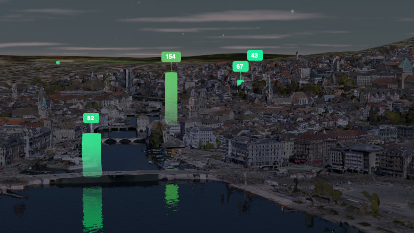
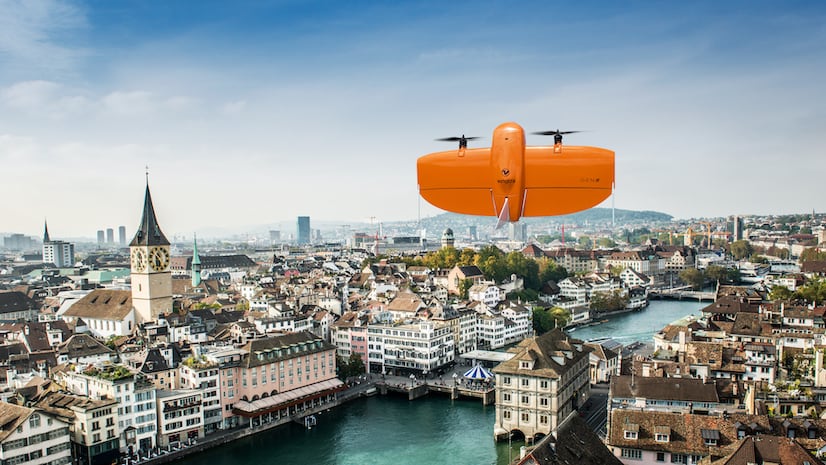
I recently found an open dataset of pedestrian counts in the city of Zurich, Switzerland. The dataset is about how many people crossed certain points in the city. I found it interesting to look at the counts for the Zurich spring festival parade, which gathers a few thousand people each year in April. I’m visualizing the counts with 3D cylindrical bars whose height is proportional to the number of people that passed that point in the last 15 minutes.

Nothing new so far, but there are two tricks I want to tell you about in this blog post:
The saturated colors for cylinders
From my experience, using saturated colors is better when visualizing data in a realistic environment because it emphasizes the thematic layers and it helps to better distinguish them from the colors of the integrated mesh. I also use a material for the cylinder that is not influenced by the lighting in the scene that much. In my example I connected the time of the day with the sun position and I can still see the cylinders during night-time:
Color gradients along the vertical height
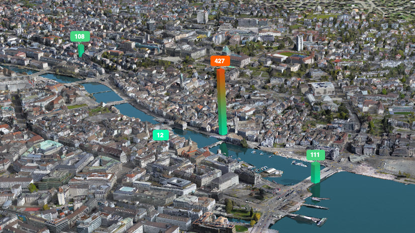
I won’t hide it, I just love color gradients, I think they make visualizations aesthetically more appealing to look at. But besides this superficial reason, I think it also helps to better understand the height of a cylinder: in my example, seeing the color fading out means that this part of the cylinder is closer to the ground.
Another trick I tried was to have the gradient start from the color expressing the lowest values (green) and go to the color of the current value. I think it works pretty well too:
How to build this?
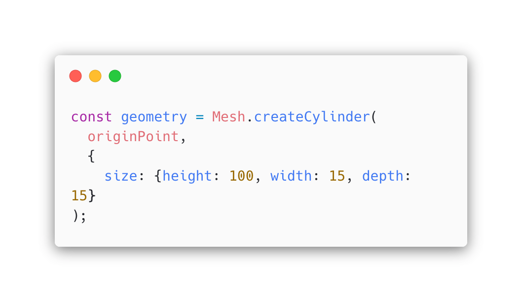
To create the cylinders I used the Mesh geometry which gives us more flexibility in visualization (for example I can use color gradients or custom materials). However, one drawback is that it doesn’t scale well with a large number of features because generating the geometry is an expensive process. Mesh has utilities to create the most common shapes like cubes or cylinders:
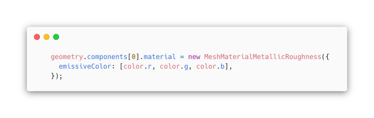
How do we change transparency along the cylinder? We can set the vertex colors manually: the bottom vertices will have a high transparency and the top vertices of the cylinder will have zero transparency. The color is close to black because we set the actual color in the material using the emissive property.
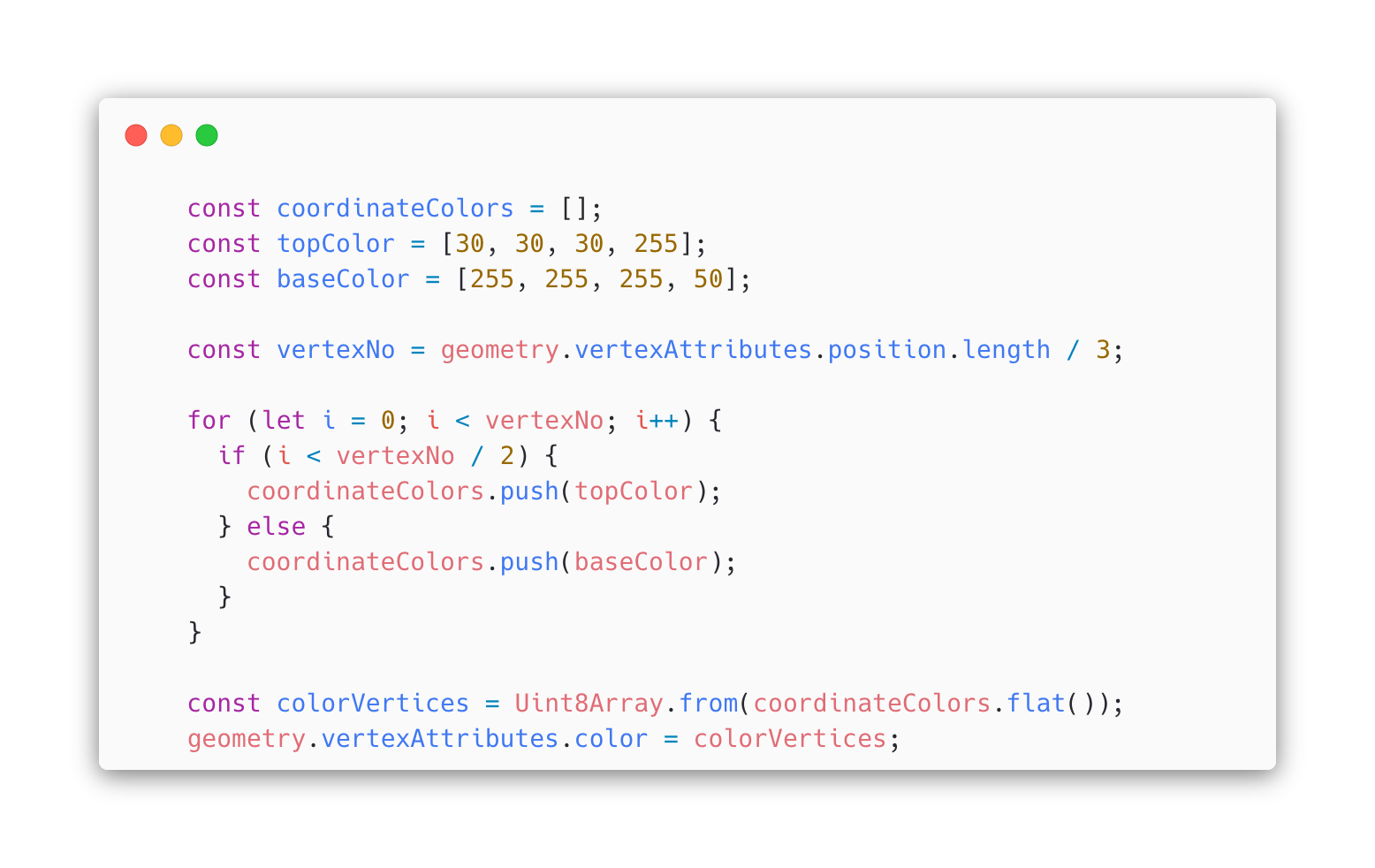
Using the mesh geometry we can also set a custom material where we set the emissive color property to a color based on its pedestrian count value.
And these were the two little tricks I wanted to show you with this blog post. If you liked the integrated mesh for the city of Zurich and you’re interested how it was created, have a look at this blog post: Creating City-Wide 3D Meshes with Drones.

Looking great. Thanks for sharing Raluca.