Learn all about the key updates in Calcite Design System recently released with 5.1 with the latest functionality offered since 5.0 (February 2026), including:
- Action enhancements
- Carousel’s top pagination positioning
- Combobox’s alternative selection appearance
- List usability enhancements
- Tooltip’s usability improvements
- Dropdown configuration options
- Enhanced dark mode color contrast
- Archived documentation site
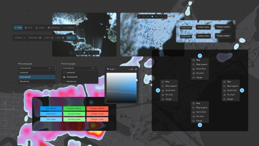
Action enhancements
Action-named components offer additional configuration options for developers to support more use cases, including the ability to always display Actions outside of an overflow menu within an Action Bar regardless of its width.
Prevent Actions from collapsing in an overflow menu
Actions can be configured to accommodate more workflows within Action Bar, always displaying outside of an overview menu regardless of the width of the parent component. Actions can be configured by either:
- Setting a property on Action Group, where all child Actions are prevented from displaying of an overflow menu
- Specifying a property on individual Actions, where named Actions will be prevented from displaying in an overflow menu

overflowActionsDisabled property.
overflowDisabled property.Action Bar’s placement configurations
Action Bar offers more placement configurations providing more flexibility in your apps, while supporting more individuals with the ability to add a customized label and support right-to-left (RTL) locales, including:
- A new slot to add Actions to the start of the component
- A label to support content in the new slot, providing context to assistive technologies
- A boolean property to specify the location of the component’s expand/collapse button

Carousel’s top pagination positioning
Carousel offers additional configuration of its pagination element, where the navigation controls can display at the top of the component. The new pagination control placement offering can be useful in scenarios where content may extend vertically beyond the viewport.

Combobox’s alternative selection appearance
Combobox supports an alternative approach of communicating selected Combobox Items through a highlighted background and stronger font styling, instead of the default selection icons. The new appearance matches that of Autocomplete, providing more flexibility in visual configuration and consistency when used alongside other components, such as Autocomplete.

List usability enhancements
List offers increased configurability and refined visual behaviors, providing a more clear and informative user experience.
Add context to Lists without List Items
When a List has no List Items to display, custom placeholder content can be added in its place, ensuring users understand the current state of the List. The placeholder content is especially useful for Lists with drag-and-drop enabled, allowing the visible drop zone to be expanded and clearly communicated.

List Item Group’s sticky header
Lists now have a sticky header when specifying a List Item Group, where the group will remain visible at the top of the screen when scrolling through the List and child List Items. When subsequent List Item Groups are present, the sticky header will remain at the top of the component.

Tooltip’s usability improvements
Tooltip supports more configurations and scenarios through smaller and larger scale options and the ability to disable the caret pointer associated with the reference element.
The scales bring consistency with other components and support use in more situations, for example, utilizing the small scale to help the Tooltip not interfere with other elements in the interface. Removing the pointer can be useful for certain user experiences where the pointer interferes with other elements or the desired spacing.

Dropdown configuration options
Dropdown provides more control over how and where the component is opened, allowing for more complex use cases and customization.
Improved setup configuration
Dropdown is configurable with a reference element, which informs where the component is positioned and toggles its open state. Previously, this behavior was handled by a trigger slot, which is now deprecated and planned for removal in version 7.0. Unlike the trigger slot, the reference element can be set programmatically to any HTML element or virtual element, allowing for more complex markup and supporting use cases such as context menus or input field suggestions.
Additional placement options
Dropdown offers more options for placement relative to its reference element, supporting more workflows where specific placement is necessary for the ideal user experience. The most notable offerings allow for placement on the sides of the reference element as opposed to the common bottom and top placements.
Enhanced dark mode color contrast
In 5.1, enhanced color contrast is provided in dark mode across interactive states when combined with the mode’s inverse text color. The enhanced contrast ratios exceed WCAG’s 1.4.6: Contrast (Enhanced) (Level AAA) of 7 to 1:
| CSS variable name | v5.0 HEX code | v5.1 HEX code |
|---|---|---|
--calcite-color-brand-hover |
#007AC2
|
#40B9FF
|
--calcite-color-brand-press |
#00619B
|
#80D1FF
|
--calcite-color-status-info-hover |
#3DB8FF
|
#40B9FF
|
|
|
#009AF2
|
#80D1FF
|
--calcite-color-status-success-hover |
#3BED52
|
#6
|
--calcite-color-status-success-press |
#44ED51
|
#9DF2A3
|
--calcite-color-status-warning-hover |
#FFB54D
|
#FFAF4F
|
--calcite-color-status-warning-press |
#FF9500
|
#FFC47D
|
--calcite-color-status-danger-hover |
#FF0015
|
#FE7863
|
--calcite-color-status-danger-press |
#D90012
|
#
|
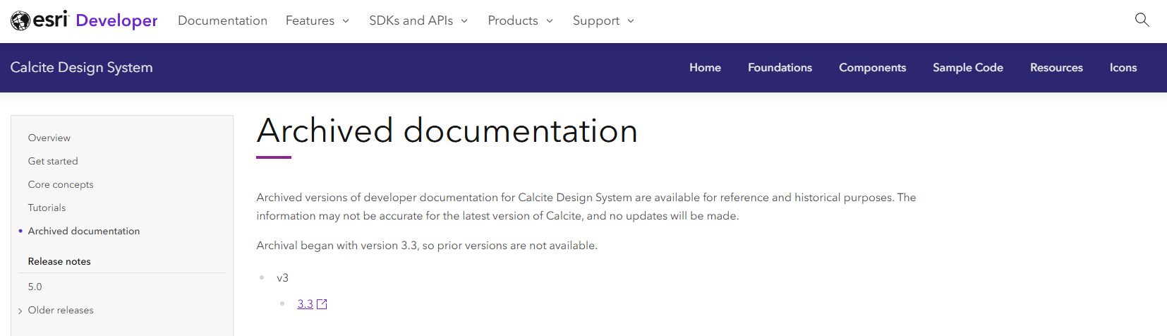
Archived documentation site
Starting with version 3.3, archived versions of Calcite’s developer documentation are available for reference and historical purposes. If you are using an older version of Calcite or ArcGIS Maps SDK for JavaScript, these archived sites can be referenced in addition to the latest releases.
2026 Developer & Technology Summit Recordings
Technical session recordings from the 2026 Developer & Technology Summit are now available, including the following Calcite-featured offerings:
- ArcGIS Maps SDK for JavaScript: App Development with Components, Part 3: User Experience
- ArcGIS Maps SDK for JavaScript: App Development with Components, Part 4: Extending and Styling
- Building Accessible Web Apps with ArcGIS Maps SDK for JavaScript and Calcite
- Eyes on Design: The Art and Science of Creating Intuitive Interfaces
To explore more recordings, visit the Developer & Technology conference proceedings page.
2026 User Conference
Attending the User Conference in San Diego next month? Visit with Calcite team members, where we’ll be located in the showcase’s Developer Technologies section next to the ArcGIS Maps SDK for JavaScript kiosk.


Article Discussion: