Learn all about the key updates in Calcite Design System that we’ve recently released with 3.3!
Since 3.2, we’ve made important additions to component design tokens for custom theming via CSS variables, continued consistency across components, introduced new functionality, and made many updates worth exploring.
Read on to explore some of the highlights since May, including:
- Swatch and Swatch Group
- Component design tokens
- Built-in form labels
- Expanded and collapsed events
- Date Picker’s one month view
- Combobox no results filtering
- Color Picker’s fieldDisabled property
- Accordion Item enhancements
- Accessibility and internationalization improvements
Swatch and Swatch Group
Introducing the new Swatch and Swatch Group components, which showcase collections of graphical elements ideal for color selection workflows such as theming tools or dashboards. The components display a selection of colors, images, and pattern fills across a variety of selection workflows, such as single selection, including:
- Keyboard navigation support: Accommodate more individuals and provide usability support
- Selection workflows: Supports active, selected, and disabled states
- Integration with Color Picker: Swatch is inherently offered in Color Picker for consistency in the design system

Component tokens
All components across the design system now offer component tokens with version 3.3 introducing tokens for the Color Picker, Dialog, Popover, and Table components. Component tokens allow for component level customization, such as adjusting Color Picker’s background color, border color, and border radius in your apps.
Design tokens provide a single source of truth for visual styling including colors, spacing, and shadows, ensuring consistency across your apps and supporting theme scalability. Explore Calcite’s token usage and token reference content to learn more about design tokens, component tokens, and how you can customize your apps.

<style>
  #themed {
    --calcite-color-picker-background-color: #fff5fb;
    --calcite-color-picker-border-color: #eda1c6;
    --calcite-color-picker-corner-radius: 12px;
  }
</style>

<calcite-color-picker id="themed" alpha-channel></calcite-color-picker>
Built-in form labels
Form-based components like Input Date Picker and Input Number, now support built-in labels. When required, the labels provide more visual context via an indicator dot and tooltip. The required context is now also provided to assistive technologies through an aria-required attribute. Additionally, Label provides a new "label-content" slot, allowing icon configurability.

Expanded and collapsed events
Accordion Item, Action Bar, Block and List Item now emit expanded and collapsed events, such as Action Bar’s calciteActionBarCollapse and calciteActionBarExpand events. The new lifecycle events offer ways to observe and react to the component’s state changes in coordination with animations, focus management, and component state synchronization across a user interface.

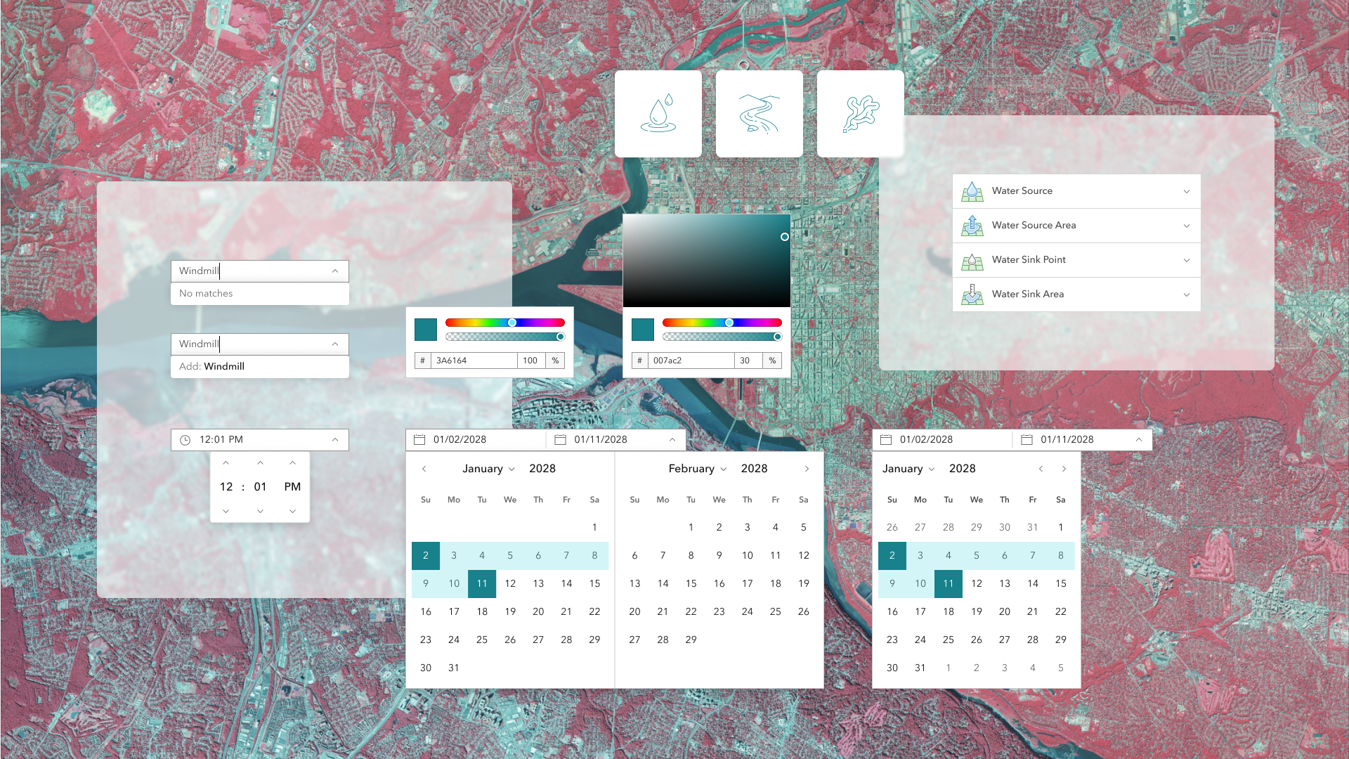
Date Picker’s one month view
The Date Picker and Input Date Picker include a new calendars property to display the component with either a one month or two month view with respective values of 1 and 2.
When range is specified, allowing a start and end date, the component’s default display is a two month view. The new single month view provides a more compact alternative for mobile or limited space scenarios, while still supporting proper date range selection.

Combobox no results filtering
Combobox now includes usability improvements when no matching Combobox Items are found during filtering. The component will display “no matches” text when no items exist in the component, unless the allowCustomValues property is true, when a new entry can be added to the component as a custom value.


Color Picker’s fieldDisabled property
Color Picker now includes a fieldDisabled boolean property, which allows the disabling of the upper color graph portion of the component. The configuration can be useful in scenarios where space is limited, in mobile or smaller screen resolutions, or if the graph input is not needed.

Accordion Item enhancements
Accordion Item now supports two new slots for adding content to the component’s header with "content-start" and "content-end". The slots place content at the start and end of the component’s heading and description text, offering more configuration possibilities, such as displaying Chips or custom icons.

Additionally, the component now includes a headingLevel property, which when specified renders the heading text as a heading level between 1 and 6. The new property is useful when ensuring proper document structure and accessibility, without affecting the component’s visual styling.
Accessibility and internationalization improvements
Calcite continues to prioritize accessibility and internationalization throughout its components to allow greater access to more audiences. To continue to build your apps with individuals in mind, visit designing for individuals and learn about localization.
Some improvements with 3.3 include:
Input Time Picker’s label property
Input Time Picker now offers a label property, which provides additional specificity on its intent to assistive technologies, such as screen readers. When specified, its value is communicated, providing more context in forms and when interacting with the component.
<calcite-input-time-picker label="2025 5k fall leaf run start time"></calcite-input-time-picker>
Date Picker’s improved color contrast
The Date Picker component has improved color contrast for its next and previous months and days. Now, interacting with the component’s different states, such as hovering via mouse or selecting a day, provides more contrast, enhancing the component’s usability and accessibility to accommodate more audiences.

More support with icon and iconFlipRTL properties
Dialog, Flow Item, and Panel now offer icon and iconFlipRtl properties, where icons can be added to fit use cases. The enhancement ensures icons in the components are scalable and have a consistent look and feel across the design system. The icon property provides consistency in design and with other components such as Block and Accordion.
Icons can also be mirrored for right-to-left (RTL) bidirectional support using the iconFlipRtl property, such as left and right icons used for navigation. However, not all icons should be mirrored, such as logos. Learn more on how to accommodate mirroring icons in RTL.
Explore what’s new in 3.3
For a full list of changes, visit Calcite’s September 2025 summary notes, which also lists changes since 3.2, and includes new functionality, bug fixes, and deprecations.
What’s next
Calcite will be launching a major version with breaking changes in early 2026, followed by a YouTube live event covering:
- Breaking changes
- Migration strategies
- Tips for upgrading seamlessly
Stay tuned for more announcements in the coming weeks!

Article Discussion: