The July 2021 release of ArcGIS for Office is an exciting opportunity to re-introduce yourself to the add-in, which features an updated user experience and new capabilities. Enjoy a new look and feel for the functionality you’re familiar with when building maps within Excel, analyzing your data, and sharing results with your teams. Let us show you around!
Quick links:
- New name: ArcGIS for Office
- A quick tour of the new ArcGIS for Office user interface
- Get to know the map tools
- The layer list: all your content in one place
- Layer options & styling
- Simple workflows for adding data
- New capability: Buffer/Drive time analysis
New name: ArcGIS for Office
Formerly known as ArcGIS Maps for Office, the July 2021 release introduces a streamlined product name: ArcGIS for Office. You’ll see the new name within the product—for example, the “ArcGIS Maps” tab is now the ArcGIS tab.

Opening this tab in the Excel ribbon shows the basic tools for creating and working with maps in Excel. Give it a click!
A quick tour of the new ArcGIS for Office user interface
Once you’ve added a map to a worksheet in Excel, notice the updated look and feel of the map window.
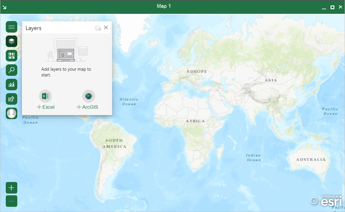
Things look a little different now! We are confident you’ll be able to find your way around this intuitive design.
Get to know the map tools
In the July 2021 release of ArcGIS for Office, the map tools are now contained in an expandable (and collapsible!) vertical toolbar.
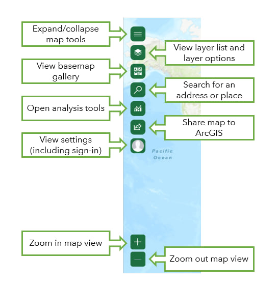
From the map tools, you can navigate the map, add and analyze data from Excel or ArcGIS, style your map, and then share it.
The layer list: all your content in one place
ArcGIS for Office now features a sleek layer list, accessed from the map tools. The layer list is your starting point for adding data to the map, viewing and modifying your layers, and working with ArcGIS tools.
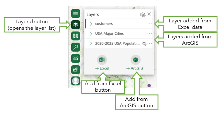
Layers were previously represented by layer cards, and configuration options appeared in the layer options pane. This updated interface maintains the same functionality—you can move, rename, hide, and delete layers and expand a layer to view its legend—but now, all layer options are accessible in one place.
Layer options & styling
The new ArcGIS for Office interface has gathered all the tools you use for customizing your map and tucked them into the powerhouse Layer options button. The button is accessed through the layer list.
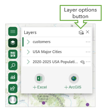
In the Layer options pane, you’ll find options for styling, selecting features, clustering, displaying pop-ups and labels, mapping time-aware data, sharing a layer, and adjusting the layer properties.
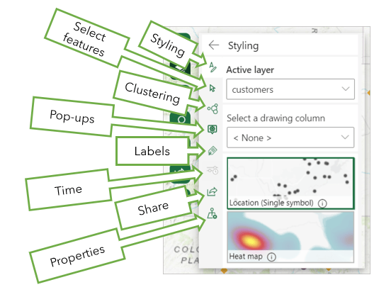
The Layer options pane is the Swiss army knife of ArcGIS for Office—a neat and compact container for a wide range of useful tools. Click on any option to enable, adjust, and disable elements of your layer, or share it through ArcGIS.
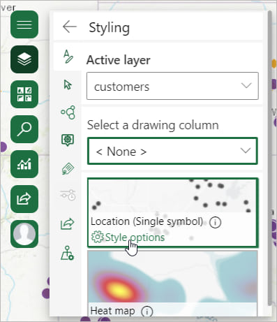
One of the most exciting new features in this release is the advanced styling options, including more map styles and symbology choices. On your chosen map style, click Style options to view all the customization options for the theme, including advanced options for symbol shape, fill, and outline.
Simple workflows for adding data
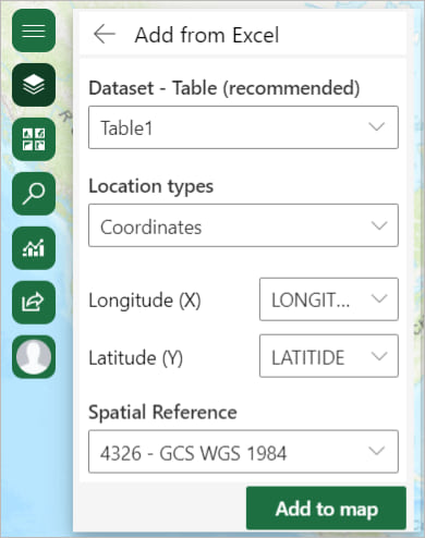
The process of plotting your own data on a map, or adding ArcGIS layers from Living Atlas, is even easier with this release. The refined Add from Excel pane allows you to pick a dataset, identify the types of locations you’re mapping, and see your data on the map in as little as one click.
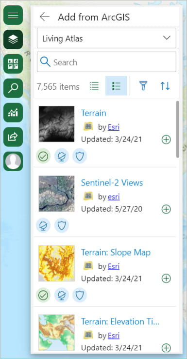
Supplementing your data with ArcGIS content is similarly straightforward. The Add from ArcGIS pane lets you browse and search multiple data repositories, including Living Atlas and your ArcGIS Online organization, if you have one.
Unlike previous versions of ArcGIS for Office, styling your data is a separate workflow accessed once your data’s on the map, meaning you can concentrate on creating cartographic fireworks at your own pace.
New capability: Buffer/Drive time analysis
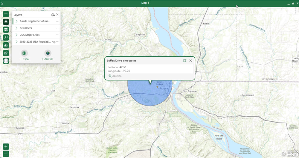
New at the July 2021.1 release, Buffer/Drive time analysis draws a polygon on the map showing either distance or travel time to or from points or layers. This tool can help you visualize trade and service areas, determine whether such areas overlap, and inform crucial business decisions. Access the tool from the Analysis map tool, select a point layer or drop a pin, and buffer away!
New name and functionality: infographics cards
You know them, you love them—the feature formerly known as demographics cards. With a fresh name and more intuitive design, infographics cards are an ArcGIS for Office staple.
Updated help documentation
In line with the updated product, ArcGIS for Office help topics have been revamped to reflect the new interface and functionalities. Help documentation can be accessed in the ArcGIS ribbon in Excel, or by visiting the help site in a browser window.
We hope you enjoy this new user experience and that it makes your ArcGIS for Office mapping smoother. You will recognize this interface in ArcGIS for SharePoint too—try it out and integrate ArcGIS maps into your Microsoft system for a seamless data visualization experience.



Article Discussion: