Infographics cards are visualizations that provide contextual information about your map. Infographics cards are interactive, as their content updates depending on what you’re doing.
Infographics cards use the ArcGIS GeoEnrichment service behind the scenes. Using infographics, you can get information about people, places, and businesses in a specific area, or within a certain distance or drive time from a location. Specifically, by selecting a point or polygon in ArcGIS for Office or ArcGIS for SharePoint, you can retrieve the demographic data and other relevant characteristics associated with the surrounding area.
Using the concept of a study area, if you input one or more points as a study area in ArcGIS for Office or ArcGIS for SharePoint, the service will create a buffer or drive-time analysis area around the study area and append the enrichment data that will display on the infographics card.
Let’s look at an example in ArcGIS for SharePoint.
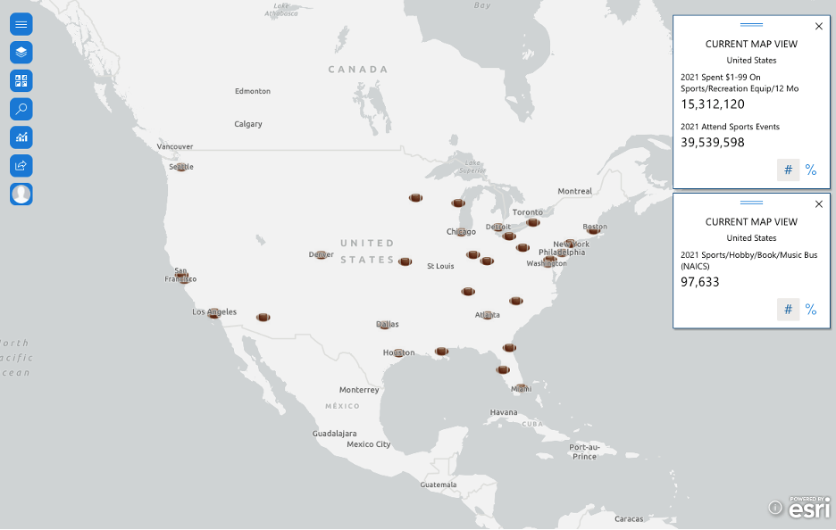
If a rugby promoter wants to organize rugby tournaments all across the United States, and if the company is looking for potential locations to organize the tournaments, the promoter can run a drive-time analysis around NFL stadiums across the United States and study the business landscape, Behavior, and Spending as part of that analysis. This can help save money and resources for the promoter, since they can use the results of the analysis to deploy the appropriate amount of resources and money to ensure that there is enough outreach about the tournaments and, most important, rugby. The map below shows the infographics card highlighting Behaviors, Spending, and the sports business landscape categories. Before we select specific features or data points from the layer, let’s observe that the infographics cards show the numbers for the current map extent, which is currently focused on North America.
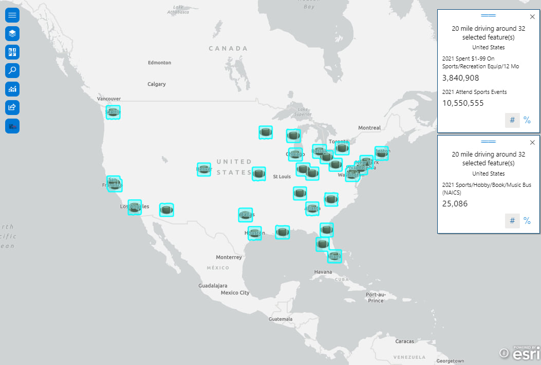
We can now select the NFL team stadiums across the United States, and as you can see, the infographics cards now reflect the numbers for the selected features on the map.
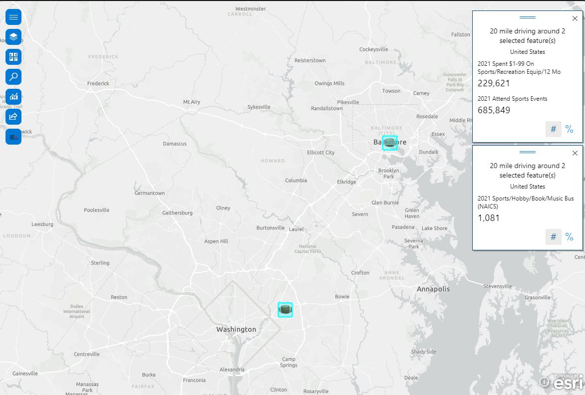
We can also do a deep dive and look at the numbers in and around the DC-Maryland-Virginia (DMV) tri-state area to see how the numbers in the DMV region compare with the rest of the country.
Here are some tips and tricks while using infographics cards.
The infographics card has two main functions: Select variables and Settings.
Select variables
You can select variables based on your study area from the Country or area drop-down list. The default country is always the United States. All available variables will display and can be classified into different categories based on the selected country or area. You can also immediately get variables by searching all variables in the search bar.
Let’s look at an example in ArcGIS for SharePoint.
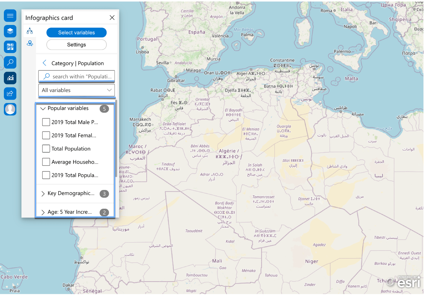
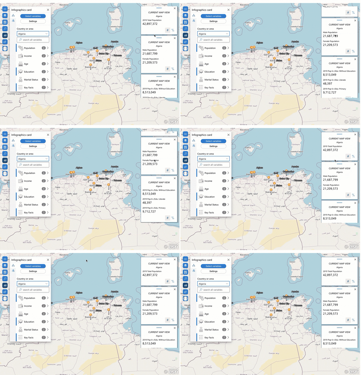
If we want to get demographic information from Algeria and add related variables to the map, we can simply choose Algeria from the Country or area drop-down list. The resultant variables are classified into the following categories:
- Population
- Income
- Age
- Education
- Marital Status
- Key Facts
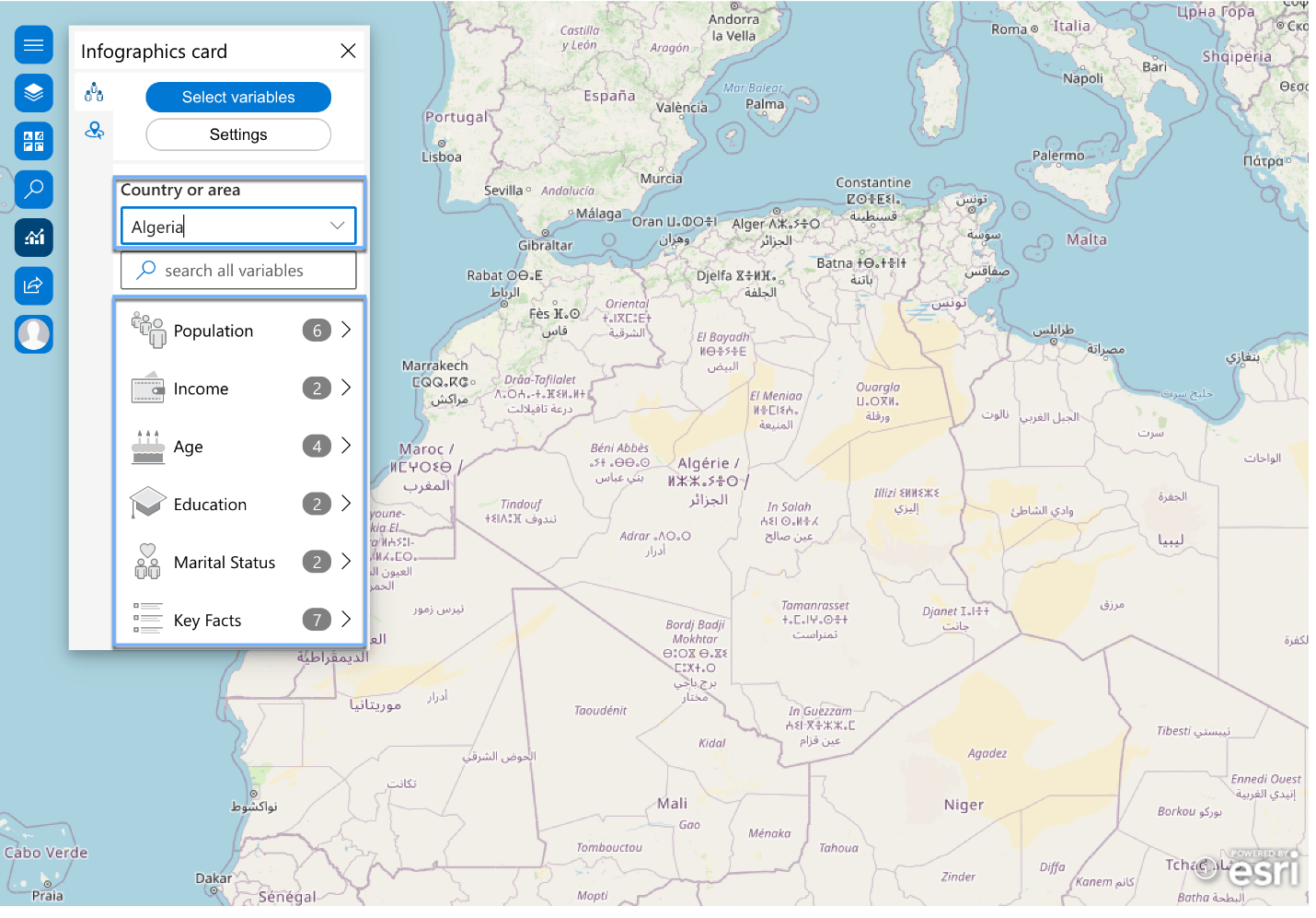
If we select the Population category, the population variables will be classified in detail. We can thus search any variables we want by expanding those respective categories, searching within a specific category in the search bar, or choosing broadly from the All variables drop-down list.
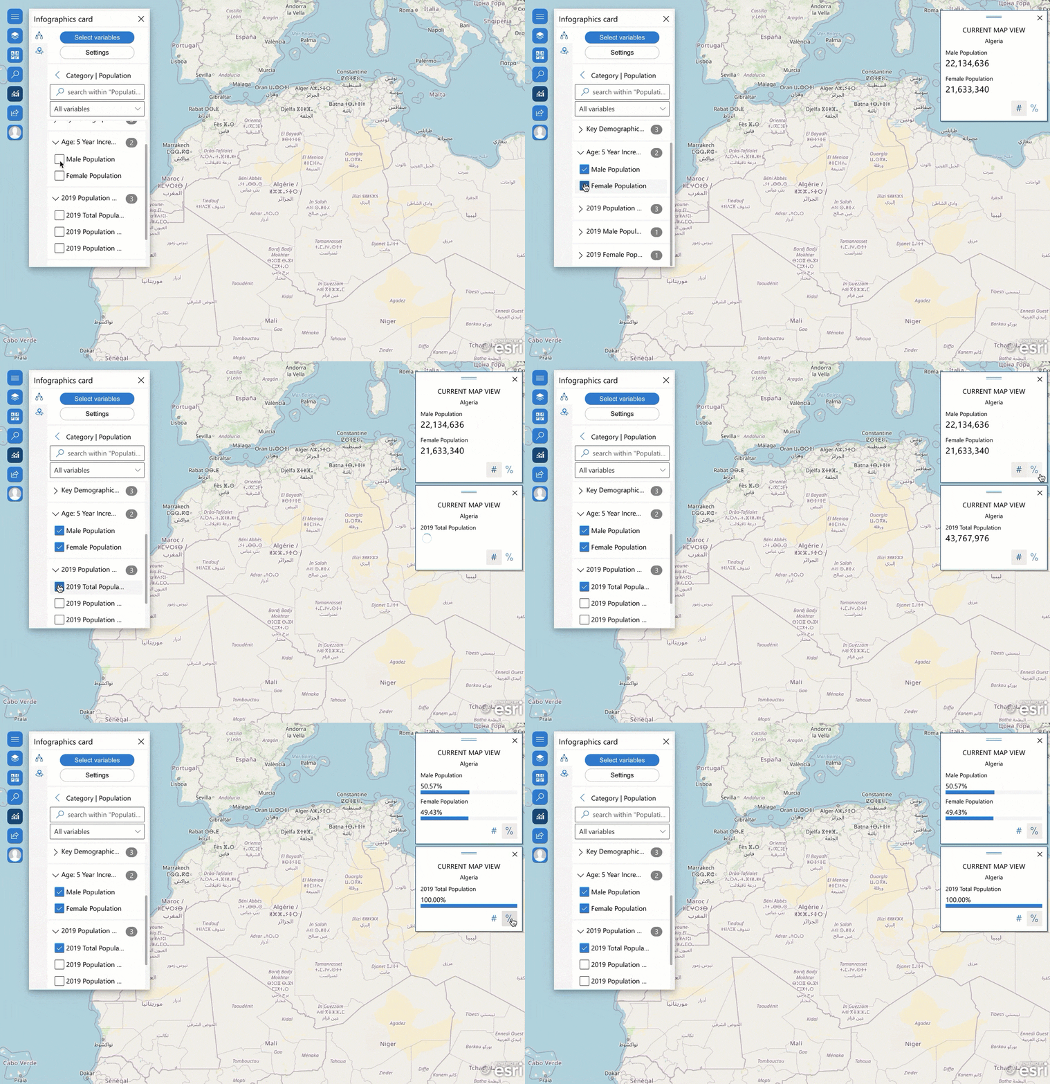
If the variables are in the same category, they will be added on the same card. Otherwise, they will be added separately. By default, infographics cards are shown in numbers. We can change numbers to percentage display.
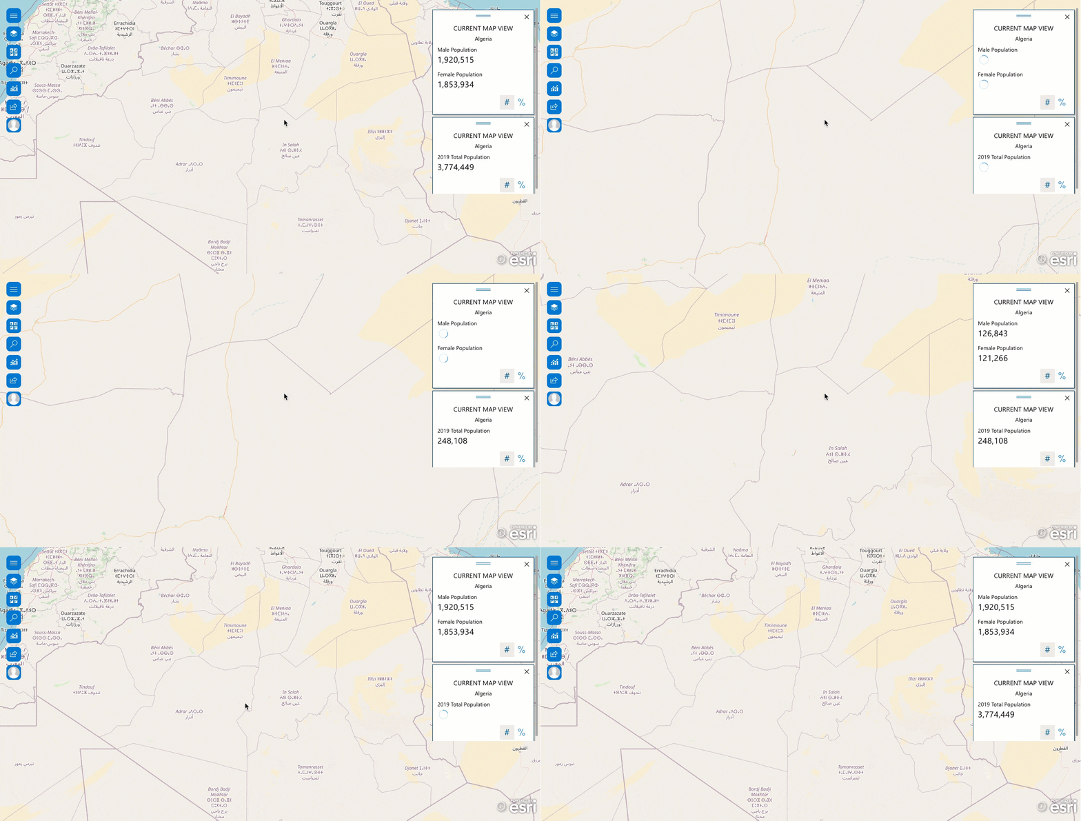
Zooming in or out on the map changes the numbers accordingly.
We can also change the position of the added cards by dragging them across the map.
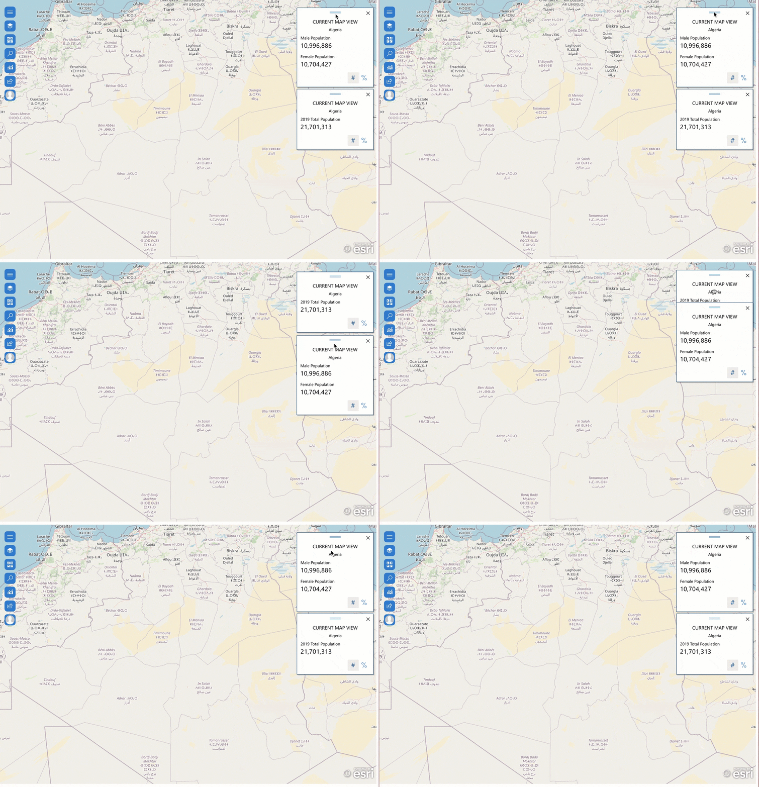
We can see all the added infographics cards by scrolling up or down.
Settings
After adding the demographic information, we might want to do some light analysis on it.
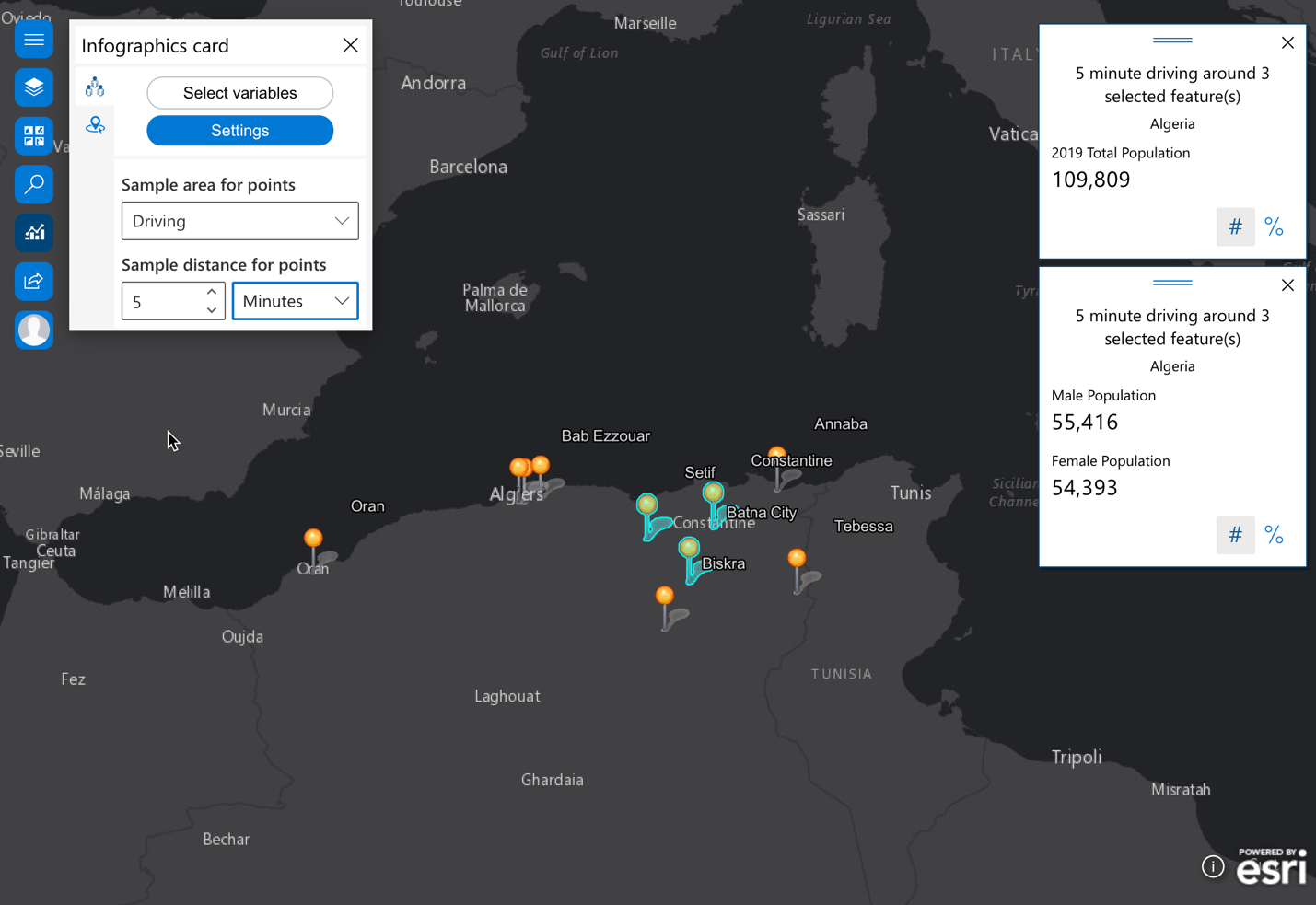
Let’s add some city points in Algeria and select any three cities. We thus get demographic information based on the following settings:
- 5 mile radius around 3 selected features

- 5 minute driving around 3 selected features
- 5 minute walking around 3 selected features

- 5 minute driving trucks around 3 selected features

Hopefully these tips and tricks are helpful while you are using the infographics card in ArcGIS for Office or ArcGIS for SharePoint.
With this enhancement feature, infographics cards in the July 2021 release of ArcGIS for Office and ArcGIS for SharePoint, spatial analysis can be easily accessible combined with web maps. You can make decisions on location selections, develop policies, and more based on the data visualization and your interaction with maps and cards.
To learn more about infographics cards, you can check out the following topics:
Try it out and let us know your experience with infographics cards. We are looking forward to hearing from you in the Esri ArcGIS for Office Community and ArcGIS for SharePoint Community.


Article Discussion: